
Ember Freestyle is an Ember addon that allows you to quickly create a living styleguide for your Ember app. Whereas other living style guide projects showcase current CSS using dummy HTML, Ember Freestyle presents existing Ember components from your app in a dedicated living style guide.
This is a work in progress. Collaboration is welcomed.
This installation process is opinionated in order to get you going quickly. We want to make everything much easier to use in the near future. Please report any problems, and as always, PRs are welcome.
-
ember install ember-freestyleThis will do the following:
- Install the
ember-freestyleaddon itself - Install additional highlight.js and remarkable dependencies (which will eventually be made optional)
- Add a
freestyletemplate in your app - Add a
freestylecontroller in your app - Add an
app.scssfile with the required SCSS- You can type
nto decline this as long as you add@import 'ember-freestyle';somewhere in your SCSS
- You can type
Note: Ember CLI versions < 0.2.3 should use
ember install:addoninstead ofember install - Install the
-
Add
this.route('freestyle');to yourrouter.jsfile -
Navigate to
/freestyle. You should now see something like: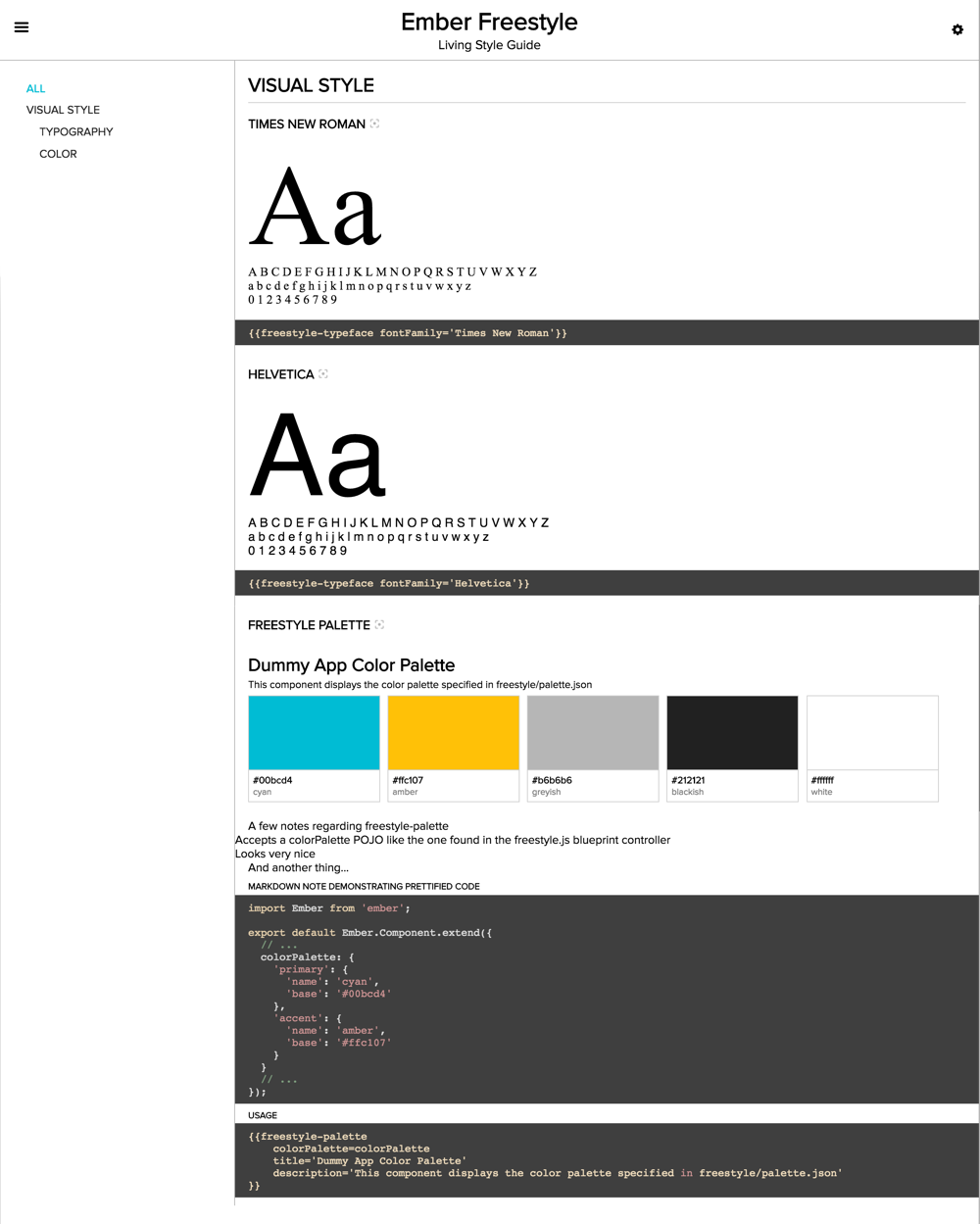

Here is a simple style guide, where {{loading-spinner}} is a hypothetical component in your application.
Here's a brief rundown of the components Ember Freestyle provides for adding a living style guide in your app:
The freestyle-guide component provides the user interface for a style guide. It includes a header section and
navigation controls.
The freestyle-usage component is the workhorse. Wrap your application's components with a freestyle-usage
component, being sure to provide a unique slug (positional param) as follows:
The snippet above will render your app's x-foo component as well as a handlebars snippet demonstrating how to use it.
Optionally group your freestyle-usage-wrapped components into sections using the freestyle-section component. The
freestyle-section component registers itself in order to appear in the navigation provided by the freestyle-guide
component.
Optionally divide your style guide sections into subsections using the freestyle-subsection component.
The snippet above will create a style guide with one 'Visual Style' section with separate subsections for
'Typography' and 'Colors'. Your app's x-foo-typography and x-fie-colors components would show up in the
appropriate subsections.
NOTE: For subsection navigation to work properly, the freestyle-section component must yield itself as Showcasing
in the above snippet. This limitation will be removed in a forthcoming release.
Documentation coming soon...
Documentation coming soon...
If you wish to change things like the color of UI elements like the lines that divide the freestyle-guide header and body or the colors of active links, you can do so by overriding any of the following SCSS variables before importing the ember-freestyle SCSS partial in your application's SCSS:
$FreestyleGuide-color--primary$FreestyleGuide-color--accent$FreestyleGuide-color--secondary$FreestyleGuide-color--foreground$FreestyleGuide-color--background
This SCSS will change the default (teal) UI elements to red in your application.
$FreestyleGuide-color--primary: #ff0000;
@import 'ember-freestyle';When using Ember Freestyle within an addon, you will need to tell the build where to search for code snippets as follows:
var app = new EmberAddon(defaults, {
  // ...
  snippetSearchPaths: ['tests/dummy/app', 'app/styles']
});
When running ember install ember-freestyle within an addon, the generator will attempt to put the freestyle
template, controller, and scss import in the wrong place. This is a known issue... please do help fix it if you
are so inclined.
ember server- Visit your app at http://localhost:4200.
npm test(Runsember try:testallto test your addon against multiple Ember versions)ember testember test --server
ember build
For more information on using ember-cli, visit http://ember-cli.com/.