A Toast component for react-native, supports Android, IOS, Web, Windows
This project is a fork of https://github.com/arnnis/react-native-fast-toast and https://github.com/tuanth89/react-native-fast-toast. I've cloned the project here in order to provide better support and maintenance.
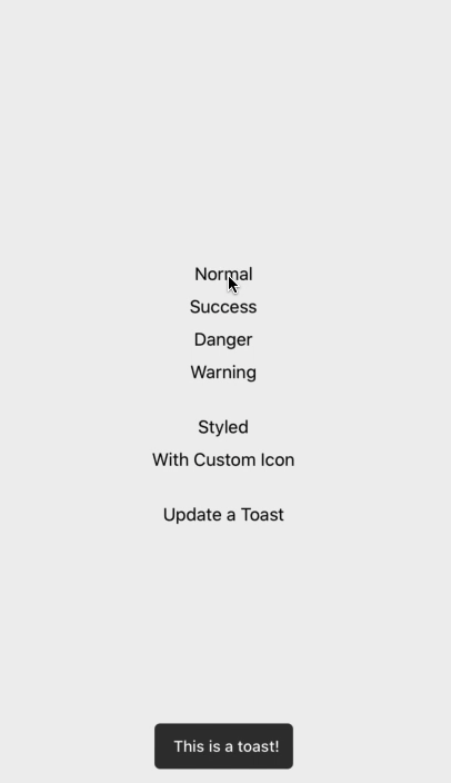
- Normal, Success, Danger and Warning toasts
- Customizable and Icon support
- Smooth animation
- Fully typed with TypeScript
Open a Terminal in the project root and run:
yarn add @emmanuj/react-native-fast-toastimport React, { useEffect, useRef } from "react";
import Toast from "react-native-fast-toast";
export default function App() {
const toast = useRef(null);
useEffect(() => {
toast.current.show("Task finished successfully");
}, []);
return (
<>
<RestOfYourApp />
<Toast ref={toast} />
</>
);
}If you want to have one Toast and use it everywhere on your app. do this in root component of your app (index.js or App.js)
import Toast from "react-native-fast-toast";

export default function App() {
  return (
    <>
      <RestOfYourApp />
      <Toast ref={(ref) => global['toast'] = ref} />
    </>
  );
}
now you can call toast.show() everywhere on app. like alert.
Check App.tsx in example app for typescript.
Alternatively you can use hooks to call toasts, to do so, wrap ToastProvier to your root component (index.js or App.js)
import { ToastProvider } from 'react-native-fast-toast';

export default function App() {
  return (
    <ToastProvider>
      <RestOfYourApp />
    </ToastProvider>
  );
}
Then use hook like this everywhere:
import { useToast } from 'react-native-fast-toast'

const Component = () => {
  const toast = useToast()
}toast.show("Task finished successfully", { type: "success" });toast.show("Task finished successfully", { icon: <Icon /> });or
<Toast
  ref={toast}
  icon={<Icon />}
  successIcon={<SuccessIcon />}
  dangerIcon={<DangerIcon />}
  warningIcon={<WarningIcon />}
/>toast.show("Task finished successfully", {
duration: 5000,
style: { padding: 0 },
textStyle: { fontSize: 20 },
});You can customize default options in Toast component
<Toast
  duration={5000}
  textStyle={{ fontSize: 20 }}
  successColor="green"
  dangerColor="red"
  warningColor="orange"
/><Toast
placement="bottom | top" // default to bottom
offset={50} // distance from bottom or top. ( default to 60 )
/>Pull request are welcome.
MIT