Readme
This is the repo used at the Theming Workshop held September 5th, 2023, in Stockholm at the Flutter'N Friends event.
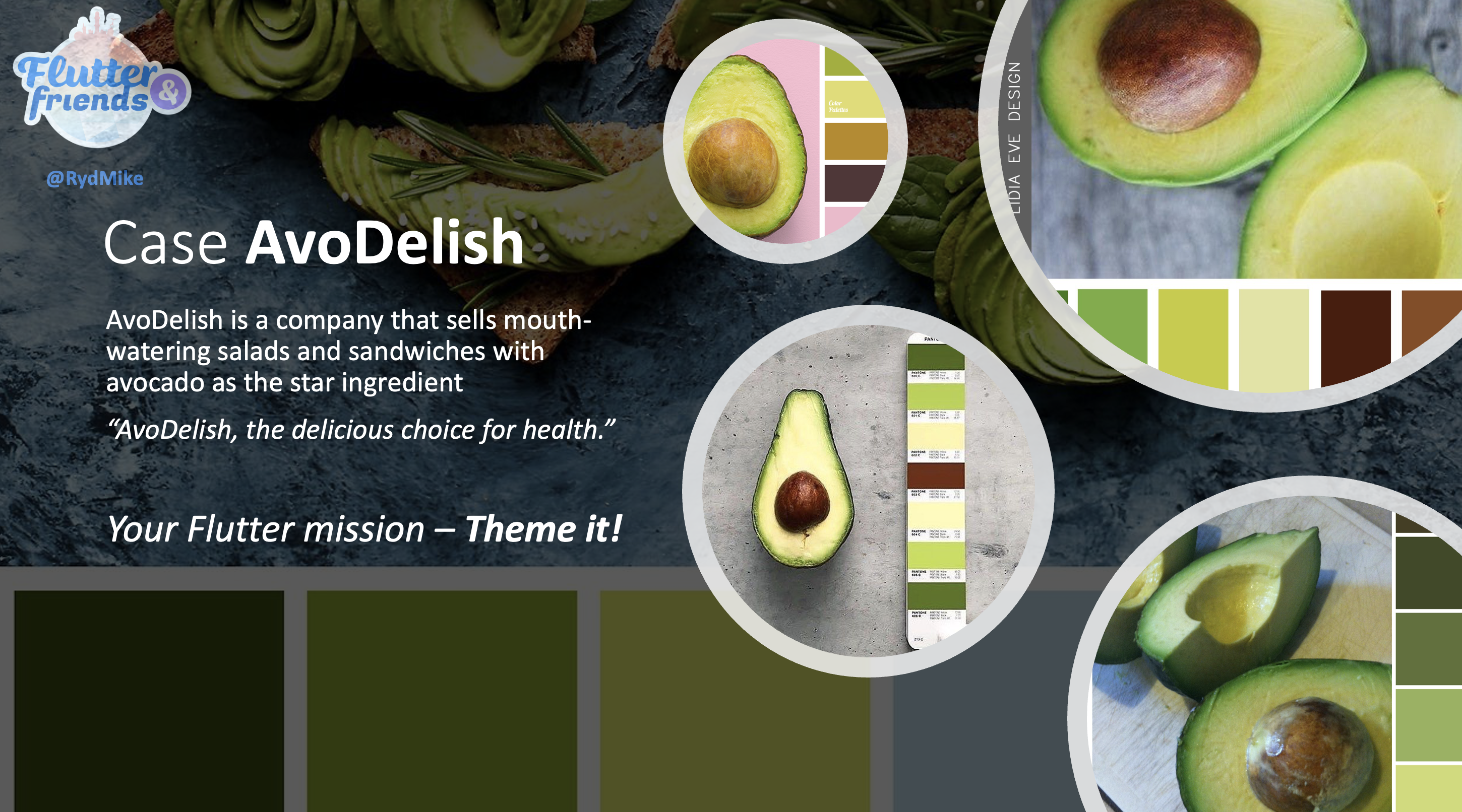
AvoDelish is a company that sells mouth-watering salads and sandwiches with avocado as the star ingredient
“AvoDelish, the delicious choice for health.”
Your Flutter mission – Theme it!
The interesting files that we will be working with are:
- /theme/avo_tokens.dart
- /theme/avo_scheme.dart
- /theme/avo_theme.dart
- /theme/avo_theme_ext.dart
Slides for intro and talk part used during the Flutter'N Friends theming workshop held in Stockholm, September 5th, 2023.
Slides for theming teaser talk, a slight variation of the intro
part from the theming workshop. This slide deck version was used at a local Flutter Meetup in Helsinki, October 5th, 2023, hosted by Montel Intergalactic.
The intent of this talk was to in a lightning talk introduce the audience
to the possibilities of theming with Material-3 design in Flutter. Those interested in diving deeper can use this repo to explore further.
At some later time, I may write an article about the steps involved in the theming workshop to explain what was done during the live workshop.
This repo contains a branch for each step used in the theming workshop. You can check out each branch and build it to see the differences in each step. The steps are briefly explained below, and they have a link to the branch containing the incremental changes for it.
The demo app contains eight different example themes. The first six differs only in how the used ColorScheme is defined. The ThemeData object is later defined manually, with many component themes and theme extensions.
Scheme and Theme versions 7 and 8 are made with the Themes Playground web app, and the theme code has been copied from the Playground. They use the package FlexColorScheme to define their ThemeData objects including their ColorSchemes.
-
M3 seed generated scheme, with the main brand color locked in.
Branch step: https://github.com/rydmike/theming_workshop/tree/01-scheme-step-1 -
Generated with M3 WEB theme builder
Branch step: https://github.com/rydmike/theming_workshop/tree/02-scheme-step-2 -
M3 seed generated scheme, with all token colors locked in.
Branch step: https://github.com/rydmike/theming_workshop/tree/03-scheme-step-3 -
FlexSeedScheme, seed from three colors, with the main brand color locked in. (Also used to demonstrate one hue!).
Branch step: https://github.com/rydmike/theming_workshop/tree/04-scheme-step-4 -
FlexSeedScheme, seed from three colors, with all token colors locked in.
Branch step: https://github.com/rydmike/theming_workshop/tree/05-scheme-step-5 -
A second theme for the Deli's red wine bar. This is a completely different ColorScheme based theme. Used to illustrate how to swap theme to completely different ColorScheme. In this demo, the fictive use case for it is that deli wants a different style for the app when used in their wine bar. It uses the Red-Red Wine theme that was copied from the Themes Playground as a ColorScheme.
Branch step: https://github.com/rydmike/theming_workshop/tree/06-scheme-step-6 -
A theme made with ThemesPlayground that closely matches hand made version 5. This theme is added in a much later step in the workshop further below.
-
As theme 7, but with adaptive theme responses depending on the used platform. This theme is added in a much later step in the workshop further below.
The demo app uses a simple function to select the used theme, based on theme settings and brightness.
-
A ThemeData function where we can build our app theme. We begin by only setting
VisualDensityto a fixed choice.
Branch step: https://github.com/rydmike/theming_workshop/tree/07-theme-step-1 -
Consider using M3 Typography even if you use M2 mode, it just looks much better.
Branch step: https://github.com/rydmike/theming_workshop/tree/08-theme-step-2 -
Fix the legacy divider color.
Next, fix all legacyThemeDatacolors. This is not so critical when using Material3 mode. However, it is still good to define them all properly (=in a ColorScheme matching way), then if somebody uses the directThemeDatacolors in the app, it will look and be OK. Avoid using theThemeDatacolors as they will all be deprecated eventually.
Branch step: https://github.com/rydmike/theming_workshop/tree/09-theme-step-3 -
Fix legacy primary colors.
Branch step: https://github.com/rydmike/theming_workshop/tree/10-theme-step-4 -
Fix legacy surface colors.
Branch step: https://github.com/rydmike/theming_workshop/tree/11-theme-step-5
In the next branch steps, we define custom styles for a number of example component themes.
-
AppBar
Branch step: https://github.com/rydmike/theming_workshop/tree/12-theme-step-6 -
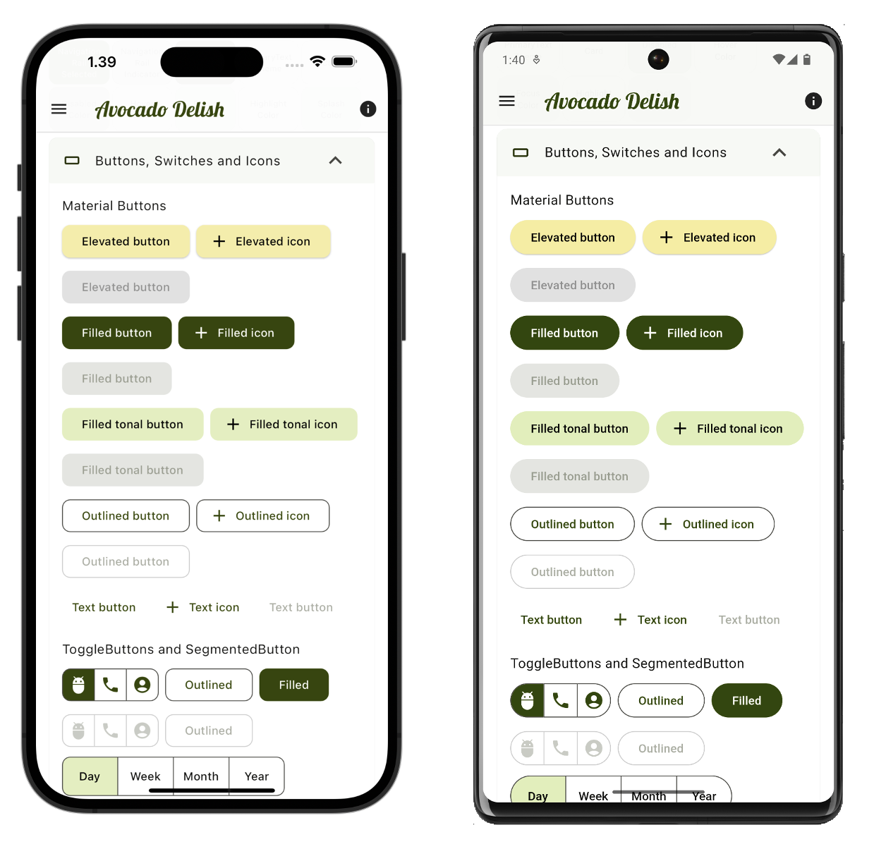
ElevatedButton
Branch step: https://github.com/rydmike/theming_workshop/tree/13-theme-step-7 -
Custom radius on other buttons
Branch step: https://github.com/rydmike/theming_workshop/tree/14-theme-step-8 -
ToggleButtons Theme
Branch step: https://github.com/rydmike/theming_workshop/tree/15-theme-step-9 -
FloatingActionButton
Branch step: https://github.com/rydmike/theming_workshop/tree/16-theme-step-10 -
ChipTheme
Branch step: https://github.com/rydmike/theming_workshop/tree/17-theme-step-11 -
Switch, make thumb size fixed! Branch step: https://github.com/rydmike/theming_workshop/tree/18-theme-step-12
-
A more advanced custom Switch theme, very iOS like.
This component theme example shows have to make a Switch in Material3, that is very close in style to the iOS switch, if an iOS Switch is colored on widget level to use the primary color. The iOS switch cannot be themed, nor does the iOS version of theSwitch.adaptiveuse primary color. Thus, when using iOS Switch in a Material app, it must always use a wrapper setting widget color prop tocolorScheme.primaryto get the custom primary color, which is often desired. If not wrapped, it is Apple system green when it is an iOS Switch. By using the M3 iOS themed look alike style, we get a switch that is familiar on both Material and iOS and uses the theme color without any wrapper.
Branch step: https://github.com/rydmike/theming_workshop/tree/19-theme-step-13 -
Input decorator. Making an input decorator theme is VERY tedious. This shows an advanced example of it using
MaterialStateOutlineInputBorder. Branch step: https://github.com/rydmike/theming_workshop/tree/20-theme-step-14 -
The old button theme still has some usage, like aligning the DropdownButton and DropdownButtonFormField to their parent. Branch step: https://github.com/rydmike/theming_workshop/tree/21-theme-step-15
-
Dropdown menu theme. Use same
InputDecoratorThemeas the main one made forTextField, so the text field part of theDropdownMenumatches used text input style. This is often desired. Branch step: https://github.com/rydmike/theming_workshop/tree/22-theme-step-16 -
Time picker should have a dial background color. (FIX Flutter SDK bug) Branch step: https://github.com/rydmike/theming_workshop/tree/23-theme-step-17
-
Custom date picker style. Branch step: https://github.com/rydmike/theming_workshop/tree/24-theme-step-18
-
Add a custom TextTheme with
GoogleFonts.nnnTextTheme. Explain and demo issues with contrast of fonts withGoogleFonts.nnnTextThemeand show fix with the extension.fixColors. Branch step: https://github.com/rydmike/theming_workshop/tree/25-theme-step-19 -
Add a custom TextTheme made from TextStyles. For more flexibility when making a custom
TextThemedefine eachTextStylein it. To use different weights, they must be explicitly defined to get the correct font glyphs. If not defined, they just get an approximation that is incorrect. The same applies to italics. Branch step: https://github.com/rydmike/theming_workshop/tree/26-theme-step-20 -
Custom text styles Branch step: https://github.com/rydmike/theming_workshop/tree/27-theme-step-21 Includes: 21a) Make a totally custom text style for a component theme: AppBar 21b) A "semantic" text theme that we will use for content, not SDK widgets. 22c) A "semantic" text style that we will use for content, not SDK widgets.
-
Add the text styles a theme extensions: Branch step: https://github.com/rydmike/theming_workshop/tree/28-theme-step-22
This part of the workshop demonstrates making the theme using the Themes Playground instead. The goal is to recreate all the above theming as close as possible using the Themes Playground. At the same time, it also shows that some parts cannot be made in the Playground, but we can add them with the API and in some cases by using ThemeData.copyWith. The effort to make the above elaborate theme is still significantly lower.
-
Entire theme made with ThemesPlayground.
Branch step: https://github.com/rydmike/theming_workshop/tree/29-themes-playground-23Tasks to do in the Playground in the workshop for this step.
- Add the colors! Copy from app! Light and dark! Only main colors!
- REMOVE blends
- USE M3 divider -> Going to keep!
- AppBar
- Elevation scroll under light 0.5 dark 1
- Surface color for M2! (not needed for M3)
- Opacity light .97 dark .96
- Adaptive theme - shadows back - all
- Buttons
- Elevated colors background primaryContainer, foreground onPrimaryContainer
- All Material buttons - radius 10
- Toggle buttons radius 10
- FAB set to primaryContainer for M2, circular!
- Chips
- Cannot replicate (use primary chip blend), radius top full
- Switch - thumb (and hover to onPrimary)
- Toggles - add selected is colored
- TextField
- LIGHT Primary, opacity 6%, 0x10, Unfocused has border OFF, prefix icon primary
- DARK set opacity to 15% 0x27s
- Popupmenu and dropdown - Set match button width option.
- Menus - Dropdown menu, it uses the correct input decorator by default, just show it.
- Navigation bar
- Has FCS legacy default - set to M3 to get the same as we used in the manual theme above.
- Make custom with primary and onPrimary - nicer (imo)
- Dialogs
- Time picker is OK
- Date picker - header primary container
- FONTS? No fonts in Theme Playground, but we can add them in API later.
- Visual density! - Standard
- Swap legacy -> Remove
- COPY-PASTE the code
- Copy via text editor
- Light
- Dark
- Paste in the custom styles we do not have in the Playground.
- Entire theme made with ThemesPlayground - Platform adaptive.
Branch step: https://github.com/rydmike/theming_workshop/tree/30-themes-playground-step-24
This part of the workshop changes the setup made in step 23 in the Themes Playground to a theme that is platform adaptive and that it looks a bit different on iOS, macOS and other desktops compared to Android.
- Platform adaptive themes
- What are platform adaptive themes?
- Remove custom radius, so we get defaults for none adaptive response
- Shape: Set adaptive radius to 10, and use it for desktop and iOS.
- Adaptive theme: Splash, density
- AppBar elevation tint - remove on desktop and iOS.
- Dialog desktop and iOS - 18?
- Final result - Demo the adaptive theme result and differences on Android and iPhone.
Branch step: https://github.com/rydmike/theming_workshop/tree/31-done