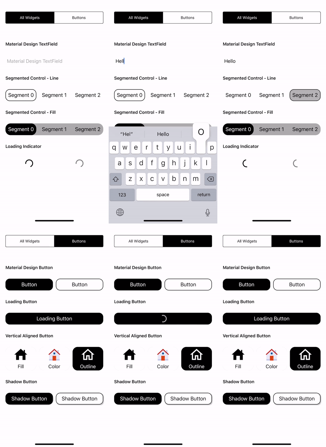
This framework give you full flexibility to apply any material design widget you would like to use in your app! Please see below steps if you only need to use one or two of the entire package widgets.
You may download MaterialDesignWidgetsDemo to see how its used in your app.
- A full package of material design widgets that you'll need to upgrade your app's visual.
- Widget classes are made to be open, which gives you flexibility to create your own.
- Instead of pull down the entire package, you can also copy the source of any widget you need independently.
- If you decide to just use one of the widgets, you can follow below usage for instructions on which files you need for that specific widget.
- Swift 5.0
- iOS 11.0+
Files needed:
- RippleLayer.swift
- MaterialButton.swift
let btnSample1 = MaterialButton(text: "Sample1", cornerRadius: 15.0)
let btnSample2 = MaterialButton(text: "Sample2", textColor: .black, bgColor: .white)let btnLoading = MaterialButton(text: "Loading Button", cornerRadius: 15.0)
loadingBtn.addTarget(self, action: #selector(tapLoadingButton(sender:)), for: .touchUpInside)
@objc func tapLoadingButton(sender: MaterialButton) {
sender.isLoading = !sender.isLoading
sender.isLoading ? sender.showLoader(userInteraction: true) : sender.hideLoader()
}let btnShadow = MaterialButton(text: "Shadow Button", cornerRadius: 15.0, withShadow: true)let img = UIImage(named: "Your image name")
let btnV = MaterialVerticalButton(icon: img, title: "Fill", foregroundColor: .black, bgColor: .white)Files needed:
- MaterialSegmentedControl.swift
var segments = [UIButton]() // Segments are in the Button form.
for i in 0..<3 {
	let button = MaterialButton(text: "Segment \(i)", textColor: .gray, bgColor: .clear, cornerRadius: 18.0)
	segments.append(button)
}let sgFilled = MaterialSegmentedControl(segments: segments, selectorStyle: .fill, textColor: .black, selectorTextColor: .white, selectorColor: .black)
// Below is styling, you can write your own.
sgFilled.backgroundColor = .lightGray
sgFilled.setCornerBorder(cornerRadius: 18.0)let sgOutline = MaterialSegmentedControl(segments: segments, selectorStyle: .line, textColor: .black, selectorTextColor: .white, selectorColor: .black)let sgLine = MaterialSegmentedControl(selectorStyle: .line, textColor: .black, selectorTextColor: .black, selectorColor: .black, bgColor: .white)Files needed:
- RippleLayer.swift
- MaterialTextField.swift
let textField = MaterialTextField(hint: "TextField", textColor: .black, bgColor: .white)Files needed:
- MaterialLoadingIndicator.swift
let indicatorBlack = MaterialLoadingIndicator(radius: 15.0, color: .black)
indicatorBlack.startAnimating()
let indicatorGray = MaterialLoadingIndicator(radius: 15.0, color: .gray)
indicatorGray.startAnimating()MaterialDesignWidgets is available through CocoaPods. To install it, simply add the following line to your Podfile:
$ pod 'MaterialDesignWidgets'
If you don't use CocoaPods, you can download the entire project then drag and drop all the classes and use them in your project.


