Gorgeous and powerful GUI/ button library for Codea projects.
I'm calling it Soda as it is inspired by Cider (but is not a fork).
Forum Discussion: http://codea.io/talk/discussion/6847/soda-gorgeous-and-powerful-gui-windowing-button-library-for-codea
-
Interface elements 1. Frame 1. Button 1. Toggle 1. Segment 1. List 2. Slider 3. Text entry 4. Text scroll 5. Alerts and dialogs
-
Positions and dimensions of elements are defined relative to the parent of the element (ie the frame or window that they are in). Positions can be defined relative to any edge of the enclosing frame, or as a proportion of the parent frame. Decide a window is too cluttered? No need to move all of the elements around, just resize the parent window.
-
Elements automatically and intelligently resize when device orientation changes
-
A collection of elements can be moved around the screen, hidden or made inactive, just by addressing the parent of the collection
-
Drawing and touching are automatically handled in order to get the correct draw and touch order so that, for instance, it is not possible to touch an element through an overlying window.
-
196-sample Gaussian blur shader used for proper drop-shadows and blurred panel effects
-
True rounded-rectangle mesh with an anti-aliased stroke, allows for translucent rounded-rectangles
-
Graphics kept largely separate from button logic (in the Style tab), making Soda very easily customisable and skinnable


-
Big changes underneath the hood: all touch logic is now handled by Jmv38's Sensor engine (renamed Gesture in Soda), making for a more modular architecture that will be easier to maintain and expand in future.
-
Jmv38 has rewritten the text entry boxes. Now features fully selectable text with draggable selection start and end points, the ability to scroll the text by dragging and holding the cursor to either end of the entry box, and a pop-up menu for cut, copy, paste, and 5-level undo.
-
Windows can now be draggable: add
draggable = trueto the window's constructor to add this. The window can be moved by dragging any part of the window that does not contain interface elements. See the calculator demo for an example of this. -
Various minor fixes for iOS 9 and Codea 2.3.2 affecting sliders, orientationChanged, and forcing the plain, non-emoji form of various symbols to display.


-
SubStyles: A new, more powerful way of handling styles. Uses the same palette as iOS9.
- if you have used the
styleattribute, you may need to make changes. See notes tosubStylebelow
- if you have used the
-
Improvements to text scrolls: now wraps lines at word boundaries, has option to scroll to bottom of text when new text added
-
Text Entry boxes now properly interpret text pasted into them (requires iOS9 shortcuts row)
-
Fixed a major bug in Lists where one List would inherit the panels of another
-
Tutorial rejigged following feedback
-
Overview now includes a funky calculator demo.
-
Lots of minor fixes
-
NEW
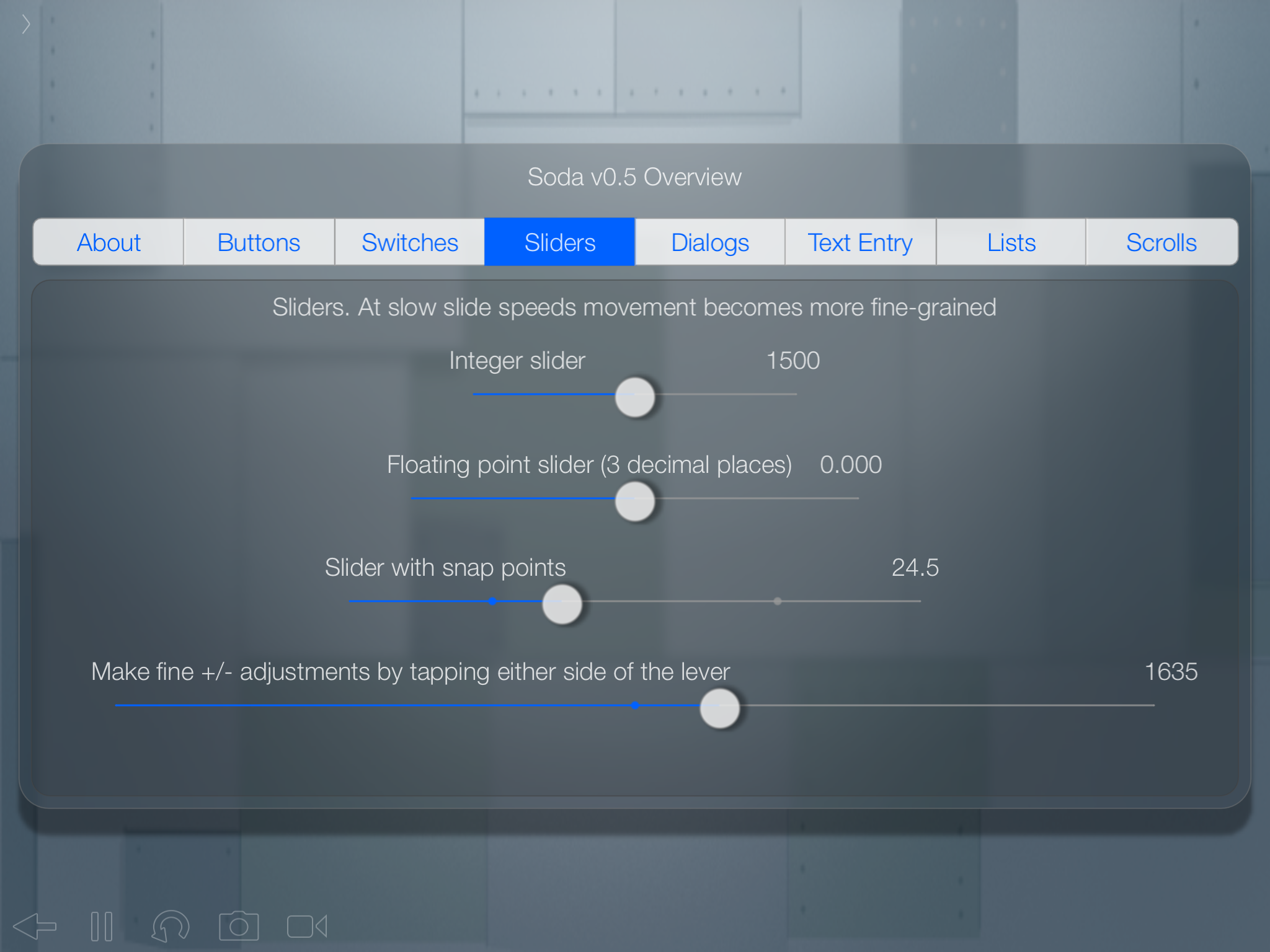
Soda.Sliders- Sliders can be any length (default to 300 pixels), can be integer or floating point, can have an optional set of "snap points" that the value will snap to, support tapping either side of the handle for fine +/- adjustments, and at slow drag speeds have a cubic relation to touch allowing for up to 1/20,000 accuracy. -
New, more comprehensive overview of all the elements supported by Soda when you run the program.
-
In
TextScrollandTextWindow, methodinputString(text)now appendstextto whatever is already in the window, instead of clearing the window. New methodclearString()clears the window. -
Panel switching functionality of
Soda.Segmentnow also available inSoda.Listviapanelsparameter -
Soda.Windowcan now have optional automatic ok and cancel buttons by setting ok and cancel attributes.
- Vertical list selectors now less aggressive at rejecting scroll gestures
- Lists now have :clearSelection() method
- Lists now have an
enumerateflag. Set this to true to automatically number the items in the list - To populate a TextScroll or TextWindow with text, constructor attribute is now
textBody, instead oftext Soda.Alert2- 2-Button proceed/ cancel alerts have been fixed- Fixed a bug in the appearance of buttons in alerts
- Close button is now a proper X
- Selector touch logic now greatly simplified
- Tutorial now updated with all major element types
- Fixed bug where vertical lists sometimes returned the wrong result
-
NEW
Soda.DropdownList- A button which, when pressed, toggles a dropdown list (this is a wrapper or factory which makes it much easier to setup dropdown lists). When an item is selected from the list, the button's label changes to reflect the selection, and an optional callback is triggered. -
NEW
Soda.Toggle- now, in addition to iOS-styleSoda.Switch(with an animated lever that ficks back and forth), any button can behave as a toggle. This has been implemented by separating the graphics and animation ofSoda.Switchfrom the toggle button logic. -
Callbacks have been made more consistent and are triggered by more elements. Callbacks are now always triggered as
self:callback(with a colon) so the first argument passed to the callback will always be the sender's self. If you have any callbacks that take an argument, egcallback = function(inkey), these will now need to have aself/thisvariable as their first argument (how you name the variables passed to the callback is up to you): egcallback = function(self, inkey).-
In
Soda.TextEntry, callback is triggered by hitting return or the close keyboard button (but not by selecting a different interface element, which closes the keyboard and cancels text entry). Callback is passed the string entered. -
In
Soda.List, callbacks return 3 variables: 1) the sender (the list object itself), 2) the selected item, 3) the selected item's title string -
Soda.ToggleandSoda.Switchhave two callbacks:callback(when on state is activated) andcallbackOff
-
-
new
updateparameter. Like a callback, but triggered every frame, in case any elemenets need constant updating (see the new profiler panel in the demo). -
If you're using iOS 9, TextEntry fields now have cut, copy, and paste ;-)
-
The
Soda.Controlwrapper is now calledSoda.Window -
The
drawingfunction called indrawmust now be calledSoda.drawing
Copy the contents of /SodaInstaller.lua. It is easiest to do this from the RAW page. In Codea, long-press "+ Add New Project", and select "Paste into project".
To incorporate Soda into your own project, make Soda a dependency of your own project. Do this by tapping the plus icon in the top-right corner of the code editor of your project, and checking the box next to Soda.
Soda needs hooks into the five built-in functions setup, draw, touched, keyboard, and orientationChanged, that pass the arguments of those functions into Soda. These are Soda.setup(), Soda.draw(breakPoint),* Soda.touched(touch), Soda.keyboard(key), and Soda.orientationChanged(ori) . How to call these hooks can be found in the Main tab of Soda.
-- Use this as a template for your projects that have Soda as a dependency.

function setup()
    Soda.setup()
    --do your setting up here
end

function draw()
    --do your updating here
    pushMatrix()
    Soda.camera()
    Soda.drawing()
    popMatrix()
    profiler.draw()
end

function Soda.drawing(breakPoint)
    --in order for gaussian blur to work, do all your drawing here
    background(40, 40, 50)
    sprite("Cargo Bot:Game Area", WIDTH*0.5, HEIGHT*0.5, WIDTH, HEIGHT)
    Soda.draw(breakPoint)
end

--user inputs:

function touched(touch)
    Soda.touched(touch)
    --do underlying touches (won't trigger if a Soda touch event is called)
end

function keyboard(key)
    Soda.keyboard(key)
end

function orientationChanged(ori)
    --do your orientation changes
    Soda.orientationChanged(ori)
end
You can copy this Main tab and use it as a template for your projects that use Soda.
If you want blurry panels to blur elements that lie beneath the interface, you will need to place this drawing in a function in your own project titled Soda.drawing(breakPoint). When a new blurred panel is created, Soda.drawing is run twice, once to be output to the screen as normal, and a second pass with the gaussian blur effect applied. There needs to be a breakpoint variable in order to prevent the blurred window itself being incorporated into the blurred effect. For best results, separate your drawing from all other code that may be in your draw loop (updating positions etc), and place just the drawing in Soda.drawing.
NB for performance reasons, currently the blurred panels do not have live updating of the underlying image being blurred. The blurred image is only generated when the panel is first declared, or the orientation changes. They therefore look best if the underlying image is not moving.
Add interface elements to your code with constructors consisting of a Soda element and a table of arguments. All Soda elements take a single table of parameters as an argument. In Lua, if a function takes a single table or a single string as its argument, then the () brackets that usually enclose the arguments can be omitted. So, Soda.Button{title = "Press Me"} is the same as Soda.Button({title = "Press Me"}), but with less typing. Keys can be supplied in any order, and very few are compulsory (Soda will supply defaults for certain missing values).
Soda will automatically record each UI element you create. Therefore Soda constructors are "fire and forget". Soda does this in order to ensure the correct order of drawing and touching (so that, for example, you cannot touch a button hidden beneath a pop-up dialog window). You will ony need to define local handles for UI elements if you need to refer to that element, usually in either a callback, or to make that element the parent of others (see /tabs/Demo for examples).
A container for other UI elements (a window).
One press to activate a callback. Has a variety of built-in variants for frequently-used interface elements:
Soda.SettingsButtonthe settings "gear" iconSoda.MenuButtonthe "hamburger" menu buttonSoda.BackButton(adddirection = RIGHTif you want a right facing button)Soda.CloseButtonan "X" close iconSoda.DropdownButtona triangle pointing downSoda.AddButtona big "+"Soda.QueryButtona big "?"
Toggles on and off. Additional attributes:
on- flag.Soda.Toggleis off by default. Set this to true to override this behaviour.callback,callbackOff- in addition tocallbackparameter (see General Parameters below), fired when switch turns on, there is acallbackOff, triggered when the switch is turned off.
Additional methods:
:switchOn(),:switchOff()- methods to switch the toggle on or off (and fire its callbacks), in case you need to automate the switches.
Built-in variants:
-
Soda.MenuTogglethe "hamburger" menu button, as a toggle -
Soda.Switch- An iOS-style toggle with a lever that slides back and forth.
Horizontally segmented buttons that activate different frames/ panels. Define the panels first, before defining the segment button that will switch between them. Additional attributes:
text- array of strings. Describes how each segment will be labelled. eg:text = {"Buttons", "Switches"}panels- array of UI element identifiers. Identifies which panels the segmented button will flick between, corresponds withtextarray. eg:panels = {buttonPanel, switchPanel}wherebuttonPanel,switchPanelare handles (local variables are fine here) for prior defined Soda elements.defaultdefault- integer. if you want one of the segment sections to be selected by default, set this to the number of the item in thetextarray. egdefaultNo = 2to default to"Switches"from the above list. If omitted defaults to 1 (left-most panel)
A vertically scrolling list of elements that the user can select from. Has elastic snap-back when user scrolls past edge of list. Additional attributes:
text- array of strings. One string for each item in the list. egtext = {"apples", "oranges", "bananas"}enumerate- flag. Set to true and the list items will automatically be numbered, eg1) apples 2) oranges 3) bananaspanels- array of UI element identifiers. Same as inSoda.Segment, identifies which panels the list will flick between, corresponds withtextarray. eg:panels = {applesPanel, orangesPanel}whereapplesPanel,orangesPanelare handles (local variables are fine here) for prior defined Soda elements.defaultNodefault- integer. Similar toSoda.Segment, if you want an item in the list to be selected by default, set this to the number of the item in thetextarray. egdefaultNo = 2to default to"oranges"from the above list. Omit this for no selection.callback- list callbacks return 3 variables, eg:callback = function(self, selected, txt)- as always, the sender (the list object itself).
- the selected item. List items are numbered in order with the variable
idNo, this can be queried within the callback with egselected.idNo - the selected item's title string.
Additional method:
:clearSelection()- clears the selection
Variant:
Soda.DropdownList- A button which, when pressed, toggles a dropdown list. When an item is selected from the list, the button's label changes to reflect the selection, and an optional callback is triggered.text,enumerate,callback,clearSelectionall same asSoda.List. Arguments:title- the title of the button, will be prepended to the user's list selection. A downward-facing triangle is automatically prepended to the title to indicate that a dropdown menu is availabledefaultNodefault- the list item selected by default, same asSoda.List. If you omit this, there will be no selection by default, and the text "Select from list" will be appended to the button's label.
A slider. Sliders can be integer or floating point, can have an optional set of "snap points" that the value will snap to, support tapping either side of the handle for fine +/- adjustments, and at drag speeds of less than 1 pixel delta have a cubic relation to touch allowing for up to 1 in 20,000 accuracy. They can be any length (default to 300 pixels). Callback is triggered on touch ended.
Attributes:
min,max- number, required. The minimum and maximum values for the sliderstart- number. Start point of slider. Omit to start at minimum.snapPoints- table of numbers. Points between min and max that the slider will snap to, egsnapPoints = {0, 100}decimalPlaces- integer. Sets the number of decimal places of floating point sliders. Omit this to default to an integer slider.
A text entry field with a draggable cursor, fully selectable text (double tap a word to select it), draggable selection start and end points, a pop-up menu with cut, copy, paste, and 5-level undo, and the ability to scroll the text by dragging and holding the cursor at either end of the selection box. Additional attributes:
default- string. Default text that can be overwritten by the user.
Additional method:
:inputString(string)- in case you need to populate the field with a string:output()- returns the current contents of the box
Soda.TextScroll is a window for handling scrolling through large bodies of text. Soda.TextWindow is a wrapper that adds a close button to the text window. Additional attribute:
textBody- string. the body of text to be scrolled.
Additional method:
:inputString(string)- appends string to the contents of the window:clearString()- clears the contents of the window
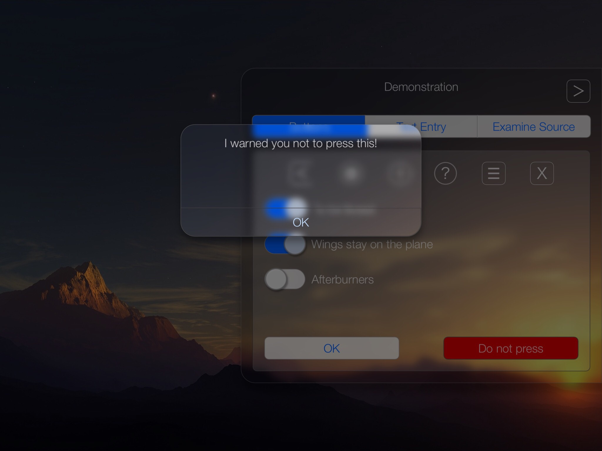
Soda.Alert- alert message plus single OK buttonSoda.Alert2- OK and cancel buttons. Additional attributes:ok- override default "OK" button textcancel- override "cancel" button text
Soda.Window- a standard window with a title and rounded corners.ok- flag/ string. Set to true to add an OK button that will triggercallback. Set to a string (eg "Proceed" etc) to override the title of the buttoncancel- flag/ string. Set to true to add a cancel button that closes the window. Set to a string (eg "No" etc) to override the title of the button.closeflag. Set to true to add a close X button to the top-left corner.
Not all parameters are currently supported by all Soda UI elements.
-
parent- UI element identifier. The parent of this element. Positions and dimensions are defined relative to the parent. Elements without any parent are top-level. -
x,y,w,h- float. Position and dimensions of element, defined relative to the parent, or to the viewable screen if there is no parent, according to 3 rules:- if x,y,w, or h are positive integers, they behave as normal coordinates in rectMode CORNER (ie pixels from the origin)
- if x,y,w,or h are floating point between 0 and 1, they describe proportions in CENTER mode (x,y 0.5 is centred)
- if x,y,w, or h are negative, they describe distance in pixels from the TOP or RIGHT edge, as in CORNERS mode (ie, w,h become x2,y2 rather than width and height). if x and y are negative, they also behave the same way as w,h, describing the distance between the TOP/RIGHT edge of the parent, and the TOP/RIGHT edge of the child (they also become x2, y2). How do you fix an element to the top or right edge (or, how do you write -0)? Use -0.001
the above 3 rules can be mixed together in one definition. eg a button fixed to the bottom right corner of its parent with a 20 pixel border, with a variable width of a quarter of its parent's width, and a fixed height of 40 pixels, would be: x = -20, y = 20, w = 0.25, h = 40.
-
title- string. The text that will label this element -
text- table of strings. Used by elements made of multiple parts such asSoda.Segment,Soda.List -
textBody- string. Used bySoda.TextScroll,Soda.TextWindow -
defaultNodefault- integer. Used by elements made of multiple parts such asSoda.Segment,Soda.Listto indicate a default selected item in the list. -
default- string. Used bySoda.textEntryfor default text that can be overwritten by the user. -
callback- function. Triggered by completing actions (pressing a button, hitting return in textEntry). Callbacks are always triggered asself:callback(with a colon) so the first argument passed to the callback will always be the sender's self.- In
Soda.TextEntry, callback is triggered by hitting return or the close keyboard button (but not by selecting a different interface element, which closes the keyboard and cancels text entry). Callback is passed the string entered as the second variable. egcallback = function(self, inkey) - In
Soda.List, callbacks return 3 variables: 1) as always, the sender (the list object itself), 2) the selected item, 3) the selected item's title string Soda.ToggleandSoda.Switchhave two callbacks:callback(when on state is activated) andcallbackOff
- In
-
update- function. Fired every frame, in case an element needs constant live-updating (eg a window displaying constantly changing stats) -
on- flag.Soda.ToggleandSoda.Switchare off by default. Set this to true to override this behaviour. -
hidden- flag. Set to true for elements that are hidden initially. (NB make sure you add a button that will:show()or:toggle()the element) -
kill- flag. Set this totrueto delete the element -
shape- function pointer. Set (or override) the default shape of the element. Currently, onlySoda.RoundedRectanglesupports blurred panels -
style- table pointer. set (or override) the default style of the element (see Style tab). Currently there is only one style,Soda.style.default. If you were previously using styles such asSoda.style.translucent, these have now become sub-styles. You can also set a custom style table (documentation coming soon) -
subStyle- table of strings. Set additional style features to the element. The strings must correspond to keys in the table of the base style. Current keys are:"warning"- red warning buttons"icon"- a larger typeface, for buttons using symbols"darkIcon"- a white icon with a transparent background, looks good against dark surfaces"button"- the default iOS blue button style. NB this will be set automatically by the button classes. Use subStyle attribute to override."translucent"- a dark translucent area (useful for frames)
If you were setting the style attribute in 0.5, most of these styles have been folded in to
Soda.style.default, and are now accessed using thesubStyleattribute. Remember thatsubStyleis a table allowing multiple attributes to be set. Eg: changestyle = Soda.style.translucenttosubStyle = {"translucent"}
-
panels- table of UI element identifiers. Used bySoda.SegmentandSoda.Listto identify which panels the segmented button will flick between -
alert- flag. Set to true to darken and disable the underlying interface elements until this element has been dismissed. Automatically set bySoda.Alertdialog. -
blurred- flag. Make this a blurry panel. Currently only supported for Rounded Rectangle. Use sparingly. Instead of layering blurs on top of one another, consider making only the underlying element blurred, and overlying elements transparent. -
shadow- flag. Add a drop-shadow. -
shapeArgs- table of parameters to be passed to the shape function. Currently only supported bySoda.roundedRectangle. Arguments:corners- bitwise flag. Sets which corners to round. Corners are numbered 1,2,4,8 starting in bottom-left and proceeding clockwise. Defaults to 15 (all corners). Use bitwise operators to set. eg to only round the bottom corners set this to1 | 8(1 or 8). To round all but the top-right corner, use~4(not 4)radius- the radius of the rounded corners. Defaults to 6.
-
:show(direction),:hide(direction),:toggle(direction)- Makes the element, and its chidren if it has any, appear (and become active) and disappear (and become inactive), or toggle between the two states. The optional direction argument can be set to eitherLEFTorRIGHT, and will make the element slide in and out of the left and right sides of the screen. If direction is not specified, the element will appear and disappear without animation. -
:inputString(string)- method to add text toSoda.TextEntry,Soda.TextWindow(andSoda.TextScroll)
If the height of a scroll box's contents is shorter than the height of the box itself, elastic snap-back behaves strangelySometimes vertical lists return the wrong result- Can only scroll a textbox by adding and deleting text (waiting to see if Codea will add support for iOS 9 keyboard touchpad to its touched API)
New keyboard height in iOS 9 has not been accounted for- Drop shadows sometimes only offset on Y-axis, not X-axis
- If TextEntry input is too long for the box, text scroll position is not recalculated on orientationChanged
- Dropdown lists do not disappear on selecting another interface element
-
ADDED V0.5 Sliders. -
Interface designer
-
ADDED v0.7Improvements to TextEntry:-
Be able to select a word with a double-tap. -
Be able to scroll the field leftwards by moving the cursor (currently you can only scroll leftward by deleting)
-
-
ADDED. Add a factory for easier creation of the drop-down list seen in the demo -
Add a rect shape that supports textures and aliased strokes, so that you can have rectangular blurred panels that match the same stroke as the rounded rectangles
-
Add optional support for live-updating blurred panels
-
Add option to emulate various iDevices to prepare interfaces for universalisation
-
Add optional filters (eg Codea syntax highlighting, markdown parsing) to TextWindows
-
v0.7 Make gesture recognition (refusal of swipe-to-scroll gestures) universal across Soda (currently just applies to List classes) -
Make styles list cascading -
Add scroll-bar indicator to text windows