Create a new Next.js project:
Open the cmd / Terminal and run the following command npx create-next-app@latest
- Give a Project Name: ‘What is your project named? my-app’
builder-app - Select
yesWould you like to use TypeScript? No / Yes. - Select
yesWould you like to use ESLint? No / Yes. - Select
noWould you like to use Tailwind CSS? No / Yes - Select
noWould you like to use ‘src/directory?’ - Select
noto use the App Router? - Select
noWould you like to customize the defaultimport alias (@/*)?

Installing Builder SDK:
After finishing the installation process, navigate to the builder-app directory using cd builder-app/ and execute the command npm install @builder.io/react to install the necessary builder dependency.
.gif)
-
To set up your project to use Tailwind CSS, you'll need to follow these steps in your terminal:
- Enter the command
npm install -D tailwindcss postcss autoprefixerThis installs Tailwind CSS, PostCSS, and Autoprefixer as development dependencies.
- Next, enter
npx tailwindcss init -p. This command creates thetailwind.config.jsfile for Tailwind CSS configuration and thepostcss.config.jsfile for PostCSS and Autoprefixer configuration.
💡 By following these steps, you will have set up your project to use Tailwind CSS with the necessary configurations for PostCSS and Autoprefixer..gif)
- Enter the command
-
In order to optimize Tailwind for production, start by modifying the
tailwind.config.tsfile to include the paths to all of your components, pages, and app.- Remove the
backgroundImage { .. }object in order to eliminate the default next.js styling. - Customizes the theme by extending default attribute of the pages by adding custom colours, spacing, border radius, font families, and screen breakpoints.
// tailwind.config.ts  {Updated tailwind configuration }
module.exports = {
  content: [
    "./pages/**/*.{js,ts,jsx,tsx}",
    "./components/**/*.{js,ts,jsx,tsx}",
    "./app/**/*.{js,ts,jsx,tsx,mdx}",

    // Or if using `src` directory:
    "./src/**/*.{js,ts,jsx,tsx,mdx}",
  ],
  theme: {
    extend: {
      colors: {
        primary: {
          light: "#3fbaeb",
          DEFAULT: "#0fa9e6",
          dark: "#0c87b8",
        },
        secondary: {
          light: "#ff7ce5",
          DEFAULT: "#ff49db",
          dark: "#ff16d1",
        },
      },
      spacing: {
        "128": "32rem",
        "144": "36rem",
      },
      borderRadius: {
        "4xl": "2rem",
      },
      fontFamily: {
        sans: ["Graphik", "sans-serif"],
        serif: ["Merriweather", "serif"],
      },
      screens: {
        "3xl": "1600px",
      },
    },
  },
  plugins: [],
};
Specifies additional variants for utilities. For instance, enabling
backgroundColorto haveactivevariant andtextColorto havevisitedvariant.variants: { extend: { backgroundColor: ['active'], textColor: ['visited'], }, },
- Remove the
-
**Plugins:** make sure to include the Tailwind CSS official plugins for
forms,typography,andaspect-ratioutilities in your project to take full advantage of the functionality they provide. These plugins will help you easily create and customizeforms,typography,andaspect-ratiosin your user interface.plugins: [ require('@tailwindcss/forms'), require('@tailwindcss/typography'), require('@tailwindcss/aspect-ratio'), ],
-
**Installation of Plugins:** When using tailwind CSS, it's important to remember that you need to install plugins in order to utilise its full functionality. Make sure to install the required plugins alongside the main package for a seamless experience.
npm install -D @tailwindcss/forms @tailwindcss/typography @tailwindcss/aspect-ratio
-
**Adding directives:** In order to start using Tailwind CSS, you'll need to first ensure that you have a directory named
/stylewithin your project directory. If it doesn't exist, you'll need to create it. Once that's set up, you'll want to create a new file calledglobal.cssinside the/styledirectory. In thisglobal.cssfile, you should import the necessary Tailwind CSS components to get started.💡 Import `gobal.css` file into the `_app.tsx` file present in the `Pages/` directory to apply the styling to all the pages and components in your project.**@tailwind base; @tailwind components; @tailwind utilities;**

.gif)
-
In the app folder navigate to the pages directory and rename the
page.tsxto[[..page]].tsxreplace the code given below:(if there’s no
page.tsxfindindex.tsxand rename it to[[...page]].tsx)Import the listed dependencies
// pages/[[...page]].tsx
import React from "react";
import { useRouter } from "next/router";
import { BuilderComponent, builder, useIsPreviewing } from "@builder.io/react";
import { BuilderContent } from "@builder.io/sdk";
import DefaultErrorPage from "next/error";
import Head from "next/head";
import { GetStaticProps } from "next";
To set up the builder, simply use the following function along with your unique API key.
💡 Replace `YOUR_API_KEY` with your actual Builder.io Public API Key.// Replace with your Public API Key builder.init(YOUR_API_KEY);
This function fetches the content for a specific page from Builder.io and returns it as props to the page component. This function is executed at build time.
💡 Explanationexport const getStaticProps: GetStaticProps = async ({ params }) => { // Fetch the builder content for the given page const page = await builder .get("page", { userAttributes: { urlPath: "/" + ((params?.page as string[])?.join("/") || ""), }, }) .toPromise(); // Return the page content as props return { props: { page: page || null, }, // Revalidate the content every 5 seconds revalidate: 5, }; };
- Parameters: Receives
paramsfrom Next.js, which includes the dynamic URL segments. - Fetching Content: Uses the Builder.io SDK to fetch content for the page based on the URL path.
- Returning Props: Returns the fetched content as
props. If no content is found, it returnsnull. - Revalidation: Sets
revalidateto 5 seconds, allowing incremental static regeneration to update the page content.
This function generates the paths for all pages that need to be statically generated. It is also executed at build time.
💡 Explanationexport async function getStaticPaths() { // Get a list of all pages in Builder const pages = await builder.getAll("page", { // We only need the URL field fields: "data.url", options: { noTargeting: true }, }); // Generate the static paths for all pages in Builder return { paths: pages .map((page) => `${page.data?.url}`) .filter((url) => url !== "/"), fallback: "blocking", }; }
- Fetching Pages: Fetches a list of all pages from Builder.io.
- Generating Paths: Maps over the fetched pages to extract their URLs and generate static paths.
- Fallback: Sets
fallbackto "blocking" which means new paths not returned bygetStaticPathswill be generated on-demand.
This component renders the page content fetched from Builder.io or shows a 404 error if the content is not found.
💡 Explanationexport default function Page({ page }: { page: BuilderContent | null }) { const router = useRouter(); const isPreviewing = useIsPreviewing(); // If the page content is not available and not in preview mode, show a 404 error page if (!page && !isPreviewing) { return <DefaultErrorPage statusCode={404} />; } // If the page content is available, render the BuilderComponent with the page content return ( <> <Head> <title>{page?.data?.title}</title> </Head> {/* Render the Builder page */} <BuilderComponent model="page" content={page || undefined} /> </> ); }
- Router and Previewing: Initialises the Next.js router and checks if the page is in preview mode.
- Error Handling: If no page content is found and not in preview mode, it renders a 404 error page.
- Page Rendering:
- Uses the
Headcomponent to set the page title. - Uses the
BuilderComponentto render the page content from Builder.io.
- Uses the
- Parameters: Receives
- To get started, go to Builder.io and sign up for a new account if you haven't already. Once you're logged in, access the dashboard and locate the settings menu in the sidebar. From there, navigate to the 'space tab' and make sure to copy the public API key.


-
To add the API key to the code, open the local code editor and locate the
page.tsxfile. Then, find thebuilder.init(YOUR_PUBLIC_API_KEY);function and insert the API key into the parentheses.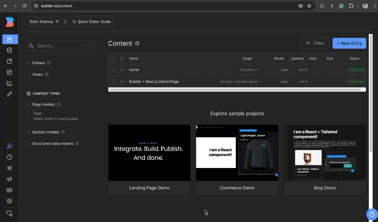
-
Start the server, open the terminal and type
npm run dev. After that, go to http://localhost:3000 on your web browser to see if the server is up and running. You should see the default page for next.js.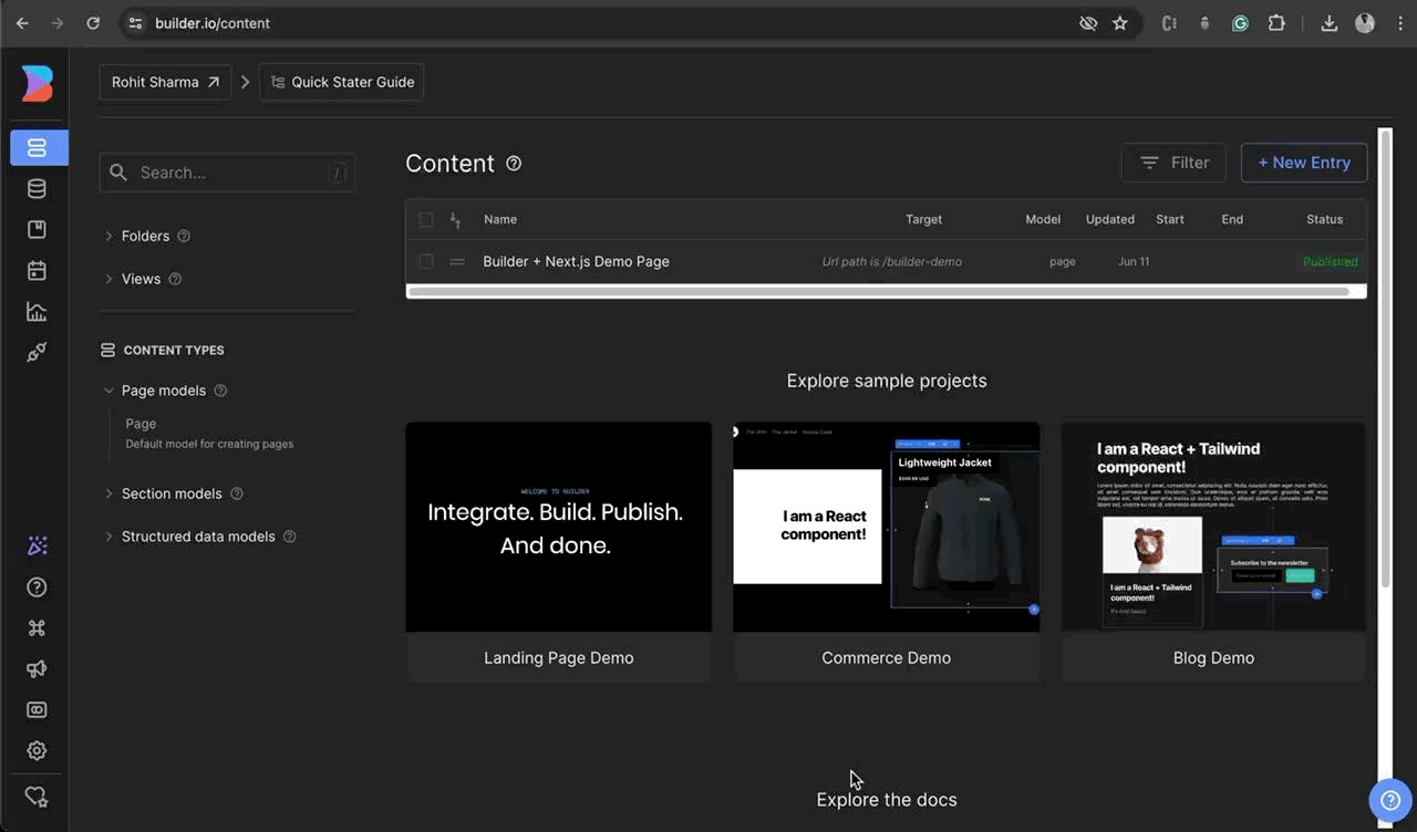
-
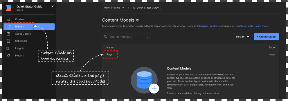
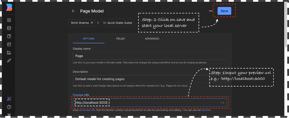
Upon initiating the server, please proceed to launch your web browser and access the builder dashboard. Subsequently, navigate to the sidebar and select the Model tab. Upon reaching the Content models page, designate the
🗯️ If the there’s no model available then create a new model. Click on `+ Create Model` button and select the page type give a name such as “eg: Page” give a short description and click on Create.Page Modeland insert “localhost:3000” as the preview URL, followed by saving the changes.Explore the Model section to create custom content model for custom content types, such as custom sections or structured data, for your site. These content types can include elements like announcement bars, blog articles, navigation links, and much more. Read More
-
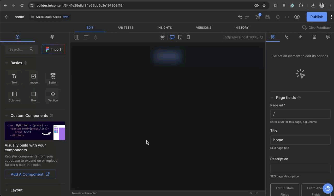
Head to the Content tab and you'll find a list of Demo content. To add a new entry, click on the
+ New Entrybutton. Then, select the Content Model (for example, 'Page'). Next, enter the name of the page, for example, "home". The URL will be automatically generated, but you can also edit it. Change the URL to "/", which will make it the root directory. Finally, click on+ Create Page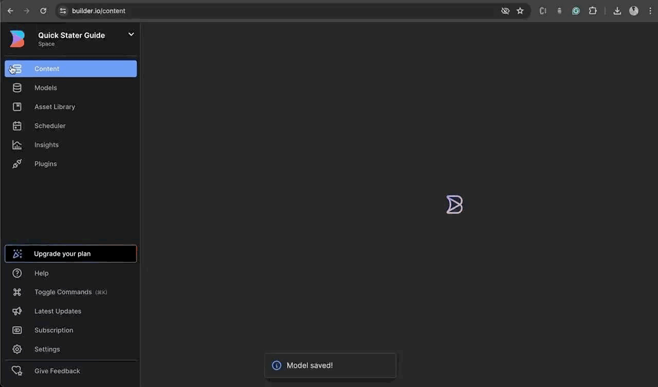
-
Once the page is created. Notice the page editor for the page loads automatically.
-
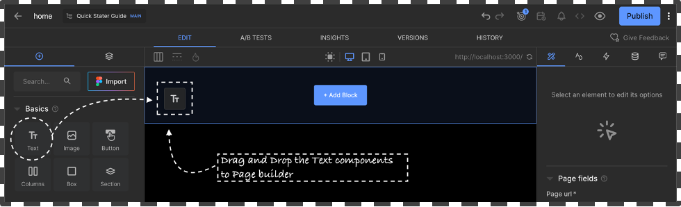
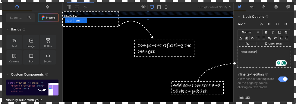
Use the visual tool to drag and drop components in this case we will use the “Text Box” to Redner some Content on the home page to check the integration is working perfectly.
-
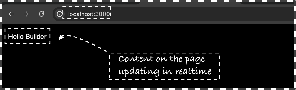
Drag and drop the Text box from the left side of the screen and Add some text via the editor window “Hello Builder” and click on Publish and Navigate to the localhost:3000/ to view the change on the server


To create custom component in builder is relatively easy all you need to do add a new file into your project directory builder-registry.ts to register your component.
-
Start by Creating a new
componentsdirectory into you Project directory.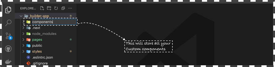
-
Add a new file
Image.tsxinside thecomponentsdirectory and create a simple react component that takes in 2 props image src and alt text.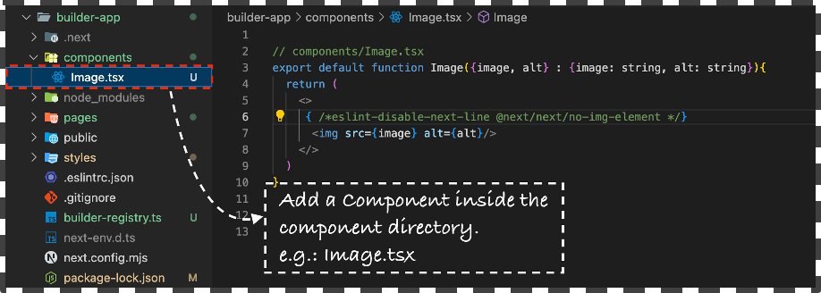
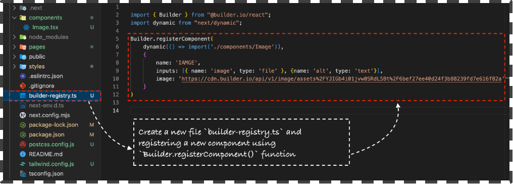


In the above example we created a new custom component take as image input via the builder page builder interface and to render it on the screen.

- Localization: It is the technique of delivering content and formatting specific to different regions. Read More
- Targeting: Targeting content for specific audiences can help you drive customer acquisition and retention. Read More
- Dynamic Preview URLs: A Dynamic Preview URL lets you see how your content will look live before it's published. This is especially helpful for dynamic routing, custom fields, or targeting to ensure an accurate preview under real-world conditions. Read More
- Types of Reusable Blocks: Reusing parts of your page saves time and makes updates easier. To reuse things like headers, footers, and product recommendation sections. Read More
- Ensure Accessibility Compliance: Develop accessible content adhering to W3C guidelines to enhance usability for all users. Read More
- Layout: Responsive design is a best practice in and of itself, whether you're coding or using a visual tool such as Builder. Read More
- Styling Blocks: Use the Full Page Width setting in the Style Tab for a quicker, typo-free approach to making blocks as wide as the viewport. Read More
- Correctly Use Text Blocks: Set Text Blocks according to their semantic meaning to improve accessibility and styling consistency. Read More
Additional Resources: