Important note: although the data visualization is still avaialble, the largest files have been deleted from git-lfs and a new version of this visual method has been developed to run text analysis in Python. Last version of this code is avaialble at https://github.com/rodighiero/SPT2021.
Network visualizations are instruments for distant reading to visually explore large corpora. The Cartography of COVID-19 concerns the scientific literature that has been produced in the last months, which is used to understand how the coronavirus has affected society through the eyes of scientists. The work has no pretense to explain the pandemic but rather to make visible the effort of science through scientific production, which counts 400,000 articles on December 1, 2020.
Using the open-source database COVID-19 Open Research Dataset (CORD-19) released by the Allen Institute for AI, its articles are grouped by authors and analyzed with Natural Language Processing. The result is a metric of lexical similarity between authors, which enabled to space out the scientific community as a network where two authors that use the same vocabulary are next to each other. (More information about the method on this article titled Mapping as a Contemporary Instrument for Orientation in Conferences).
Check the cartography at this URL. After a few seconds needed to stabilize forces, a network composed by the major authors working on the COVID-19 subject is visible. The elevation map in yellow points out as peaks the most active areas of research. When two close authors have at least a common keyword, that is visible between them with a font size that reflects the edge's weight. By moving over an author, the relative network of peers is highlighted as well as the keywords that define his/her profile. The left panel shows a few author's information with the most relevant keywords, the nationality of his/her community, and the publication years. On the top right a search function to find a specific author.
The project started during the Digital Humanities Conference 2019 with the spirit to create the cartography of the DH community. At that moment, it was priceless the contribution of Daniele Guido (University of Luxembourg), Philippe Rivière (Visiocarto), and Stephan Risi (MIT).
This version has been improved thanks to Eveline Wandl-Vogt from Austrian Academy of Sciences and Elian Carsenat NamSor. The data about nationality / country of origin / ethnicity or diaspora are generated through the NamSor algorithm (NamSor API v2.0.9B02) ; NamSor is not 100% accurate, and accuracy is in range 85%-95% so name origin inference introduces potential bias and error; for privacy reason, the data is presented at an aggregate level; also privacy-related, individuals can suggest corrections to inferred origin in diaspora.csv file, or out-out if they wish; although this inferred data is not perfect, both nationality and university affiliation are missing from the original CORD-19 data set and visualizing this data can give further insights on the literary production.
Clone the repository, the install the libraries by typing npm install.
Run the local server by typing npm run start and open the visualization at this URL.
If you want to run your data, format the file ./data/authors.json properly, according to this structure:
	{
		"id": 1
		"name": "Dario Rodighiero",
		"variants": ["Dario Cesare Rodighiero", "Dario C. Rodighiero"],
		"docs": 3,
		"years": {
			"2019": 1,
			"2020": 2,
		},
		"peers": [
			2,
			3,
		],
		"text": "Mapping as a Contemporary Instrument for Orientation in Conferences",
	},
The authors.json_ is parsed using analysis.js, that runs text analysis to compute the lexical distance. To run the analysis type node analysis. This algorithm will produce two files, nodes.json and links.json that are the constituents of the network visualization.
The K-Means algorithm will also cluster nodes into 30 groups and produce two additional files, millefeuille1.json and millefeuille2.json
You can now check your visualization at the localhost, or publish its static version using npm run build that create the build in the ./docs folder.
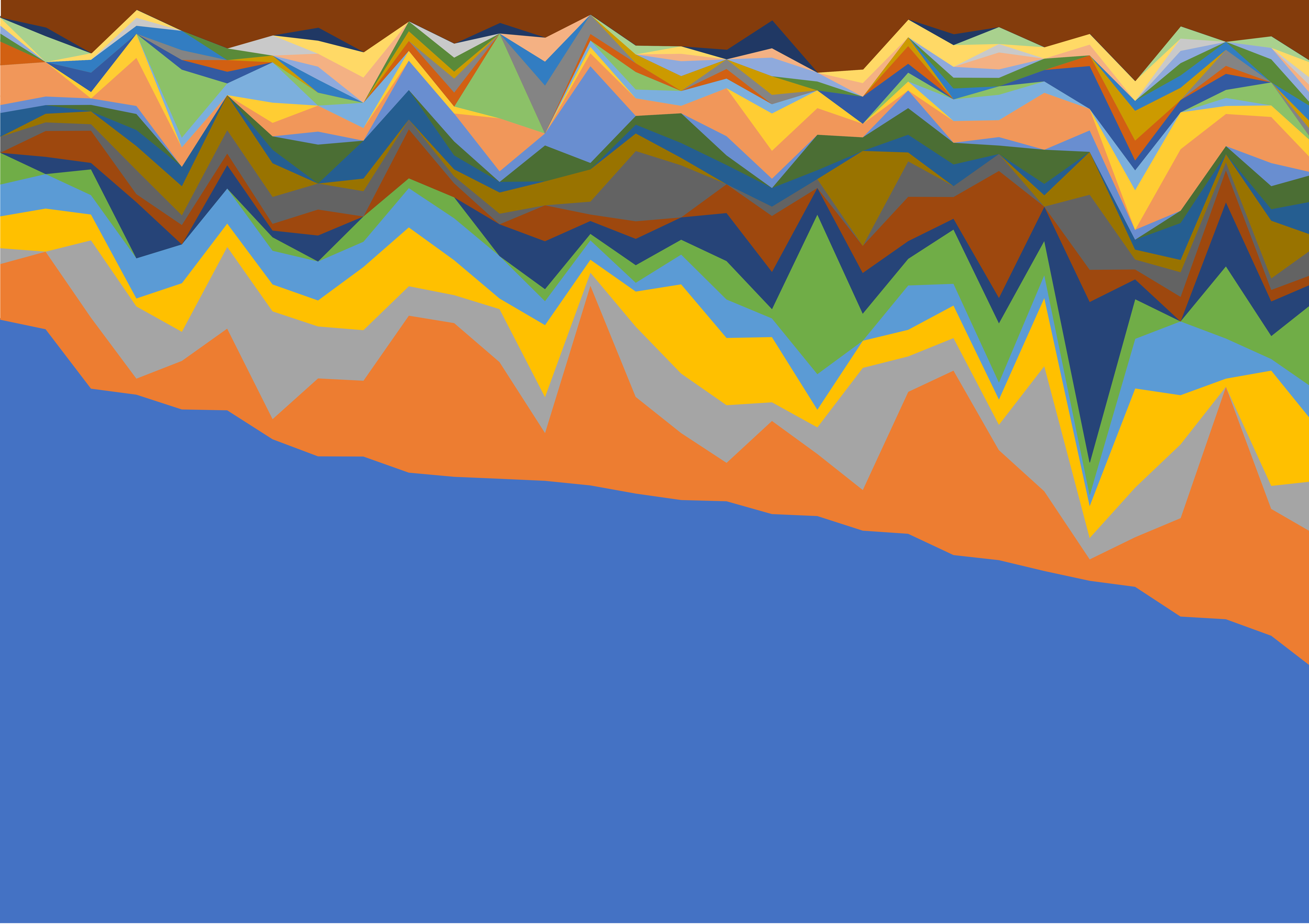
'Chinese sea' is a colorful view of the cartography of COVID-19 Scientific Literature, from the angle of nationality / country of origin or ethnicity of scientists across 30 different subject clusters.
It reflects a collaboration project of Dario Rodighiero (MIT CMS/W / Harvard Metalab), Eveline Wandl-Vogt (Ars Electronica Research Institute knowledge for humanity / Austrian Academy of Sciences), and Elian and Gabriel Carsenat (NamSor).
Using the open-source database COVID‑19 Open Research Dataset (CORD‑19) released on July 1, 2020 by the Allen Institute for AI, scientific articles are grouped by authors and analyzed with methods of Natural Language Processing.
The data is taken from millefeuille1.json, converted to millefeuille1.CSV and summarized into pivot table 20200806_Millefeuilles_SVG.txt
The pivot table 20200806_Millefeuilles_SVG.txt is then made into a SVG canvas using Gabriel Carsenat's open source script (https://github.com/namsor/namsor-diversity-viz).

The canvas shows the pre-eminence of Chinese names across all 30 subject clusters. Their overall share in production of science is the large blue 'sea' making about a third of the canvas. Apart from China, most countries have worked in silos and focused their effort on one single subject. So their combined production of science looks like a mountainous shore.
This work was first presented at Ars Electronica 2020. From it were made 15 original and unique prints on A0 foamboard (1189mm X 841mm) with Certificate of Authenticity.