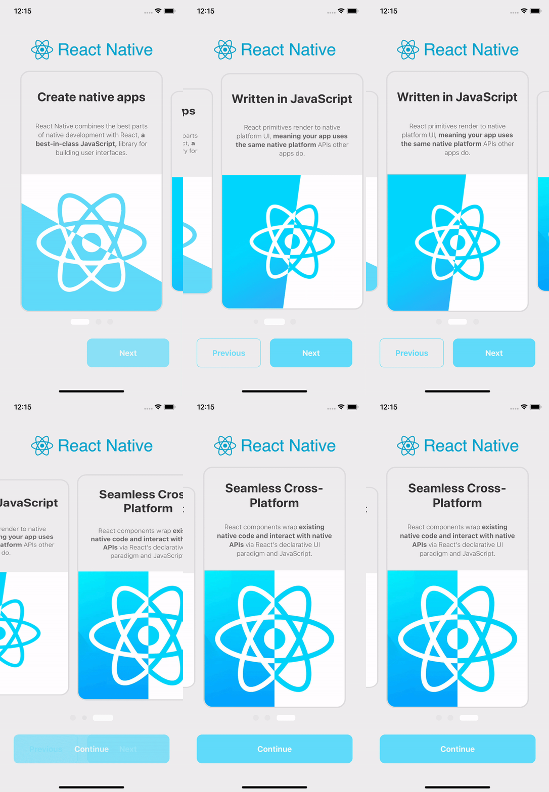
A simple and practical component for creating a Walkthrough with Carousel for React Native applications
-
Using npm:
npm install react-native-walkthrough-carousel -
Using Yarn:
yarn add react-native-walkthrough-carousel
import React from 'react';
import Walkthrough from 'react-native-walkthrough-carousel';

import logo from '../assets/logo.png';

import carousel from './carousel';
import buttons from './buttons';

const styles = {
	backgroundColor: '#eee',
	card: {
		borderColor: '#ddd',
	},
	dotStyle: {
		backgroundColor: 'rgba(255, 255, 255, 0.92)',
	},
	inactiveDotStyle: {
		backgroundColor: '#ddd',
	},
};

export default function App() {
	return (
		<>
			<Walkthrough
				logo={logo}
				carousel={carousel}
				buttons={buttons}
				styles={styles}
			/>
		</>
	);
}
/*
* carousel.js
*/
import React from 'react';
import { Text, Image, StyleSheet } from 'react-native';
const styles = StyleSheet.create({
title: {
fontSize: 28,
color: '#333',
fontWeight: 'bold',
textAlign: 'center',
paddingHorizontal: 10,
},
text: {
fontWeight: '300',
fontSize: 15,
color: '#666',
textAlign: 'center',
lineHeight: 20,
paddingHorizontal: 25,
},
bannerImage: {
resizeMode: 'contain',
flex: 2,
justifyContent: 'center',
alignContent: 'center',
alignItems: 'center',
alignSelf: 'center',
},
bold: { fontWeight: 'bold' },
});
export default [
{
key: 1,
title: <Text style={styles.title}>Create native apps</Text>,
text: (
<Text style={styles.text}>
React Native combines the best parts of native development with React,{' '}
<Text style={styles.bold}>a best-in-class JavaScript,</Text> library for building user interfaces.
</Text>
),
banner: (
<Image
source={require('../../example/assets/1.png')}
style={styles.bannerImage}
/>
),
},
...
];/*
* buttons.js
*/
const previousButton = {
text: 'Previous',
styles: {
color: '#61DBFB',
borderColor: '#61DBFB',
borderWidth: 1,
},
};
const nextButton = {
text: 'Next',
styles: {
backgroundColor: '#61DBFB',
borderColor: '#61DBFB',
borderWidth: 2,
},
};
const doneButton = {
text: 'Continue',
styles: {
borderColor: '#61DBFB',
backgroundColor: '#61DBFB',
borderWidth: 1,
},
onPress: async function handleDone() {
console.log('Continue button was clicked');
},
};
export default { previousButton, nextButton, doneButton };See example for a working demo!
| Prop | Type | Description |
|---|---|---|
| logo | string | Importing an image to be displayed at the top of the page. |
| carousel | array of objects | - Key (Number): unique key to identify the position within the array - Title (Text Component): Text component, styled input is supported - React Native <Text/> recommended- Text (Text Component): Text component, styled input is supported - React Native <Text/> recommended- Banner (Image Component):Image component, stylized input is supported - React Native <Image/> recommended |
| buttons | object | - previousButton (Object): Includes text attribute that expects a string and styles that expects a stylized object - nextButton (Object): Includes text attribute that expects a string and styles that expects a stylized object - doneButton (Object): Includes text attribute that expects a string, styles that expects an object with stylization and onPress that expects a function to be executed at the click of a button - strongly recommended to change the global display state of the Walkthrough |
| styles | object | Wait for a stylized object where at the root of the object will impact the component as a whole, the card attribute will only impact the cards, the dotStyle attribute will only impact the active dot, and finally, the inactiveDotStyle will have impact only on the idle dot. |
This component does not manage the global state of the application for implementing Walkthrough behavior - displaying a single one the first time the application is opened.
This responsibility rests with the consumer application of that library. Below is an example of application routing:
const App = createStackNavigator();

export default function AuthRoutes() {
	const { isFirstAccess } = useAuth(); // Variable extracted from the global state containing the (Boolean) value if the Walkthrough is to be displayed

	return (
		<App.Navigator
			initialRouteName={isFirstAccess ? 'WalkThrough' : 'Home'}
		>
			<App.Screen name="WalkThrough" component={WalkThrough} />
			<App.Screen name="Home" component={Home} />
		</App.Navigator>
	);
}- Make a fork;
- Create a branck with your feature:
git checkout -b my-feature; - Commit changes:
git commit -m 'feat: My new feature'; - Make a push to your branch:
git push origin my-feature.
After merging your receipt request to done, you can delete a branch from yours.
This project is under the MIT license. See the LICENSE for more information.

