node-maker
A set of subflow nodes that can be used to quickly create a new Node-RED node, the property panel, and the node's behavior. You can use Node Maker to easily create an initial template or the entire work necessary for creating a Node-RED node.
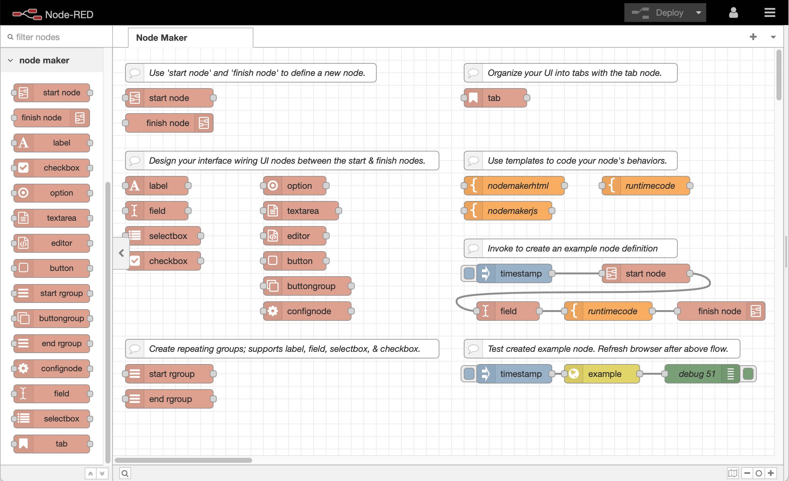
Why Node Maker?
Time and time again I've found that I need to create nodes with a rich property panel user interface. While Node-RED's fantastic editor includes the ability to make nodes and package them via it's subflow functionality it falls short in the key area of designing a rich user interface. Often this pushes users into creating nodes from scratch that can furnish full control over the property UI:
- Place multiple input fields and types next to each other.
- Implement custom controls; i.e. option boxes, selectboxes with multiselect, etc.
- Create groups of repeating input fields aka "editableLists".
- Design a tabbed interface to pack more 'pages' of input fields.
- Customize the initial size of the property panel.
Now with Node Maker you can create rich property panel combinations without even having to *leave the Node-RED Editor interface!
* technically you'll have to refresh the webpage to see newly created nodes in the palette
Requirements
- You should be familiar with Creating Nodes using Node-RED's documentation.
- Linux / macOS with native bash shell.
- You may need CLI access to kickoff/troubleshoot the optional autorestarting of Node-RED.
Node Maker is currently being developed under Ubuntu Linux; it may work just as well on macOS. It does NOT currently work on Windows; however, a ticket has been opened for that possibility here (ticket #1).
How to Install Node Maker
Node Maker is distributed as a JSON flow file named node-maker.json. To add node-maker to your own Node-RED instance, simply obtain the contents of the node-maker.json file and import it into your Node-RED editor:
Via GitHub
- View the raw file by clicking here, select all of its content and copy it to the clipboard.
Via Node-RED's flows library
- View the Node-RED's flows library entry for the Node Maker page by clicking here.
- Use the copy button or select all of the JSON and copy it to the clipboard.
Use Node-RED's Import command
- Use Node-RED editor's hamburger menu in the upper right corner to select the "Import" menu option.
- Paste the JSON flow from the clipboard and optionally select the Import into option button for "new flow", followed by the import button.
To complete installation; stop your Node-RED instance and restart it while recording the PID to the temp folder to allow automatic Node-RED restart ability. See the section on autorestarting of Node-RED.
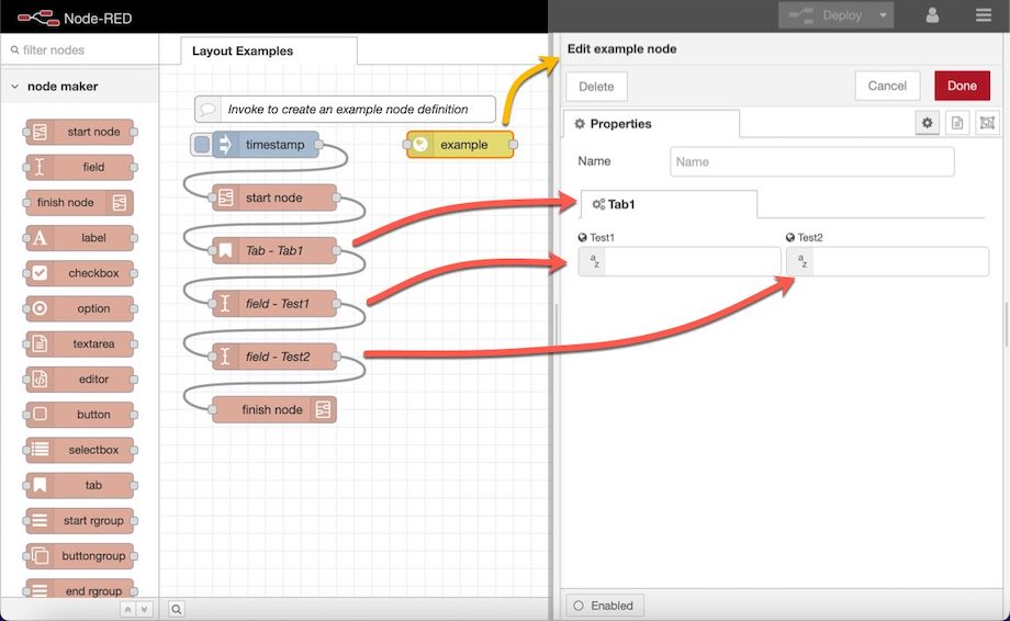
How to Use Node Maker
Node Maker is a group of subflow nodes that can be found in the Node-RED editor's palette group titled node maker. Within the palette you'll find two important nodes: 1) start node and 2) finish node. Wire these two nodes together and wire an inject node to the start node. Double click the start node to fill out the required and optional input fields (see 'The start node' below). You may then drag and drop (wire inline) additional UI input nodes (user interface input nodes) between the start node and finish node; such as the label, field, selectbox, checkbox, spinner, option, textarea, editor, button, button group, or confignode. You can learn more about each node using Node-RED's sidebar help tab.
The start node
The start node marks the beginning of a new node defintion. To create a node, connect an inject node to the start node and connect the start node to a finish node. You may wire various other nodes between the start and finish nodes to define your node's user interface.
The following properties can be configured in the properties panel:
- Node Name - choose a JavaScript variable safe name for your node.
- Version - A valid version string in the form of major, minor, patch i.e. 1.0.0
- Description - a short description of your node.
- Category - The palette group the node will appear under; existing i.e. common or you can define your own.
- Icon - An existing fontawesome name, sans the 'font-awesome/fa-' prefix; i.e. bathtub
- Color - The color of the node as it appears in the palette and editor. I.e. #E2D96E
- Keywords - Used in the package.json file for reference and indexing by npm.
- Author Name - The name of the node author. Used in package.json
- Author Email - The email of the node author. Used in package.json
- GitHub Handle - The handle used for the GitHub repo URL, I.e. john will appear as https://github.com/john/node-name
- Max Row Width - The initial width of the property dialog (in pixels) when it is first opened.
- Inputs - Whether the node accepts an input or not; 1 or 0 our the only acceptable values.
- Outputs - The number of outputs the node will have.
- Include node name... - Determines if a default name field will appear at the top of the property window; appears above any tab or other input fields.
The field node
The field node represents an instance of the Node-RED Inputs field. A plain input text box can be achieved with the no “Typed” checkbox or type definition specified. The following properties for defining a field are as follows:
- Layout - The number of columns the label will consume out of a division of four or three equal areas. To align controls on the panel on the same row, ensure the used column space totals to consume an entire row.
- Field Name - A JavaScript compatible variable name (no spaces hyphens or punctuation).
- Label - The actual text that will be used when displaying the label.
- Icon - A font awesome icon that will appear to the left of the label. You can specify the icon name sans any ‘fa’ prefix; i.e. bathtub
- Default - the optional default contents of the field.
- Placeholder - displays a grey value in the input field as a suggested or example value.
- Required - whether the input field is required and must be filled out. True will invoke a basic validation check to ensure the value is supplied. A missing value will cause the node’s appearance to show an “needs configuration” triangle and subsequent message when the user attempts to deploy the flow. Additionally, a red border will appear around any required fields not filled out.
- Typed - This section allows the field input to have one or more types to be prefixed to the field area and influences the fields display behavior. See the Node-RED Inputs field for examples.
- Type Definitions - Allows for defining a custom type using JSON. When the above Typed checkbox “Include additional type definition array” is checked, this property becomes relevant. For example, you can create a custom input option such as “the complete msg object” as used in the debug node.
- Default Type - This string value determines the default type to be selected for the input field when your node’s property panel is first opened.
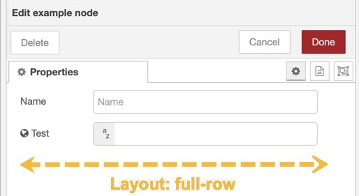
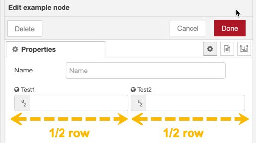
Using the Layout Property
By default each UI input node will occupy one line in the property panel. One line is typical for most applications and is the only option when designing the property panel using Subflows. However, Node Maker gives you the ability to pack up to four UI input nodes next to each other. This more compact arrangement allows you include more options in your property panel user interface. Use the layout property to visualize how UI input nodes will appear in the property panel:
| One field, full-row | Two fields, each 1/2-row |
|---|---|
 |
 |
Certain UI input nodes have optional labels and option icons as apart of the node; so you don't have to use a separate label UI node. For these types of nodes, the label will appear full size when the layout option is set to full-row.
In the second example, we've created two fields (Test1 and Test2) and set both their Layout properties to 1/2 row to occupy just one line in the property panel. A smaller label is used for these types of UI input nodes when the layout property is less than a full-row.
The tab node
The tab node allows you to group your input fields and other controls in your node’s property panel under tabs. An example of tabs can be seen in the Node-RED's native function node. Simply wire a tab node between the start and finish nodes and before the UI nodes you wish to have appear under a tab. The tab node uses the following properties to determine its appearance:
- Tab Name - A JavaScript compatible variable name (no spaces hyphens or punctuation).
- Label - The actual text that will be used when displaying the label.
- Icon - A font awesome icon that will appear to the left of the label. You can specify the icon name sans any ‘fa’ prefix; i.e. bathtub
Tip: You can create more tabs than the initial property panel width is capable of displaying; to increase the initial property panel width, adjust the 'Max row width' value in the start node.
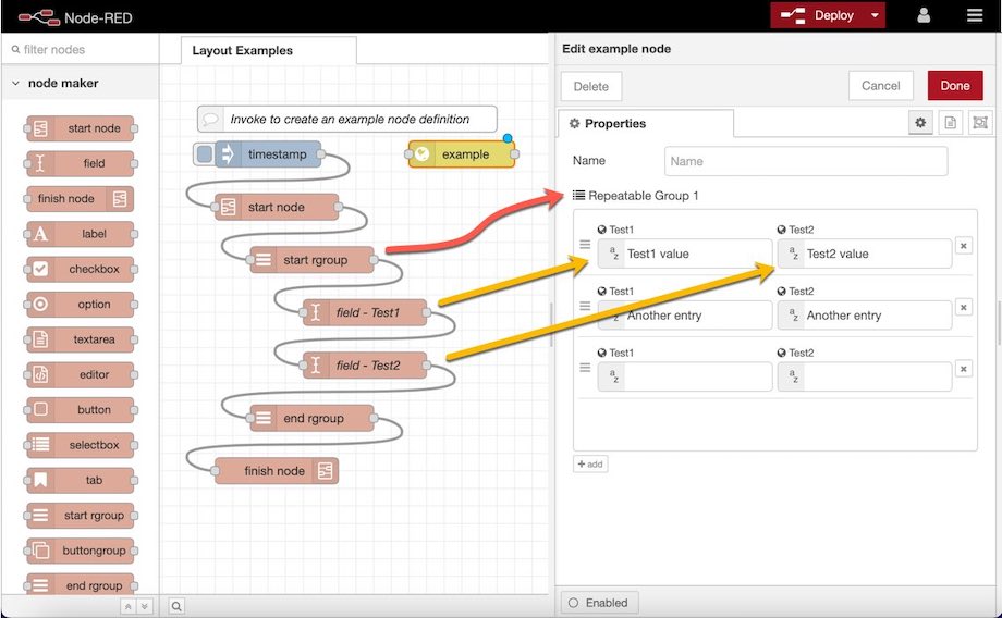
The start rgroup and stop rgroup nodes
Node Maker allows you to create repeatable groups of UI input nodes; or as Node-RED's API calls them: editableList. Creating the list is easy; simply place the UI input nodes between the start rgroup and stop rgroup nodes. See the image below for an example. Currently, only the following nodes are supported within a repeatable group:
- Label
- Field
- Selectbox
- Checkbox
- Spinner
Preparing Your Node Files
You can include the pre-built template nodes that come with the Node Maker flow file; they are titled:
- nodemakerhtml - A template for your node's HTML file, see Creating Nodes - HTML File documentation.
- nodemakerjs - A template for your node's JavaScript file, see Creating Nodes - JavaScript File documentation.
- runtimecode - An optional runtimecode template that can be used in lieu of nodemakerjs, to quickly implement the msg handler for your node.
To use these optional template nodes, copy the template node and wire them into your flow after the use templts node and before the finish node to implement your node's custom behavior and functionality.
Note: You must wire in the use templts node before the template nodes to use the templates.
If you omit them, Node Maker will use a default version of the template internally. Each of the templates cast to the msg object's properties of the same name (msg.nodemakerhtml, msg.nodemakerjs, and runtimecode respectively). Within each file, you will find various mustache syntax elements. These mustache elements are used to inject Node Maker's generated code and should be preserved.
Lastly, Node Maker will write the files for your node into a folder within your node_modules folder of your running Node-RED instance. By default on Linux based operating systems the location would be:
$HOME/.node-red/node_modules/node-red-example
Where by example in node-red-example is the name of your node as specified in the start node's property panel.
Auto-restarting Node-RED
On compatible Linux operating systems, the finish node will write all the necessary files and then restart the Node-RED server. This behavior allows you to easily design your Node's UI and edit its code from within the Node-RED editor; simply invoke the inject node to activate the start node followed by refreshing your browser's webpage. You may need to wait a couple of seconds for services to restart before refreshing your browser and seeing your generated node appear in the left hand palette.
To accomplish this, Node Maker will need to kill the current Node-RED running instance; via a PID file in your temp folder (i.e. /tmp/node-red.pid) and then restart Node-RED and record the new PID to the temp folder. This requires that you initially start Node-RED with the PID recording command.
To Start the Node-RED Instance and Allow Auto-restarting of Node-RED
You will need to initially start Node-RED with the following command (it is the same command that the finish node executes to restart Node-RED after generating your node files):
kill -9 `cat /tmp/node-red.pid`; nohup nice node-red > /dev/null 2>&1 & echo $! > /tmp/node-red.pid
Tips on writing nodes
- Because you can crash the runtime; use try... catch liberally in your javascript file(s), then you can avoid having to drop to the shell to restart Node-RED. For example:
module.exports = function(RED) {
    function {{node_name}}(config) {
        RED.nodes.createNode(this,config);
        var node = this;
        try {

            // You might do something fatal

        }catch(e) {
          node.error(e); // report it within Node-RED's IDE
        }
    }
    RED.nodes.registerType('{{node_name}}', {{node_name}});
}
Support the creator
You can help Steveorevo's open source development endeavors by donating any amount. Your donation, no matter how large or small helps pay for his time and resources to create MIT and GPL licensed projects that you and the world can benefit from. Click the link below to donate today :)