
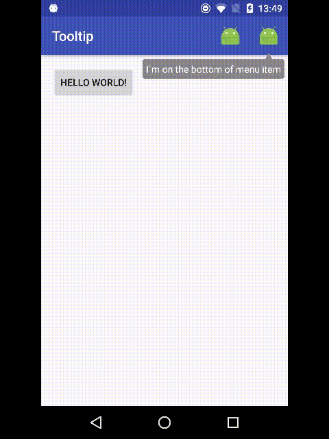
Simple to use customizable Android Tooltips library based on PopupWindow. This Tooltips does not require any custom layout. It works as PopupWindow.
dependencies {
    compile 'com.github.vihtarb:tooltip:0.1.8'
}<dependency>
<groupId>com.github.vihtarb</groupId>
<artifactId>tooltip</artifactId>
<version>0.1.8</version>
</dependency>Tooltip tooltip = new Tooltip.Builder(anchorView)
.setText("Hello tooltip")
.show();Builder(Context context, MenuItem anchorMenuItem)Builder(Context context, MenuItem anchorMenuItem, @StyleRes int resId)Builder(View anchorView)Builder(View anchorView, @StyleRes int resId)setCancelable(boolean cancelable)- dismiss on outside touch. Default isfalsesetDismissOnClick(boolean isDissmissOnClick)- dismiss on inside touch. Default isfalsesetBackgroundColor(@ColorInt int color)- background color. Default isColor.GRAYsetCornerRadius(@DimenRes int resId)- background drawable corner radius from resourcessetCornerRadius(float radius)- background drawable corner radiussetArrowHeight(@DimenRes int resId)setArrowHeight(float height)setArrowWidth(@DimenRes int resId)setArrowWidth(float width)setMargin(@DimenRes int resId)- margin between arrow and anchor view from resourcessetMargin(float margin)- margin between arrow and anchor viewsetPadding(@DimenRes int resId)- content padding from resourcessetPadding(float padding)- content paddingsetGravity(int gravity)- Tooltip gravity. Default isGravity.BOTTOMsetText(@StringRes int resId)setText(String text)setTextSize(@DimenRes int resId)setTextSize(float size)setTextColor(@ColorInt int color)setTextStyle(int style)setTextAppearance(@StyleRes int resId)setLineSpacing(@DimenRes int addResId, float mult)setLineSpacing(float add, float mult)setTypeface(Typeface typeface)setOnDismissListener(OnDismissListener listener)build()- creates and returns new Tooltipshow()- creates, shows and returns new Tooltip
isShowing()- retruns is Tooltip showingshow()- show Tooltip if not showingdismiss()- dismissing Tooltip
You can create Tooltip with custom style
Tooltip tooltip = new Tooltip.Builder(anchorView, R.style.tooltip)
        .setText("Hello tooltip")
.show();<attr name="cancelable" format="boolean"/>- dismiss on outside touch. Default isfalse<attr name="dismissOnClick" format="boolean"/>- dismiss on inside toush. Default isfalse<attr name="backgroundColor" format="color"/>- background color. Default isColor.GRAY<attr name="cornerRadius" format="dimension"/>- background drawable corner radius<attr name="arrowHeight" format="dimension"/><attr name="arrowWidth" format="dimension"/><attr name="margin" format="dimension"/>- margin between arrow and anchor view<attr name="textAppearance" format="reference"/><attr name="android:padding"/>- content padding<attr name="android:text"/><attr name="android:textSize"/><attr name="android:textColor"/><attr name="android:textStyle"/><attr name="android:gravity"/>- Tooltip gravity<attr name="android:fontFamily"/><attr name="android:lineSpacingExtra"/><attr name="android:lineSpacingMultiplier"/><attr name="android:typeface"/>
- Implemented OnDismissListener
- Removed
Context contextargument in builder constructors with second argumentView anchorView - Renamed styleable attribute from
colorBackgroundtobackgroundColor
- Min SDK changed from 7 to 11
- Removed not used dependencies(library size is reduced almost in 2 times)
This version is supported Android API 7 and large. If you want use Tooltips in projects with Min SDK 7 then use this in dependencies:
dependencies {
    compile 'com.github.vihtarb:tooltip:0.1.6'
}<dependency>
<groupId>com.github.vihtarb</groupId>
<artifactId>tooltip</artifactId>
<version>0.1.6</version>
</dependency>- Animations
- Elevation(Shadow)
License(MIT License)
The MIT License (MIT)

Copyright (c) 2016. Viнt@rь

Permission is hereby granted, free of charge, to any person obtaining a copy
of this software and associated documentation files (the "Software"), to deal
in the Software without restriction, including without limitation the rights
to use, copy, modify, merge, publish, distribute, sublicense, and/or sell
copies of the Software, and to permit persons to whom the Software is
furnished to do so, subject to the following conditions:

The above copyright notice and this permission notice shall be included in
all copies or substantial portions of the Software.

THE SOFTWARE IS PROVIDED "AS IS", WITHOUT WARRANTY OF ANY KIND, EXPRESS OR
IMPLIED, INCLUDING BUT NOT LIMITED TO THE WARRANTIES OF MERCHANTABILITY,
FITNESS FOR A PARTICULAR PURPOSE AND NONINFRINGEMENT. IN NO EVENT SHALL THE
AUTHORS OR COPYRIGHT HOLDERS BE LIABLE FOR ANY CLAIM, DAMAGES OR OTHER
LIABILITY, WHETHER IN AN ACTION OF CONTRACT, TORT OR OTHERWISE, ARISING FROM,
OUT OF OR IN CONNECTION WITH THE SOFTWARE OR THE USE OR OTHER DEALINGS IN
THE SOFTWARE.