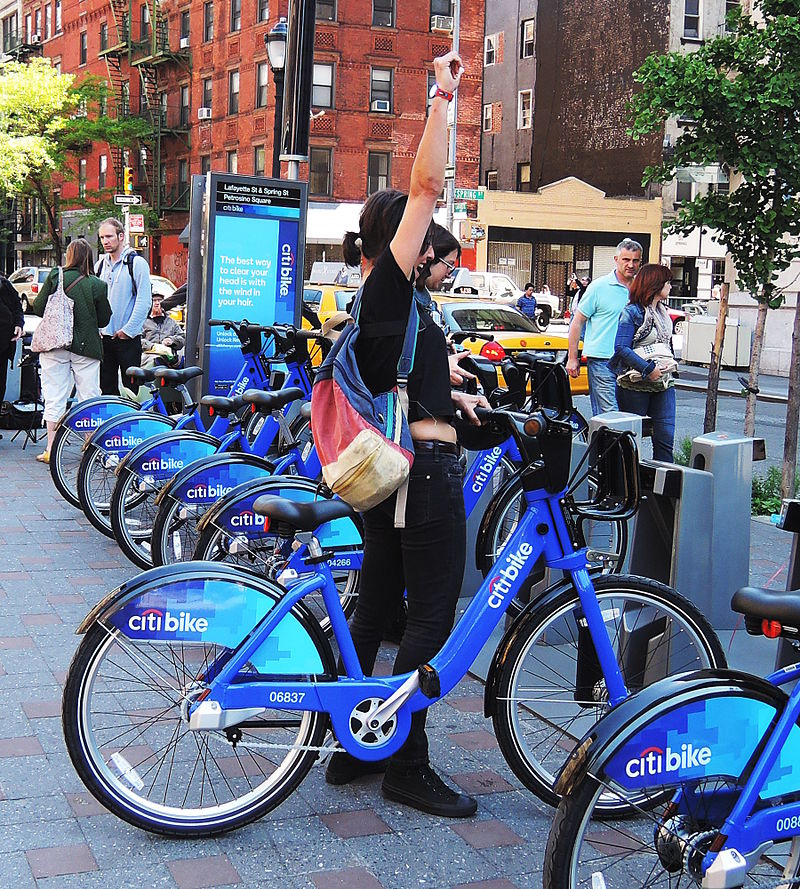
Since 2013, the Citi Bike Program has implemented a robust infrastructure for collecting data on the program's utilization. Through the team's efforts, each month bike data is collected, organized, and made public on the Citi Bike Data webpage.
Your task is to aggregate the data found in the Citi Bike Trip History Logs and find two unexpected phenomena.
Design 2-5 visualizations for each discovered phenomena (4-10 total). You may work with a timespan of your choosing. Optionally, you may merge multiple datasets from different periods.
The following are some questions you may wish to tackle. Do not limit yourself to these questions; they are suggestions for a starting point. Be creative!
-
How many trips have been recorded total during the chosen period?
-
By what percentage has total ridership grown?
-
How has the proportion of short-term customers and annual subscribers changed?
-
What are the peak hours in which bikes are used during summer months?
-
What are the peak hours in which bikes are used during winter months?
-
Today, what are the top 10 stations in the city for starting a journey? (Based on data, why do you hypothesize these are the top locations?)
-
Today, what are the top 10 stations in the city for ending a journey? (Based on data, why?)
-
Today, what are the bottom 10 stations in the city for starting a journey? (Based on data, why?)
-
Today, what are the bottom 10 stations in the city for ending a journey (Based on data, why?)
-
Today, what is the gender breakdown of active participants (Male v. Female)?
-
How effective has gender outreach been in increasing female ridership over the timespan?
-
How does the average trip duration change by age?
-
What is the average distance in miles that a bike is ridden?
-
Which bikes (by ID) are most likely due for repair or inspection in the timespan?
-
How variable is the utilization by bike ID?
Next, as a chronic over-achiever:
- Use your visualizations (does not have to be all of them) to design a dashboard for each phenomena.
- The dashboards should be accompanied with an analysis explaining why the phenomena may be occuring.
City officials would also like to see one of the following visualizations:
-
Basic: A static map that plots all bike stations with a visual indication of the most popular locations to start and end a journey with zip code data overlaid on top.
-
Advanced: A dynamic map that shows how each station's popularity changes over time (by month and year). Again, with zip code data overlaid on the map.
-
The map you choose should also be accompanied by a write-up unveiling any trends that were noticed during your analysis.
Finally, create your final presentation
- Create a Tableau story that brings together the visualizations, requested maps, and dashboards.
- This is what will be presented to the officials, so be sure to make it professional, logical, and visually appealing.
Data Boot Camp © 2019. All Rights Reserved.
