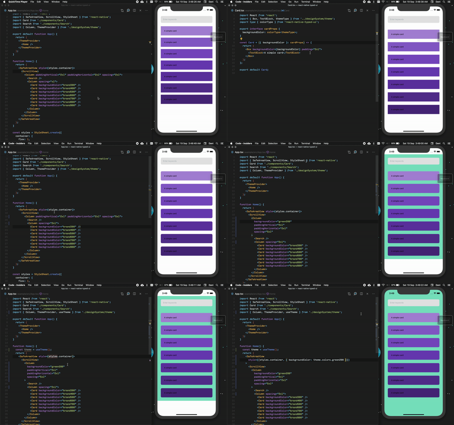
React Native Typed UI lets you strongly type your UI components based on your design system. It's TypeScript meets design!
We assume you are already following a proper design system. Based on your design system configuration, Typed UI will create some UI Components, hooks & Types that help you typecheck your design throughout your application.
Consider the following design configuration ﹣
const fontWeights: { normal: 'normal' } = {
  normal: 'normal',
};

const shadows: {
  card: 2;
} = {
  card: 2,
};

export const awesomeDesignSystem = {
  colors: {
    brand: '#5DB075',
    text: '#666666',
    placeholder: '#BDBDBD',
    placeholderBackground: '#F6F6F6',
    title: 'black',
    background: 'white',
  },
  fonts: {
    primary: 'roboto',
  },
  fontSizes: {
    normalText: 16,
    infoText: 14,
    titleText: 30,
  },
  fontWeights,
  lineHeights: {
    normalText: 1,
    infoText: 1.2,
    titleText: 2,
  },
  letterSpacings: {
    title: 1.2,
  },
  spacing: {
    normal: 16,
    large: 32,
  },
  zIndices: {
    banner: 1200,
    overlay: 1300,
    modal: 1400,
  },
  iconSizes: {
    normal: 16,
  },
  borderRadius: {
    inputField: 8,
    button: 100,
  },
  shadows,
};
You can use the createThemeComponents from Typed UI to create your custom themed React Native components ﹣
import React from 'react';
import createThemeComponents from 'react-native-typed-ui';
import { awesomeDesignSystem } from './awesomeDesignSystem';

// Creating themed Components & Hooks
export const {
  Box,
  Column,
  Row,
  InputText,
  TextBlock,
  Touchable,
  ThemeProvider,
  useTheme,
  useThemeToggle,
  useChangeDarkTheme,
  useChangeLightTheme,
} = createThemeComponents(awesomeDesignSystem);

// Creating Theme Type
export type AwesomeTheme = ReturnType<typeof useTheme>;

const Title = () => {
  return (
    <TextBlock fontFamily="primary" fontSize="titleText" color="title">
      My Awesome App!
    </TextBlock>
  );
};

const NormalText = () => {
  return (
    <TextBlock fontFamily="primary" fontSize="normalText" color="text">
      App is themed with react-native-typed-ui
    </TextBlock>
  );
};

const InfoText = () => {
  return (
    <TextBlock fontFamily="primary" fontSize="infoText" color="brand">
      Strongly Typed based on your design configuration!
    </TextBlock>
  );
};

const Home = () => {
  return (
    <Column
      alignItems="flex-start"
      justifyContent="center"
      spacing="large"
      backgroundColor="background"
    >
      <Title />
      <NormalText />
      <InfoText />
    </Column>
  );
};

const App = () => {
  return (
    <ThemeProvider>
      <Home />
    </ThemeProvider>
  );
};

export default App;
Contributing
See the contributing guide to learn how to contribute to the repository and the development workflow.
License
MIT


