Photography portfolio
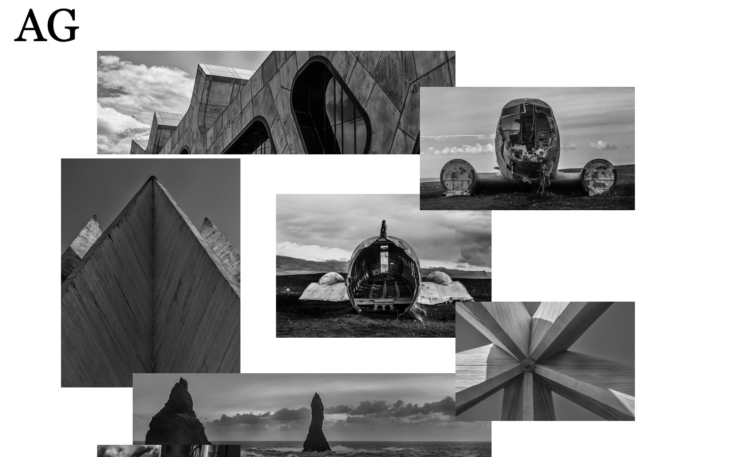
The concept behind this project was to build a minimalistic website, with no info about the artist apart from his initials. The client wanted his photos to be displayed in an unstructured way and whenever one of them was clicked, to display a carousel of all the pictures on the page. A contact form was added to help people get in touch if interested in the work.
-
- HTML5
- SASS
- JavaScript
- JQuery
- Mustache
- Browserify
- Common.js
-
The website is hosted on Netlify on this address: https://www.arturasgrimalis.com
-
Open the terminal and run this command:
npm run watchifyTo start watching the script files in ./components/scripts and automatically get browserify to compile all the files into one bundle.js.
-
In the command line, navigate to the project folder and run:
gulp watchThe watch function will keep track of ./components/sass folder and any changes on the .scss files will be automatically compiled into .css and piped to ./development/styles/ folder.
-
Once again in the root of the projects folder, run this command on the terminal:
gulpthe default gulp function will run the following:
- gulp-minify-HTML
- gulp-css-nano
- gulp-uglify-es
- gulp-json-minify
- imagemin
All the output will be piped to the relevant folders inside ./dist.
-
The bulk of the markup was built using Mustache for templating. A div element with an id of #image-container was filled with img tags generated with this template:
{{#images}}
<img src={{src}} id={{id}} alt="{{alt}}"/>
{{/images}}
Using a JSON file containing all the relevant info to build it. Like the following:
{
  "images" : [
    {
        "id":"image1",
        "src":"images/1.jpg",
        "alt":"curved building facede contrasting with horizon"
    }
  ]
}
resulting in this:
<img src="images/1.jpg" id="image1" alt="curved building facede, contrasting with horizon"/>
like this any new data added to the data.json file will dynamically build the HTML.
-
The initial pictures grid was built for screens with max-width of 1400px and any bigger widths won't stretch the grid further and avoid deforming the pics. The table bellow shows the different forms of the grid depending on screen width:
screen width grid-column grid-row > 900px 1fr 70.88px < 900px and > 400px 1fr 50px < 400px 1fr 40px To position the photos on the grid, the following SASS mixin was used
  @mixin grid($arr) {
      grid-column-start: nth($arr, 1);
      grid-column-end: nth($arr, 2);
      grid-row-start: nth($arr, 3);
      -ms-grid-column: nth($arr, 4);
      -ms-grid-column-span: nth($arr, 5);
      -ms-grid-row: nth($arr, 6);
      -ms-grid-row-span: nth($arr, 7);
      z-index: nth($arr, 8);
  }
it takes a list of grid coordinates and distributes them through the according properties. A list of coordinates lists was used with a SASS @each loop to create the css for every single image:
  $gridCoordinates: (
      (2, 12, 1, 2, 10, 1, 2, 2),     //pic1
      (13, 17, 21, 13, 5, 21, 6, 1),  //pic2
      (11, 17, 2, 11, 6, 2, 3, 2)     //pic3
    );

  @each $coordinate in $gridCoordinates {
      #image#{index($gridCoordinates, $coordinate)} {
          @include grid($coordinate)
      }
  }
Using the index of every list, it was possible to name the ID's and target the right ones for every list. The result of this process was the bellow css rules to position the pictures on the grid:
#image1 {
  grid-column-start: 2;
  grid-column-end: 12;
  grid-row-start: 1;
  -ms-grid-column: 2;
  -ms-grid-column-span: 10;
  -ms-grid-row: 1;
  -ms-grid-row-span: 2;
  z-index: 2; }

#image2 {
  grid-column-start: 13;
  grid-column-end: 17;
  grid-row-start: 21;
  -ms-grid-column: 13;
  -ms-grid-column-span: 5;
  -ms-grid-row: 21;
  -ms-grid-row-span: 6;
  z-index: 1; }
Whenever a new pic is added to data.json and the markup updated with Mustache, the $gridCoordinates list can be updated with the relevant info and generated the css rule to position it.
-
All the scripts in this project were created as modules and made into a single file using Browserify. There are four main features that were separated into four different modules and exported to main file called app.js and then compiled into bundle.js and sent to ./development/scripts. The features are:
- Header animation
- Form event listener
- Pictures click event listener and carousel
- Compiling Mustache template
Organized like this the script files were easy to maintaing and work with. If more features are added in the future, new modules can be created.
For now this is the finished version of this project but potentially, with more photos added in the future, it might grow further and some ideas were already discussed to created different work collection and use a different grid pattern for each of them.
© Rafael Freitas 2019