A simple and fun expandable card with image layout to be used in Compose Framework.

Add below codes to your root settings.gradle file.
allprojects {
  repositories {
    ...
    maven { url 'https://jitpack.io' }
  }
}
And add a dependency code to your module's build.gradle file.
dependencies {
    implementation 'com.github.radustavila:ExpandableCardWithImage:1.0'
}
Basic usage:
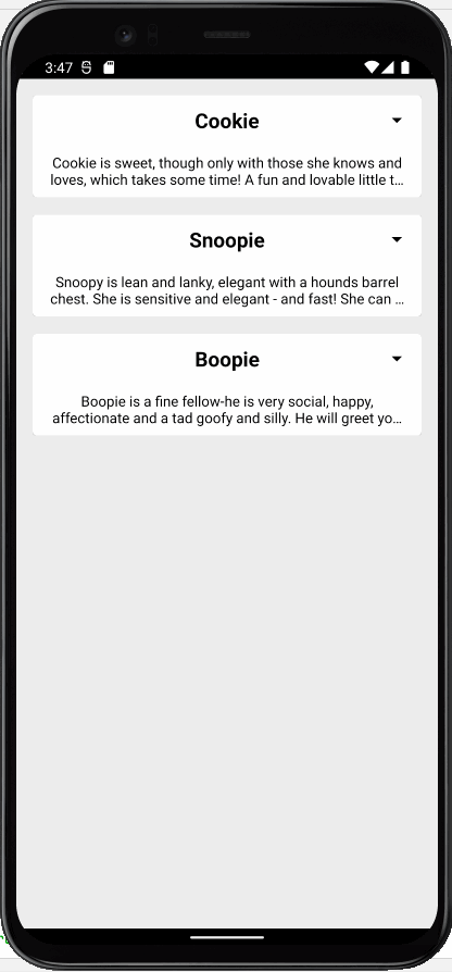
@Composable
fun Card() {
  ExpandableCardWithImage(
      title = "Cookie",
      description = "Text"
      image = R.drawable.dog1
  )
}
You can customize the attributes of the layout by providing it into parameters of the composable function ExpandableCardWithImage():
ExpandableCardWithImage(
    title = "Cookie",
    description = stringResource(id = R.string.dog_1_text),
    image = R.drawable.dog1,
    titleFontSize = 18.sp,
    titleColor = Color.Blue,
    titleAlignment = Alignment.CenterStart,
    titleTextAlignment = TextAlign.Start,
    descriptionFontSize = TextUnit = 12.sp,
    descriptionColor = Color.Gray,
    descriptionMaxLines = 3,
    descriptionTextAlignment = TextAlign.Start,
    imageHeight = 150.dp,
    imageWidth = 300.dp,
    contentScale = ContentScale.Crop,
    cardBackgroundColor = Color.White,
    arrowColor = Color.Red
)
| Attributes | Type | Default | Description |
|---|---|---|---|
| title | String | Expecting an expression | Card's title text |
| description | String | Expecting an expression | Card's description text |
| image | Int (Drawable Res) | null | Card's image resource |
| titleFontSize | TextUnit | 20.sp | Font size of the title |
| titleColor | Color | Color.Black | Color of the title |
| titleAlignment | Alignment | Alignment.Center | Alignment of title component |
| titleTextAlignment | TextAlign | TextAlign.Center | Alignment of title's text |
| descriptionFontSize | TextUnit | 12.sp | Font size of the description |
| descriptionColor | Color | Color.Black | Color of the description |
| descriptionMaxLines | Int | 2 | Visible number of description text lines |
| descriptionTextAlignment | TextAlign | TextAlign.Center | Alignment of description's text |
| imageHeight | Dp | 150.dp | The height of the image |
| imageWidth | Dp | 100.dp | The width of the image |
| contentScale | ContentScale | ContentScale.Fit | The ContentScale of the image |
| cardBackgroundColor | Color | Color.White | Card's background color |
| arrowColor | Color | Color.Red | Arrow's color |