Bloomberg Data Visualization Project
😄 Summary
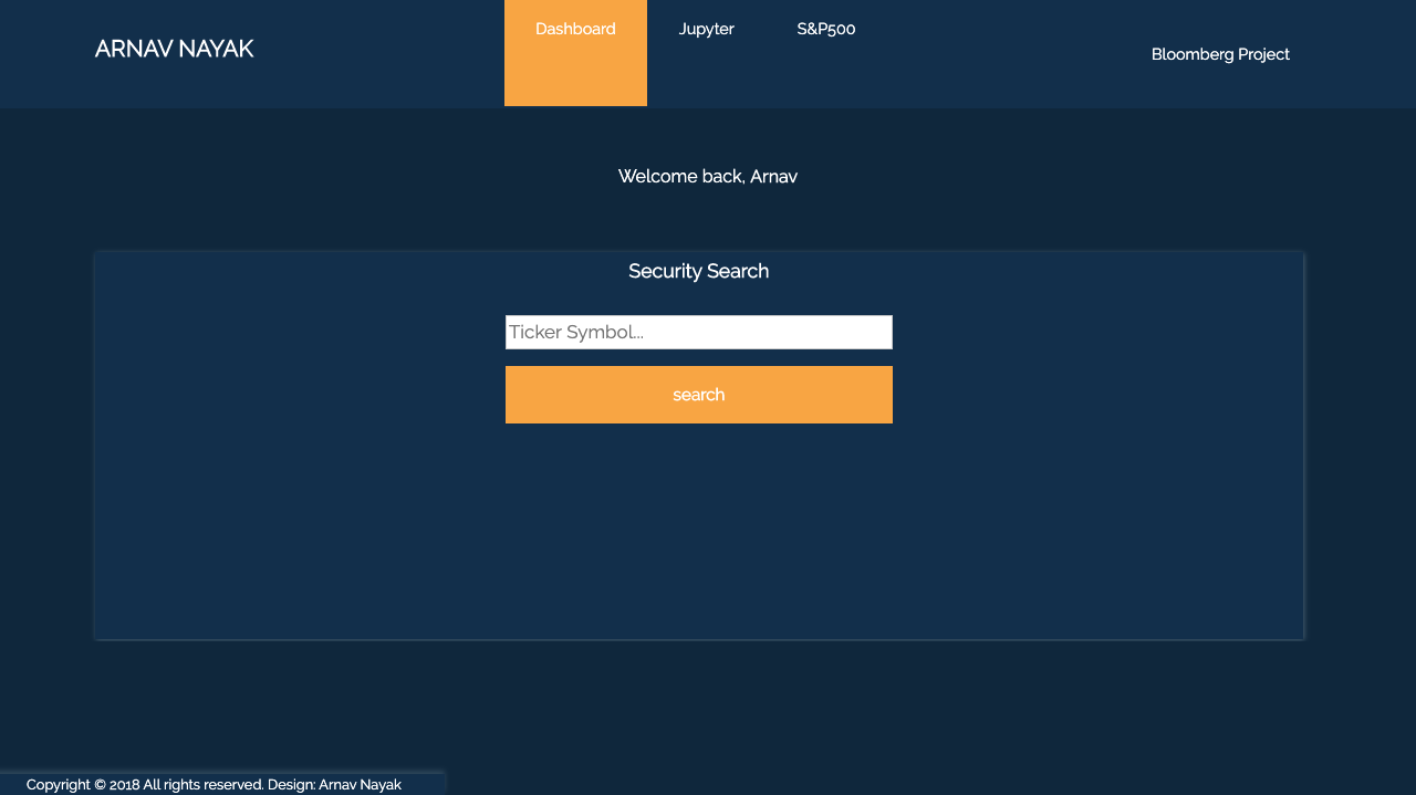
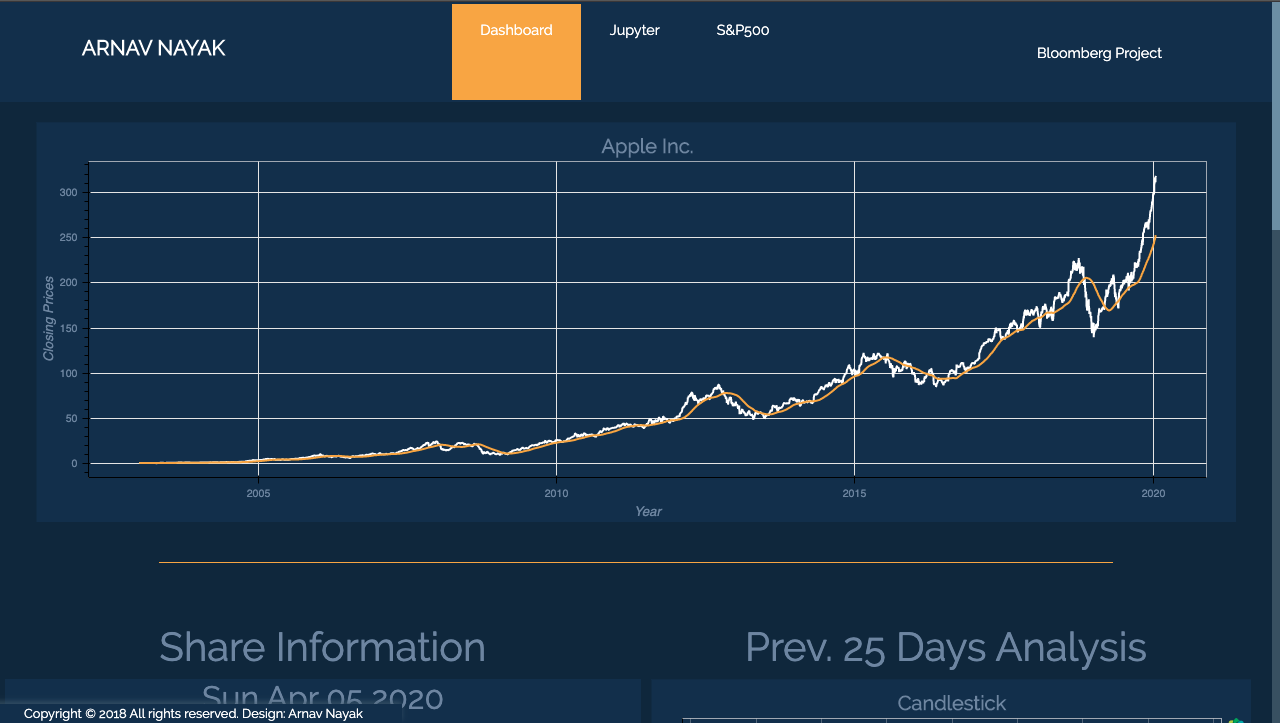
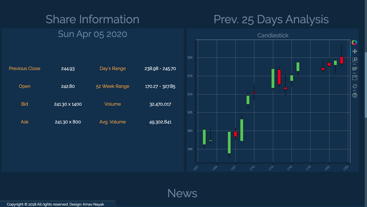
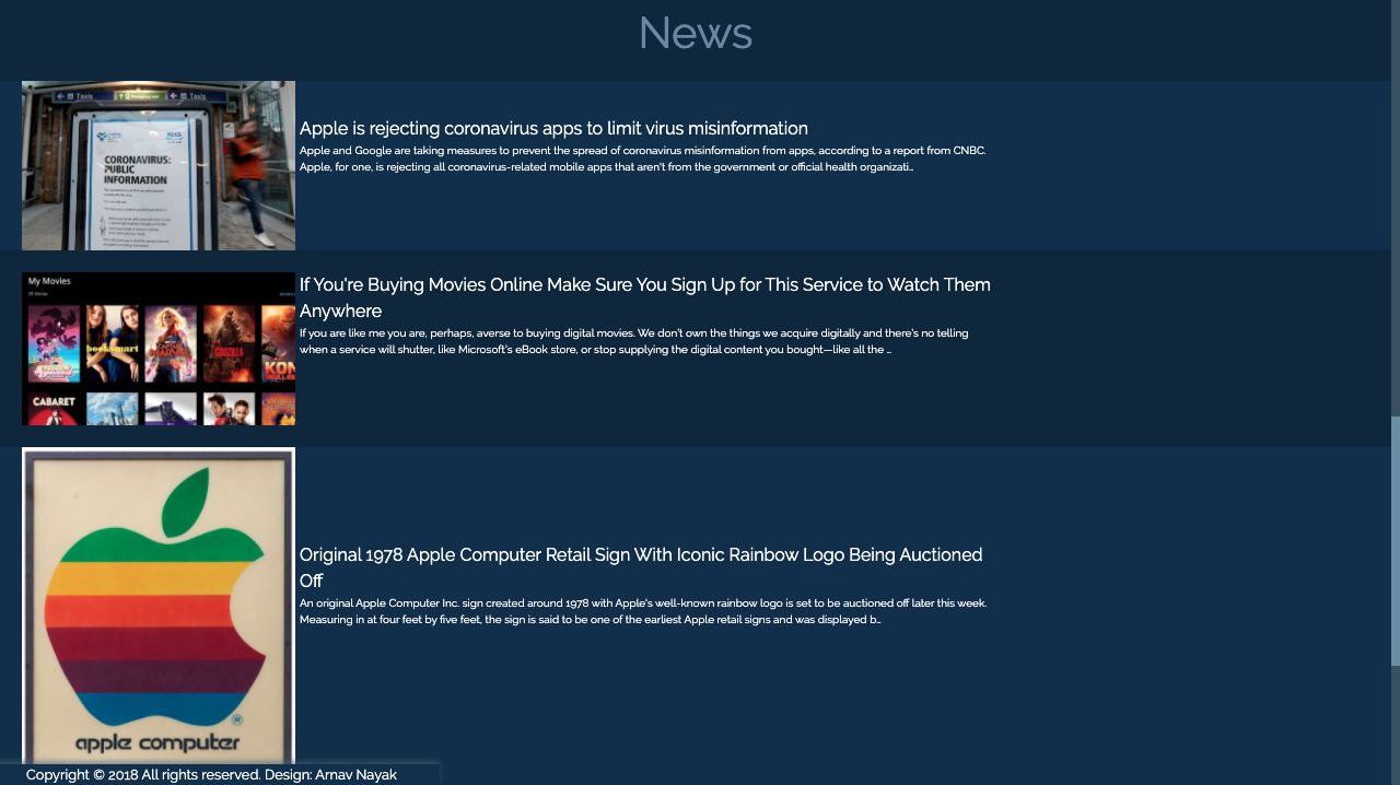
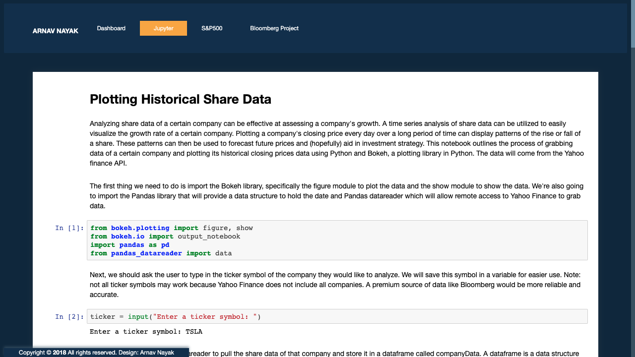
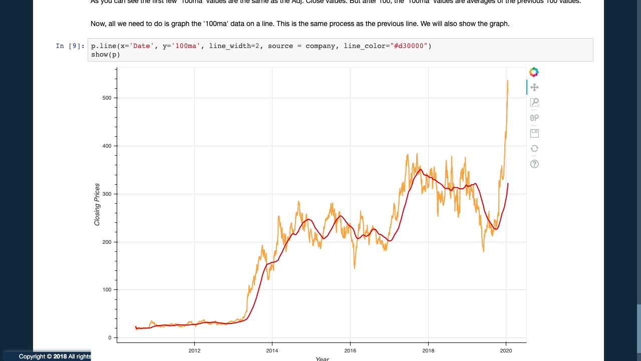
In my junior year, the Bloomberg Data center by Princeton was offering some students opportunities to create a project that involves Python and data visualization, preferably financial data. Going along with this format, I made a web application with Flask that allows users to type in the ticker symbol of any company they like, and see a time series analysis of the company's share prices. The web app also uses web scraping to grab data from the Yahoo finance page for tables and a candlestick chart that shows open, low, high and close prices. Along with the news of that particular company, there is also a Jupyter notebook file, outlining the code used to grab and create the visuals. The visuals were made using Bokeh plots.
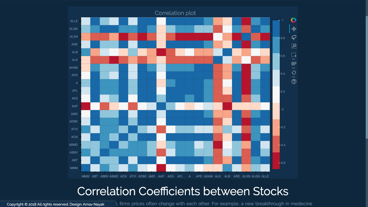
On the last tab, there is a correlation coefficient graph with the top 25 S&P500 companies. Being such a volatile market, finding correlation between the price movements of two companies is important to minimize risk in a portfolio, or doubling down on risk for a greater return.
📷 Home Page
📷 Dashboard (Apple is used as an example)
📷 Jupyter Page
📷 Correlation Chart
💻 Tech
- Flask - The web framework used
- Bokeh - The Visualization API
- BeautifulSoup - Web scraping API
- Pandas - The Data manipulation API
- Jupyter Notebook - Used to easily present the code
