Posize is the flexible layout tool which implements the concept of resizing constraints.
There is also react version here
All popular design tools have the concept of resizing constraints, such as Sketch, Figma, and AdobeXD. It's very useful to define the responsive behavior which describes how to position and resize an item across different resolutions.
pxCode, an online editor which help users to convert design files into responsive web code, widely uses posize to achieve responsiveness.
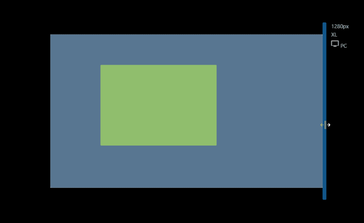
Posize Demo
Traditional CSS margin is useful but limited. CSS margin can't be proportional without using complicated calc syntax. And the vertical margin (margin-top and margin-bottom) can't use precent intuitively because the percentage is in terms of the parent width, not height.
- Supports proportional and fixed margin
- Support both direction - vertical and horizontal
- Support MediaQuery
Try the posize Playground or CodeSandbox

just add the script in your <head>
<script type="text/javascript" async defer src="https://cdn.jsdelivr.net/gh/px2code/posize/build/v1.00.3.js"></script><px-posize
x="176fr 546fr 558fr"
y="150px 379px 191fr">
<div class="content">
...
</div>
</px-posize>posize with MediaQuery, max, xxxl, xxl, xl, lg, md, sm, xs
<px-posize
  x="20px 546fr 558fr"
  y="20px 379px 191fr"
  md-x="1fr minmax(400px,2fr) 1fr"
  md-y="150px 379px 1fr"
  xs-x="10px 1fr 10px"
  xs-y="150px 379px 1fr">
  <div class="content">
    ...
  </div>
</px-posize>| name | Type | Default value | Description |
|---|---|---|---|
| x | String | Array | "0px 1fr 0px" | the parameters for left, width and right |
| y | String | Array | "0px 1fr 0px" | the parameters for top, height and bottom |
| z-index | Number | 0 | set zIndex into track div |
The syntax of x and y is the same to CSS grid.
?pxmeans pixel which is fixed value?frmeans "fraction" which means proportional to the sibling.?%means "perentage" which means proportional to the parent.max-contentmeans largest maximal content contribution.minmax(?px, ?fr)means a size range greater than or equal to min and less than or equal to max.minmax(?px, max-content)means a size range greater than or equal to min and less than or equal to max-content.
posize use the Web Component to simpify the usage and it use 3 x 3 CSS Grid internally for the layout arrangement.
 Edge |
 Firefox |
 Chrome |
 Safari |
 iOS Safari |
|---|---|---|---|---|
| 79+ | 63+ | 67+ | 10.1+ | 10.3+ |
This project is licensed under the terms of the MIT license.