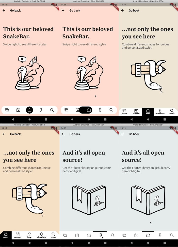
A new Flutter SnakeNavigationBar widget package.
To separate colors and gradient logic now you have SnakeNavigationBar.color and SnakeNavigationBar.gradient constructors. Changes naming: style => behaviour, snakeColor => snakeViewColor (snakeViewGradient in gradient configuration), onPositionChanged => onTap
Added selectedItemColor and unselectedItemColor (selectedItemGradient and unselectedItemGradient in gradient configuration)
To use this plugin, add flutter_snake_navigationbar as a dependency in your pubspec.yaml file.
SnakeNavigationBar has a similar API to BottomNavigationBar and uses BottomNavigationBarItem to show items as well.
     Scaffold(
      bottomNavigationBar: SnakeNavigationBar.color(
        behaviour: snakeBarStyle,
        snakeShape: snakeShape,
        shape: bottomBarShape,
        padding: padding,

        ///configuration for SnakeNavigationBar.color
        snakeViewColor: selectedColor,
        selectedItemColor: snakeShape == SnakeShape.indicator ? selectedColor : null,
        unselectedItemColor: Colors.blueGrey,

        ///configuration for SnakeNavigationBar.gradient
        //snakeViewGradient: selectedGradient,
        //selectedItemGradient: snakeShape == SnakeShape.indicator ? selectedGradient : null,
        //unselectedItemGradient: unselectedGradient,

        showUnselectedLabels: showUnselectedLabels,
        showSelectedLabels: showSelectedLabels,

        currentIndex: _selectedItemPosition,
        onTap: (index) => setState(() => _selectedItemPosition = index),
        items: [
          BottomNavigationBarItem(icon: Icon(Icons.notifications), label: 'tickets'),
          BottomNavigationBarItem(icon: Icon(CustomIcons.calendar), label: 'calendar'),
          BottomNavigationBarItem(icon: Icon(CustomIcons.home), label: 'home'),
          BottomNavigationBarItem(icon: Icon(CustomIcons.podcasts), label: 'microphone'),
          BottomNavigationBarItem(icon: Icon(CustomIcons.search), label: 'search')
        ],
      ),
   final List<BottomNavigationBarItem> items;

  /// If [SnakeBarBehaviour.floating] this color is
  /// used as background color of shaped view.
  /// If [SnakeBarBehaviour.pinned] this color just
  /// a background color of whole [SnakeNavigationBar] view
  final Gradient backgroundGradient;

  /// This color represents a SnakeView and unselected
  /// Icon and label color
  final Gradient snakeViewGradient;

  /// This color represents a selected Icon color
  final Gradient selectedItemGradient;

  /// This color represents a unselected Icon color
  final Gradient unselectedItemGradient;

  /// Whether the labels are shown for the selected [BottomNavigationBarItem].
  final bool showSelectedLabels;

  /// Whether the labels are shown for the selected [BottomNavigationBarItem].
  final bool showUnselectedLabels;

  /// The index into [items] for the current active [BottomNavigationBarItem].
  final int currentIndex;

  ///You can specify custom elevation shadow color
  final Color shadowColor;

  /// Defines the [SnakeView] shape and behavior of a [SnakeNavigationBar].
  ///
  /// See documentation for [SnakeShape] for information on the
  /// meaning of different shapes.
  ///
  /// Default is [SnakeShape.circle]
  final SnakeShape snakeShape;

  /// Defines the layout and behavior of a [SnakeNavigationBar].
  ///
  /// See documentation for [SnakeBarBehaviour] for information on the
  /// meaning of different styles.
  ///
  /// Default is [SnakeBarBehaviour.pinned]
  final SnakeBarBehaviour behaviour;

  /// You can define custom [ShapeBorder] with padding and elevation to [SnakeNavigationBar]
  final ShapeBorder shape;
  final EdgeInsets padding;
  final double elevation;

  /// Called when one of the [items] is pressed.
  final ValueChanged<int> onTap;

