
Visual primitives for the component age. Use the best bits of ES6 and CSS to style your apps without stress 💅
npm install --save styled-components


Utilising tagged template literals (a recent addition to JavaScript) and the power of CSS, styled-components allows you to write actual CSS code to style your components. It also removes the mapping between components and styles – using components as a low-level styling construct could not be easier!
styled-components is compatible with both React (for web) and ReactNative – meaning it's the perfect choice even for truly universal apps! See the documentation about ReactNative for more information.
Note: If you're not using
npmas your package manager, aren't using a module bundler or aren't sure about either of those jump to Alternative Installation Methods.
Made by Glen Maddern, Max Stoiber and Phil Plückthun, supported by Front End Center and Thinkmill. Thank you for making this project possible!
See the documentation at styled-components.com/docs for more information about using styled-components!
Quicklinks to some of the most-visited pages:
There is (currently experimental) support for stylelint – meaning you can take advantage of 150 rules to make sure your styled-components CSS is solid!
See the stylelint-processor-styled-components repository for installation instructions.
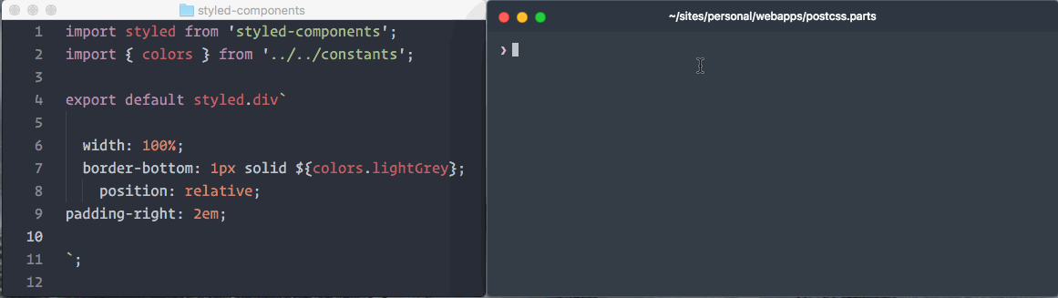
The one thing you lose when writing CSS in template literals is syntax highlighting. We're working hard on making proper syntax highlighting happening in all editors. We currently have support for Atom, Visual Studio Code, and soon Sublime Text.
This is what it looks like when properly highlighted:
@gandm, the creator of language-babel, has added support for styled-components in Atom!
To get proper syntax highlighting, all you have to do is install and use the language-babel package for your JavaScript files!
There is an open PR by @garetmckinley to add support for styled-components to babel-sublime! (if you want the PR to land, feel free to 👍 the initial comment to let the maintainers know there's a need for this!)
As soon as that PR is merged and a new version released, all you'll have to do is install and use babel-sublime to highlight your JavaScript files!
@gandm's language-babel has been ported to VSCode under the name Babel JavaScript by Michael McDermott. It provides the same all-in-one solution for Babel syntax highlighting with styled-components included.
If you would like to keep your current JavaScript syntax highlighting, you can use the vscode-styled-components extension to provide styled-components syntax highlighting inside your Javascript files. You can install it as usual from the Marketplace.
The vim-styled-components plugin gives you syntax highlighting inside your Javascript files. Install it with your usual plugin manager like Plug, Vundle, Pathogen, etc.
Also if you're looking for an awesome javascript syntax package you can never go wrong with YAJS.vim.
We could use your help to get syntax highlighting support to other editors! If you want to start working on syntax highlighting for your editor, open an issue to let us know.
- react-aria-tooltip: Simple & accessible ReactJS tooltip component
- uiGradients: Generate beautiful background gradients from the uigradients.com database.
- react-enhanced-form: The best react form component, on earth 🌍. It makes form inputs easy, finally !
- react-teleportation: Teleport your components to the foreground.
- reshake: CSShake as a React Functional Component (demo)
- last-draft: A Draft.js Editor (demo)
- styled-components-spacing: Responsive margin and padding components for
styled-components. - reactour: Tourist Guide into your React Components (demo)
- mcs-lite-ui: An on-premises Internet of Things cloud platform, which can be quickly built and get started with. (demo)
- react-progressive-bg-image: 🖼 Medium style progressive background image. (demo)
- react-simple-chatbot: Simple chatbot / conversational-ui React component. (demo)
- react-css-loaders: A collection of pure CSS React loading components. (demo)
- Rebass: Functional React UI component library (demo)
- grid-styled: Responsive grid system (demo)
- Hedron: A no-frills flex-box grid system.
- styled-components-grid: Responsive grid components for
styled-components. - react-styled-flexboxgrid: Grid system based on Flexbox (demo)
- react-flexa: React grid system implementing the flexbox CSS API responsively.
- griz: The simplest grid system you'd ever see. Using grids with a flexbox fallback.
- styled-css-grid: A tiny CSS grid layout for React.
- neat-components: A styled-components implementation of ThoughtBot's Neat grid system.
- styled-props: Simple lib that allows you to set styled props in your styled-components without stress (demo)
- styled-components-breakpoint: Utility function for using breakpoints with
styled-components. - styled-theme: Extensible theming system for styled-components.
- styled-tools: Useful interpolated functions for styled-components.
- styled-ax: Functional theme property accessor(s)
- react-create-component-from-tag-prop: Create a react component from a tag prop. Lets your users to choose which HTML elements get styled by your 💅 styled-components.
- styled-components-theme: A library for refering to theme colors and modifying them inline. e.g.
color: ${primary.lighten(0.3)}; - styled-map: Super simple lib to map props to styles with
styled-components - styled-system: Design system utilities for styled-components – used in grid-styled and Rebass (demo)
- styled-shortcuts: Use simple string notation to access props. No functions necessary! Example:
font-size: ${'theme.fontSize:px'};(demo) - styled-shortcut-components: A convenience package that wraps
styled-componentswithstyled-shortcuts. - styled-media-query: Easily and beautifully use media queries with styled-component with custom breakpoints
- styled-by: Simple and powerful lib to handle styled props in your components (demo)
- react-redux-styled-hot-universal (SSR, Universal Webpack, Redux, React-router, Webpack 2, Babel, Styled Components and more...)
- ARc: Atomic React App boilerplate with styled components (demo)
- react-boilerplate: A highly scalable, offline-first foundation with the best developer experience and a focus on performance and best practices
- Scalable React Boilerplate
- Scalable React TypeScript Boilerplate
- Superstylin': A Gatsby starter with styled-components 💅 (demo)
- Generator create-redux-app: Add Redux, styled-components and other useful libraries and tools like auto-generate boilerplate code, on top of the most common React starter create-react-app.
- PostCSS.parts: A searchable catalog of PostCSS plugins
- spaceexperience.club: Brings you each day a stunning picture of our universe, Astronomy Picture of the Day. (source)
- sachagreif.com: personal homepage built with Gatsby (source).
- ismaywolff.nl: personal portfolio with serverside rendering (source).
- Dirtyredz.com: David McClain | Dirtyredz - About me, Latest projects and Contact (source)
- Reactiflux: Reactiflux community home build with Gatsby (source).
- michaelhsu.tw: A simple static homepage built with CRA pre-renderer (source).
- joeireland.com: Portfolio of Joseph Ireland (source).
- rosesdaycare.center: Marketing website with theme colors that change on refresh (source).
- CodeSandbox: An online editor tailored for React development (source).
- Grabient.com: A beautiful and simple UI for generating web gradients. (source).
- react-presents: Highly customizable React slideshow framework with syntaxt highlighting and mobile support.
- react-adminlte-dash: AdminLTE dashboard components in React (demo)
- colors-show: Present your application colors with style. (demo)
Built something with styled-components? Submit a PR and add it to this list!
These are some great articles and talks about related topics in case you're hungry for more:
- 📝 "Scale" FUD and Style Components: Using components as low-level styling constructs
- 🎙 The Future of Reusable CSS: How component libraries should be styled, and why they're not yet
- 📝 Rendering Khan Academy’s Learn Menu Wherever I Please: Documenting the move from the handlebars + less combo to react and inline styles
- 🖥 Ryan's random thoughts about inline styles: Explaining some benefits of using styles in js
- 🖥 Create a style guide using NPM & styled-components: Jamie fumbles through creating a shareable NPM package.
If you're not using a module bundler or not using npm as your package manager, we also have a global ("UMD") build!
You can use that via the unpkg CDN to get styled-components, the URL is https://unpkg.com/styled-components/dist/styled-components.min.js.
To install styled-components with bower you'd do:
bower install styled-components=https://unpkg.com/styled-components/dist/styled-components.min.js
To use it from your HTML, add this at the bottom of your index.html, and you'll have access to the global window.styled variable:
<script src="https://unpkg.com/styled-components/dist/styled-components.min.js" type="text/javascript"></script>If styled-components isn't quite what you're looking for, maybe something in this list is:
glamorous- basicallystyled-componentsbut using JS objects and functions instead of strings.
Licensed under the MIT License, Copyright © 2017 Glen Maddern and Maximilian Stoiber.
See LICENSE for more information.
This project builds on a long line of earlier work by clever folks all around the world. We'd like to thank Charlie Somerville, Nik Graf, Sunil Pai, Michael Chan, Andrey Popp, Jed Watson & Andrey Sitnik who contributed ideas, code or inspiration.
Special thanks to @okonet for the fantastic logo.