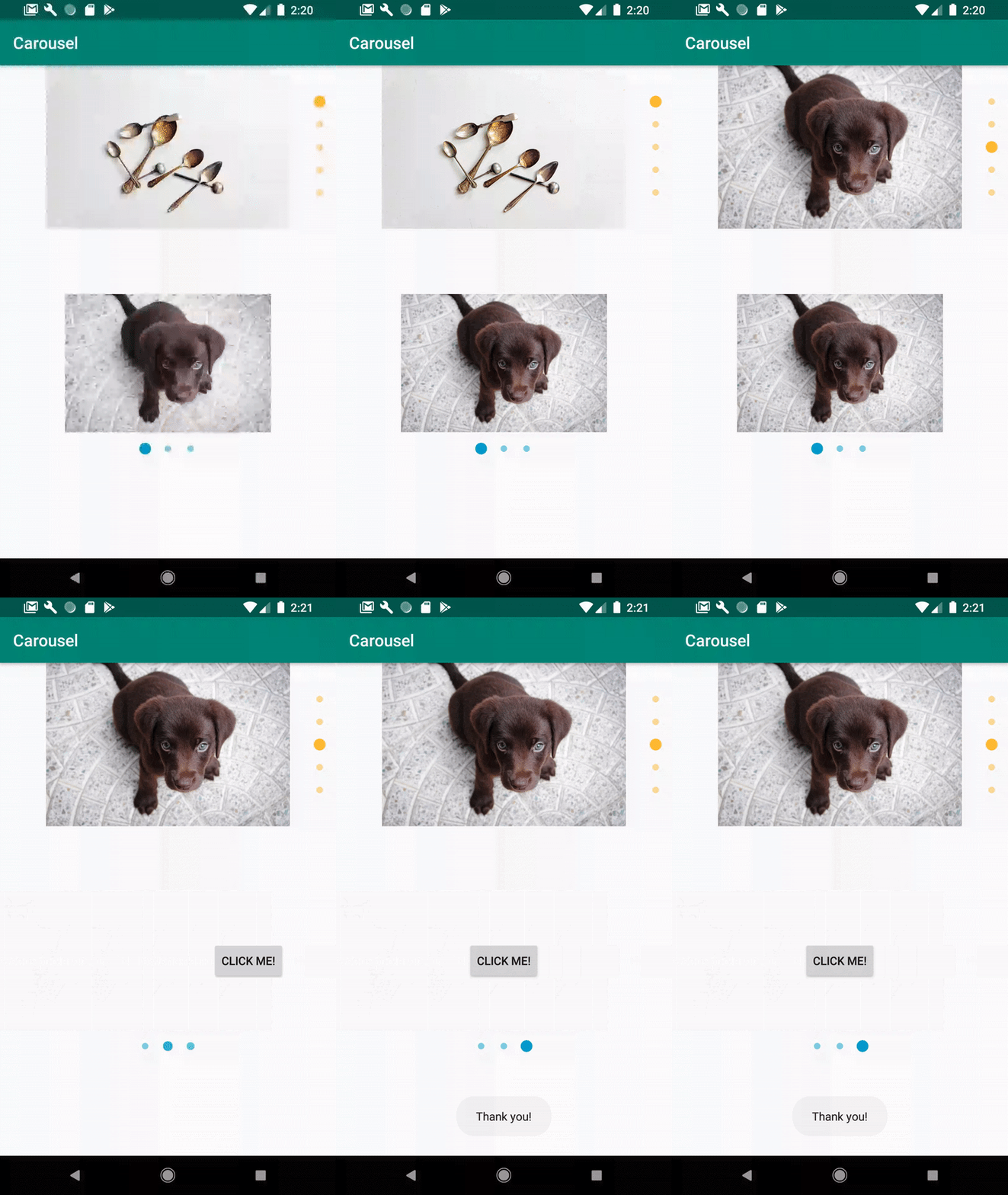
Carousel for Android
A carousel for Android applications with built-in page indicators.
Implemented as a custom view that renders a carousel leveraging ViewPager2, with an extensible Adapter system that allows you to build the carousel you want.
The example application has two bare-bones adapter implementations that can function
as a quick-start, both of which are marked as open:
CarouselViewsAdapterfor a simple, generic View adapter.CarouselImagesAdapteras an example of a slightly more involved adapter that delegates binding behaviour to the custom object typeCarouselImagethat was created for handling loading of either a resource or aUriimage via Coil.
Built with versatility in mind. All the Carousel needs is some implementation of a
CarouselAdapter. Simply instantiate the Carousel in your activity or fragment, create the adapter,
and attach it. Everything else is handled for you.
Implementations of CarouselAdapter have a default / standard ViewHolder baked
in for use if desired - called DefaultCarouselViewHolder. It has a simple
indeterminate loading circle . You can get an instance of this ViewHolder by calling
CarouselAdapter.getDefaultCarouselViewHolder(parentView)
If you are not interested in this pre-packaged ViewHolder, onCreateViewHolder
and onBindViewHolder should return and work with your own implementation of
a CarouselAdapter.CarouselViewHolder.
Currently active item indicators are also automatically created and kept in sync with the carousel's ViewPager.
Get it
Available on jCenter.
Carousel has a co-dependency on AndroidX's RecyclerView, as adapters inherit
from RecyclerView.Adapter. You can fulfill this dependency either through
the AndroidX RecyclerView package or the ViewPager2 package.
=> See RecyclerView Releases for the latest RecyclerView version(s)
=> See ViewPager2 Releases for the latest ViewPager2 version(s)
implementation 'com.meetarp:carousel:$carouselVersion'

// and one of...
implementation 'androidx.viewpager2:viewpager2:$viewPager2_version'
implementation 'androidx.recyclerview:recyclerview:$recyclerview_version'
Customizability
Has multiple defined attributes that you can specify in your XML layout or manipulate programmatically:
| XML Attribute | Description | Default |
|---|---|---|
app:carousel_backgroundColor |
@ColorInt The color that will be applied to the background of the carousel, if visible. |
android.R.color.transparent |
app:carousel_showIndicators |
Boolean Determines whether or not to show the indicators at all. |
true |
app:carousel_indicatorPosition |
Enum Position of indicators relative to the carousel content(s). One of "top", "bottom", "start" or "end". |
bottom |
app:carousel_insetIndicators |
Boolean Determines whether or not to inset the carousel item indicators. |
true |
app:carousel_indicatorColor |
@ColorInt Color to tint all carousel item indicators. |
android.R.color.white |
app:carousel_indicatorOffset |
@Dimension Dimension (pixels) representing the distance between the bottom of the viewpager and the closest edge of the indicator container (bottom edge if indicators are inset, top edge if outset) |
16dp |
app:carousel_indicatorSize |
@Dimension Dimension (pixels) for the base size of all carousel item indicators. |
5dp |
app:carousel_indicatorSpacing |
@Dimension Dimension (pixels) for the total space in between carousel item indicators. |
10dp |
app:carousel_indicatorActiveScaleFactor |
Float Scale factor for the selected state of a carousel item indicator. |
1.8 |
Usage
**NOTE: app:carousel_indicatorPosition will affect the scrolling behaviour of the ViewPager!
Start and end positions will cause vertical scrolling while top and bottom positions cause horizontal scrolling.
Note: It is highly recommended that you constrain the height of the Carousel so that the viewpager does not resize itself when loading items of drastically different sizes. What that means for the sizing controls of the views you pass in is up to you; it is recommended that they be of similar (if not identical) heights.
In Layout XML
<!-- Shown with all of the default values as described in the table above -->
<com.meetarp.carousel.Carousel
        android:id="@+id/carousel"
        android:layout_width="match_parent"
        android:layout_height="200dp"
        app:carousel_backgroundColor="@android:color/transparent"
        app:carousel_showIndicators="true"
        app:carousel_indicatorPosition="bottom"
        app:carousel_insetIndicators="true"
        app:carousel_indicatorColor="@android:color/white"
        app:carousel_indicatorOffset="16dp"
        app:carousel_indicatorSize="5dp"
        app:carousel_indicatorSpacing="10dp"
        app:carousel_indicatorActiveScaleFactor="1.8" />
In Activity/Fragment
// Capture the reference to the carousel
val carousel: Carousel<CarouselImage> = findViewById(R.id.carousel)

// Populate the image list with drawables
val images = mutableListOf<CarouselImage>()
images.add(ResourceImage(R.drawable.image1))
images.add(UriImage(Uri.parse("https://example.me/image2.jpg")))
images.add(ResourceImage(R.drawable.image3))

// Create the adapter and set the items
val imagesAdapter = CarouselImagesAdapter()
imagesAdapter.setItems(images)

// Attach a click listener, if you want.
// This is a slightly improved View.OnClickListener that includes
// carousel item position
imagesAdapter.itemClickListener = object : Carousel.ItemClickListener {
    override fun onItemClicked(view: View, position: Int) {
        // ... do something
    }
}

// Give the carousel the adapter
carousel.adapter = imagesAdapter

// Listen for paging events if you're interested in that information
carousel.pageChangeListener = object : ViewPager2.OnPageChangeCallback {
    override fun onPageSelected(position: Int) {
        // ... do something
    }
}

// All of the xml attributes can also be set through code using identically named accessors
carousel.carouselBackgroundColor = ContextCompat.getColor(context, R.color.grey)
carousel.showIndicators = true
carousel.indicatorPosition = Carousel.IndicatorPosition.START
carousel.insetIndicators = false
carousel.indicatorOffset = dpAsPx(20f)
carousel.indicatorColor = ContextCompat.getColor(context, R.color.royal_blue)
carousel.indicatorSize = dpAsPx(8f)
carousel.indicatorSpacing = dpAsPx(12f)
carousel.indicatorActiveScaleFactor = 1.5f
The Adapter
CarouselAdapter is an adapter with a slight implementation on top of
RecyclerView.Adapter. You can retrieve an item passed to the adapter from
setItems(...) by accessing the carouselItems protected member:
override fun onBindViewHolder(holder: CarouselViewHolder, position: Int) {
    val item = carouselItems[position]
    // ... do something with the item
}
Working with changing data
If you find that you need to update your carousel items after its initial population,
you will have to call adapter.setItems(newList) with the new data.
The default handling of this data swap is a call to notifyDataSetChanged().
However, there is an opportunity to handle the data change event in a way
of your own choosing (as an example: using DiffUtils)
if the adapter has provided an override for handleDataChange(oldData, newData)
and returns true.
The default return value for handleDataChange(oldData, newData) is false.
Please see CarouselAdapter.setItems() if this is unclear.
DefaultCarouselViewHolder
CarouselAdapter.getDefaultCarouselViewHolder(parentView) provides an instance
of DefaultCarouselViewHolder with publicly exposed members:
- container (ViewGroup - RelativeLayout)
- progressBar (ProgressBar)
An example of working with these members and the default ViewHolder can be seen in CarouselImagesAdapter in the example application.

