Do you love to make awesome projects with Kirby CMS? Do you also find it difficult to switch between snippets and blueprints folders?
This Plugin will change your life!

Watch the video tutorial or check the example project
Manually
Download and copy the plugin into your plugin folder: /site/plugins/
With Composer
composer require microman/kirby-components
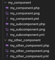
- Create a components folderfolder
site/components - Make a subfolder for your component, e.g.
components/my_component - Create at least one blueprint with the same name as the folder. e.g.
my_component/my_component.yml - Create at least one snippet. e.g.
my_component//my_component.php
You can create more snippets and blueprints in your components folder. (called sub components) To access them later, declaring the location
my_component/my_subcomponent
You can set label, title and icons in your blueprint. Even tabs and columns, if you like.
To output your component, use the component helper:
component('my_component');Pass values to this component:
component('my_component', $page, ['title' => 'This is a different title.']);The first and the second parameter could be an array or an Kirby object, that contains a content object. Try it out what is working for you.
my_field:
  type: component
  fieldsets: my_component
You can also use Kirby blocks in here:
fieldsets: blocks/heading
$page->my_field()->toComponent();Extend your component like in the example above:
$page->my_field()->toComponent(['new_value' => 'My new value']);The variables in the components snippet are accessible with $content
$content->field_in_component();If you add more than one component to the fieldsets, a selector appears:
my_field:
  type: component
  fieldsets:
    - my_component
    - my_component/my_subcomponent
    - my_other_component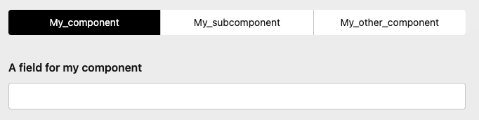
By choosing, the fields of the selected component will appear.
To change the labels in the selector, set the property 'title' of the component.
Component selector with images
Adding images to your component folder (with the same name as the component itself)
These images will shown in the selector and you can be styled with the selector property:
my_field:
  type: component
  selector:
    columns: 3
    background: var(--color-yellow-200)
    ratio: 3/1
    fit: contain
    gap: 1em
  fieldsets:
    - my_component
    - my_component/my_subcomponent
    - my_other_component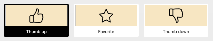
Images toggles field
You can use the component selector also standalone:
images_toggles:
  type: imagetoggles
  root: location/of/the/images
  ratio: 2/1
  fit: cover
  gap: 1.2em
  options:
    - text: Text1
     value: value1
     image: image1.png
    - text: Text2
     value: value2
     image: image2.png
    - text: Text3
     value: value3
     image: image3.png
It follows the same rules as the togglesfield.
Use the toComponent()method.
$page->my_field()->toComponent();Or you can extend the values (with an array or an Kirby object):
$page->my_field()->toComponent(['my_component_field' => 'My existing or new value']);
$page->my_field()->toComponent($page->any_section());
The toComponent() method delivers the selected component.
If you like to use all the available components of the component fields use toComponents():
<?php foreach ($page->my_field()->toComponents() as $component): ?>
  <?= $component ?>
<?php endforeach ?>Add more than one component by using the components field.
It follows the same rules as the Kirby blocks field.
multiple_components:
  type: components
  fieldset:
    - my_component
    - my_component/my_subcomponent
    - my_other_component
    - blocks/heading
    - blocks/text
    - blocks/list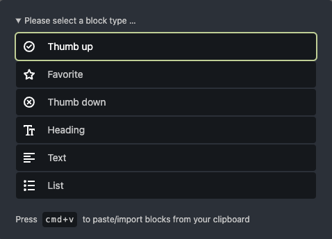
Add a tabs with components to the component(s) fields.
multiple_components:
  type: components
  tabs:
    my_component/my_subcomponent:
      position: after
      label: Injected tab
  fieldset:
    - my_component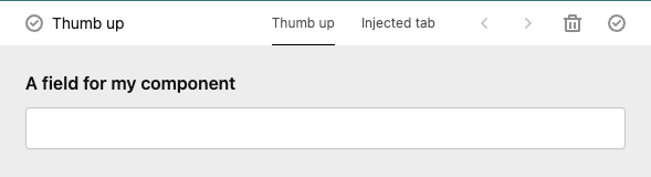
you can also extend your component there:
multiple_components:
  type: components
  tabs:
    my_component/my_subcomponent:
      position: after
      label: Injected tab
      fields:
        existing_field:
          label: Another Label
        new_field:
          type: text
  fieldset:
- my_componentThis is a free trial version of Kirby Components Plugin, which grants you the right to use the plugin for testing purposes. If you wish to use this plugin on one website or if you intend to use it for commercial purposes, you must purchase a license.
A license is required for those who wish to use the plugin to generate revenue, including but not limited to: e-commerce websites, affiliate marketing websites, and websites that require payment to access content. Licenses are non-transferable and cannot be shared with other users or websites.
By downloading and using this plugin, you agree to the terms and conditions of the License Agreement. Failure to comply with the terms of the License Agreement may result in revocation of your license and legal action.
To purchase a license or learn more about our licensing options, please visit our website or contact us at Contact Email. Thank you for your interest in Kirby Components Plugin!