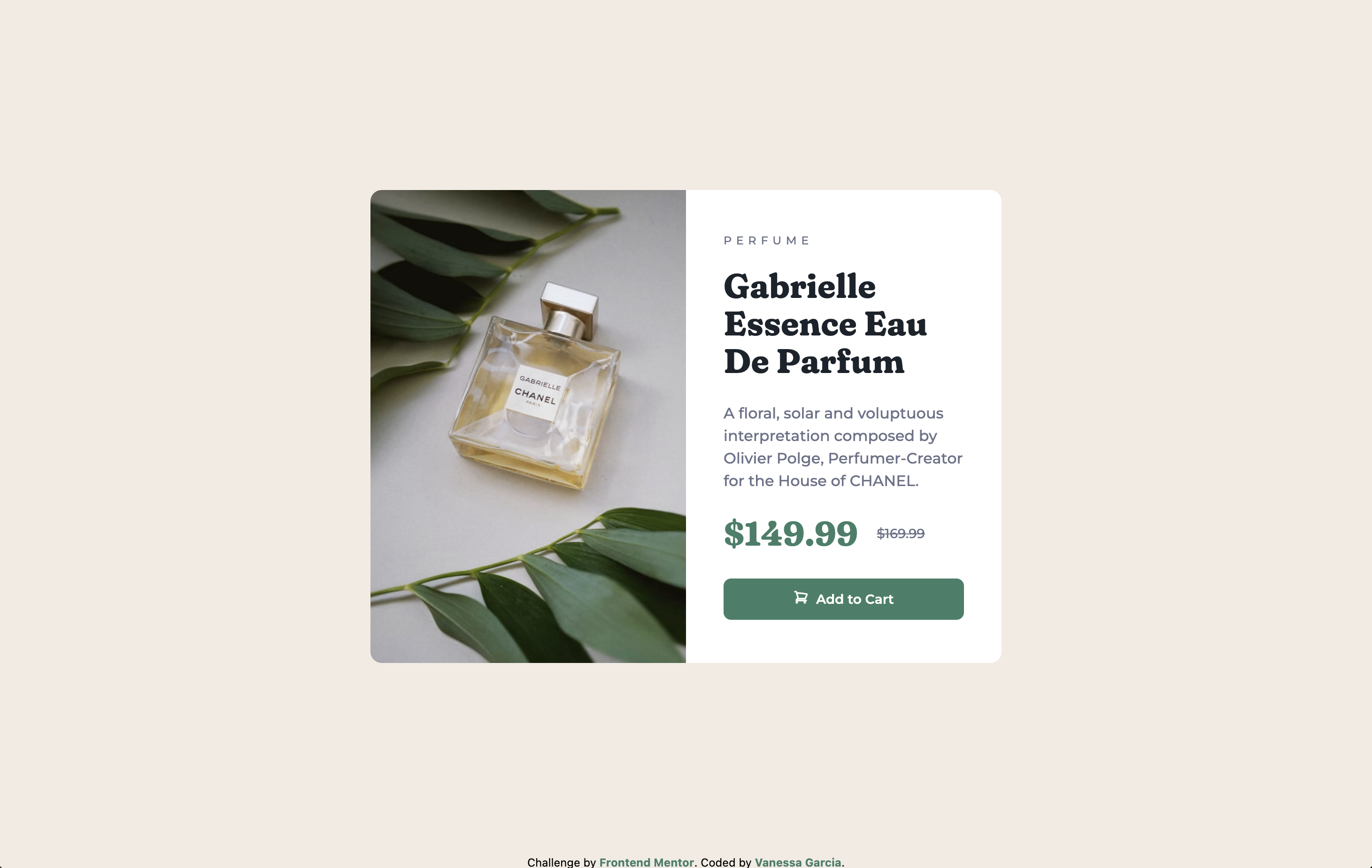
This is a solution to the Product preview card component challenge on Frontend Mentor. Frontend Mentor challenges help you improve your coding skills by building realistic projects.
Users should be able to:
- View the optimal layout depending on their device's screen size
- See hover and focus states for interactive elements
- Live Site URL: Demo
- Semantic HTML5 markup
- CSS custom properties
- Flexbox
- Mobile-first workflow
- Tailwind CSS - CSS Framework
I learned how to utilize flex-grow and flex-1 to make my containers and the content within them responsive.
<main class="flex-grow flex justify-center items-center p-4">
  <div
    class="flex flex-col md:flex-row justify-center self-center bg-white rounded-xl max-w-2xl lg:w-2/4"
  >
    <img
      src="images/image-product-mobile.jpg"
      alt="Gabrielle Chanel perfume surrounded by leaves"
      class="md:hidden rounded-t-xl"
    />

    <img
      src="images/image-product-desktop.jpg"
      alt="Gabrielle Chanel perfume surrounded by leaves desktop"
      class="hidden md:block md:w-1/2 rounded-l-xl"
    />

    <div
      class="p-6 md:p-10 md:flex-1 md:flex md:flex-col md:justify-center"
    ></div>
  </div>
</main>- Website - Vanessa Garcia
- Frontend Mentor - @petrihcour

