Investigating Socio-Economic Disparities in the Damages Caused by Hurricane Katrina and Hurricane Rita in Southern Louisiana Counties
Acacia Lio (400320363)
Moira Maxwell (400264551)
Holly Parent (400306606)
Kajani Yoganathan (400324939)
Nelly Okwu-wolu (400299499)
Noah Giglia Hoffman (400139706)
Final project for ENVSOCTY 4GA3 Applied Spatial Statistics (McMaster University)
This study investigates the potential correlation between race, income, and education level, with the extent of damage inflicted by Hurricanes’ Katrina and Rita on Southern Louisiana households at the county level. Utilizing data from the U.S. Census Bureau and damage reports from FEMA, spatial statistical analyses were conducted to examine if sociodemographic differences influenced the severity of hurricane damage. The findings suggest that although socioeconomic and racial disparities are prevalent at the county level, they ultimately do not significantly correlate with the patterns of household damages observed. The study observed that the central counties of Southern Louisiana experienced the least amount of damage, while counties along the periphery faced more severe impacts. Our analysis includes regression models, choropleth maps, and Moran’s I tests to validate spatial autocorrelation, revealing a nuanced landscape of damage distribution. This challenges conventional assumptions about socioeconomic vulnerability, in the context of natural disasters. These results highlight the complexity of factors influencing disaster impacts, while underscoring the importance of considering a multitude of variables in the mitigation of disasterrelated damages. This study therefore contributes to the ongoing and demanding discussion on approaches to disaster response and recovery, by providing a detailed empirical analysis of the potential interrelations between race, income, and education attainment with hurricane damage outcomes.
Climate change is occurring at unprecedented rates posing great risks to our environment and society. Due to these drastic changes, we are experiencing hikes in precipitation rates, warmer average global temperatures, and warmer sea temperatures influencing wind speeds, and more. Natural and anthropogenic climate forcings that are driving these changes are resulting in more instances of natural environmental disasters such as hurricanes. One of the most costly hurricanes in U.S. history is that of Hurricane Katrina impacting New Orleans and the Gulf coasts of Louisiana, Alabama, and Mississippi, costing billions of dollars in damage and claiming almost 2,000 lives (Groen & Polivka, 2010). Shortly after the area experienced the massive impact of Hurricane Katrina, it was then hit by Hurricane Rita causing further damage to the area. Social, racial, and economic inequities all contribute to the treatment of minority groups and impact how damages are incurred and how damaged infrastructure and loss of property are remediated (Krause & Reeves, 2017; Yun & Waldorf, 2016). This analysis will utilize data collected from the United States Census Bureau to further our understanding of the potential inequality of damages incurred in southern Louisiana counties due to Hurricanes Katrina and Rita. Our analysis will answer the question of if areas of higher proportions of marginalized ethnicities, low incomes, and/or low education attainment experienced more damages from Hurricane Katrina and Rita. This data will consider the influence of race, income, and education level and the potential impacts they have on the magnitude of damages experienced from both Hurricanes. In this report, the background, study area, methodology as well as the spatial analysis will be covered.
As climate change becomes more and more prominent, the incidence risk, season duration, and magnitude of intensity for natural disasters (such as hurricanes) increase (Balaguru et al., 2023). One such example is the destruction caused by Hurricane Katrina, the costliest and deadliest hurricane in U.S. history, causing an estimated $57.2 billion in insured damage and 1,500 people’s lives (Hartwig & Wilkinson, 2010). Hurricane Katrina touched down in Southeast Louisiana on August 29, 2005, and affected the Gulf Coast, notably Louisiana, Alabama, and Mississippi (Hartwig & Wilkinson, 2010). One and a half million residents evacuated from these states, and approximately 40% of them did not return, reducing the population of New Orleans, Louisiana by half (Bienvenu, 2024). Then, only twenty-six days after Katrina, Hurricane Rita hit coastal Louisiana as the fourth-strongest Atlantic hurricane ever recorded (Thibodeaux, 2023). Since Rita and Katrina occurred so closely together, much of the data and analysis would refer to the cumulative destruction of both hurricanes, especially when the data is dated after September 24, 2005. However, residents complained of “Rita amnesia”, claiming the government and media did not pay as much attention to the destruction caused by Rita as compared to Katrina as while it still affected the New Orleans metropolitan area, it hit the coastal region more (Thibodeaux, 2023). In addition, Katrina killed 1,577 people whereas Rita killed 1 (Thibodeaux, 2023).
When the levees protecting New Orleans failed, approximately 80% of the city was flooded, especially the neighbourhoods, displacing up to 600,000 households (Plyer, 2016). Throughout the metropolitan area, whites composed 51% of the pre-Katrina metropolitan population but only 31% of flood victims whereas Blacks composed 44% of the population but 65% of the flood victims (Campanella, 2007). As for people of Hispanic ancestry, they made up 3% and 3% (Campanella, 2007). In a national poll conducted between September 6 and 7, 2005, 66% of African Americans claimed that the government’s response to the situation would have been faster if most of the victims had been white, but only 17% of white Americans agreed (Doherty, 2015). In contrast, 19% of African Americans rated the federal government’s response to relief efforts as excellent or good, compared with 41% of whites (Doherty, 2015). The televised and photographed spectacle of Katrina’s aftermath revealed that the vast majority of those worst affected were black, in numbers disproportionate even to the large percentage of blacks within the city (Belkhir & Charlemaine, 2007).
Minority and low-income communities are more vulnerable to risks of natural disasters and struggle more to recover as they are more likely to live in neighbourhoods or buildings with substandard infrastructure (Krause & Reeves, 2017). Inundated residents experienced a short-term negative shock to their Equifax risk score after the storm of about 6.7 points (0.05 standard deviations) and recovered little over the following ten years, with their average score remaining 5.6 points lower ten years after the storm (Bleemer & van der Klaauw, 2017). Schools were also affected due to the extensive damage sustained by the majority of the school districts, students returning to Louisiana and New Orleans following the hurricane were sent to charter schools overseen by the Recovery School District (RSD) which was created prior to Hurricane Katrina to take over failing public schools in the Orleans Parish (Frazier-Anderson, 2008). 107 New Orleans Public Schools that performed at or below the state average in 2004-2005 were taken over by the RSD (Hewitt & Tuzzolo, 2007). However, these schools suffered from a lack of tangible resources essential for success in an educational environment such as textbooks, desks for students, sufficient and well-trained teachers, a teaching plan for children with special needs, counseling services, and hot lunches for the impoverished students, creating a warehouse-like atmosphere (Hewitt & Tuzzolo, 2007). As a result, in the New Orleans metropolitan area, the hurricane produced a population that was more white and less poor due to the disproportionate out-migration, and slower return, of lower-income and black residents from the entire metropolitan area after the storms (Frey & Singer, 2006). In contrast, counties along the Louisiana-Mississippi coast lost a size-able share of their white residents (Frey & Singer, 2006).
The shapefile depicting the United States of America at the county level was retrieved from the U.S. Census Bureau, and further processed to exclusively include the southern portion of Louisiana (United States Census Bureau, 2018). The data for all three independent variables being studied, were also retrieved from the U.S. Census Bureau, particularly through the 2000 decennial Census. Race data was retrieved from the profile of general demographic characteristics dataset (United States Census Bureau, 2024). Income data was retrieved from the profile of selected economic characteristics, specifically the number of county residents based on their 1999 income (United States Census Bureau, 2024). Education level data was retrieved from the profile of selected social characteristics dataset (United States Census Bureau, 2024). Finally, damages data was retrieved from FEMA Individual Assistance Registrants and Small Business Administration Disaster Loan Applications (U.S. Department of Housing and Urban Development’s Office of Policy Development and Research, 2006).
Race data was manually processed in Microsoft Excel to filter the number of white, black/African American, Hispanic, and Latino county residents (United States Census Bureau, 2024). Income data was manually processed in Microsoft Excel to group populations by low (less than 10,000, 10,000-14,999, and 15,000-24,999 dollars (USD) per year), moderate (25,000-34,999, 35,000-49,999, and 50,000-74,999 dollars (USD) per year), and high (75,000-99,999, 100,000-149,999, 150,000-199,999, and over 200,000 dollars (USD) per year) income (United States Census Bureau, 2024). Education level data was manually processed in Microsoft Excel to group populations by low (less than 9th grade, 9th grade-12th grade (no diploma), and high school graduate), moderate (some college (no degree) and Associate’s degree), and high (Bachelor’s degree and graduate or professional degree) education attainment (United States Census Bureau, 2024). Damages data, namely the number of households damaged in each county were manually entered from this report into Microsoft Excel (U.S. Department of Housing and Urban Development’s Office of Policy Development and Research, 2006). To convert these values into a rate variable, race, income, education attainment, and damages counts were divided by each county population (ages 25 and above). Post-processing of all independent and dependent variables, this study used RStudio to conduct all spatial statistical analyses. Particularly, choropleth maps were used to visually depict the spatial trends seen amongst all variables, coupled with empirical and simulated spatial moving averages, scatterplots, and Moran’s I analysis (for household damages), as well as regression analysis for the potential relationships between damages and race, income, and/or education attainment. The R code used to implement these methods in RStudio were generated based off of guidelines in the official course textbook for ENVSOCTY 4GA3 at McMaster University (Páez, 2021).
Race, income, and education levels influencing southern Louisiana were studied at a county level. There are 64 counties in Louisiana, and data to be analyzed was found for 38 counties. Southern Louisiana was chosen as it was the area most affected by both Hurricanes Katrina and Rita as well as covered heavily by the media. The Community Development Block Grant Disaster Recovery (CDBG-DR) fund gave Louisiana $13.4 billion, making up 68% of the funds whereas the other 32% was given to Mississippi, Texas, Florida, and Alabama (Richardson, 2021). As well, for the Disaster Housing Assistance Program (DHAP), the Orleans parish alone made up 38% of the housing assistance, other areas of Louisiana made up 21%, and the last 41% was made up of all other states. The study was done to uncover these complexities by exploring how various demographic groups in specific geographical locations were adversely affected, to thoroughly understand Hurricane Katrina’s extensive impact on the socioeconomic level in Louisiana.
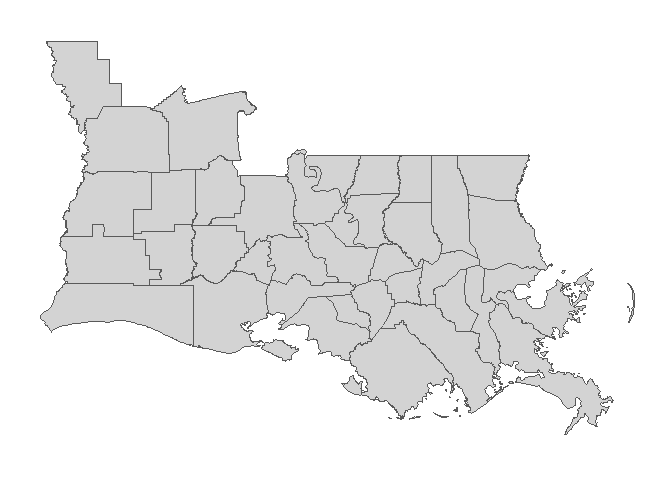
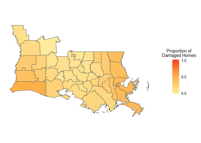
Parishes in Southern Louisiana, U.S.A.The beginning of this study’s investigation required a general understanding of the housing damage trends following Hurricanes Katrina and Rita. To do this, data was collected from FEMA, and converted into a proportion of damaged homes. Figure 2 displays a choropleth map demonstrating the general trend of housing damages by 2000 Census population.
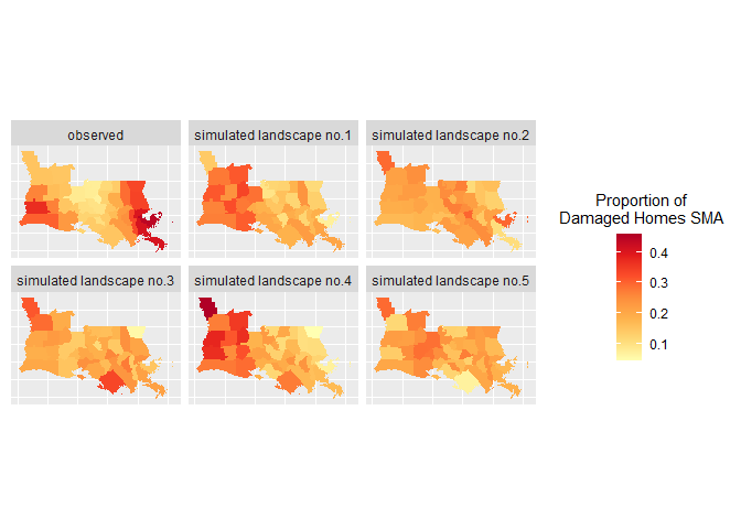
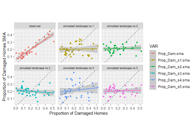
Proportion of damaged homes by 2000 census populationTo further investigate the underlying trends in housing damages, six choropleth maps were created; demonstrating the empirical (i.e., observed) spatial moving averages alongside five simulated spatial moving averages. Figure 3 displays all six choropleth maps of spatial moving averages, comparing the empirical proportion of damaged homes with five simulated landscapes. From here, scatterplots were created to display these spatial moving averages by the proportion of damaged homes. Figure 4 shows scatterplots for the empirical and simulated landscapes; all of which contain their own regression line with a 95% confidence interval envelope.
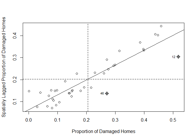
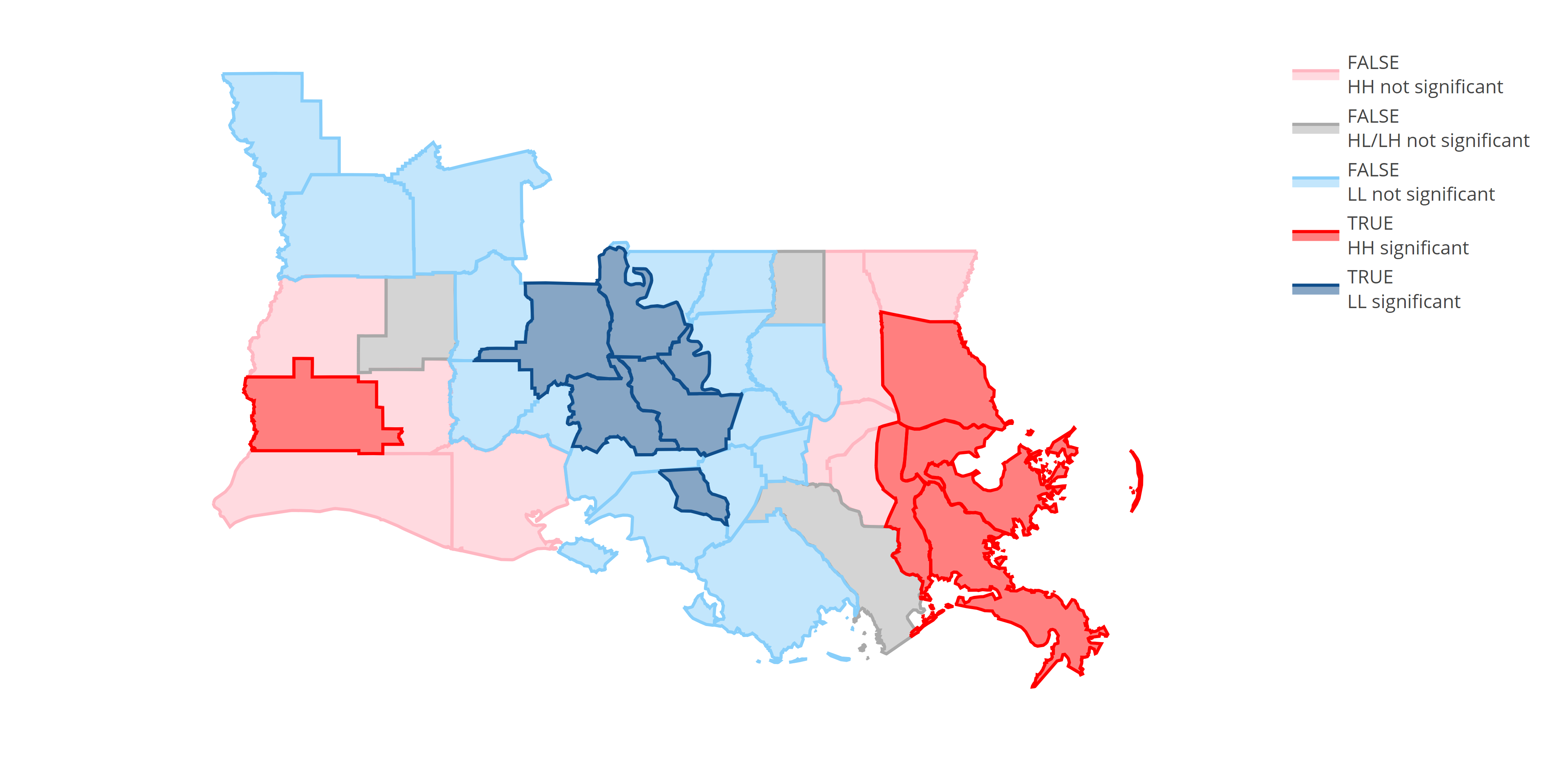
Empirical distribution of the proportion of damaged homes alongside five simulated landscapes Moran’s scatterplots for empirical (red) alongside five simulated (gold, green, lightblue, blue, and pink) spatial moving averages of proportion of damaged homesMoreover, a Moran’s I test was performed on the housing damages data to determine whether this spatial pattern is random or non-random; in other words, to determine spatial autocorrelation. Here, the Moran’s I statistic was 0.677889 with a p-value of 1.497e-11. Provided that this p-value is much less than 0.05, the null hypothesis (i.e., spatial independence/spatial randomness) can therefore be rejected with a high degree of confidence. Figure 5 displays the Moran’s I scatterplot for the empirical proportion of damaged homes. From here, a map of local Moran’s I was created to investigate the contribution of each individual area to the statistic. The results of this analysis consider three general outcomes. Firstly, counties with high housing damages neighbouring/surrounded by other counties with high housing damages are designated a “High-High” (or “HH”) status. Secondly, counties with low housing damages neighbouring/surrounded by other counties with low housing damages are designated a “Low-Low” (or “LL”) status. Thirdly, counties with high housing damages surrounded by other counties with low housing damages (or vice versa) are designated a “High-Low/Low-High” (or “HL/LH”) status. Figure 6 shows the results of this local Moran’s I analysis, displaying significant (i.e., p-value < 0.05) HH and LL areas in red and dark blue, respectively, alongside insignificant HH, LL, and HL/LH areas in pink, light blue, and grey, respectively.
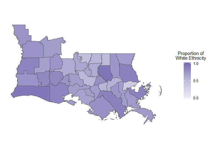
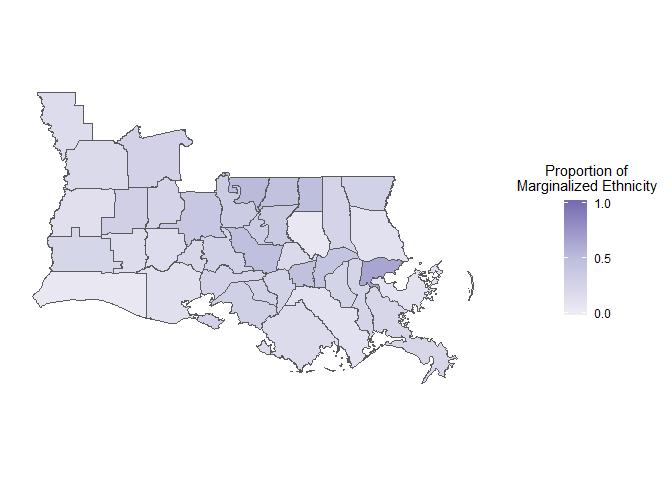
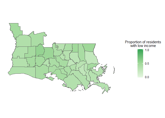
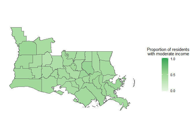
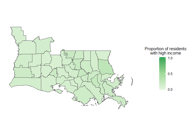
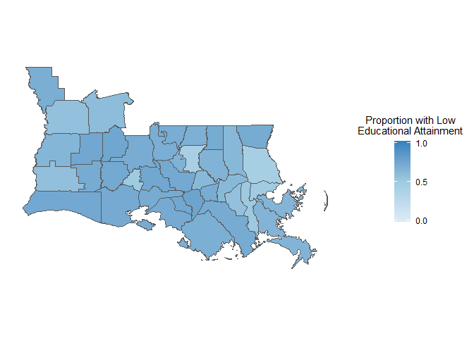
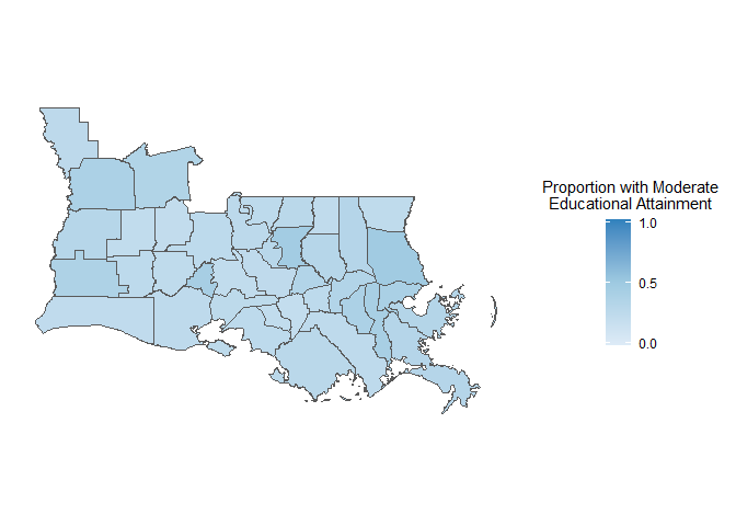
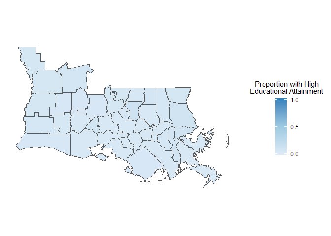
Moran’s scatterplots for empirical/observed proportion of damaged homes Local Moran’s I statistics of the proportion of damaged homesMoving forward, the independent variables, namely race, income, and education attainment were analyzed to gain a general understanding on their trends prior to Hurricanes Katrina and Rita. Their corresponding data, all collected from the 2000 decennial Census, were converted into proportions in each county by 2000 Census population. Race data was separated into two sub-variables; the first being residents of white ethnicity, and the second being residents of black/African American, Latino and/or Hispanic ethnicity (i.e., the marginalized racial group in this study). Figure 7 displays a choropleth map demonstrating the proportion of white county residents, while figure 8 shows a choropleth map displaying the proportion of racially marginalized county residents. Income data was separated into three sub-variables, specifically low, moderate, and high income. Figure 11 displays a choropleth map demonstrating the proportion of county residents with low incomes, while figure 13 shows a choropleth map displaying the proportion of county residents with moderate incomes, and figure 15 displays a choropleth map demonstrating the proportion of county residents with high incomes. Finally, education attainment data was similarly separated into three sub-variables, namely low, moderate, and high education level. Figure 17 shows a choropleth map displaying the proportion of county residents with low education attainments, while figure 19 displays a choropleth map demonstrating the proportion of county residents with moderate education attainments, and figure 21 shows a choropleth map displaying the proportion of county residents with high education attainments.
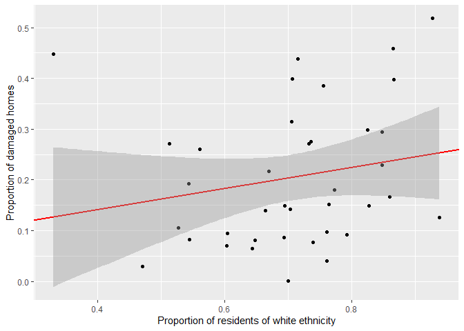
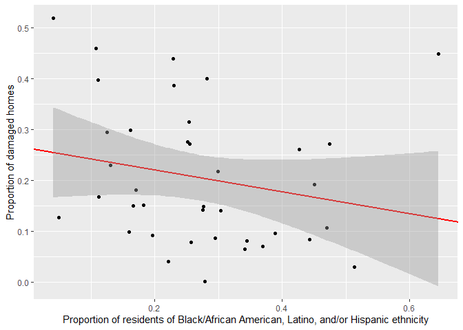
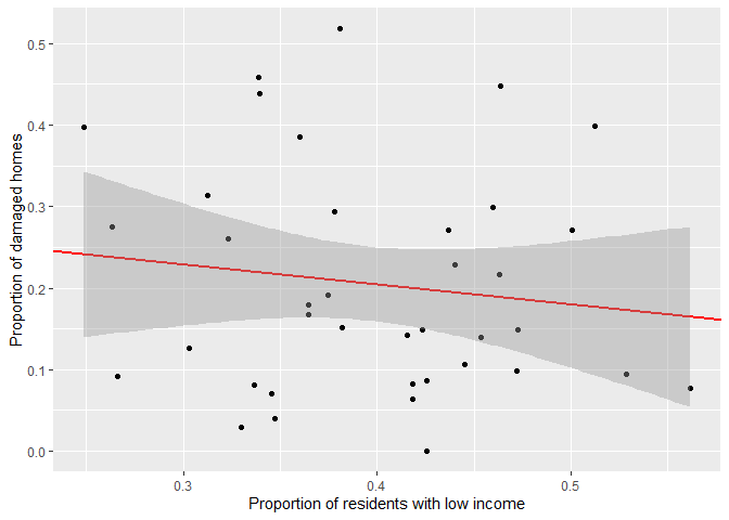
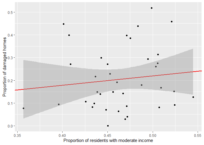
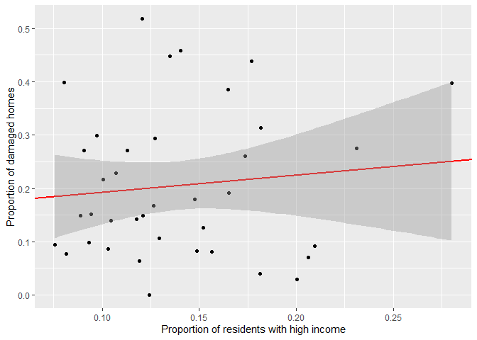
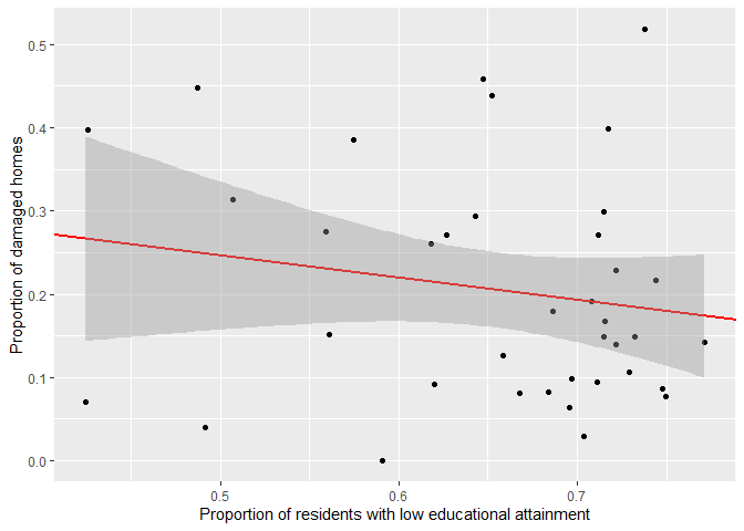
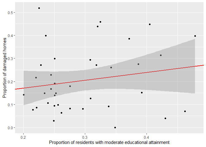
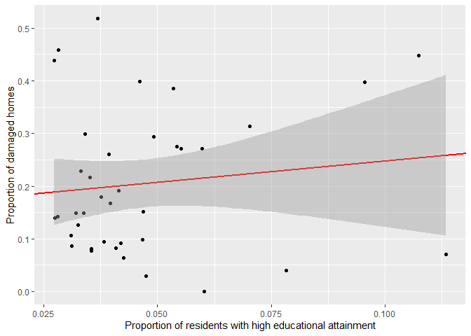
Once the general trends were identified, each variable (and corresponding sub-variable) underwent linear regression analysis to investigate their potential relationship with housing damages following Hurricanes Katrina and Rita. Figure 8 displays the linear regression for housing damages by the proportion of white county residents, with a 95% confidence interval envelope, while table 1 details the regression’s results. Figure 10 shows the linear regression for housing damages by the proportion of racially marginalized county residents, with a 95% confidence interval envelope, while table 2 details the regression’s results. Figure 12 displays the linear regression for housing damages by the proportion of county residents with low incomes, with a 95% confidence interval envelope, while table 3 details the regression’s results. Figure 14 shows the linear regression for housing damages by the proportion of county residents with moderate incomes, with a 95% confidence interval envelope, while table 4 details the regression’s results. Figure 16 shows the linear regression for housing damages by the proportion of county residents with high incomes, with a 95% confidence interval envelope, while table 5 details the regression’s results. Figure 18 displays the linear regression for housing damages by the proportion of county residents with low education attainments, with a 95% confidence interval envelope, while table 6 details the regression’s results. Figure 20 displays the linear regression for housing damages by the proportion of county residents with moderate education attainments, with a 95% confidence interval envelope, while table 7 details the regression’s results. Figure 22 displays the linear regression for housing damages by the proportion of county residents with high education attainments, with a 95% confidence interval envelope, while table 8 details the regression’s results.
Proportion of residents of white ethnicity by 2000 Census population Regression line analysis of housing damage by proportion of residents of white ethnicity Proportion of residents of Black/African American, Latino, and/or Hispanic ethnicities by 2000 Census population Regression line analysis of housing damage by proportion of residents of marginalized ethnicity Proportion of residents with incomes of less than 10,000 to 24,999 dollars (USD) per year by 2000 Census population Regression line analysis of housing damage by proportion of residents with incomes of less than 10,000 to 24,999 dollars (USD) per year Proportion of residents with incomes of 25,000 to 74,999 dollars (USD) per year by 2000 Census population Regression line analysis of housing damage by proportion of residents with incomes of 25,000 to 74,999 dollars (USD) per year Proportion of residents with incomes of 75,000 to over 200,000 dollars (USD) per year by 2000 Census population Regression line analysis of housing damage by proportion of residents with incomes of 75,000 to over 200,000 dollars (USD) per year Proportion of residents who have completed high school or less by 2000 Census population Regression line analysis of housing damage by proportion of residents who have completed high school or less Proportion of residents who have completed some college, and/or an Associate’s degree by 2000 Census population Regression line analysis of housing damage by proportion of residents who have completed some college, and/or an Associate’s degree Proportion of residents who have completed a Bachelor’s degree or higher by 2000 Census population Regression line analysis of housing damage by proportion of residents who have completed a Bachelor’s degree or higherFirstly, before examining and correlating the spatial relationship between the sociodemographic factors of income, race and education level to the intensity of damaged homes, the proportion of damaged homes in Southern Louisiana was visually showcased using a choropleth map in Figure 2. This map displays the variation in the proportion of damaged homes across the counties in Southern Louisiana. It is evident that the central counties have the lowest proportion of damaged homes while the proportions increase as one progresses outward away from the centre. This trend is particularly noticeable in the perimeters of the map, specifically in the northeastern, southwestern and southeastern hemispheres where the counties are shaded in the darkest yellow tones.
In order to gather more spatial information of the proportion of damaged homes and evaluate whether the spatial pattern is random or not. Another choropleth map was created however this model accounted for the spatial moving average which reduces the amount of variability in the data and makes the trends more noticeable as seen in Figure 3 in the top left map. The application of the spatial moving average to the map informs us that the highest proportion of damaged homes are located in the perimeter of the southeastern region across three counties and the lowest proportions are in the centre. The other maps seen in Figure 3 are random simulated landscapes and when compared to the map with the empirical data, there is a noticeable difference seen with a visible spatial trend and pattern apparent in the empirical map. Therefore, this suggests that the proportion of damaged homes within each county and region is not random across Southern Louisiana.
Figure 4 also utilizes the spatial moving average values but instead showcases scatterplots of both the observed empirical data and the simulated landscape variables with fitted regression lines on the graph. The slope of the data points in the empirical figure is similar and overall closer to the 45 degree line and this informs us that there is a high similarity between the observed values and its neighbouring observations. Therefore, indicating that the value of the points are not independent of their local mean and that the probability of the pattern not being random is high. On the other hand, the opposite can be said for the simulated landscape figures as most of them have a flatter and slightly downward appearance making their regression lines farther away from the 45 degree line. Ultimately, we can infer that this is due to these variables being a null landscape with random points that share no spatial correlation within the simulated landscapes.
The Moran’s scatterplot for the observed/ empirical proportion of damaged homes displayed against its lag values is depicted in Figure 5. The scatterplot communicates spatial autocorrelation of the variables in the dataset and in terms of spatial association we can see the most clustering in the lower left quadrant which indicates that the low values are surrounded by other low values and therefore showcasing a positive spatial correlation. Additionally, the slope of the best fit line is positive which also suggests a positive spatial autocorrelation; this is because similar values cluster together and highlight areas of concentration and high spatial autocorrelation. This is also supported by the Moran’s I test which resulted in a low p-value allowing the null hypothesis to be rejected with a high level of confidence because there is a spatial pattern between the variables (proportion of damage homes and geographic location in Southern Louisiana) as they are spatially dependent.
The local statistics of the proportion of damaged homes was a vital addition to this analysis as it gives us a better understanding of the spatial pattern by specifically describing the spatial autocorrelation for each county and also the contribution of the surrounding neighbouring counties. Figure 6 shows us if high proportionally damaged home counties are surrounded by other counties that also have high proportions of damaged homes (HH) or vice versa for zones with low proportionally damaged areas (LL). Overall, the figure highlights hotspots where high proportions of damaged homes were surrounded by counties with equally high proportions of damaged homes and vice versa. This supports the trend seen in Figure 2 and 3 where the central area of Southern Louisiana had the lowest proportion of damaged homes and subsequently the neighbouring/ surrounding counties also had low proportions of damaged homes. On the other hand, Figure 2 and 3 showed that the areas in the perimeter had the highest proportions of damaged homes and using Figure 6 as a supplement we can see that the most significant HH area is in the eastern perimeter of the map.
So, with the spatial pattern/ trend being verified through these measures we incorporated sociodemographic factors such as race, income and education level to figure out if these factors were correlated to the pattern seen in the proportions of damaged homes across the counties of Southern Louisiana. Starting off with the race factor, Figure 7 shows the spatial spread of the proportion of people living within each county who are of white ethnicity. The choropleth map does not show any distinct pattern or areas of high clustering. However, counties with notably high proportions of white people are in a couple counties at/ near the perimeter. While this shares some correlation with the proportions of property damage being highest in counties at the perimeter, the pattern of the darkest shaded counties which indicate high proportions of white individuals are not significantly apparent. Figure 8 shows the regression line analysis conducted for this variable and it has a positive trajectory which indicates a positive relationship. So, as the proportion of white residents increases so does the proportion of damaged homes. However, the data points are dispersed and have little to no indication of a spatial autocorrelated pattern of clustering. Additionally, most of the data points reside out of the confidence band making it more difficult to determine spatial correlation with accuracy.
The results of the linear regression model, seen in table 1, displays that damaged homes is the dependent variable. The model provides an adjusted R2 value of 0.013. The adjusted R-squared value can range from 0-1 and this value indicates how much of the variation observed in the dependent variable can be explained by the independent variable, which in this case would be white ethnicity. Only 1.3% of the variance in the proportion of damaged homes is explained by the resident being white. However, there may still be a correlation between the two variables, just a weak one.
Moving on to the marginalized groups, we wanted to figure out the correlation between the proportion of marginalized individuals in the counties across Southern Louisiana and the proportion of property damage. The map in Figure 9 does not show any significant hotspots of clustering and the spatial spread shows no notable variation. A regression line analysis is executed once again in Figure 10, modelling the proportion of damaged homes and the proportion of residents who are of Black/African American, Latino and/or Hispanic ethnicity. A significant amount of noise remains after this model, indicated by the fact that the majority of the data points fall outside of the confidence band. However, there is an inverse relationship present where, as the proportion of residents of a marginalised ethnicity increases, the proportion of damaged homes decreases. If there is a correlation between the two variables, it’s a negative one. The R2 as a percentage is 4.6%. The value is close to zero, suggesting that these ethnicities do not explain the variance seen in the proportion of damaged homes, indicating there is a weak correlation here.
Figure 11 maps the proportion of residents with annual incomes of less than 10,000 to 24,000 USD. The map displays a rather smooth pattern where all the counties share similar characteristics. There are no concentrated areas whatsoever or outlying counties, the range for all the counties is 0.2-0.6. Figure 12 represents this income category with the proportion of damaged homes in a regression model. Here, more of the data points fall within the confidence band in comparison to the regression model for ethnicities, however, the data points outside of the regression line and confidence band are much more spread out across the plot. The slope of the regression line is negative, indicating that as the proportion of residents with low income increases, the proportion of damaged homes decreases but the relationship is not strong due to the small slope. Based on the R2 value of 0.018 from table 3, only 1.8% of the variation is explained by the proportion of low income, indicating a random process. Of the 3 regression models thus far, this model signifies the weakest correlation between the two variables.
Figure 13 maps the proportion of residents with an income of 25,000 to 74,999 USD and there is even less variation seen with this map than in figure 11. There are no concentrated areas or counties with an outlying proportion value and the majority of the counties appear to have proportion value of about 0.5. Figure 14 shows a large amount of scattered points, but less random distribution in comparison to figure 12. There is still a significant amount of noise and the regression line somewhat captures the general trend. As seen in table 4, only 1.5% of the variance seen in the estimated points can be explained by residents having an income between $25,000 and $74,999. Therefore, it is not a completely random process for this variable.
Figure 15 maps the highest income category and all the counties fall within a range of 0-0.3 for the proportion of residents with high income. Similar to the previous income maps, the gradient is smooth and the same throughout, no concentrated areas at all. Most of the data points in Figure 16 fall outside of the confidence band, although there seems to be more concentration of the points in the bottom left portion of the plot. As per table 5, 1.2% of the variation is explained by the high income. The number of people with a higher income has a weak influence on the number of damaged homes.
The proportion of people with a low educational attainment is pretty consistent among most counties, as seen in figure 17. 0.7 is the value most seen, however, there is a concentration of eastern counties that have a lower proportion of about 0.5. The regression line in figure 18 has a negative slope, indicating that as the proportion of residents with a low educational attainment increases, the proportion of damaged homes decreases, even if by a very small factor. This is an inverse relationship. A concentration of observations in the bottom right area of the plot can also be seen. There is a good amount of noise in the model. Based on table 6, 3.2% of the variance is explained by the proportion of low educational attainment. There is a weak correlation between the two variables.
Once again, the distribution in figure 19 is smooth. There are no concentrated areas or other areas of interest. There is a lot of noise in figure 20 and the most concentrated area is in the bottom left of the plot. As per the R2 value in table 7, 3.4% of the observation variance is explained by the proportion of people with a moderate educational attainment. Similarly, the relationship between the two variables does not seem to be significant enough but it is not completely random because of the small concentration of points observed. Based on figure 21, the proportion of people with high educational attainment is pretty even across all counties. The regression model in figure 22 displays a significant amount of noise, although the observations are not as distributed across the entire plot as many of the previous regression models. The observations are mainly on the left hand side of the plot, which suggests there is no significant linear relationship between the two variables. 1.5% of the variance is explained by the proportion of high education attainment. The correlation between the two variables is extremely weak.
Lastly, it is difficult to determine the presence of a significant relationship between the ethnicity, income, and education variables themselves. This is supported by the consistent patterns of relatively even distribution observed in all the choropleth maps.
Through analysing the choropleth maps, it is evident that the counties suffering the worst degree of property damage were those along the edges of the state, the least damage in the central counties. This was proven not to be a coincidence through analyzing the empirical distribution of property damage, as the southeastern counties, containing New Orleans, were impacted the most.
One of the main correlations we had expected to witness in our research, that being a link between property damage and people of non-white ethnicities, ended up not being significant. Race turned out to not be a predominant factor in property damage. Similarly, we had expected to see a strong correlation between lower income populations withstanding more severe property damage, however that also was proven to not be true through regression line analysis. People from all types of economic standings faced property damage from hurricanes and it appears to be a random process. We had also expected to see that those with lower educational attainment suffer from more property damage, although that also appeared to not be true, people of all educational backgrounds suffering the effects of natural disasters.
While hurricanes impacting Southern Louisiana have commonly been a topic of class and racial inequality, our data suggests that natural disasters do not target certain groups of people more than others. However, it is important to take into consideration that our data represents property damages of those who own their houses. Marginalised and low income groups may rent rather than own their property, meaning their damages would not be accounted for in this specific dataset and ultimately making their losses go unnoticed. Future research projects on this topic may benefit from data that represents the damages of both people who own their property and those who rent, as it would allow for a more accurate analysis of how socioeconomic factors play a role in the impact of a natural disaster. Additionally, looking at other factors in conjunction with property damage such as patterns of displacement, examining rates of injuries related to the disaster and investigating access to essential resources such as electricity, clean water and shelter would be useful to establish a more comprehensive report that showcases sociodemographic factors are its correlation with the hurricane and its influence on vulnerability.
Belkhir, J. A., & Charlemaine, C. (2007). Race, Gender and Class Lessons from Hurricane Katrina. Race, Gender & Class, 14(1/2), 120–152. http://www.jstor.org/stable/41675200
Bienvenu, G. (2024, January 31). Hurricane Katrina Impact on Communities. Guides.lib.lsu.edu; Louisiana State University Libraries. https://guides.lib.lsu.edu/Hurricanes/KatrinaCommunities
Bleemer, Z., & Van Der Klaauw, W. (2017, February). Disaster (Over-)Insurance: The Long-Term Financial and Socioeconomic Consequences of Hurricane Katrina. Federal Bank of New York. https://www.newyorkfed.org/medialibrary/media/research/staff_reports/sr807.pdf?la=en
Campanella, R. (2007, December). Through the Eye of Katrina - An Ethnic Geography of New Orleans. Archive.oah.org; Journal of American History. http://archive.oah.org/special-issues/katrina/Campanella.html#:~:text=African%20Americans%20made%20up%2067
Doherty, C. (2015, August 27). Remembering Katrina: Wide racial divide over government’s response. Pew Research Center. https://www.pewresearch.org/short-reads/2015/08/27/remembering-katrina-wide-racial-divide-over-governments-response/
Frazier-Anderson, P. N. (2008). Public Schooling in Post-Hurricane Katrina New Orleans: Are Charter Schools the Solution or Part of the Problem? The Journal of African American History, 93(3), 410–429. https://www.jstor.org/stable/25609997
Frey, W., & Singer, A. (2006, June). Katrina and Rita Impacts on Gulf Coast Populations: First Census Findings. The Brookings Institution. https://www.brookings.edu/wp-content/uploads/2016/06/20060607_hurricanes.pdf
Groen, J. A., & Polivka, A. E. (2010). Going Home After Hurricane Katrina: Determinants of Return Migration and Changes in Affected Areas. Demography, 47(4), 821–844. https://doi.org/10.1007/BF03214587
Hartwig, R. (2010). HURRICANE KATRINA: THE FIVE YEAR ANNIVERSARY. https://www.iii.org/sites/default/files/1007Katrina5Anniversary.pdf
Hartwig, R., & Wilkinson, C. (2010). Hurricane Katrina: The 5 Year Anniversary. Insurance Information Institute. https://www.iii.org/sites/default/files/1007Katrina5Anniversary.pdf
Krause, E., & Reeves, R. V. (2017, September 18). Hurricanes hit the poor the hardest. Brookings. https://www.brookings.edu/articles/hurricanes-hit-the-poor-the-hardest/
Páez, A. (2021). An Introduction to Spatial Data Analysis and Statistics: A Course in R (v0.0.1). Zenodo. https://doi.org/10.5281/zenodo.5155983
Plyer, A. (2016, August 26). Facts for Features: Katrina Impact. The Data Center. https://www.datacenterresearch.org/data-resources/katrina/facts-for-impact/
Richardson, T. (2021, September 21). A Look Back at Hurricane Katrina. Www.huduser.gov; Office of Policy Development and Research. https://www.huduser.gov/portal/pdredge/pdr-edge-frm-asst-sec-092121.html
Thibodeaux, R. (2023, February 10). Hurricane Rita. 64 Parishes. https://64parishes.org/entry/hurricane-rita-adaptation
Tuzzolo, E., & Hewitt, D. T. (2006). Rebuilding Inequity: The Re-Emergence of the School-to-Prison Pipeline in New Orleans. The High School Journal, 90(2), 59–68. https://www.jstor.org/stable/40364210
United States Census Bureau. (2018). County Shapefile. [Shapefile]. https://www.census.gov/geographies/mapping-files/time-series/geo/carto-boundary-file.html
United States Census Bureau. (2024). Profile of General Demographic Characteristics: 2000 - All Counties within Louisiana. [Data set]. https://data.census.gov/table/DECENNIALDPSF42000.DP1?g=040XX00US22$0500000&y=2000
United States Census Bureau. (2024). Profile of Selected Social Characteristics: 2000 - All Counties within Louisiana. [Data set]. https://data.census.gov/table/DECENNIALDPSF42000.DP2?t=Education&g=040XX00US22$0500000&y=2000
United States Census Bureau. (2024). Profile of Selected Economic Characteristics: 2000 - All Counties within Louisiana. [Data set]. https://data.census.gov/table/DECENNIALDPSF32000.DP3?g=040XX00US22$0500000&y=2000
U.S. Department of Housing and Urban Development’s Office of Policy Development and Research. (2006). Current Housing Unit Damage Estimates: Hurricanes Katrina, Rita, and Wilma. https://gnocdc.s3.amazonaws.com/reports/Katrina_Rita_Wilma_Damage_2_12_06___revised.pdf
Yun, S., & Waldorf, B. S. (2016). THE DAY AFTER THE DISASTER: FORCED MIGRATION AND INCOME LOSS AFTER HURRICANES KATRINA AND RITA. Journal of Regional Science, 56(3), 420–441. https://doi.org/10.1111/jors.12250
