Examining the Relationships Between Socioeconomic Variables and Particulate Air Pollution in the Toronto Metropolitan Area
Farah Chin (400229991)
Talat Hakim (400315290)
Nathan Nadeau (400342430)
Cindia Dao-Vu (400319161)
Ifra Awan (400261667)
Oliver Lawless (400271127)
Final project for ENVSOCTY 4GA3 Applied Spatial Statistics (McMaster University)
This study analyzes the air quality (specifically the levels of particulate matter (PM 2.5)) in the city of Toronto, Canada and how it relates to socioeconomic demographic data. Demographic data was obtained through the cancensus R package and air quality data was retrieved from open source air quality monitoring devices. It was found that the proportion of visible minorities, the median age of residents, and the proportion of commuters by automobile have a positive correlation with high PM 2.5. On the other hand, the proportion of commuters walking and cycling are negatively linked to PM 2.5.”
The aim of this study is to analyze the relationships between particulate air pollution and various socio-economic variables in the city of Toronto, and to determine which of those variables have the most significant effect on air quality. It examines the predominant air quality factors responsible for the emission of fine particulate matter (PM2.5). Generally, air quality tends to be worse in areas of lower socioeconomic status (SES) where people are forced to live near major sources of contamination such as major roads and factories. Through concrete analysis of these relationships, it is hoped that strategies to improve air quality in Toronto can be informed and motivated, especially in the case of certain demographic groups being disproportinately affected.
This paper contains a literature review to set a foundation for the analysis. Using air quality data from several sensors, we interpolated fine particulate matter concentrations across Toronto. Then, using data collected from the Canadian census we performed a linear regression analysis to determine the correlation between the air pollution statistics and demographic factors such as socioeconomic status. Next, the statistics were summarized and interpreted to determine which demographic factors are the most correlated with poor air quality. Finally, the paper concludes with recommendations for future correlation analysis and steps to be taken by the City of Toronto in order to manage the negative effects of air pollution.
Climate change is one of the principal concerns for society in the 21st century. Its main driver is the release of greenhouse gasses (GHGs) altering climate functions which cause a warming of the average global temperature, rising sea levels, increased precipitation intensity, and droughts (Sanderson, 2013). GHGs also have adverse impacts on human health, and tend to be emitted from urban areas with higher and denser population distribution (Sanderson, 2013). The most damaging GHGs consist of carbon monoxide (CO2), nitrous oxide (N2O) and halocarbons which are complex molecules responsible for the depletion of ozone (O3) within Earth’s atmosphere (Sanderson, 2013).
Though urban areas are typically thought to be the main contributors to GHG emissions, the major factor correlated with emissions is GDP (gross domestic product) per capita (Hoornweg et al., 2020). On average, less wealthy urban populations tend to produce less emissions when compared to wealthier suburban populations of higher socioeconomic class (Hoornweg et al., 2020). The primary sources of GHG emissions are heating in buildings, emissions from vehicles, and waste production (Mohareb and Kennedy, 2012). With increasing population and GDP, technologies relying on fossil fuels become more readily used, further contributing to the worsening air quality (Mohareb and Kennedy, 2012). This is why suburban areas tend to produce more GHGs per capita. The Greater Toronto and Hamilton Area (GTHA) is responsible for a large proportion of Canadian emissions. According to a report by Shekarrizfard and Sotes (2021), 44% of carbon emissions in Ontario come from the GTHA wherein some sectors disproportionately produce more GHGs than others. In 2019, buildings accounted for 44.6% of emissions, transportation accounted for 35%, and industrial activities accounted for 19% (Shekarrizfard and Sotes, 2021). Due to the importance of Toronto as one of Canada’s most important economic and cultural centers and the fact that it is responsible for a significant amount of emissions, this paper will focus on it as a study area.
Due to the interconnectedness of anthropogenic processes and air pollution, the impacts of climate change in a local area can be observed through analysis of air quality data in the region. This is because many of the sources of air pollution also emit high levels of CO2 (World Health Organization, n.d.). Sources of electricity generation using fossil fuels produce both particulate matter (PM2.5) and CO2. Short-lived climate pollutants (SLCPs) like methane and black carbon can also be found within fine particulate matter, further contributing to, and often carrying a greater potential for climate change acceleration than that of CO2 (World Health Organization, n.d.). Like GHGs, air pollutants are also a threat to public health (Muñoz-Pizza et al., 2020). For example, fine particulate matter (PM2.5) has been linked to three million deaths annually from non communicable diseases (Muñoz-Pizza et al., 2020).
Furthermore, research has shown that there are disparities in air quality in low socioeconomic status communities versus high socioeconomic status communities. According to a review article by Hajat et al. (2016), most studies conducted in North America have shown that areas resided by low SES communities contain higher concentrations of air pollutants. A study done by Rentschler and Leonova (2023) also found that in 2021, 80% of the 7.3 billion people exposed to unsafe concentrations of PM2.5 lived in low- and middle-income countries. On top of the higher exposure to air pollutants, low SES communities also experience increased health risks related to air pollutants as a result of more psychosocial stressors, like chronic stress, and reduced access to healthcare (Hajat et al., 2016). Studies have hypothesized that this disparity may result from low SES communities having limited political influence compared to high SES communities, which results in the inability to stop locally unwanted land uses (LULU), like industrial plants and transport corridors, from being constructed in their communities (Hajat et al., 2016). Low SES communities have lower social capital which makes it more difficult to launch a campaign against the construction of LULUs in the community (Hajat et al., 2016). Furthermore, many low paying jobs require physical and outdoor labor which can lead to increased exposure to air pollutants (Rentschler & Leonova, 2023).
It is important to understand where emissions are concentrated at both regional and local scales (Asdrubali et al. 2013). Geographic information system (GIS) based tools have been used to analyze the spatial distribution of GHG emissions from different sectors. For example, in Italy, GHG emission maps were used by Asdrubali et al. (2013) to help the city of Spoleto control and reduce their air pollution. This study used land-use data to estimate the emissions of the city based on classification of land-use done via remote sensing. This technique is one way of looking at the relationship between air pollutants and urban land use. There are also techniques used in GIS to transform point data into a continuous field of data through interpolation. This is great when you have air quality sensors around the field of study as this technique has been used successfully in previous research (Kumar et al. 2016, Kumar et al. 2022). Interpolation techniques have had varying degrees of success at predicting air pollutants due to the nature of each technique (Kumar et al. 2022). Inverse distance weighting (IDW) has proven accurate when estimating greenhouse gas emissions such as CO2 and N2O while kriging techniques have been better at estimating suspended particulate matter (Kumar et al. 2022). Additionally, previous research has used interpolation of air quality to estimate the adverse health effects on populations by incorporating demographic data (Kumar et al. 2016).
The analyses performed in this study are focused on the Toronto Metropolitan Area. This was chosen due to its nature as an urban center, as well as the high density of air quality observation points near and around the region, improving the chances of an accurate interpolation.
The Air Quality map from the University of Northern British Columbia (AQmap, n.d.), provides particulate matter (referred to as PM 2.5) observations for Canada. The map updates values of PM 2.5 on an hourly basis. The latitude and longitude values for each data point in Toronto, and a few outside of the region to reduce edge effects, were obtained. The analysis was done for data between the 2-week time period starting from March 8 at 8PM to March 21 at 8PM. The name of locations in Toronto, and their coordinate points were put into an excel file to be used for analysis. Along with longitude and latitude values, the PM 2.5 average values were calculated and added into the excel file. To get the average PM 2.5 values for each data point, the CSV file was downloaded from the plot time series, which provided values for PM 2.5 within the specified time range. Each CSV file provided the time and PM 2.5 value and from this the mean PM 2.5 value was calculated for analysis. This final data was then imported to R as a dataframe, and converted to a sf object.
The Canadian Census is carried out every five years, and covers multiple categories of demographic data at varying scales, from dissemination areas to census metropolitan areas and larger. To access census data, the R package cancensus was utilized in order to retrieve the data directly as a sf object for further analysis. Data was imported at the Dissemination Area level, which was the smallest level available for the 2021 census, in order to both generate a sufficient set of data for analysis, as well as to ensure that any small-scale patterns are not lost through aggregation. The census variables retrieved were population density, median household income, median age, and the number of people belonging to a visible minority. Additionally, in order to investigate the effect of commute choice on pollution, the numbers of people who commute using automobiles, public transit, walking and cycling were retrieved.
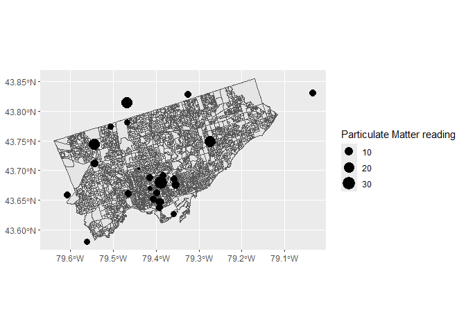
In order to perform accurate analyses on the data from the two different sources, it was imperative that they be projected to the same coordinate system. The functions and st_crs were used to project the sf object containing the PM 2.5 observations and the one containing the dissemination area polygons to WGS84 UTM Zone17N, which is ideal for data in Toronto. Figure shows the locations of PM 2.5 observations overlaid on a map of Toronto’s dissemination areas.
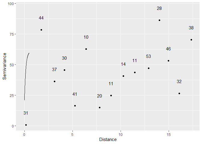
Dissemination areas within the Toronto metropolitan area (polygons) and locations of PM 2.5 observations (points)Air quality readings were taken at discrete points, where monitoring stations exist. This, however, does not render it eligible for point pattern data analysis, since the element of randomness involved is not in the location of the stations, but rather the observations taken there. Therefore, in order to obtain a measure of air quality for each dissemination area, the observations were interpolated to generate a spatially continuous field. Initially, kriging was the planned interpolation method, in order to gain a more accurate surface as well as a measure of the interpolation error. However, analysis of the observations’ semivariogram showed that it did not fit well with any of the theoretical variogram models, so kriging was not effective.
Emperical semivariogram of the PM 2.5 observations, and the best fitting theoretical variogram modelTile based methods of interpolation, i.e. inverse distance weighting (IDW) and k-point means, were then considered. IDW was selected over k-point means, as it was found to result in a smoother, more continuous surface. Additionally, since the pattern of observations is not regular, IDW better accounted for distance effects.
For IDW, the selection of the power,
The function idw from the spatstat package was utilized to interpolate the data, which required the sf object of observations to be converted to a ppp object.
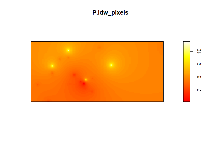
Continuous field resulting from IDW interpolation of PM 2.5 observationsThe output of idw was in the form of an im object, which is essentially a pixel image. This was converted to a sf object to be cohesive with the census data. In order to perform subsequent analyses, it was necessary to join the interpolated PM 2.5 values to the dissemination areas. This was done with the st_join function using the join type st_contains, between the centroids of the dissemination areas and the sf object of the interpolated field. Essentially, each centroid was assigned the PM 2.5 value of the closest ‘pixel’ in the interpolation field. These values were then added to the dissemination areas polygon object.
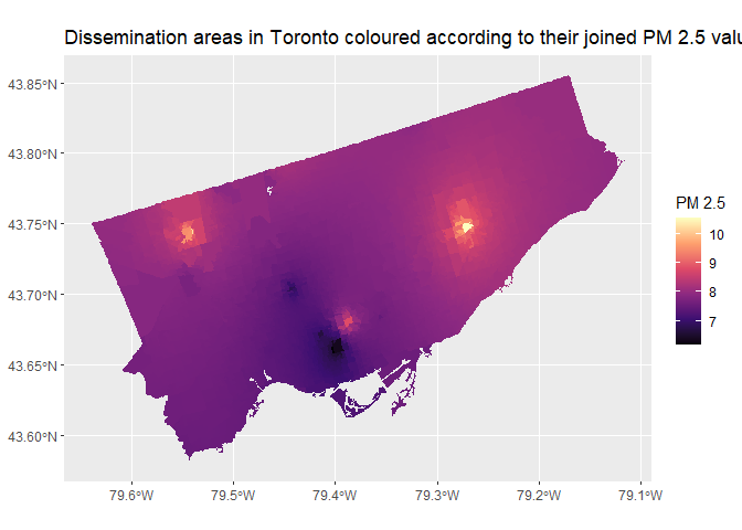 With the air quality
data interpolated, and a PM 2.5 value obtained for each dissemination
area, further exploration and analysis could now be carried out.
Firstly, exploratory analyses were conducted to gain a sense for overarching patterns in the data.
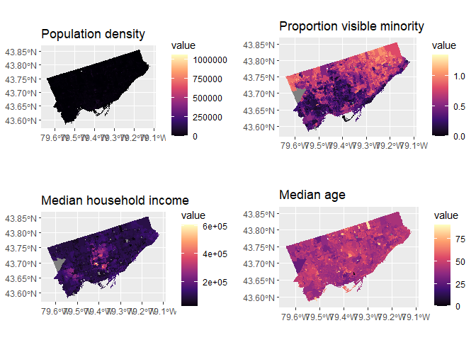
One approach to explore the data was to construct chloropleth maps for each covariate under investigation. Chloropleth maps allow for spatial trends in the data to be easily identified visually. Variables of count data, such as the number of people commuting by a particular method, were standardized in order to account for population differences between dissemination areas.
Chloropleth maps showing socioeconomic variables at the dissemination area level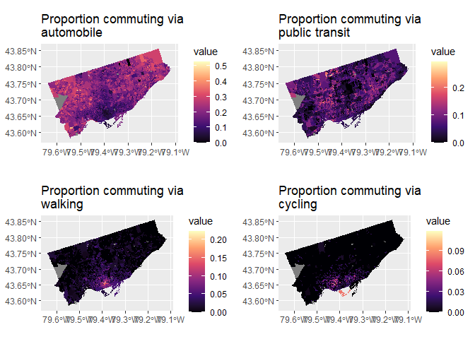 The above
choropleth maps show that the northern parts of Toronto have lower
median household incomes. Meanwhile, these areas also have higher
proportions of visible minority populations. Dissemination areas with a
high proportion of people who walk or cycle are noticeably concentrated
in the downtown area, indicating that there is more walkable and
cyclist-friendly infrastructure in these areas. On the other hand,
dissemination areas with a high proportion of automobile users tend to
be found near the edges of the city.
One other important descriptive statistic for inferring spatial patterns in data is Moran’s I. It gives an estimate of the spatial autocorrelation of a variable; that is, the presence of systematic spatial variation, or whether or not the value of the variable at an area is affected by the area’s location.
Using the function moran.test from the spdep package allows for a
hypothesis test of spatial autocorrelation to be conducted. Conducting
this test for the interpolated PM 2.5 data results in a p-value of less
than
A more meaningful analysis would be to run moran.test for each of the covariates under consideration, the results of which are shown below.
#>                                         Variable Moran_I   p_value
#> 1                             Population density  0.1229 < 2.2e-16
#> 2                        Median household income  0.5455 < 2.2e-16
#> 3                                     Median age  0.3055 < 2.2e-16
#> 4                    Proportion visible minority  0.7477 < 2.2e-16
#> 5            Proportion commuting via automobile  0.5567 < 2.2e-16
#> 6 Proportion commuting via public transportation   0.336 < 2.2e-16
#> 7               Proportion commuting via walking  0.5839 < 2.2e-16
#> 8               Proportion commuting via cycling  0.4099 < 2.2e-16
Each covariate has a significantly low p-value, meaning that they all exhibit significant spatial autocorrelation.
While these exploratory analyses do not directly relate to the principal research question, they do provide valuable insight into the behaviour of these covariates over the study area, and may indicate avenues for further research into the underlying processes that affect their distribution.
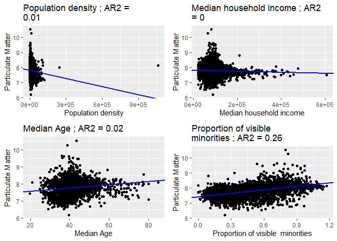
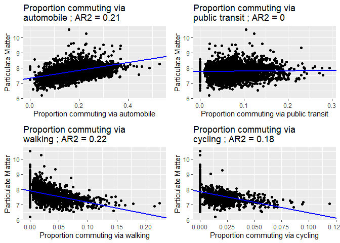
Linear regression is a powerful data analysis technique that estimates a model of a stochastic process. It posits linear relationships between a dependent variable (in this case, PM 2.5), and one or more covariates. Conducting linear regression between the PM 2.5 value and each covariate served as a means of estimating the strength of the relationship between the two variables and, therefore, providing insight into which variables have the most effect on particulate air pollution. The function lm was used to carry out this analysis, and the results are shown in the following figures.
Scatterplots of each socio-economic covariate vs PM 2.5, along with a trend line and adjusted R-squared value based on coefficients estimated from linear regression Scatterplots of each commuting-related covariate vs PM 2.5, along with a trend line and adjusted R-squared value based on coefficients estimated from linear regressionParticulate matter levels were regressed against several socio-economic factors. A positive relationship is seen between PM 2.5 and the covariates median age, proportion of visible minorities, and proportion commuting via automobile. As was seen above from the chloropleth maps, areas with high minority populations tend to align with those of lower income. The regression analysis suggests that visible minorities may live closer to polluting areas of the city, a pattern that reflects socioeconomic disadvantages that visible minority groups disproportionately face. Additionally, the findings suggest that increased usage of automobiles is a contributing factor to particulate air pollution. The positive relationship between PM 2.5 and age also suggests that elderly populations are increasingly subject to pollutants.
On the other hand, a negative relationship is observed between PM 2.5 and proportions commuting via walking and cycling. This indicates that, with increased walking and cycling, other factors that contribute to pollution are diminished, due to these methods of commuting being ones that do not release emissions.
The graphs also display the adjusted R-squared value for each model. This statistic provides a measure of the amount of variability in the data accounted for by the model, with higher values indicating a better fit. For the five variables mentioned above which seem to display significant relationships with PM 2.5, the adjusted R-squared values are relatively higher than those of the other covariates. Although the trendline for the population density graph seems to indicate a negative relationship, its low adjusted R-squared value also suggests that the model is not a good estimator of the underlying process.
To further investigate the relative strength of each’s covariate’s effect on PM 2.5, and their relative importance in predicting it, a linear regression model was created using all eight covariates. It was considered that this might result in a better fit than models involving only a single covariate, due to particulate matter levels being dependent on multiple factors. A summary of the regression analysis is shown below:
#>
#> Call:
#> lm(formula = P ~ population_density + minority_proportion + median_age +
#>     median_hh_income + automobile_prop + public_tr_prop + walking_prop +
#>     cycling_prop, data = toDAs.NAomit)
#>
#> Residuals:
#>      Min       1Q   Median       3Q      Max
#> -1.33640 -0.17765 -0.01834  0.16016  2.50336
#>
#> Coefficients:
#>                       Estimate Std. Error t value Pr(>|t|)
#> (Intercept)          7.051e+00  4.948e-02 142.520  < 2e-16 ***
#> population_density  -4.722e-07  2.383e-07  -1.981  0.04762 *
#> minority_proportion  6.684e-01  2.225e-02  30.039  < 2e-16 ***
#> median_age           7.913e-03  8.249e-04   9.593  < 2e-16 ***
#> median_hh_income     3.541e-07  1.250e-07   2.832  0.00465 **
#> automobile_prop      7.975e-01  8.085e-02   9.863  < 2e-16 ***
#> public_tr_prop      -4.072e-01  1.287e-01  -3.164  0.00157 **
#> walking_prop        -3.683e+00  2.314e-01 -15.914  < 2e-16 ***
#> cycling_prop        -5.215e+00  4.412e-01 -11.819  < 2e-16 ***
#> ---
#> Signif. codes:  0 '***' 0.001 '**' 0.01 '*' 0.05 '.' 0.1 ' ' 1
#>
#> Residual standard error: 0.29 on 3666 degrees of freedom
#> Multiple R-squared:  0.4841, Adjusted R-squared:  0.483
#> F-statistic:   430 on 8 and 3666 DF,  p-value: < 2.2e-16
It can be seen that the adjusted R-squared value is higher than those for the individual covariate models, indicating that a model that makes use of multiple covariates provides a better fit. Examining the p-values of the coefficients of each covariate allows it to be determined whether the covariate affects the dependent variable significantly (that is, whether the coefficient is significantly different from 0). It can be seen that the covariates with the lowest p-values are the same five ones identified earlier: median age, proportion of visible minorities, and proportions commuting via automobile, walking and cycling.
In an attempt to improve the model, linear regression analysis was conducted again, using only these five covariates. A summary of the results is shown below:
#>
#> Call:
#> lm(formula = P ~ minority_proportion + median_age + automobile_prop +
#>     walking_prop + cycling_prop, data = toDAs.NAomit)
#>
#> Residuals:
#>      Min       1Q   Median       3Q      Max
#> -1.32615 -0.17306 -0.01627  0.16371  2.49662
#>
#> Coefficients:
#>                       Estimate Std. Error t value Pr(>|t|)
#> (Intercept)          7.0361088  0.0415344  169.40   <2e-16 ***
#> minority_proportion  0.6154436  0.0200923   30.63   <2e-16 ***
#> median_age           0.0088286  0.0007926   11.14   <2e-16 ***
#> automobile_prop      0.8531586  0.0800063   10.66   <2e-16 ***
#> walking_prop        -3.8315499  0.2294299  -16.70   <2e-16 ***
#> cycling_prop        -5.3605210  0.4406873  -12.16   <2e-16 ***
#> ---
#> Signif. codes:  0 '***' 0.001 '**' 0.01 '*' 0.05 '.' 0.1 ' ' 1
#>
#> Residual standard error: 0.2912 on 3669 degrees of freedom
#> Multiple R-squared:  0.4795, Adjusted R-squared:  0.4788
#> F-statistic: 675.9 on 5 and 3669 DF,  p-value: < 2.2e-16
Despite using only the covariates with the lowest p-value, the adjusted R-squared value decreased slightly and the residual standard error increased, compared to the model using all covariates. This indicates that reducing the number of variables in the model does not in fact improve the fit. Therefore, for general prediction it might be best to use all 8 of the selected variables.
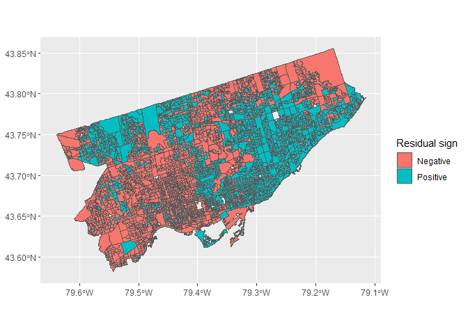
In order to determine whether this model captures all the underlying systematic spatial variation, the spatial autocorrelation of the model’s residuals was examined as a diagnostic.
Sign of the model’s residuals, indicating whether the model systematically over or under estimates the dependent variable in certain locationsAs can be seen from the plot, the model’s residuals seem to be spatially autocorrelated. To further confirm this result, moran.test was run on the residuals, resulting in a significantly small p-value. This indicates a violation of the model’s assumption of residual independence, and implies that there are other underlying processes behind the distribution of particulate matter levels that it does not account for. Further research could be conducted to remedy this, such as transforming the variables or using different methods such as trend surface analysis to conduct the analysis. Additionally, there may be other variables, socio-economic or not, which have an effect on PM 2.5 levels, and these could be investigated.
Overall, particulate air pollution levels and socioeconomic factors are found to be spatially autocorrelated. Positive relationships have been found between PM 2.5 and proportions of populations who commute via automobile, as well as between PM 2.5 and the median population age and the proportion of visible minorities. Negative relationships were found between PM 2.5 vs and proportions who commute via walking and cycling. These findings offer insight into demographic groups that might be disproportionately affected by air pollution. In addition, they reiterate the detrimental effect that automobile use has on air quality, and, consequently, the benefits to utilizing non-emitting methods of transportation.
As a result of these findings, it is recommended that the City of Toronto implements programs to encourage walking and cycling to reduce car use. To achieve this, future civil engineering should focus on being increasingly pedestrian-friendly, through means such as including more walkways and bike paths. Additionally, strategies should be developed to reduce the levels of pollutants that elderly residents and minorities are subject to, as it presents a clear health risk that could also have financial consequences.
Some recommendations for further studies are to improve the interpolation by including more data points which are evenly distributed across Toronto. More data points in areas of Toronto outside the downtown area, specifically on the north and east end, will be beneficial given that the focus of analysis is on the entire region of Toronto. For example, it could support a stronger variogram analysis with a better fitting semivariogram curve. Such an analysis could support a kriging analysis that provides a more reliable interpolation of air pollution across the city by minimizing standard error, variance, and capturing residual information.
Another recommendation would be to increase the time span the analysis is done on. By covering a greater time period, we can ensure the accuracy of results by accounting for variations in pollution not visible on a two-week approximate scale. These variations may result from fluctuations in polluting activities across time periods, seasonal changes, or other human/environmental factors.
Since the linear regression model generated in this project was shown to have spatially autocorrelated residuals, further research can be done into improving the model. This might involve further examination of the covariates and other diagnostics, as well as the inclusion of additional factors that might also play a role in particulate pollution.
Bivand, Roger. 2021. Spdep: Spatial Dependence: Weighting Schemes, Statistics. https://github.com/r-spatial/spdep/.
Bivand, Roger S., Edzer Pebesma, and Virgilio Gomez-Rubio. 2013a. Applied Spatial Data Analysis with R, Second Edition. Springer, NY. https://asdar-book.org/.
———. 2013b. Applied Spatial Data Analysis with R, Second Edition. Springer, NY. https://asdar-book.org/.
Bivand, Roger, Jakub Nowosad, and Robin Lovelace. 2020. spData: Datasets for Spatial Analysis. https://nowosad.github.io/spData/.
Bivand, Roger, and David W. S. Wong. 2018. “Comparing Implementations of Global and Local Indicators of Spatial Association.” TEST 27 (3): 716–48. https://doi.org/10.1007/s11749-018-0599-x.
Garnier, Simon. 2018a. Viridis: Default Color Maps from Matplotlib. https://github.com/sjmgarnier/viridis.
———. 2018b. viridisLite: Default Color Maps from Matplotlib (Lite Version). https://github.com/sjmgarnier/viridisLite.
Henry, Lionel, and Hadley Wickham. 2020. Purrr: Functional Programming Tools. https://CRAN.R-project.org/package=purrr.
Hlavac, Marek. 2018. Stargazer: Well-Formatted Regression and Summary Statistics Tables. https://CRAN.R-project.org/package=stargazer.
Hoek, Gerard, Rob Beelen, Kees De Hoogh, Danielle Vienneau, John Gulliver, Paul Fischer, and David Briggs. 2008. “A Review of Land-Use Regression Models to Assess Spatial Variation of Outdoor Air Pollution.” Atmospheric Environment 42 (33): 7561–78.
Jeworutzki, Sebastian. 2020. Cartogram: Create Cartograms with r. https://github.com/sjewo/cartogram.
Müller, Kirill, and Hadley Wickham. 2021. Tibble: Simple Data Frames. https://CRAN.R-project.org/package=tibble.
Pebesma, Edzer. 2018. “Simple Features for R: Standardized Support for Spatial Vector Data.” The R Journal 10 (1): 439–46. https://doi.org/10.32614/RJ-2018-009.
———. 2021. Sf: Simple Features for r. https://CRAN.R-project.org/package=sf.
Pebesma, Edzer J., and Roger S. Bivand. 2005. “Classes and Methods for Spatial Data in R.” R News 5 (2): 9–13. https://CRAN.R-project.org/doc/Rnews/.
Pebesma, Edzer, and Roger Bivand. 2021. Sp: Classes and Methods for Spatial Data. https://CRAN.R-project.org/package=sp.
R Core Team. 2021. R: A Language and Environment for Statistical Computing. Vienna, Austria: R Foundation for Statistical Computing. https://www.R-project.org/.
Rich, Steven, Andrew Ba Tran, and Aaron Williams. 2021. Arcos: Load ARCOS Prescription Data Prepared by the Washington Post. https://github.com/wpinvestigative/arcos.
Sievert, Carson. 2020. Interactive Web-Based Data Visualization with r, Plotly, and Shiny. Chapman; Hall/CRC. https://plotly-r.com.
Sievert, Carson, Chris Parmer, Toby Hocking, Scott Chamberlain, Karthik Ram, Marianne Corvellec, and Pedro Despouy. 2021. Plotly: Create Interactive Web Graphics via Plotly.js. https://CRAN.R-project.org/package=plotly.
Walker, Kyle. 2020. Tigris: Load Census TIGER/Line Shapefiles. https://github.com/walkerke/tigris.
Wickham, Hadley. 2016. Ggplot2: Elegant Graphics for Data Analysis. Springer-Verlag New York. https://ggplot2.tidyverse.org.
———. 2019a. Stringr: Simple, Consistent Wrappers for Common String Operations. https://CRAN.R-project.org/package=stringr.
———. 2019b. Tidyverse: Easily Install and Load the Tidyverse. https://CRAN.R-project.org/package=tidyverse.
———. 2021a. Forcats: Tools for Working with Categorical Variables (Factors). https://CRAN.R-project.org/package=forcats.
———. 2021b. Tidyr: Tidy Messy Data. https://CRAN.R-project.org/package=tidyr.
Wickham, Hadley, Mara Averick, Jennifer Bryan, Winston Chang, Lucy D’Agostino McGowan, Romain François, Garrett Grolemund, et al. 2019. “Welcome to the tidyverse.” Journal of Open Source Software 4 (43): 1686. https://doi.org/10.21105/joss.01686.
Wickham, Hadley, and Jennifer Bryan. 2019. Readxl: Read Excel Files. https://CRAN.R-project.org/package=readxl.
Wickham, Hadley, Winston Chang, Lionel Henry, Thomas Lin Pedersen, Kohske Takahashi, Claus Wilke, Kara Woo, Hiroaki Yutani, and Dewey Dunnington. 2020. Ggplot2: Create Elegant Data Visualisations Using the Grammar of Graphics. https://CRAN.R-project.org/package=ggplot2.
Wickham, Hadley, Romain François, Lionel Henry, and Kirill Müller. 2021. Dplyr: A Grammar of Data Manipulation. https://CRAN.R-project.org/package=dplyr.
Wickham, Hadley, and Jim Hester. 2020. Readr: Read Rectangular Text Data. https://CRAN.R-project.org/package=readr.
