
Storybook addon for Styled Components, Emotion, Material-UI and any other theming solution. Allows to develop themed components in isolation.
npm i --save-dev @react-theming/storybook-addon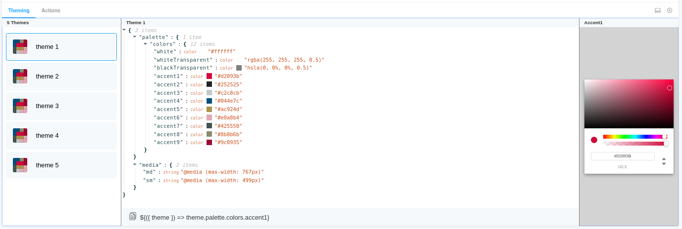
- Universal - can be used with any styling library
- Switching between themes from addon panel.
- Change a color and see how it affects to your components
- Easily copy-paste paths of nesting theme props into your code
- Auto changes background
- Supports dark Storybook theme
- Keep selected theme on stories updates
specify addon in .storybook/main.js
// .storybook/main.js

module.exports = {
  stories: ['../src/**/*.stories.js'],
  addons: ['@react-theming/storybook-addon'],
};
or in .storybook/addons.js for older versions of Storybook
import '@react-theming/storybook-addon/register';Then you'll need to add a decorator with a ThemeProvider of your library. This project is not related to any particular styling solutions, instead, you can use any of theme providers you're using in your project.
import ThemeProvider from 'library-of-your-choice';
import { withThemes } from '@react-theming/storybook-addon';
import { theme } from '../src/theme';

// create decorator
const themingDecorator = withThemes(ThemeProvider, [theme]);
ThemeProvider should accept a theme via theme props. This is usually the case for the most common styling libraries like Styled Components, Emotion, Material-UI.
In case of non standard ThemeProvider you can pass providerFn function in options:
const providerFn = ({ theme, children }) => {
  return <ThemeProvider theme={muTheme}>{children}</ThemeProvider>;
};

const themingDecorator = withThemes(null, [theme], { providerFn });
You can auto switch background for dark themes by passing onThemeSwitch function:
export const onThemeSwitch = context => {
  const { theme } = context;
  const background = theme.name === 'Dark theme' ? '#2c2f33' : 'white';
  const parameters = {
    backgrounds: {
      default: background,
    },
  };
  return {
    parameters,
  };
};

const themingDecorator = withThemes(null, [theme], { onThemeSwitch });
Below the use cases for most popular styling libraries:
// .storybook/preview.js

import { ThemeProvider } from 'emotion-theming';
import { addDecorator } from '@storybook/react';
import { withThemes } from '@react-theming/storybook-addon';

import { theme } from '../src/theme';

// pass ThemeProvider and array of your themes to decorator
addDecorator(withThemes(ThemeProvider, [theme]));// .storybook/preview.js
import { ThemeProvider } from 'styled-components';
import { addDecorator } from '@storybook/react';
import { withThemes } from '@react-theming/storybook-addon';
import { theme } from '../src/theme';
// pass ThemeProvider and array of your themes to decorator
addDecorator(withThemes(ThemeProvider, [theme]));// theme.js
import { red } from '@material-ui/core/colors';
// A custom theme for this app
const theme = {
palette: {
primary: {
main: '#556cd6',
},
secondary: {
main: '#19857b',
},
error: {
main: red.A400,
},
background: {
default: '#fff',
},
},
};
export default theme;// .storybook/preview.js
import { ThemeProvider } from '@material-ui/core';
import { createMuiTheme } from '@material-ui/core/styles';
import { addDecorator } from '@storybook/react';
import { withThemes } from '@react-theming/storybook-addon';
import theme from '../src/theme';
const providerFn = ({ theme, children }) => {
const muTheme = createMuiTheme(theme);
return <ThemeProvider theme={muTheme}>{children}</ThemeProvider>;
};
// pass ThemeProvider and array of your themes to decorator
addDecorator(withThemes(null, [theme], { providerFn }));// index.js
import React from 'react';
import ReactDOM from 'react-dom';
import { ThemeProvider } from '@material-ui/core/styles';
import { createMuiTheme } from '@material-ui/core/styles';
import App from './App';
import theme from './theme';
ReactDOM.render(
<ThemeProvider theme={createMuiTheme(theme)}>
<App />
</ThemeProvider>,
document.querySelector('#root'),
);There is an example app with CRA, Material-UI and Storybook Addon Demo Source