


A sliding sheet from the bottom of the screen with custom states build with SwiftUI.
There have been many different attempts to recreate the BottomSheet from Apple Maps, Shortcuts and Apple Music, because Apple unfortunately does not provide it in their SDK.
However, all previous attempts share a common problem: The height does not change in the different states. Thus, the BottomSheet is always the same size (e.g. 800px) and thus remains 800px, even if you only see e.g. 400px - the rest is inaccessible unless you pull the BottomSheet up to the very top.
There are also many implementations out there that only have 2 states - not 3 like e.g. Apple Maps.
- Dynamic height (works with
ScrollViewand every other view) - Fully customizable States (any number of states at any height)
- Many options for customization (backgroundBlur, tapToDismiss, swipeToDismiss, etc.)
- Very easy to use
- Support for SearchBar in the header
- Flick through feature
- Same behavior as Apple for the
.bottomposition - Beatuiful customizable animations
- iOS 13
- Swift 5.1
- Xcode 12
The preferred way of installing BottomSheet is via the Swift Package Manager.
Xcode 11 integrates with libSwiftPM to provide support for iOS, watchOS, and tvOS platforms.
- In Xcode, open your project and navigate to File → Swift Packages → Add Package Dependency...
- Paste the repository URL (
https://github.com/lucaszischka/BottomSheet) and click Next. - For Rules, select Branch (with branch set to
main). - Click Finish.
BottomSheet is available through CocoaPods. To install it, simply add the following line to your Podfile:
pod 'BottomSheetSwiftUI'WARNING: This is Sample Code for visualisation where and how to use, without a working initializer. Please see Examples for working code.
BottomSheet is similar to the built-in Sheet:
struct ContentView: View {

    @State var bottomSheetPosition: BottomSheetPosition = .middle //1

    var body: some View {

        Map() //2
            .bottomSheet() //3
    }
}
//1 The current State of the BottomSheet.
- This is any
enumthat conforms toCGFloat,CaseIterableandEquatable. For more information about custom enums see Custom States. - The following states are posible when using the predefinded
BottomSheetPosition:.hidden,.bottom,.middleand.top. - If you don't want the state to be changed, you can use
.constant(.middle)for example (should be used with the.notResizeableor.noDragIndicatoroption).
//2 The view which the BottomSheet overlays.
//3 This is how you add the BottomSheet - easy right?
.bottomSheet(
    bottomSheetPosition: Binding<BottomSheetPosition>,
    options: [BottomSheet.Options] = [],
    title: String? = nil,
    @ViewBuilder content: () -> mContent
)bottomSheetPosition: A binding that saves the current state of the BottomSheet.
- This can be any
enumthat conforms toCGFloat,CaseIterableandEquatable. For more information about custom enums see Custom States. - The following states are posible when using the predefinded
BottomSheetPosition:.hidden,.bottom,.middleand.top. - If you don't want the state to be changed, you can use
.constant(.middle)for example (should be used with the.notResizeableor.noDragIndicatoroption).
options: An array that contains the settings / options for the BottomSheet. For more information about the possible options see Options.
title: A string that is used as the title for the BottomSheet.
- Can be
nil. - You can use a view that is used as header content for the BottomSheet instead.
content: A view that is used as main content for the BottomSheet.
.bottomSheet(
    bottomSheetPosition: Binding<BottomSheetPosition>,
    options: [BottomSheet.Options] = [],
    @ViewBuilder headerContent: () -> hContent?,
    @ViewBuilder mainContent: () -> mContent
)bottomSheetPosition: A binding that saves the current state of the BottomSheet.
- This can be any
enumthat conforms toCGFloat,CaseIterableandEquatable. For more information about custom enums see Custom States. - The following states are posible when using the predefinded
BottomSheetPosition:.hidden,.bottom,.middleand.top. - If you don't want the state to be changed, you can use
.constant(.middle)for example (should be used with the.notResizeableor.noDragIndicatoroption).
options: An array that contains the settings / options for the BottomSheet. For more information about the possible options see Options.
headerContent: A view that is used as header content for the BottomSheet.
- Can be
nil. - You can use a string that is used as the title for the BottomSheet instead.
- Any view is possible - this can lead to problems if the view is too large. A label, a small picture or text is recommended
mainContent: A view that is used as main content for the BottomSheet.
.absolutePositionValue Allows absolute values in pixels to be used as BottomSheetPosition values.
.allowContentDrag Allows the BottomSheet to move when dragging the mainContent.
- Do not use if the mainContent is packed into a ScrollView.
.animation(Animation) Sets the animation for the BottomSheet.
.appleScrollBehavior The mainView is packed into a ScrollView, which can only scrolled at the .top position.
.background(() -> AnyView) Changes the background of the BottomSheet.
- Must be erased to AnyView.
.backgroundBlur(UIBlurEffect.Style = .systemThinMaterial) Enables and sets the blur effect of the background when pulling up the BottomSheet.
.cornerRadius(Double) Changes the corener radius of the BottomSheet.
.disableBottomSafeAreaInsets Disables the bottom safeAreaInsets.
.disableFlickThrough Disables the flick through feature.
.dragIndicatorColor(Color) Changes the color of the drag indicator.
.noBottomPosition Prevents the lowest value (above 0) from being the bottom position and hiding the mainContent.
.noDragIndicator Hides the drag indicator.
.notResizeable Hides the drag indicator and prevents the BottomSheet from being dragged.
.shadow(color: Color = Color(.sRGBLinear, white: 0, opacity: 0.33), radius: CGFloat = 10, x: CGFloat = 0, y: CGFloat = 0) Adds a shadow to the background of the BottomSheet.
.showCloseButton(action: () -> Void = {}) Shows a close button and declares an action to be performed when tapped.
-
If you tap on it, the BottomSheet and the keyboard always get dismissed.
-
If you want to do something extra, you have to declare it here.
.swipeToDismiss Dismisses the BottomSheet when swiped down.
.tapToDismiss Dismisses the BottomSheet when the background is tapped.
You can create your own custom BottomSheetPosition enum:
- The enum must be conforming to
CGFloat,CaseIterableandEquatable - The enum and case names doesnt matter
- The case/state with
rawValue == 0is hiding the BottomSheet - The value can be anythig between
0and1(x <= 1,x >= 0) or anything above0(x >= 0) when using the.absolutePositionValueoption - The value is the height of the BottomSheet propotional to the screen height (
1 == 100% == full screen) or the height of the BottomSheet in pixel (1 == 1px) when using the.absolutePositionValueoption - The lowest value (greater than 0) automaticly gets the
.bottombehavior. To prevent this please use the option.noBottomPosition
This BottomSheetPosition is provided and uses relative values:
public enum BottomSheetPosition: CGFloat, CaseIterable {
    case top = 0.975, middle = 0.4, bottom = 0.125, hidden = 0
}
This BottomSheetPositionAbsolute is provided and uses absolute values and requires the the.absolutePositionValue option:
public enum BottomSheetPositionAbsolute: CGFloat, CaseIterable {
    case top = 750, middle = 300, bottom = 100, hidden = 0
}
This CustomBottomSheetPosition is an example for a custom BottomSheetPosition with relative values:
public enum CustomBottomSheetPosition: CGFloat, CaseIterable {
    case middle = 0.5, hidden = 0
}PLEASE NOTE: When installed via Cocoapods, please keep in mind that the pod is called BottomSheetSwiftUI and not BottomSheet; so please use import BottomSheetSwiftUI instead.
This BottomSheet shows additional information about a book.
You can close it by swiping it away, by tapping on the background or the close button.
The drag indicator is hidden.
It uses a custom enum for the states with absolute values, since only the states .middle, .bottom and .hidden should exist with a predefined absolute height.

Source Code
import SwiftUI
import BottomSheet

//The custom BottomSheetPosition enum with absolute values.
enum BookBottomSheetPosition: CGFloat, CaseIterable {
    case middle = 325, bottom = 125, hidden = 0
}

struct BookDetailView: View {

    @State var bottomSheetPosition: BookBottomSheetPosition = .middle

    let backgroundColors: [Color] = [Color(red: 0.2, green: 0.85, blue: 0.7), Color(red: 0.13, green: 0.55, blue: 0.45)]
    let readMoreColors: [Color] = [Color(red: 0.70, green: 0.22, blue: 0.22), Color(red: 1, green: 0.32, blue: 0.32)]
    let bookmarkColors: [Color] = [Color(red: 0.28, green: 0.28, blue: 0.53), Color(red: 0.44, green: 0.44, blue: 0.83)]

    var body: some View {
        //A green gradient as a background that ignores the safe area.
        LinearGradient(gradient: Gradient(colors: self.backgroundColors), startPoint: .topLeading, endPoint: .bottomTrailing)
            .edgesIgnoringSafeArea(.all)

            .bottomSheet(bottomSheetPosition: self.$bottomSheetPosition, options: [.noDragIndicator, .allowContentDrag, .showCloseButton(), .swipeToDismiss, .tapToDismiss, .absolutePositionValue], headerContent: {
                //The name of the book as the heading and the author as the subtitle with a divider.
                VStack(alignment: .leading) {
                    Text("Wuthering Heights")
                        .font(.title).bold()

                    Text("by Emily Brontë")
                        .font(.subheadline).foregroundColor(.secondary)

                    Divider()
                        .padding(.trailing, -30)
                }
            }) {
                //A short introduction to the book, with a "Read More" button and a "Bookmark" button.
                VStack(spacing: 0) {
                    Text("This tumultuous tale of life in a bleak farmhouse on the Yorkshire moors is a popular set text for GCSE and A-level English study, but away from the demands of the classroom it’s easier to enjoy its drama and intensity. Populated largely by characters whose inability to control their own emotions...")
                        .fixedSize(horizontal: false, vertical: true)

                    HStack {
                        Button(action: {}, label: {
                            Text("Read More")
                                .padding(.horizontal)
                        })
                        .buttonStyle(BookButton(colors: self.readMoreColors)).clipShape(Capsule())

                        Spacer()

                        Button(action: {}, label: {
                            Image(systemName: "bookmark")
                        })
                        .buttonStyle(BookButton(colors: self.bookmarkColors)).clipShape(Circle())
                    }
                    .padding(.top)

                    Spacer(minLength: 0)
                }
                .padding([.horizontal, .top])
            }
    }
}

//The gradient ButtonStyle.
struct BookButton: ButtonStyle {

    let colors: [Color]

    func makeBody(configuration: Configuration) -> some View {
        configuration.label
            .font(.headline)
            .foregroundColor(.white)
            .padding()
            .background(LinearGradient(gradient: Gradient(colors: self.colors), startPoint: .topLeading, endPoint: .bottomTrailing))
    }
}This BottomSheet shows nouns which can be filtered by searching.
It adopts the scrolling behavior of apple, so that you can only scroll the ScrollView in the .top position.
The higher the BottomSheet is dragged, the more blurry the background becomes (with the BlurEffect .dark) to move the focus to the BottomSheet.

Source Code
import SwiftUI
import BottomSheet

struct WordSearchView: View {

    @State var bottomSheetPosition: BottomSheetPosition = .middle
    @State var searchText: String = ""

    let backgroundColors: [Color] = [Color(red: 0.28, green: 0.28, blue: 0.53), Color(red: 1, green: 0.69, blue: 0.26)]
    let words: [String] = ["birthday", "pancake", "expansion", "brick", "bushes", "coal", "calendar", "home", "pig", "bath", "reading", "cellar", "knot", "year", "ink"]

    var filteredWords: [String] {
        self.words.filter({ $0.contains(self.searchText.lowercased()) || self.searchText.isEmpty })
    }


    var body: some View {
        //A green gradient as a background that ignores the safe area.
        LinearGradient(gradient: Gradient(colors: self.backgroundColors), startPoint: .topLeading, endPoint: .bottomTrailing)
            .edgesIgnoringSafeArea(.all)

            .bottomSheet(bottomSheetPosition: self.$bottomSheetPosition, options: [.appleScrollBehavior, .backgroundBlur(effect: .dark)], headerContent: {
                //A SearchBar as headerContent.
                HStack {
                    Image(systemName: "magnifyingglass")
                    TextField("Search", text: self.$searchText)
                }
                .foregroundColor(Color(UIColor.secondaryLabel))
                .padding(.vertical, 8)
                .padding(.horizontal, 5)
                .background(RoundedRectangle(cornerRadius: 10).fill(Color(UIColor.quaternaryLabel)))
                .padding(.bottom)
                //When you tap the SearchBar, the BottomSheet moves to the .top position to make room for the keyboard.
                .onTapGesture {
                    self.bottomSheetPosition = .top
                }
            }) {
            //The list of nouns that will be filtered by the searchText.
                ForEach(self.filteredWords, id: \.self) { word in
                    Text(word)
                        .font(.title)
                        .padding([.leading, .bottom])
                        .frame(maxWidth: .infinity, alignment: .leading)
                }
                .frame(maxWidth: .infinity, alignment: .leading)
                .transition(.opacity)
                .animation(.easeInOut, value: self.filteredWords)
                .padding(.top)
            }
    }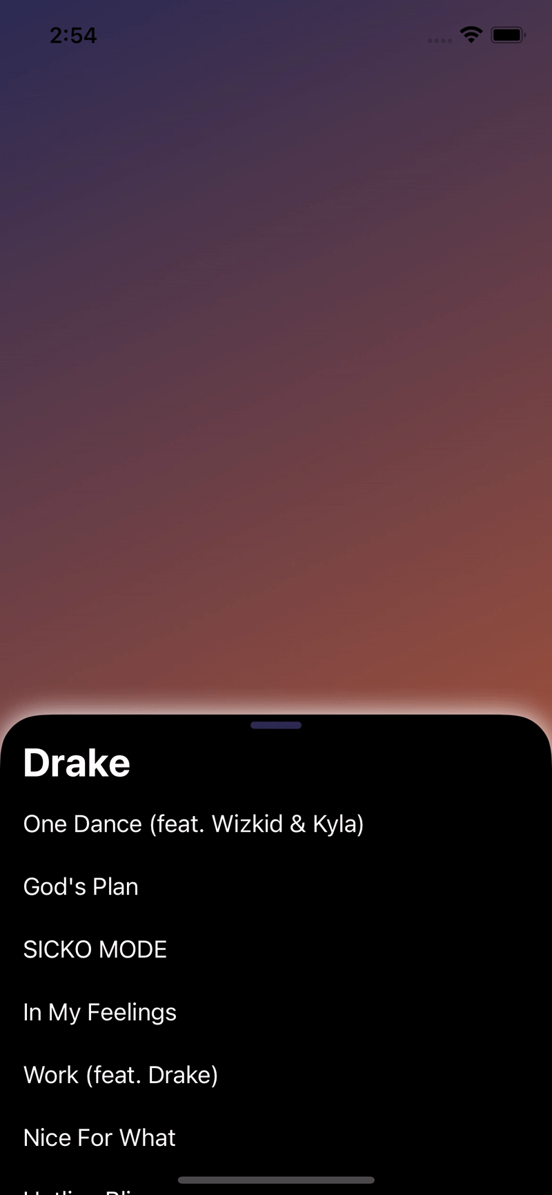
}This BottomSheet shows the most popular songs by an artist. It has a custom animation and color for the drag indicator and the background, as well as it deactivates the bottom position behavior and uses an custom corner radius and shadow.
Source Code
import SwiftUI
import BottomSheet

struct ArtistSongsView: View {

    @State var bottomSheetPosition: BottomSheetPosition = .middle

    let backgroundColors: [Color] = [Color(red: 0.17, green: 0.17, blue: 0.33), Color(red: 0.80, green: 0.38, blue: 0.2)]
    let songs: [String] = ["One Dance (feat. Wizkid & Kyla)", "God's Plan", "SICKO MODE", "In My Feelings", "Work (feat. Drake)", "Nice For What", "Hotline Bling", "Too Good (feat. Rihanna)", "Life Is Good (feat. Drake)"]

    var body: some View {
        //A green gradient as a background that ignores the safe area.
        LinearGradient(gradient: Gradient(colors: self.backgroundColors), startPoint: .topLeading, endPoint: .bottomTrailing)
            .edgesIgnoringSafeArea(.all)

            .bottomSheet(bottomSheetPosition: self.$bottomSheetPosition, options: [.animation(.linear.speed(0.4)), .dragIndicatorColor(Color(red: 0.17, green: 0.17, blue: 0.33)), .background({ AnyView(Color.black) }), .noBottomPosition, .cornerRadius(30), .shadow(color: .white)], title: "Drake") {
                //The list of the most popular songs of the artist.
                ScrollView {
                    ForEach(self.songs, id: \.self) { song in
                        Text(song)
                            .frame(maxWidth: .infinity, alignment: .leading)
                            .padding([.leading, .bottom])
                    }
                }
            }
            .foregroundColor(.white)
    }
}BottomSheet welcomes contributions in the form of GitHub issues and pull-requests.
BottomSheet is available under the MIT license. See the LICENSE file for more information.
BottomSheet is a project of @lucaszischka.