An Android library that takes the standard Android Toast to the next level with many styling options that gives your app and user experience an extra unique feeling! Style your Toast either by code or in styles.xml!
- Style toasts in a styles.xml or from code.
- Set background color of the toast.
- Set the corner radius of the toast for different shapes.
- Set the transparency of your toast.
- Set a stroke color and width of your toast.
- Style the toast text with a text color or bold effect.
- Set a custom font for the toast text.
- Set a icon next to the toast text.
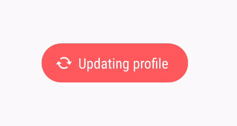
- Set an spinning animation effect on your icon (see below example)
- Works from Api 16+
- IMPORTANT Replaced constructor initialisation with builder pattern!
- Support for RTL when icons is used.
- Added a
getStyleableToast()method. - Made default values so user don't have to type every value manually.
- Improved synchronization when using both Styles.xml and code together to style a toast.
- Refactoring of methods and comments and simplified codes.

1) Style your toast in styles.xml. All available attributes:
    <style name="MyToast">
    <item name="android:textColor"></item>
    <item name="android:textStyle"></item> only bold!
    <item name="android:fontFamily"></item> For custom fonts just add the path -> fonts/myfont.ttf
    <item name="android:colorBackground"></item>
    <item name="android:strokeWidth"></item>   API 21+
    <item name="android:strokeColor"></item>   API 21+
    <item name="android:radius"></item>  radius for corners of the toast shape
    <item name="android:alpha"></item>   value between 0-255 where 255 is full solid
    <item name="android:icon">/</item>  drawable id of the icon. R.drawable.xx
    </style>
2) Pass your style in the static constructor and call show(); and you're done!
StyleableToast.makeText(context, "Hello World!", Toast.LENGTH_LONG, R.style.StyledToast).show(); st = new StyleableToast
.Builder(this)
.text("Hello world!")
.textColor(Color.WHITE)
.backgroundColor(Color.BLUE)
.build();Add the depedency in your build.gradle. The library is distributed via jCenter
dependencies {
    compile 'com.muddzdev:styleabletoast:1.0.9'
}Copyright 2017 Muddii Walid (Muddz)
Licensed under the Apache License, Version 2.0 (the "License");
you may not use this file except in compliance with the License.
You may obtain a copy of the License at
http://www.apache.org/licenses/LICENSE-2.0
Unless required by applicable law or agreed to in writing, software
distributed under the License is distributed on an "AS IS" BASIS,
WITHOUT WARRANTIES OR CONDITIONS OF ANY KIND, either express or implied.
See the License for the specific language governing permissions and
limitations under the License.