Since the first marathon in 1896, there have been many of them all around the world. We will analyze different finishing times and how they relate to the associated spatial and temporal information about them.
In a nod to Greek history, the first marathon in 1896 commemorated the run of the soldier Pheidippides from a battlefield near the town of Marathon, Greece, to Athens in 490 B.C. with a distance of approximately 25 miles. Later, for the 1908 London Olympics, a 26-mile course was laid out from Windsor Castle to White City stadium. An extra 385 yards was added inside the stadium to position the finish line in front of the royal family's viewing box.
Despite the success of the 1908 race, it took 13 more years of debate before the International Amateur Athletic Federation (IAAF) adopted the 26.2-mile distance as the official marathon. Today, there are more than 500 organized marathons in 64 countries around the world each year, with more than 425,000 marathon finishers in the United States alone.
Eric J. Allen published an article on marathon runners and they have shared much of the data that we will use. The data has close to 10 million observations.
Describe the finishing times and how they relate to the associated spatial and temporal information about the marathon. You will look at the individual marathon runners and the marathons themselves. We have been asked to create a short story that describes marathons that could be published in a local newspaper the week before a marathon is to be held in the community.
Data sources available at sources folder in this repository. We will need to use more than one of the data sets provided but not expected all of them.
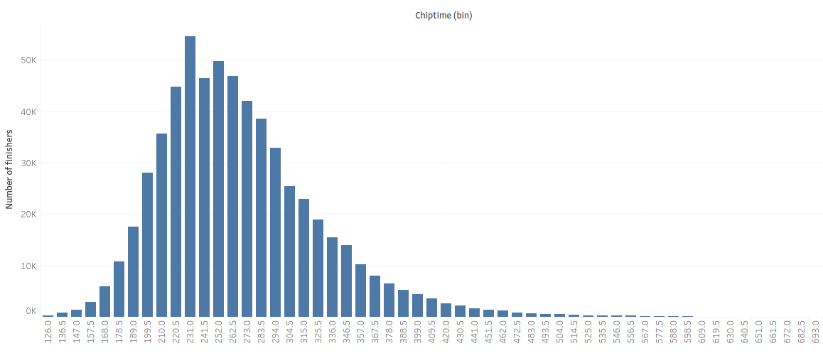
The following chart will provide us an example of normal distribution, by showing the total of finishers with the corresponding chiptime. We can observe the “bell curve” of the chart, which suggests that despite finishing through different years, with different contexts, people have a similar chiptime. The data near the mean are more frequent in occurrence than data far from the mean which will result in this curve.
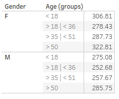
This table shows that both women and men have a stronger physical condition when they are over 18 years old, once they get to the 36 years old, men lose a little amount of that condition,but women lose a significant amount, resulting in finishing the marathons in a greater amount ofminutes. Both women and men lose a significant amount of physical strength once they areolder than 50 years old.
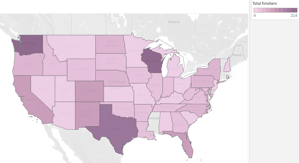
There have been many Marathon runners in the US, but not at all of them have finished the challenge. Let’s look at how many of them finished the New York marathon by State in the last few years. Washington and Wisconsin have the most finishers, with 214 and 203, Texas and other states are behind them, but there are other states like Mississippi and Maine that don’t appear in the map yet.
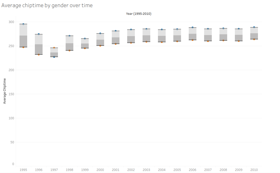
This chart will show that since 1995 to 2010, the average chip time of the NYC marathon is lower for men than for women, except for 1997 where the average chip time for women was lower than for men.