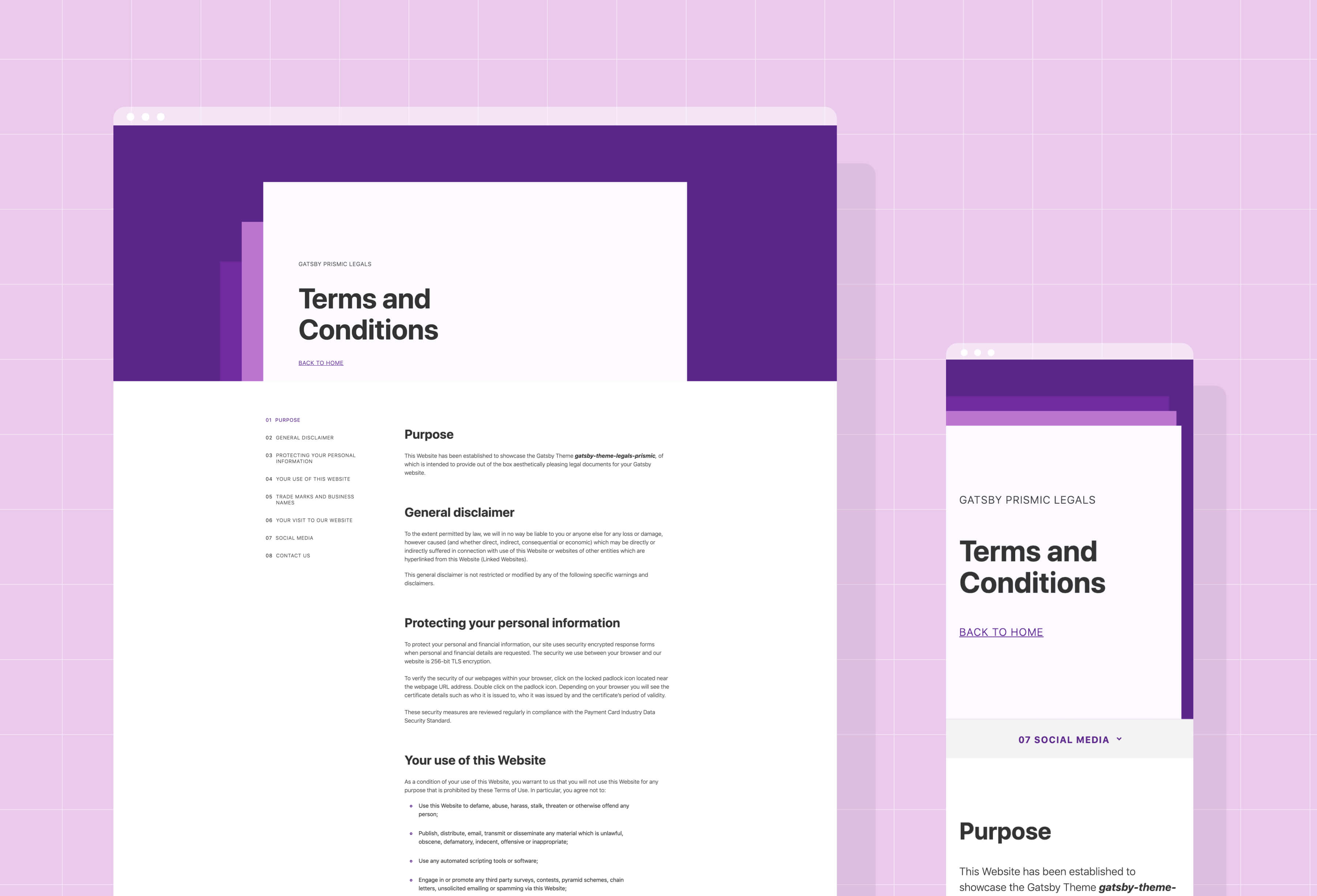
- Gatsby Theme for adding polished legal pages 💅out-of-the-box.
- Responsive across Mobiles 📱, Tablets 💊 and Desktops 🖥️
- Customisable to your brand using Theme UI 🎨
- Builds legal pages sourced from content in Prismic
- Demo at https://gatsby-theme-legals.netlify.com/
- Made by Little & Big
Legal pages are probably the most unexciting part of your site, and the last place you want to expend your creative energy.
The purpose of gatsby-theme-legals is to do the heavy lifting for you. Super polished, responsive legal pages that you can just plug onto your existing project.
yarn add @littleplusbig/gatsby-theme-legals-prismic
In your gatsby-config.js, under plugins add:
{
  resolve: "gatsby-theme-legals-prismic",
  options: {
    repositoryName: PRISMIC_REPO_NAME,
    accessToken: PRISMIC_API_KEY,
    siteName: YOUR_SITE_NAME // (Optional)
    homePath: HOME_PATH // (Optional) Defaults to '/'
  },
},
Replacing PRISMIC_REPO_NAME and PRISMIC_API_KEY with their respective values.
- Create a new custom type in your Prismic repository.
- Make sure that it is repeatable and name it
Legal. - Using the JSON Editor paste in the following content structure:
{
  "Main": {
    "page_name": {
      "type": "StructuredText",
      "config": {
        "single": "heading1",
        "label": "Page Name",
        "placeholder": "Privacy Policy"
      }
    },
    "uid": {
      "type": "UID",
      "config": {
        "label": "Slug",
        "placeholder": "privacy-policy"
      }
    },
    "sections": {
      "type": "Group",
      "config": {
        "fields": {
          "section_heading": {
            "type": "StructuredText",
            "config": {
              "single": "heading2",
              "label": "Section Heading",
              "placeholder": "General information"
            }
          },
          "content": {
            "type": "StructuredText",
            "config": {
              "multi": "paragraph, preformatted, heading3, strong, em, hyperlink, list-item, o-list-item, o-list-item",
              "allowTargetBlank": true,
              "label": "Content",
              "placeholder": "Information on this website is of a general nature. Our company has ..."
            }
          }
        },
        "label": "Sections"
      }
    }
  }
}
- Create one or more
LegalContent pages, each with 1 or more sections.
If you don't already have a Privacy Policy or Terms and Conditions document, you can generate one at Iubenda.
This project uses theme-ui, allowing some of the styling to be customised to your project's brand.
In order to override the styles, in the src directory of your project, add a folder titled gatsby-plugin-theme-ui, and within that folder a file named index.js.
Inside of this file (your-gatsby-project/src/gatsby-plugin-theme-ui/index.js) add the following:
import merge from 'lodash.merge';
import { theme } from '@littleplusbig/gatsby-theme-legals-prismic';

export default merge({}, theme, {
  fonts: {
    body: "-apple-system, BlinkMacSystemFont, Segoe UI, Roboto, sans-serif",
    heading: "-apple-system, BlinkMacSystemFont, Segoe UI, Roboto, sans-serif",
  },
  colors: {
    text: "#333333",
    background: "#FFFFFF",
    primary: "#5B2589",
    primaryLighter: "#6F2B9F",
    primaryEvenLighter: "#BB75D1",
    offWhite: "#FCFAFF",
    offBlack: "#333333",
    grey: "#F3F3F3",
  },
});
Above are the default values for the theme, which you can change depending on your project.
In particular, the colours accenting each legal page are controlled by primary, primaryLighter and primaryEvenLighter.
This uses lodash.merge, so you'll need to add that package to your project:
yarn add lodash.merge
Every time you override the theme, you'll need to restart your Gatsby project's dev server.
The components that make up the legal pages can be some what customised too. This can be done through concept new to Gatsby Themes called 'Component Shadowing'.
If you wish to override a component, in the src directory of your project, create the following directory structure: @littleplusbig/gatsby-theme-legals-prismic/components.
There are several components that a legal page, they can all be viewed here: gatsby-theme-legals-prismic/src/components
An example of how these components might be customised is adding your project's <Header /> and <Footer /> components to the layout.
In order to do this I create a shadowing layout.js in the directory we've just created (your-gatsby-project/src/@littleplusbig/gatsby-theme-legals-prismic/components/layout.js):
import React from 'react';
import { Header, Footer } from '../../somewhere-in-your-project'

export default ({ children }) => (
  <>
    <Header />
    {children}
    <Footer />
  </>
);
Soon my friend, soon.