
According to this data, the age of the universe is 13.773 billion years old. This is -0.187% off from the accepted value of 13.799 billion years old.
Data was taken from HyperLeda, using the command: SELECT objname, mod0, vgsr WHERE mod0 IS NOT NULL, basically taking all the distance vs. velocity data they had available (4240 galaxies). After doing a quick conversion from Distance Modulus to Megaparsecs (1 Megaparsec = 3.086x10^19 km), here's what the plot looks like:
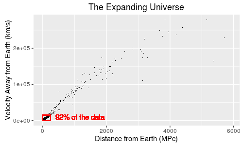
Hmm. This doesn't look too good. There's a huge cluster towards the origin, and a lot of sparse data and outliers on the extremes. This could really screw with our final value. Let's cut the extreme data out and just focus inside the red box I highlighted:
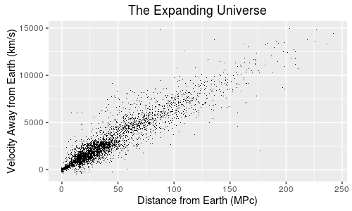
This looks much better. The cluster is a lot more even, and there are fewer (if any) outliers. Our total galaxy count is now 3908, still 92% of our data. The data range is x<=250, y<=15000. This is the set we'll use for our calculation on the age of the universe.
Find it odd that the further the galaxies are from you, the faster they're moving away from you? If you have objects moving away from you at a speed proportional to their distance from you, then there must have been some kind of explosion that took place before. Take, for instance, the following diagram, which is simulated using the program in the other folder:
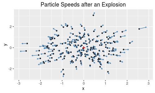
From this plot, you can intuitively figure two things:
- The further the particle is away from the center, the faster it's moving away from the center.
- If you were to go back in time, and tally up the speeds from each particle into the opposite direction of where they're currently moving, you'd see that they would all converge to a single point.
Here's what it looks like when these particles are plotted as speed vs. distance:
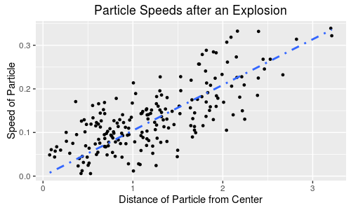
Both these plots, by the way, would look similar if you chose any point on this plot as the center.
As we know from physics, velocity times time equals distance (d = v*t). If we convert to a consistent set of units, divide distance (km) over velocity (km/s), we get time (s). A simple regression line works if you switch x and y (set the intercept to 0); the slope will be time in seconds. Convert into years, and, with this data, we get 13.77 billion years. That's pretty close.
- Tools: The data was compiled with R, and graphed in ggplot2.
- Source: HyperLeda, using the command:
SELECT objname, mod0, vgsr WHERE mod0 IS NOT NULL

Animated Hertzsprung-Russell Diagram with 119,614 data points. The Hertzsprung–Russell diagram, abbreviated H–R diagram, is a scatter plot of stars showing the relationship between the stars' absolute magnitudes or luminosities versus their stellar classifications or effective temperatures. More simply, it plots each star on a graph measuring the star's brightness against its temperature (color). It does not map any locations of stars.
Depending on its initial mass, every star goes through specific evolutionary stages dictated by its internal structure and how it produces energy. Each of these stages corresponds to a change in the temperature and luminosity of the star, which can be seen to move to different regions on the HR diagram as it evolves. This reveals the true power of the HR diagram – astronomers can know a star’s internal structure and evolutionary stage simply by determining its position in the diagram.

- 1.The main sequence stretching from the upper left (hot, luminous stars) to the bottom right (cool, faint stars) dominates the HR diagram. It is here that stars spend about 90% of their lives burning hydrogen into helium in their cores. Main sequence stars have a Morgan-Keenan luminosity class labelled V.
- 2.Red giant and supergiant stars (luminosity classes I through III) occupy the region above the main sequence. They have low surface temperatures and high luminosities which, according to the Stefan-Boltzmann law, means they also have large radii. Stars enter this evolutionary stage once they have exhausted the hydrogen fuel in their cores and have started to burn helium and other heavier elements.
- 3.White dwarf stars (luminosity class D) are the final evolutionary stage of low to intermediate mass stars, and are found in the bottom left of the HR diagram. These stars are very hot but have low luminosities due to their small size.
If you're going to play with this:
- Make sure you have ImageMagick installed
- the last line is optimized to work with unix-like systems (Linux/Mac, basically). If you have Windows, replace it with
DEL star_anim*.png - make sure the second line has the correct working directory under
setwd().
- The HYG database
More info on H-R Diagrams from Wikipedia
- ggplot2
- Rstudio
Inspired by this thread, I wanted to make the following changes:
- Expand to the full data set.
- Update the data set to most recent number provided.
- Create and provide an automated script in R to crunch new data as it comes in.
- Remove moving average, add aesthetic changes

- Source: http://www.sidc.be/silso/INFO/sndtotcsv.php
- Tools: R/ggplot2