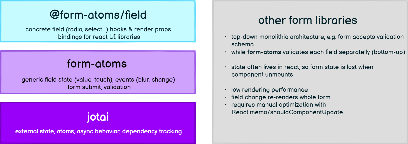
Declarative & headless form fields build on top of jotai & form-atoms.
yarn add jotai form-atoms @form-atoms/field


form-atoms is the 'last-mile' of your app's form stack. It has layered, bottom-up architecture with clear separation of concerns.
We provide you with stable pre-fabricated UI fields, while you still can go one level down and take the advantage of form primitives to develop anything you need.
To contrast it with formik or react-hook-form, our form state thanks to jotai lives outside of the react tree, so you never lose it when the component unmounts.
Moreover, jotai's external state unlike redux-form has compact API with 'atom-local reducer' and automatic dependency tracking leading to unmatched rendering performance.
Some libraries use path.to.field approach with field-dependent validation or when reading field at other place. We don't need such paths, as fields can be moved arround in regular JavaScript variables, as they are jotai atoms in reality.
With others libraries you often lose form state when your component or page unmounts. Thats because the rendered form hook maintains the store. If the library provides a contextual API, you can opt-in into the persistence, so form state lives even when you unmount the form.
form-atoms on the other hand keeps the form state until you clear it, because it lives in jotai atoms. This way, you don't have to warn users about data loss if they navigate out of filled & unsubmitted form. Instead you can display 'continue where you left off' message when they return to the form.
When implementing forms, there are subtle details which you must likely implement yourself. For example you might need to implement a placeholder for a select, a clickable label which focuses the respective input, or a custom indicator whether the input is required or optional.
We take care of these details in atomic 'low-level' components like PlaceholderOption, FieldLabel and RequirementIndicator respectively.
With other form libraries you might find yourself repeatedly wiring them into recurring scenarios like checkbox multi select or radio group. We've created highly reusable generic components which integrate the native components. For example to select a value of generic type you can use the generic RadioGroup or Select.
To select multiple values (array of values) you can use the generic CheckboxGroup or MultiSelect
Lastly to capture a list of objects, you will find the ListField handy.
Checkout our Storybook docs and for additional primitives see the form-atoms docs.
For well-known field types we export data type specific fieldAtom constructors. These come with
pre-defined empty value of undefined and a specific zod validation schema.
Similarly to zod schema fields, by default all the fieldAtoms are required.
import { numberField, stringField, Select } from "@form-atoms/field";
import { fromAtom, useForm } from "form-atoms";
import { z } from "zod";
import { NumberField } from "@form-atoms/flowbite"; // or /chakra-ui

const height = numberField();
const age = numberField({ schema: z.number().min(18) }); // override default schema
const character = stringField().optional(); // make field optional

const personForm = formAtom({ height, age, character });

export const Form = () => {
  const { submit } = useForm(personForm);

  return (
    <form onSubmit={submit(console.log)}>
      <NumberField field={height} label="Height (in cm)" />
      <NumberField field={age} label="Your age (min 18)" />
      <Select
        field={character}
        label="Character"
        options={["the good", "the bad", "the ugly"]}
        getValue={(option) => option}
        getLabel={(option) => option}
      />
    </form>
  );
};@form-atoms/field comes pre-wired to popular UI libraries:
| 📦Package | 🎨 Storybook | About |
|---|---|---|
| flowbite | Flowbite Fields | Bindigs to Tailwind component library Flowbite |
| chakra-ui | ChakraUI Fields | Bindings to CSS-in-JS library Chakra UI |
