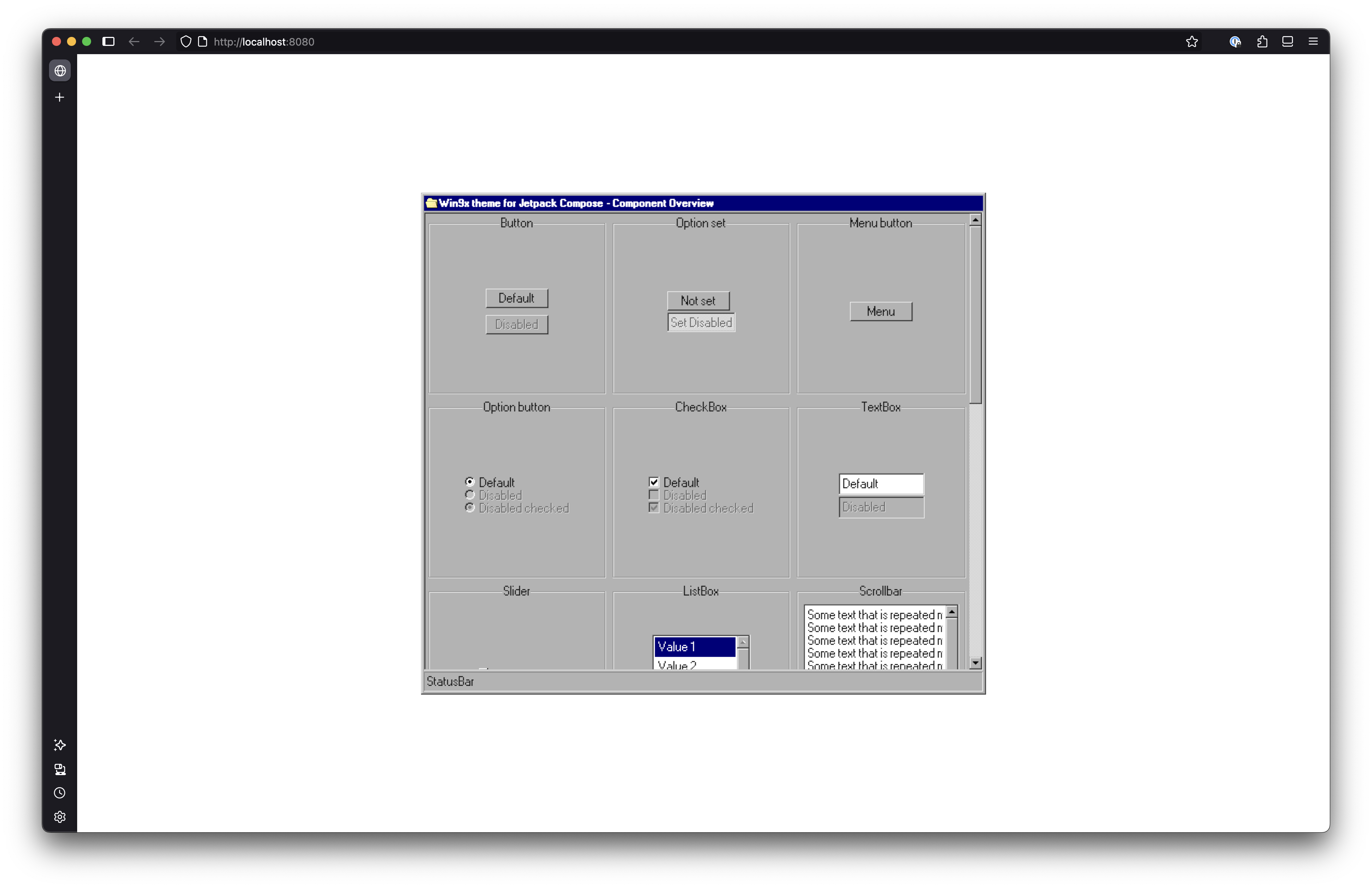
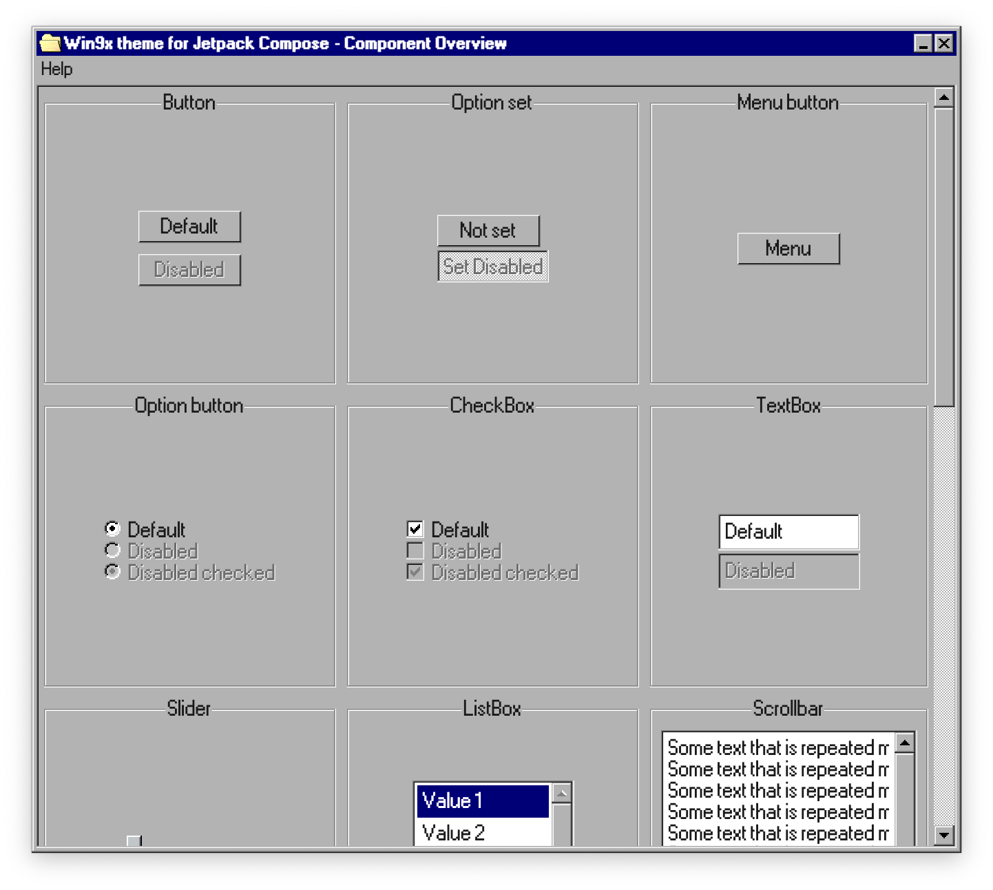
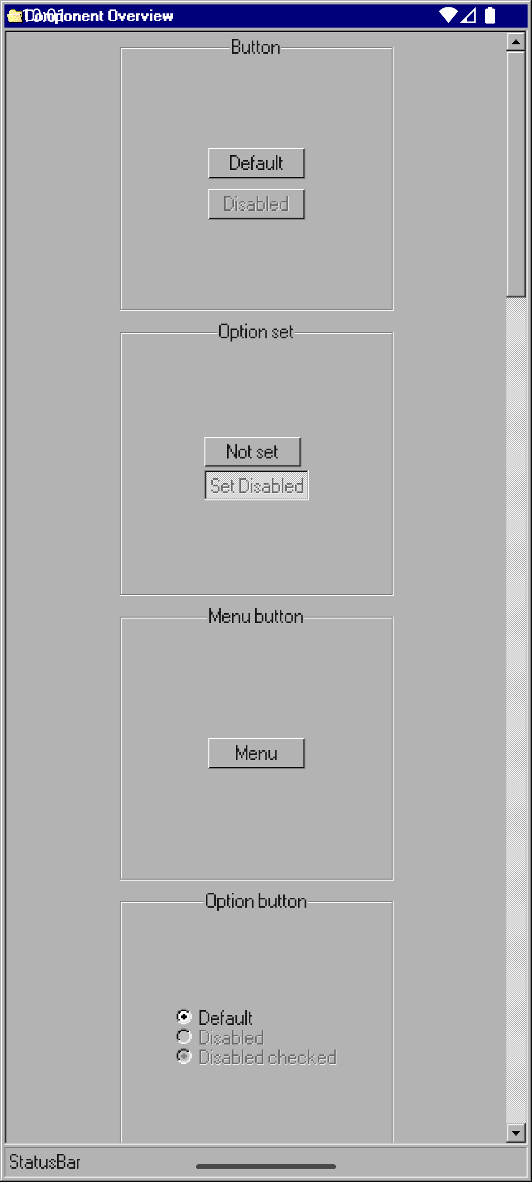
Welcome to Win9x Theme for Jetpack Compose UI, a distinctive and self-contained theme engineered exclusively for Jetpack Compose UI. This project diverges from the standard Material Design paradigm by offering a comprehensive suite of custom-built components that are intricately woven from Jetpack Compose primitives.
- Standalone Components: Each component is independently designed, eliminating dependencies on the Material Design theme, and ensuring extensive customization options.
- Multiplatform Compatibility: With targets set for JVM, Android, and JSWasm, the theme is prepared for versatile deployment across various platforms. However, the primary emphasis is on the JVM target, with iOS compatibility forthcoming.
- Development Stage: Currently in its pre-release stage, the project acknowledges that it may include breaking changes until reaching version 1.0.0. Early adopters are encouraged to experiment and offer valuable feedback.
For a glimpse of the win9x-theme library in action, visit the live JSWasm demo
at http://win9x-compose.ncaj.nl/. Please note that the JSWasm demo is experimental and does not
fully represent the capabilities of the JVM target.
| JS Wasm | JVM |
 |
 |
| Android | |
 |
Integration into a Jetpack Compose project is straightforward:
First, you need to add the repository that hosts the win9x-theme library to your
project's build.gradle.kts file. Replace VERSION with the current version of the library.
Make sure you configure authentication properly.
repositories {
    maven(url = "https://maven.pkg.github.com/nassendelft/compose-win9x-theme")
}Next, add the win9x-theme library as a dependency in your module's build.gradle file:
dependencies {
    implementation("nl.ncaj.theme.win9x:win9x-theme:VERSION")
}After adding the repository and dependency, sync your project with the Gradle files. This will download the library and make it available for use in your project.
Now, you can import and use the win9x-theme library in your Kotlin code:
import androidx.compose.ui.window.application
import nl.ncaj.theme.win9x.Win9xTheme
import nl.ncaj.theme.win9x.controls.Window

fun main() = application {
    Win9xTheme {
        Window(
            title = "Win9x theme for Jetpack Compose",
            onCloseRequested = ::exitApplication,
        ) {
            // your content
        }
    }
}The Button control represents a clickable button that triggers an action when interacted with.
Usage example:
Button(onClick = { /* Handle click */ }) {
    Text("Click Me")
}An OptionSet is a collection of mutually exclusive options, rendered as radio buttons
Usage example:
var set by remember { mutableStateOf(false) }
OptionSetButton(set, onSetChanged = { set = it })A MenuButton displays a menu when clicked, allowing users to select from multiple options.
Usage example:
MenuButton(
    menu = {
        label("Command") {}
        divider()
        cascade("Check Box") {
            label("Command") {}
        }
    }
) {
    Text("Menu")
}An OptionButton is a toggleable button that can represent a binary choice, such as on/off states.
Usage example:
var checked by remember { mutableStateOf(true) }
OptionButton(checked = checked, onCheckChange = { checked = it }) {
    Text("Default")
}A CheckBox allows users to select one or more items from a set.
Usage example:
var checked by remember { mutableStateOf(true) }
Checkbox(checked = checked, onCheckChange = { checked = it }) {
    Text("Default")
}A TextBox is an input field where users can enter text.
Usage example:
var text by remember { mutableStateOf("Default") }
TextBox(text, onValueChange = { text = it })A Slider is a control that lets users select a value from a continuous range by moving a slider thumb.
Usage example:
Slider(steps = 4, onStep = { })A ListBox presents a list of selectable items, often used for dropdown menus or lists of options.
Usage example:
 var selection by remember { mutableIntStateOf(0) }
ListBox {
    item {
        DropDownListBoxItem(
            label = "Value 1",
            onSelected = { selection = 0 },
            selected = selection == 0
        )
    }
    item {
        DropDownListBoxItem(
            label = "Value 2 (Disabled)",
            enabled = false,
            onSelected = { selection = 1 },
            selected = selection == 1
        )
    }
}A Scrollbar provides a visual indication of the scrollable content's position and size relative to the viewport.
Usage example:
val scrollState = rememberScrollState()
Box(Modifier.size(50.dp)) {
    Text(
        text = "Some text that is repeated multiple times\n".repeat(15),
        modifier = Modifier.verticalScroll(scrollState)
    )
    VerticalScrollBar(scrollState = scrollState)
}A SpinBox is an input control that allows users to increase or decrease a value using up and down arrows.
Usage example:
val decimalRegex = """[^0-9]""".toRegex()
var value by remember { mutableIntStateOf(1) }

SpinBox(
    value.toString(),
    onValueChange = {
        value = decimalRegex.replace(it, "").takeIf { it.isNotBlank() }?.toInt() ?: 0
    },
    onIncrease = { value++ },
    onDecrease = { value-- },
)A TreeView displays hierarchical data in a tree structure, with expandable and collapsible nodes.
Usage example:
TreeView(
    collapsable = true,
    showRelationship = true,
) {
    item { Item("Value 1") }
    item { Item("Value 2", enabled = false) }
    item(
        content = { Item("Value 3") },
        children = {
            item { Item("Value 3.1") }
            item { Item("Value 3.2") }
        }
    )
}
Tabs organize content into separate views which users can switch between.
Usage example:
var selectedTabIndex by remember { mutableIntStateOf(1) }
TabHost(
    selectedTabIndex = selectedTabIndex,
    onTabSelected = { selectedTabIndex = it },
    tabs = { for (i in 0..2) tab { Text("Tab ${i + 1}") } },
    content = {
        Text(text = "Tab selected: ${selectedTabIndex + 1}")
    },
)A ProgressIndicator visually indicates the progress of a long-running operation.
Usage example:
ProgressIndicator(progress = 0.5f)A DropdownListBox is a list box that appears as a dropdown menu when activated.
Usage example:
var expanded by remember { mutableStateOf(false) }
var currentValue by remember { mutableStateOf("Value") }
DropDownListBox(
    text = currentValue,
    expanded = expanded,
    onExpandChange = { expanded = it },
) {
    item { DropDownListBoxItem(text = "Value", onSelection = { currentValue = "Value" }) }
    item { DropDownListBoxItem(text = "Value (disabled)", onSelection = { }, enabled = false) }
}A ComboBox combines a text box with a drop-down list, allowing users to either type a value directly or choose from the list.
Usage example:
var value by remember { mutableStateOf("") }
Column {
    TextBox(value = value, onValueChange = { value = it }, modifier = Modifier.fillMaxWidth())
    ListBox {
        listOf("Value 1", "Value 2", "Value 3").forEach {
            item {
                DropDownListBoxItem(
                    label = it,
                    onSelected = { value = it },
                    selected = value == it
                )
            }
        }
    }
}A DropDownComboBox is similar to a ComboBox, but it always shows the drop-down list, even when not focused.
Usage example:
var value by remember { mutableStateOf("") }
DropDownComboBox(
    value = value,
    onValueChange = { value = it }
) {
    listOf("Value 1", "Value 2", "Value 3").forEach {
        item {
            DropDownListBoxItem(
                label = it,
                onSelected = { value = it },
                selected = value == it
            )
        }
    }
}
For more detailed information and examples, please refer to the source code of the win9x-theme library.
Contributions from the community are warmly welcomed! To share ideas, report bugs, or propose enhancements, simply open an issue or contribute via a pull request.
The project is governed by the GPLv3 License.