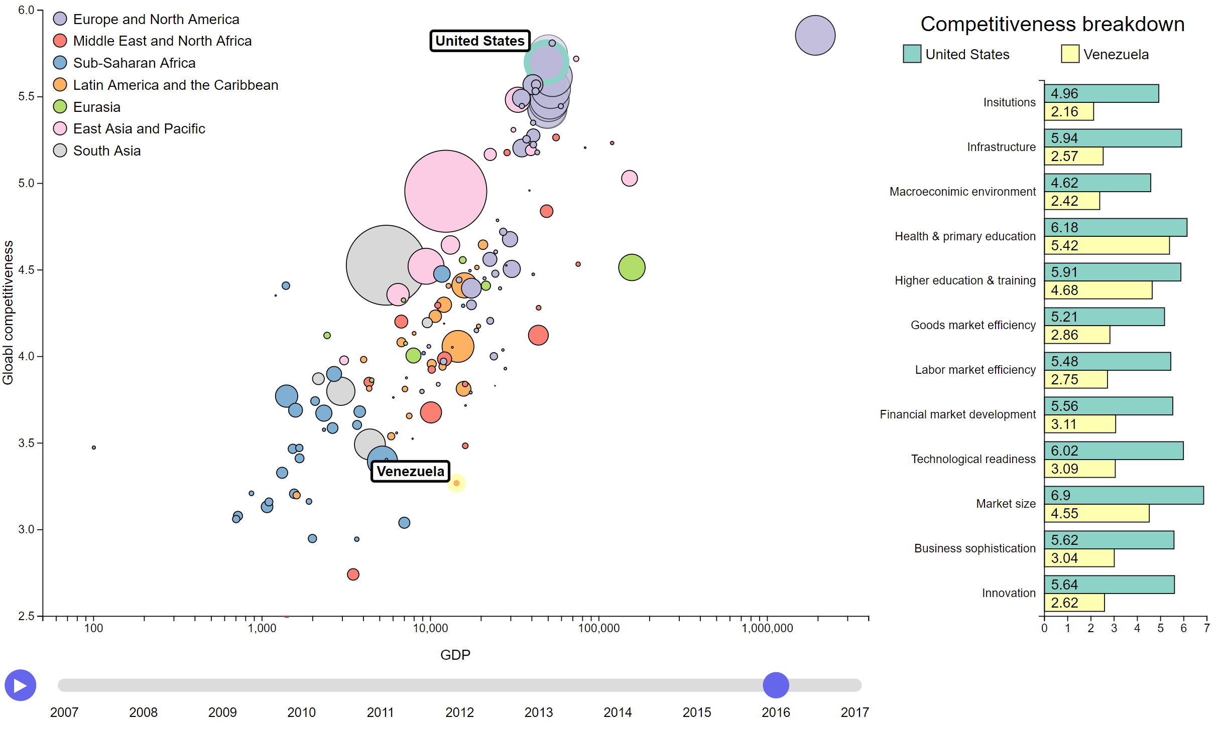
An implementation of Hans Rosling Gapminder world visualization. This project is part of the UCD information visualization class.
A live demo can be viewed here.
This visualization consists out of multiple elements. The first visualization is the bubble plot where every bubble represents a country, its x-position the gdp, its y-position the global competitiveness, the area the population and the color the region on earth. Bubbles always have a border to separate countries from the same region at the same position. The z-index of all bubbles is ordered by their population to avoid smaller countries being occluded by bigger ones. A legend for the regions is provided in the top left corner since no bubble happens to move there throughout the years. The x-axis is in logarithmic scale to spread the countries more evenly across the available space. Hovering over a country displays its name and two help lines, one for each axis, to ease the reading of values, the appropriate values are written to the axes. While hovered all other bubbles have reduced opacity to highlight the hovered. Clicking on a bubble adds the country to the selection, at most two countries can be selected at any time. Selected countries have their name always displayed and are assigned a special border color. Additionally, the most recently selected country has all its data visualized in extra bubbles. These bubbles appear in chronological order to quickly indicate their order, i.e. the most recent year pops up last. Hovering over these has the same effect has hovering over countries. Name labels are drawn to the top left of a bubble to avoid the cursor to occlude the label and have a white background in a black-bordered box to increase readability.
The second visualization displays individual components of the global competitiveness index for every selected country in a vertical bar chart. A vertical bar chart is used instead of a horizontal one to better use the available space and due to the long names for every category. The bars have the same color as the borders of the selected bubbles to ease identification. Every bar also features its value written inside the pillar to ease the reading of values. A legend is provided at the top of the bar plot.
If a country misses an entry in the provided data file, it is removed from the visualization for that year. If values are missing from an entry, they are linearly interpolated between the closest two entries with values. If an entry at one of the ends misses data, they are copied from the closest entry.
The last two elements are control elements. The first one is a list of all countries ordered by name where the user can select countries instead of finding their bubble.
The last control element features a play-button and a timeline. The timeline supports the selection of a specific year by clicking on the correct timepoint as well as dragging. Pressing the play-button leads to an automatic playback of all years starting from the current year to 2017. If the current year is 2017 it starts from start. If the playback reaches 2017 it pauses. During playback the user can pause the playback by selecting any year or pressing the button again.
