A quick end-to-end exploration of a simple Machine Learning project.
While I had previously investigated Machine Learning and Data Cleaning, the opportunity to follow along and experience an ML project from end to end seemed like a great way to gain perspective on what actually happens in a simple project.
The sequence of events is as follows:
- Install Python and the SciPy platform
- Load the Iris dataset
- Summarize the dataset
- Visualize the dataset
- Evaluate some algorithms
- Make some predictions
I had previously done most of these things - with the exception of 5 (evaluating different algorithms), which was thus of particular interest.
The contents are as follows:
- Prerequisites
- Data
- Data Summarized
- Data Visualized
- Evaluate Algorithms
- Make Predictions
- Versions
- Concepts
- Seaborn
- Reference
- To Do
- Credits
Either Python 2 or Python 3 is required, as well as
a copy of pip (either pip for Python 2 or pip3 for
Python 3).
Install the required libraries as follows:
$ pip install --user -r requirements.txt
[I never recommend Global installation. Replace with pip3 for Python 3.]
Find the installed versions by running python versions.py as shown:
$ python versions.py
Python: 2.7.12 (default, Nov 12 2018, 14:36:49)
[GCC 5.4.0 20160609]
scipy: 0.17.0
numpy: 1.14.0
matplotlib: 2.0.2
pandas: 0.20.3
sklearn: 0.20.0
seaborn: 0.9.0
$We will use the well-known Iris data set, which I previously used in my Iris exercise.
[There we accessed the data set via sklearn's load_iris convenience method.]
This data set should be available at:
http://archive.ics.uci.edu/ml/datasets/Iris
My experience has been that data sets, as well as software libraries, tend to experience drift over time. Accordingly, in order to try to replicate the published results as closely as possible, I downloaded the data set from the author's published version.
As this is a well-known data set, we will not need to do any data cleaning (which would generally be a considerable time-sink in any ML exercise).
Likewise, we will check for any missing data points (there aren't any, but it is probably always a good practice to check for data completeness).
The summarization part of the output should look as follows:
$ python iris.py
Rows, columns = (150, 5)

The first 20 observations
-------------------------
    sepal-length  sepal-width  petal-length  petal-width        class
0            5.1          3.5           1.4          0.2  Iris-setosa
1            4.9          3.0           1.4          0.2  Iris-setosa
2            4.7          3.2           1.3          0.2  Iris-setosa
3            4.6          3.1           1.5          0.2  Iris-setosa
4            5.0          3.6           1.4          0.2  Iris-setosa
5            5.4          3.9           1.7          0.4  Iris-setosa
6            4.6          3.4           1.4          0.3  Iris-setosa
7            5.0          3.4           1.5          0.2  Iris-setosa
8            4.4          2.9           1.4          0.2  Iris-setosa
9            4.9          3.1           1.5          0.1  Iris-setosa
10           5.4          3.7           1.5          0.2  Iris-setosa
11           4.8          3.4           1.6          0.2  Iris-setosa
12           4.8          3.0           1.4          0.1  Iris-setosa
13           4.3          3.0           1.1          0.1  Iris-setosa
14           5.8          4.0           1.2          0.2  Iris-setosa
15           5.7          4.4           1.5          0.4  Iris-setosa
16           5.4          3.9           1.3          0.4  Iris-setosa
17           5.1          3.5           1.4          0.3  Iris-setosa
18           5.7          3.8           1.7          0.3  Iris-setosa
19           5.1          3.8           1.5          0.3  Iris-setosa

Missing Data
------------
sepal-length    0
sepal-width     0
petal-length    0
petal-width     0
class           0
dtype: int64

Statistics
----------
       sepal-length  sepal-width  petal-length  petal-width
count    150.000000   150.000000    150.000000   150.000000
mean       5.843333     3.054000      3.758667     1.198667
std        0.828066     0.433594      1.764420     0.763161
min        4.300000     2.000000      1.000000     0.100000
25%        5.100000     2.800000      1.600000     0.300000
50%        5.800000     3.000000      4.350000     1.300000
75%        6.400000     3.300000      5.100000     1.800000
max        7.900000     4.400000      6.900000     2.500000

Class Observations
------------------
class
Iris-setosa        50
Iris-versicolor    50
Iris-virginica     50
dtype: int64

...We will start with univariate plots and then proceed to multivariate plots.
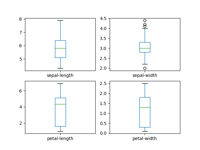
The box-and-whisker plots should look as follows:
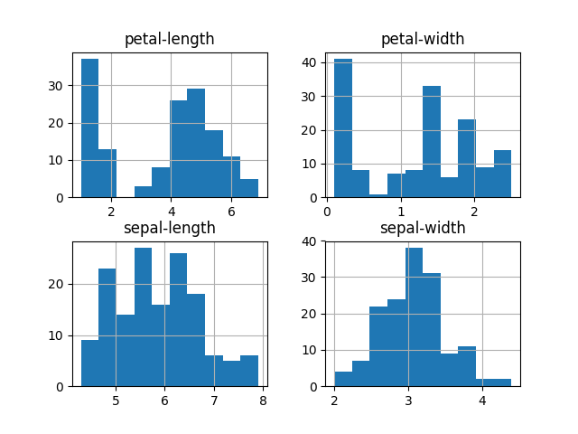
The histograms should look as follows:
[Possibly the sepal-length and sepal-width follow a normal (or gaussian) distribution, although the small sample size makes it hard to be too conclusive.]
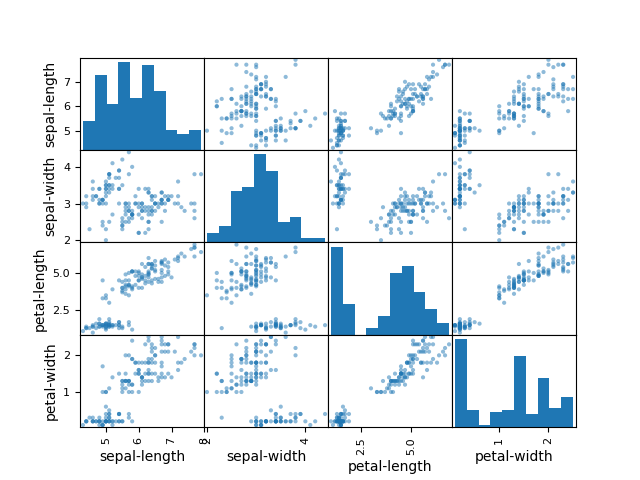
The scatter-plot matrix should look as follows:
[Note that the diagonal from top-left to bottom-right shows our histograms, although in a different order than we saw them before.]
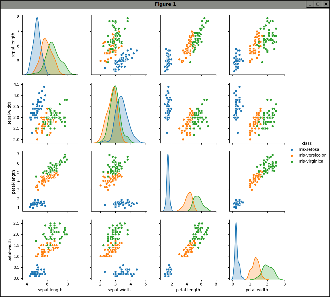
We can obtain even more useful results using Seaborn:
Here we can see that petal-length and petal-width are distributed
differently for our various Iris categories.
This corresponds with the results obtained in my Iris exercise:
Almost every ML paper these days has a table contrasting the accuracy of different algorithms, so let's follow that pattern.
[I listened to an interview with Geoffrey Hinton where he bemoaned this fact. In his opinion, what is really needed is new and original thinking, rather than small tweaks to well-established methods. However, it is still necessary to evaluate methods based upon some criteria, so why not compare against competing methods?]
According to the tutorial, the results should have been as follows:
LR: 0.966667 (0.040825)
LDA: 0.975000 (0.038188)
KNN: 0.983333 (0.033333)
CART: 0.975000 (0.038188)
NB: 0.975000 (0.053359)
SVM: 0.981667 (0.025000)
Along with some deprecation warnings, only CART and SVM differed.
I got:
CART: 0.966667 (0.040825)
SVM: 0.991667 (0.025000)
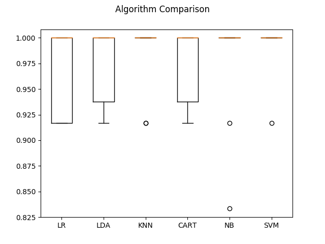
The final comparison looked as follows:
[This diagram looks somewhat different than in the tutorial, but the overall results seem to be about the same. Note that the KNN, NB and SVM boxes are squashed up at 100 percent accuracy.]
Extrapolate a trend, make a recommendation, the goal is to make some sort of prediction.
According to the tutorial, results should have been as follows:
0.9

[[ 7  0  0]
 [ 0 11  1]
 [ 0  2  9]]

             precision    recall  f1-score   support

Iris-setosa       1.00      1.00      1.00         7
Iris-versicolor   0.85      0.92      0.88        12
Iris-virginica    0.90      0.82      0.86        11

avg / total       0.90      0.90      0.90        30
The first 0.9 indicates 90 percent accuracy.
Instead of the final "avg / total" line I got the following:
      micro avg       0.90      0.90      0.90        30
      macro avg       0.92      0.91      0.91        30
   weighted avg       0.90      0.90      0.90        30
[Seems to be the same apart from the "macro avg".]
- Python 2.7.12
[The tutorial also covered Python 3, but I used Python 2]
- matplotlib 2.0.2
- numpy 1.14.0
- pandas 0.20.3
- scipy 0.17.0
- seaborn 0.9.0
- sklearn 0.20.0
This tutorial reminded me of some concepts, which are listed below.
These are a type of univariate plot, much like a Probability Density Function.
If I have understood things correctly, the green line should indicate the second quartile (the median). Of course, in the tutorial, the corresponding line was red (rather than green as mine shows).
Outliers (see sepal-width) show as circles (although in the tutorial, they show as + symbols).
Wikipedia has a great diagram showing Box-and-whisker plots contrasted with Probability Density Functions:
When creating multivariate visualizations, colour becomes important.
Seaborn offers a number of great palettes and is worth installing for this fact alone.
Of course, it is also possible to do something much like this with matplotlib but seaborn makes it simpler.
For help in visualizing any installed color schemes, check out my No More Blue repo.
read_csv
http://pandas.pydata.org/pandas-docs/stable/generated/pandas.read_csv.html
box-and-whisker plots
http://en.wikipedia.org/wiki/Box_plot
Seaborn scatter plot
http://seaborn.pydata.org/examples/scatterplot_matrix.html
- Add check for missing data points
- Add Snyk.io vulnerability scanning
- Fix annoying
sklearndeprecation warnings - Investigate naming figures with
matplotlib.pyplot - Add notes on using
seabornfor multivariate visualizations - Verify code conforms to
pylint,pycodestyleandpydocstyle - 12-Factor everything (validation segment size, seeds, test splits)
- Investigate populating missing data and/or Dora
I followed this excellent tutorial:
http://machinelearningmastery.com/machine-learning-in-python-step-by-step/
While I already had experience with all of the individual steps, it was nice to see them in an end-to-end format.
Box-and-whisker plots contrasted with Probability Density Function:
http://upload.wikimedia.org/wikipedia/commons/1/1a/Boxplot_vs_PDF.svg
How to produce a better scatter plot from this StackOverflow question:
http://stackoverflow.com/questions/22943894/class-labels-in-pandas-scattermatrix
