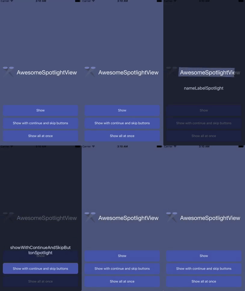
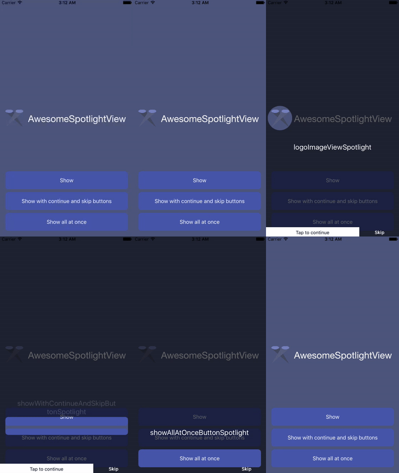
AwesomeSpotlightView is a nice and simple libriary for iOS written on Swift 3. It's highly customizable and easy-to-use tool. Works perfectly for tutorial or coach in your app.
To run the example project, clone the repo, and run pod install from the Example directory first.
AwesomeSpotlightView is available through CocoaPods. To install it, simply add the following line to your Podfile:
pod 'AwesomeSpotlightView', '~> 0.1.4'- Just drop AwesomeSpotlightView folder in your project.
- You're ready to use AwesomeSpotlightView!
override func viewDidLoad() {
    super.viewDidLoad()
    let spotlight1 = AwesomeSpotlight(withRect: CGRect(x: 75, y: 75, width: 100, height: 100), shape: .circle, text: "spotlight1", isAllowPassTouchesThroughSpotlight: true)
    let spotlight2 = AwesomeSpotlight(withRect: CGRect(x: 20, y: 200, width: 130, height: 25), shape: .rectangle, text: "spotlight2")
    let spotlight3 = AwesomeSpotlight(withRect: CGRect(x: 170, y: 50, width: 30, height: 100), shape: .roundRectangle, text: "spotlight3")

    let spotlightView = AwesomeSpotlightView(frame: view.frame, spotlight: [spotlight1, spotlight2, spotlight3])
    spotlightView.cutoutRadius = 8
    spotlightView.delegate = self
    view.addSubview(spotlightView)
    spotlightView.start()
}
You can configure AwesomeSpotlightView before you present it using the start method. For example:
spotlightView.enableContinueLabel = false
spotlightView.enableSkipButton = false
spotlightView.showAllSpotlightsAtOnce = false
spotlightView.start()The rect of spotlight.
Shape of spotlight: .Rectangle, .RoundRectangle, .Circle.
Margin for cutout shape. You can set extra space for item with this property.
Set true if you want to allow pass touches through spotlight (allow interaction with view below spotlight) (default: false).
The text of the caption.
The attributed text of the caption.
Modify the spotlights.
The color of the mask (default: 0,0,0 alpha 0.6).
Transition animation duration to the next coach mark (default: 0.3).
The cutout rectangle radius (default: 4.0).
The captions label is set to have a max width of 280px. Number of lines is figured out automatically based on caption contents.
Define how far the captions label appears above or below the cutout (default: 35px).
'Tap to continue' label pops up by default to guide the user at the first spotlight (default: false).
'Skip' label pops up by default to guide the user at the first spotlight (default: false).
Icon with Arrow showed between caption text and caption (default: false).
Fond of caption text label (default: UIFont.systemFont(ofSize: 20.0)).
Fond of continue label (default: UIFont.systemFont(ofSize: 13.0)).
Fond of skip button (default: UIFont.boldSystemFont(ofSize: 13.0)).
Showed all spotlight at once (at the same time) (default: false).
class ViewController: UIViewController, AwesomeSpotlightViewDelegate
spotlightView.delegate = self
Note: All of the methods are optional. Implement only those that are needed.
func spotlightView(_ spotlightView: AwesomeSpotlightView, willNavigateToIndex index: Int)func spotlightView(_ spotlightView: AwesomeSpotlightView, didNavigateToIndex index: Int)func spotlightViewWillCleanup(_ spotlightView: AwesomeSpotlightView, atIndex index: Int)func spotlightViewDidCleanup(_ spotlightView: AwesomeSpotlightView)


