NOTE: This module is NOT under active development. Check out this fork for a version that is being actively updated.
A React Storybook addon to show documentation generated with docgen.
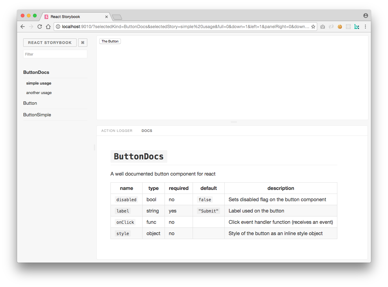
Install the following module: NOTE: This module will move to NPM once API has stabilized
npm i -D mihalik/react-storybook-addon-docgenCreate an addons.js file within your storybook config directory:
import '@kadira/storybook/addons';
import 'react-storybook-addon-docgen/register';
Then add a decorator to your stories.
storiesOf('ButtonSimple')
  .addDecorator(docs())
  .add(
    'simple usage',
    () => <ButtonSimple label="The Button" onClick={action('onClick')} />,
  );
Have a look at this example stories to see the example usage.
If you are using react native storybook and this addon doesn't work for you, it means that your .babelrc file is missing plugin.
"plugins": [
    ["react-docgen", { "DOC_GEN_COLLECTION_NAME": "STORYBOOK_REACT_CLASSES"}]
  ]
Also add global.STORYBOOK_REACT_CLASSES = {}; somewhere in begging of your code
My component name is undefined or props are not displaying
This addon is using the full information from react-docgen. Look at that project for some examples on documenting components. When creating components, set the displayName static property to show the correct component name on static builds.