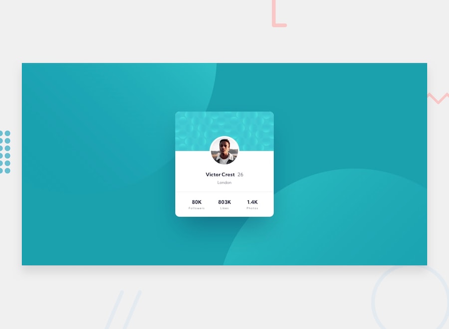
See original readme for details about challenge.
This should be easy for me as the difficult level is "newbie" and I think I'm a little beyond that.
Typically I'd react by spinning up something like a Next app or CRA, but that really shouldn't be necessary here.
I suppose since it's kind of a warm up, I could just go for the most plain html/css approach possible. There doesn't seem to be much value in going overboard and deeply considering reusability and the like.
Let's start with mobile, then proceed to the larger viewports. By the looks of the designs, the mobile version should probably work for the large viewports almost automatically.
I'll support Chrome, Firefox, Safari, and iOS Safari. I would typically add Edge (and IE if I have to), but I don't have an easy way to test and it doesn't seem worth the hassle at this point.
Geez. Even for something that seems as simple as a plain html & css profile card there's a lot more complexity than one might expect. Lots of decisions to make. I followed an "older" approach of BEM class names as targets for styles, which felt pretty tedious for a small project like this. I could have gone even more "quick and dirty" and did most things inline but I'm not sure it would have felt better, just different. There were also moments where following a more utility-based styling approach would have been advantageous and definitely caused me to pause and consider examples I've seen from Semantic UI and Tailwind. But in the end, this is a really small project and I think whatever works is fine. Those types of considerations are more important in larger projects or when working with others; not so much here.
The image that sits behind the avatar was slightly tricky. My solution is not as dynamic as I'd like in that regard. I used a magic number that is half the background image's height for padding to make the avatar positioned as the design indicates.
I'm positive the solution is not 100% equivalent to the provided images, but without actual design assets I think this is good enough and fulfills the spirit. The most glaring difference is probably the background images and their positioning across viewports. 🤷♂️
