The design of my portfolio
- About this project
- User story
- Design
- Sketches and content inventarisation
- Principles of User Interface Design
- Feedback by Mo Mulazada
- Fixes based on feedback by Mo
- Feedback by Georgemain Laurens
- Fixes based on feedback by Georgemain
- Animation
- Accessibility and animation
- What I learned from Larissa
- To do and future
About this project
This project is my personal portfolio of project i'm proud about and things I did. I'm focussing heavily on animation, which should have been clear when you saw the site ;).
User story
This website was an exercise for my study. The user story I wrote is for a man at a Creative Digital company who sees applications and hires Front-end Developers and interns.
John the CEO
As a manager of my team, I want to see interesting and creative websites, research and solutions by people who want to work at my company. I want to see work of students who can make websites feel alive and well. The website should radiate a feeling that I as a viewer can emerge in and not feel bothered by it.
Larissa
As a (near)blind user, I want to be able to use the website functionalities as fast and correct as possible with a screenreader and keyboard navigation so that I can enjoy it's purpose and use the web without strugglingDesign
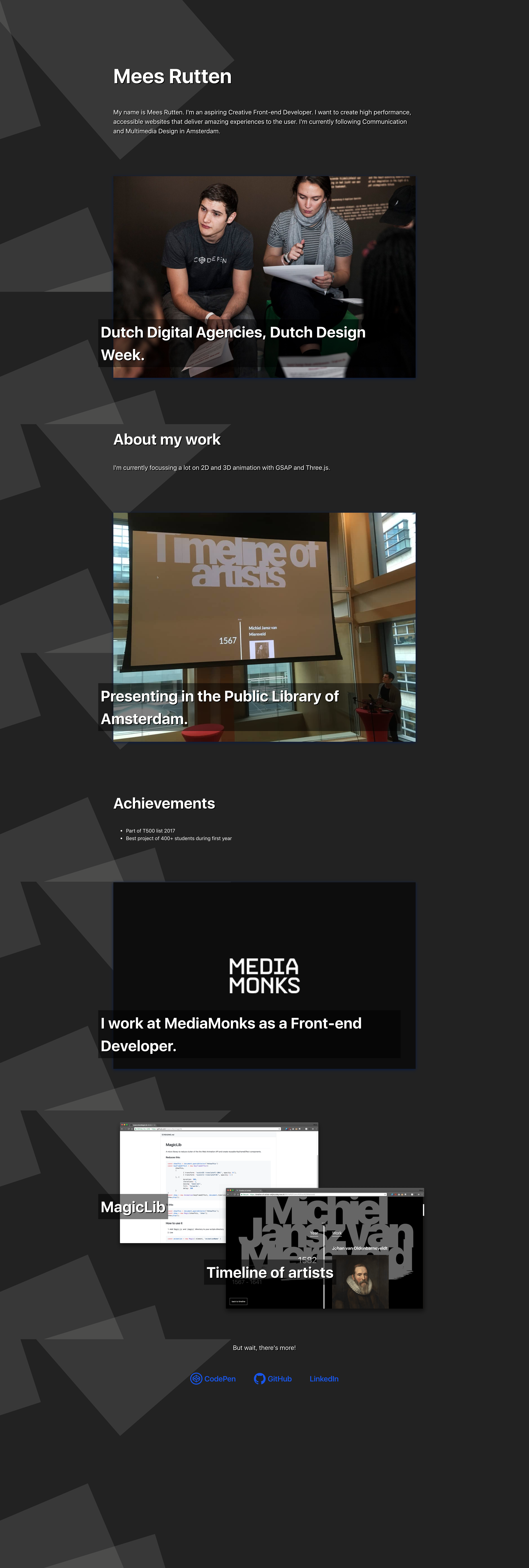
This design features an interactive card design.
The most important aspect is the 3D depth of the cards.
I've created a background of rectangles which overlay and should increase depth of the cards.
On first load, the zero state, the user will see an animation of the card to give awareness of it's interactiveness.
If the user hovers over a card he will see it moving in depth, this effect should give the user a clue that there is more content behind or within the card.
When scrolling the cards will change in depth for the same effect named above.
When interacting with the primary action, the card will flip or fold and reveal it's contents.\
Sketches and content inventarisation
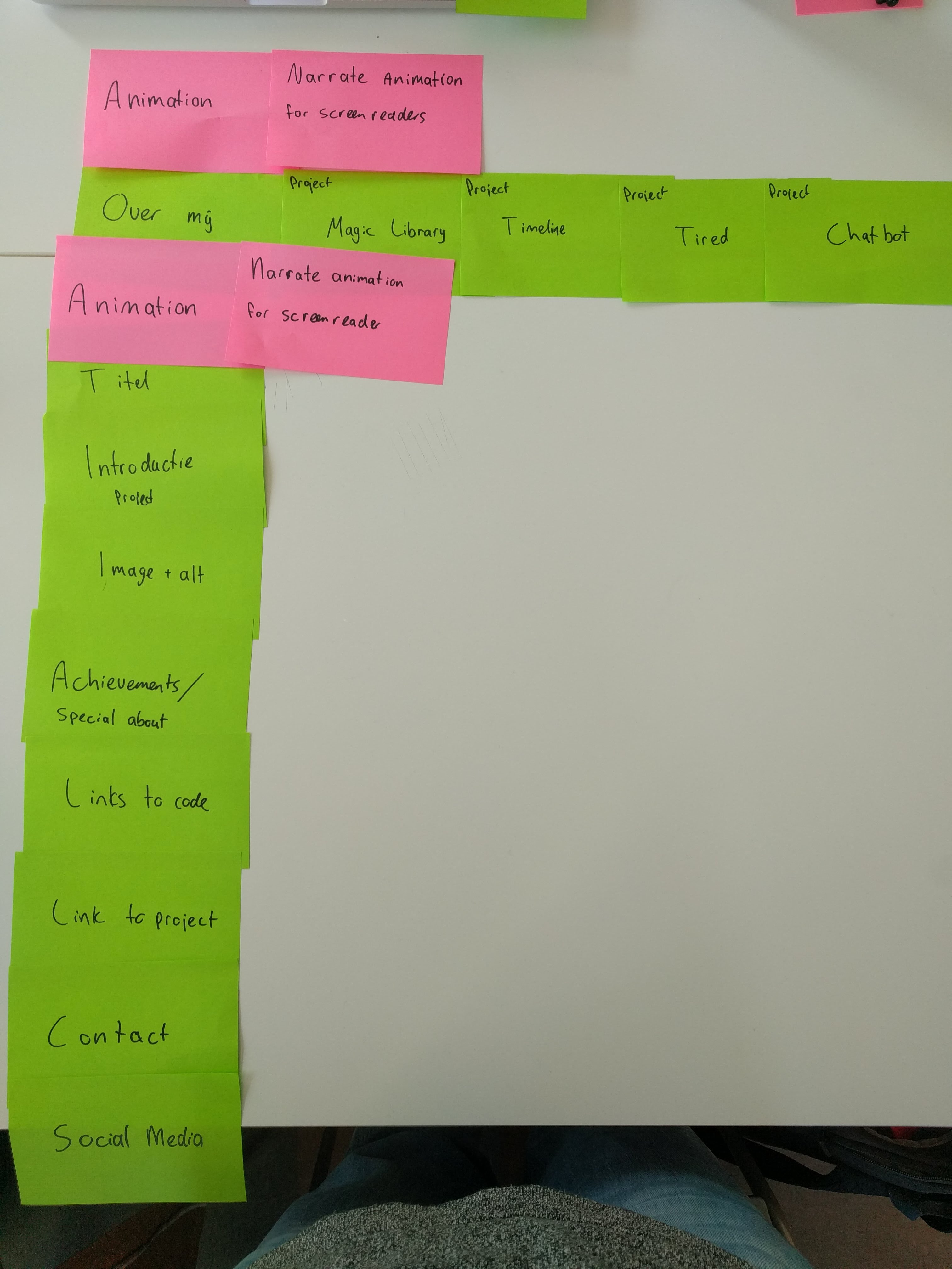
Card sorting for content inventarisation
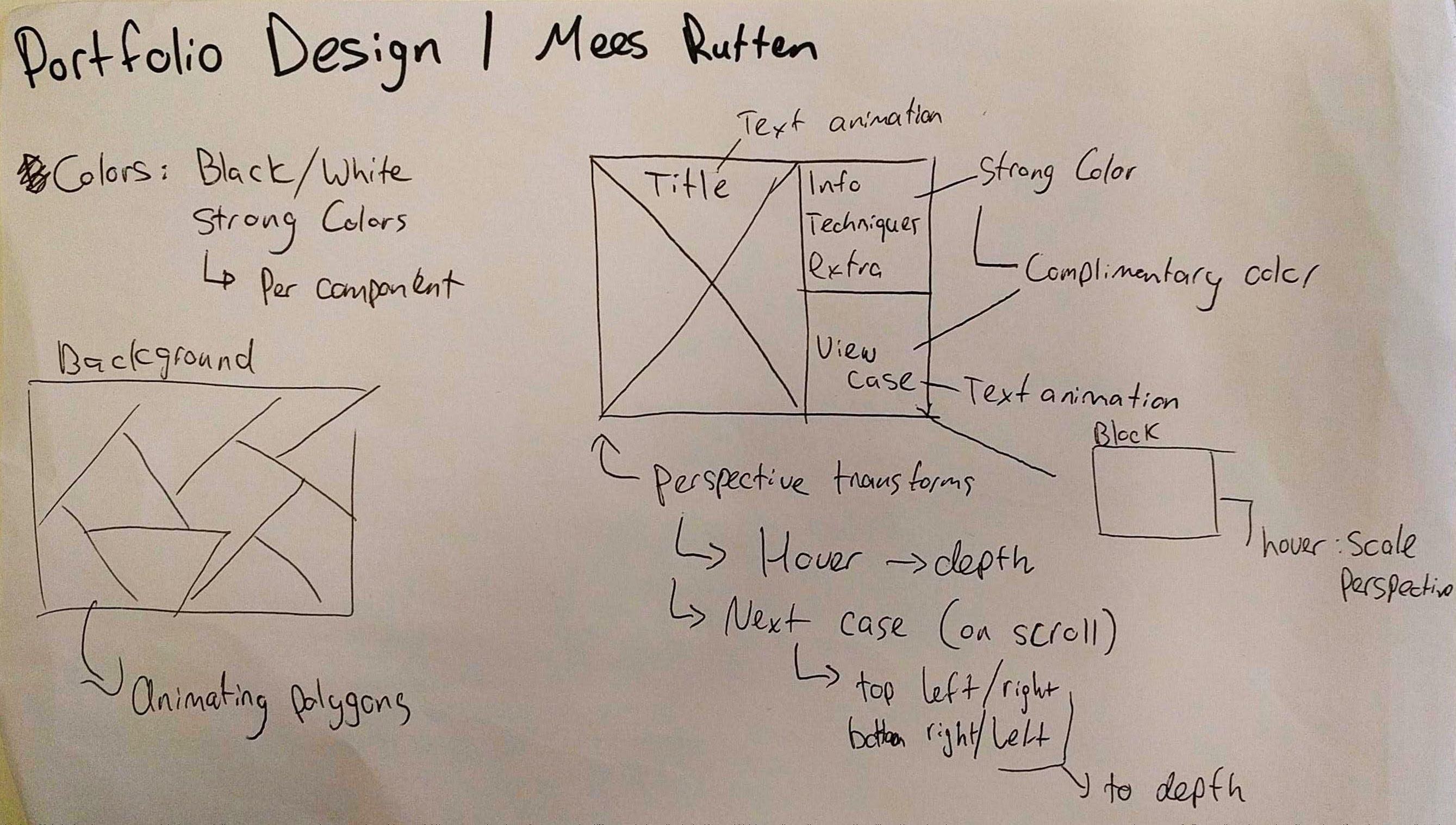
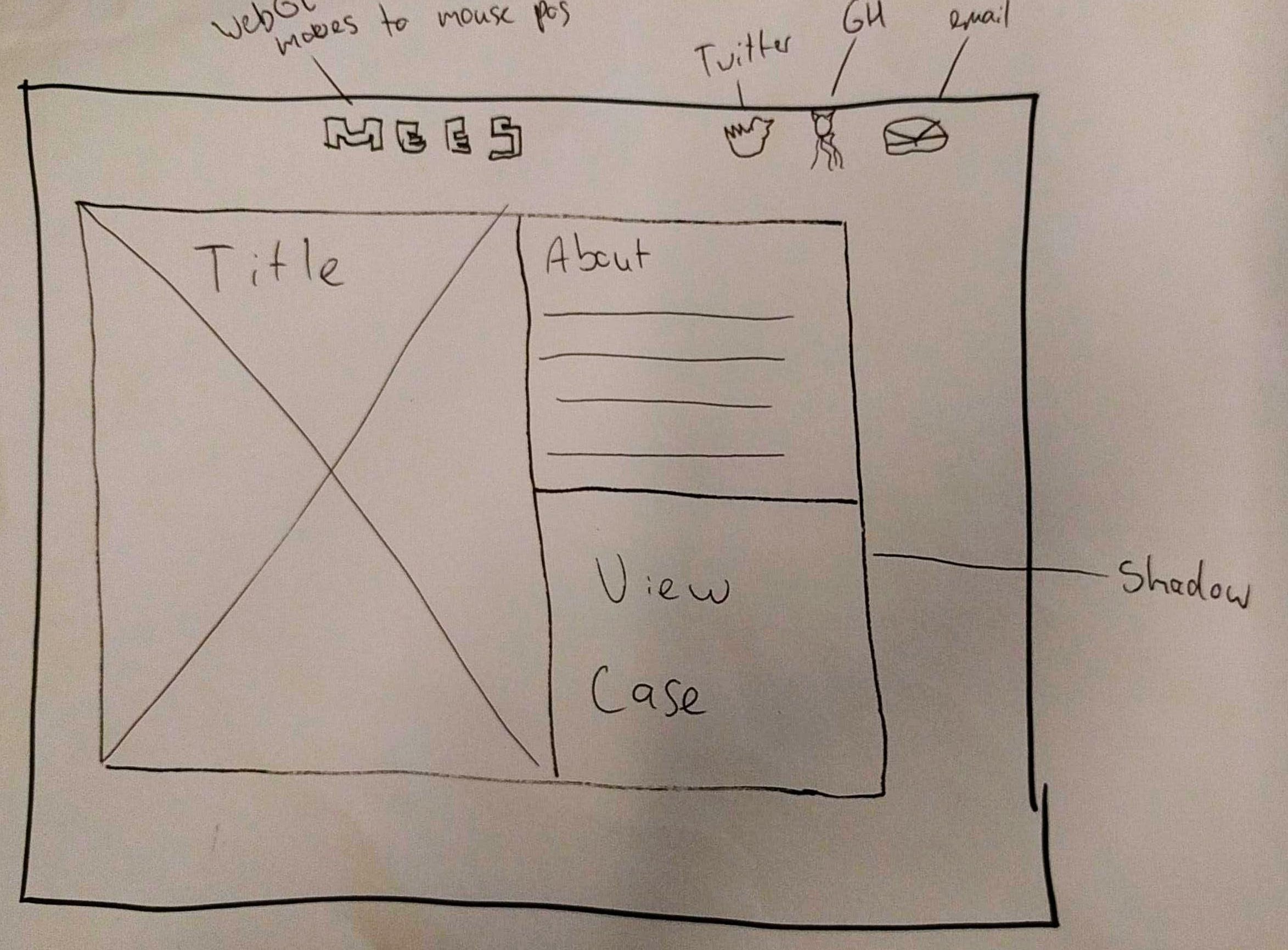
First sketch
Sketch of my cards
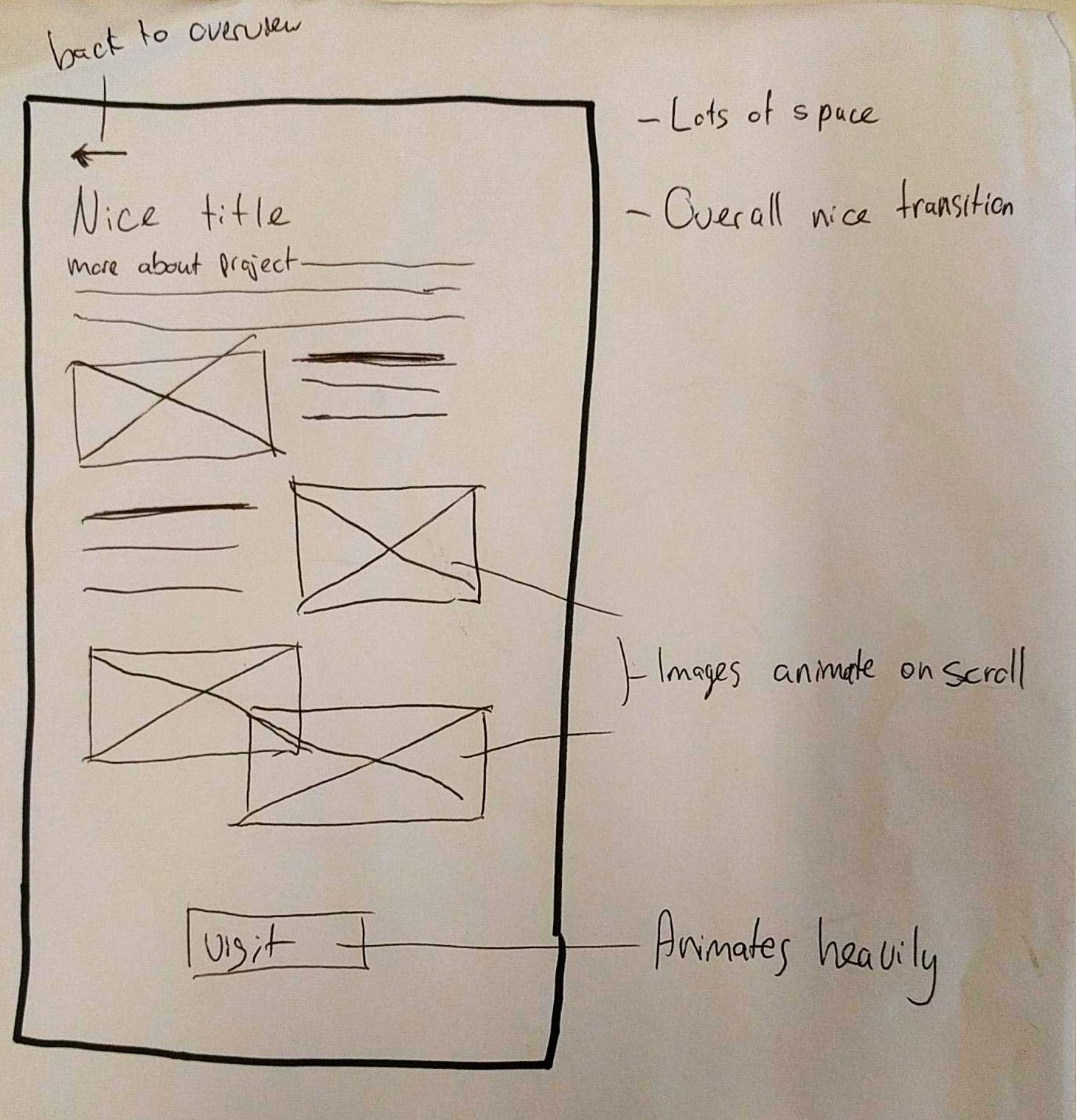
Sketch of my article page
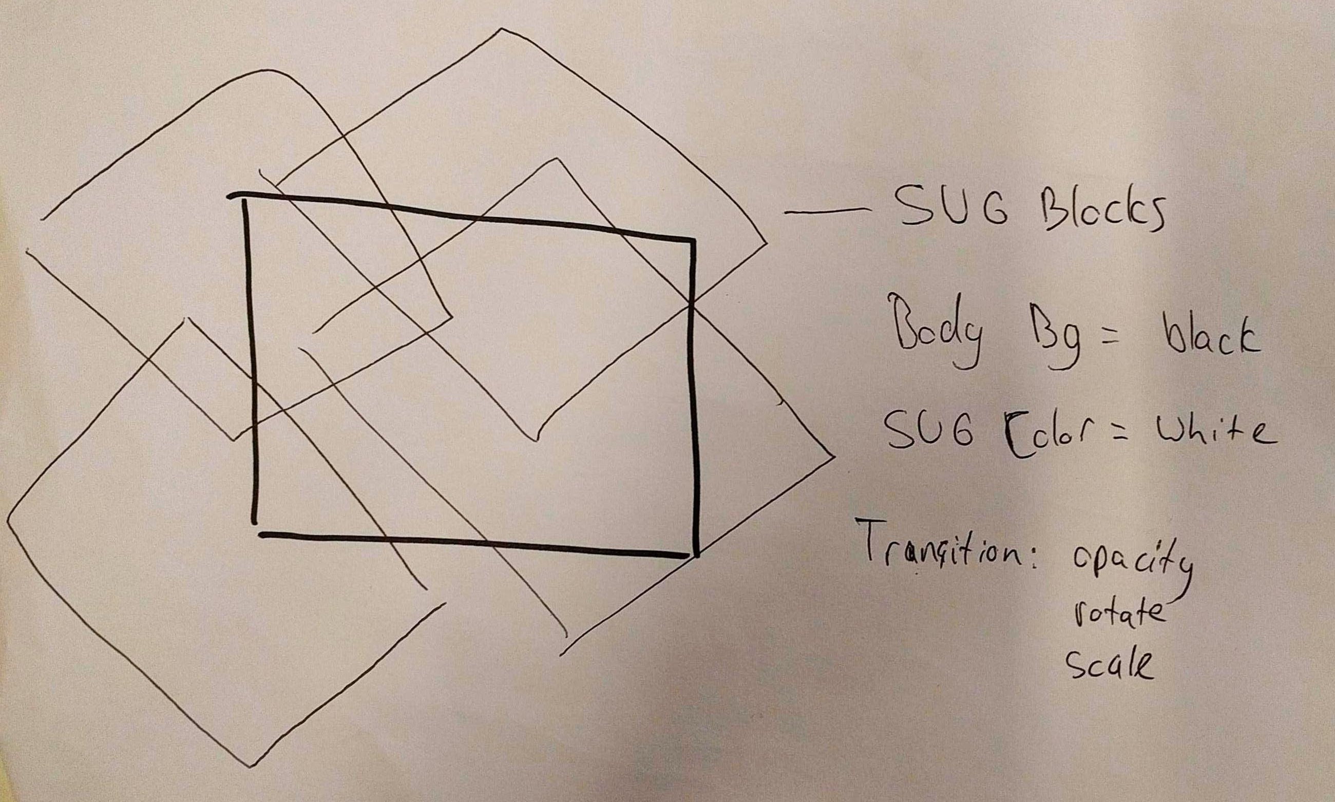
Sketch of the background
Principles of User Interface Design:
I followed certain principles of UIDesign by Joshua Porter. \
My usecase was: I want users of screen readers to experience animation but in the form of storytelling.
2: Interfaces exist to enable interaction
- The interface (on desktop) is interactive in a way where the user has direct manipulation over the depth of the cards.
6: One primary action per screen
- My primary actions are per card instead of screen.
 7: Keep secondary action secondary
- I kept links to external websites an accessible icon/logo while relative links get a link type feeling (blue on white)
8: Provide a natural next step
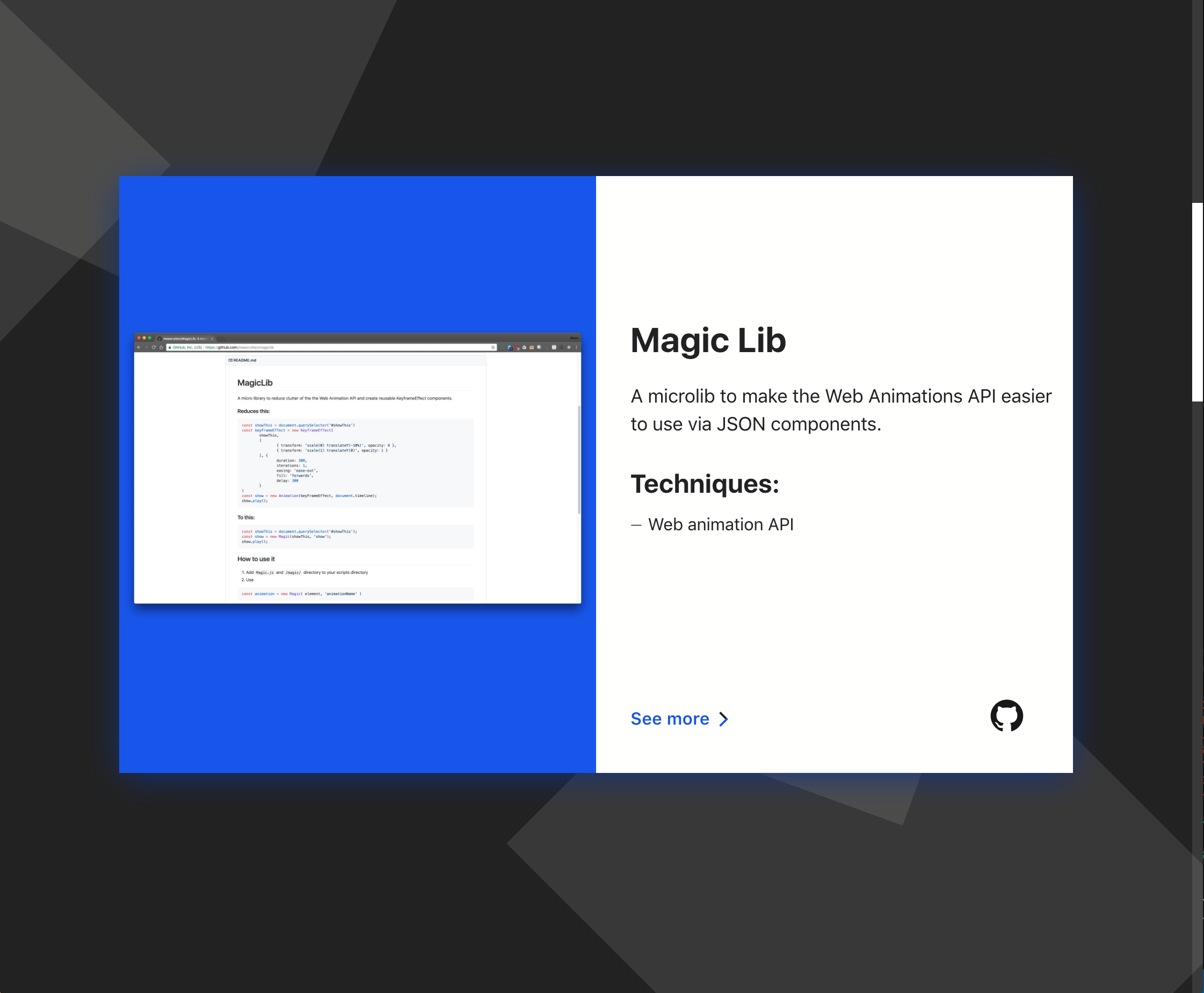
- 'See more' on the cards indicates for a natural next step.
11: Strong visual hierarchies work best
- Titles with a paragraph or a list per title for hierarchy.
- I use animation to visualize the hierarchy
12: Smart organization reduces cognitive load
- There are always one card per screen, one main CTA per card. One main title, a subtitle, some text and icon/logo links.
Feedback by Mo Mulazada:
- Fix typography, placement
- a blue-ish green on white contrast is not sufficient
- 'Cool scrollbar'
- 'What is this website?'
- Concept isn't clear enough
Fixes based on feedback by Mo
- Changed typography to a system font
- I changed the link color which now scores a contrast ratio of 6.14
- The links are also made bold for better readability
- I added 'Portfolio' in the title of the website.
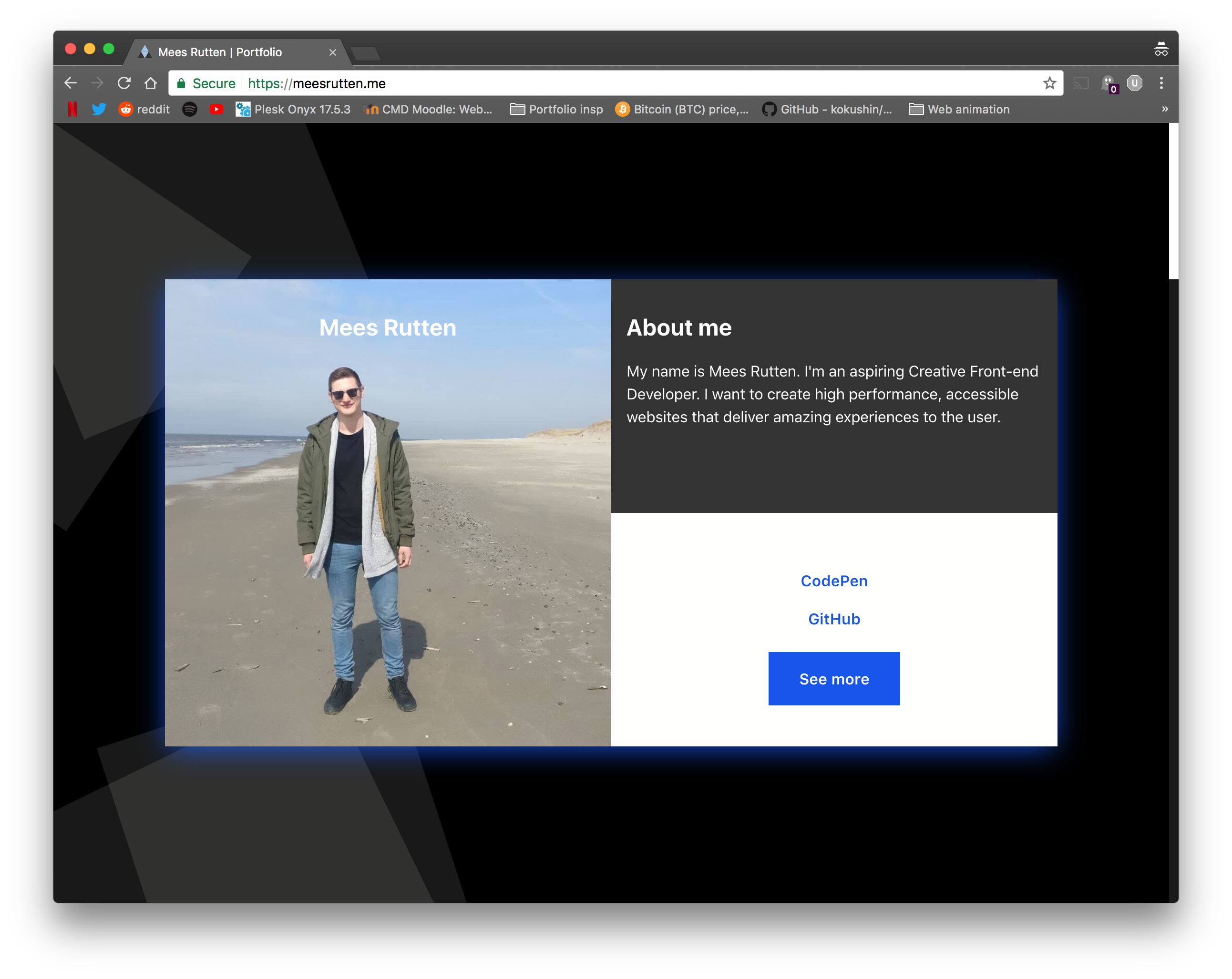
Version 1.0.0 of my portfolio
Feedback by Georgemain Laurens:
- The title on the image is off, you could change that with the title on the right top block
- The hover effect on your button is feeling cheapish
- There is a disconnect between your blue drop-shadow and the rest of the content, especially the gray block
- 'See More' button seems to be too big, and align the links on the left
- You could add icons to the links
- The 'i used:' list is getting cut off and has too little space
- 'See more' is your main action, keep it's priority highest
Fixes based on feedback by Georgemain
- I changed the title to be on the right block
- I changed the color of the dark gray block to the same white color of the block underneath
I have more space for content now :)
- Added some icons and screen-reader text in the links
- Changed styling of the 'See more' link
- Aligned the titles with the images
Version 1.1.0 of my portfolio
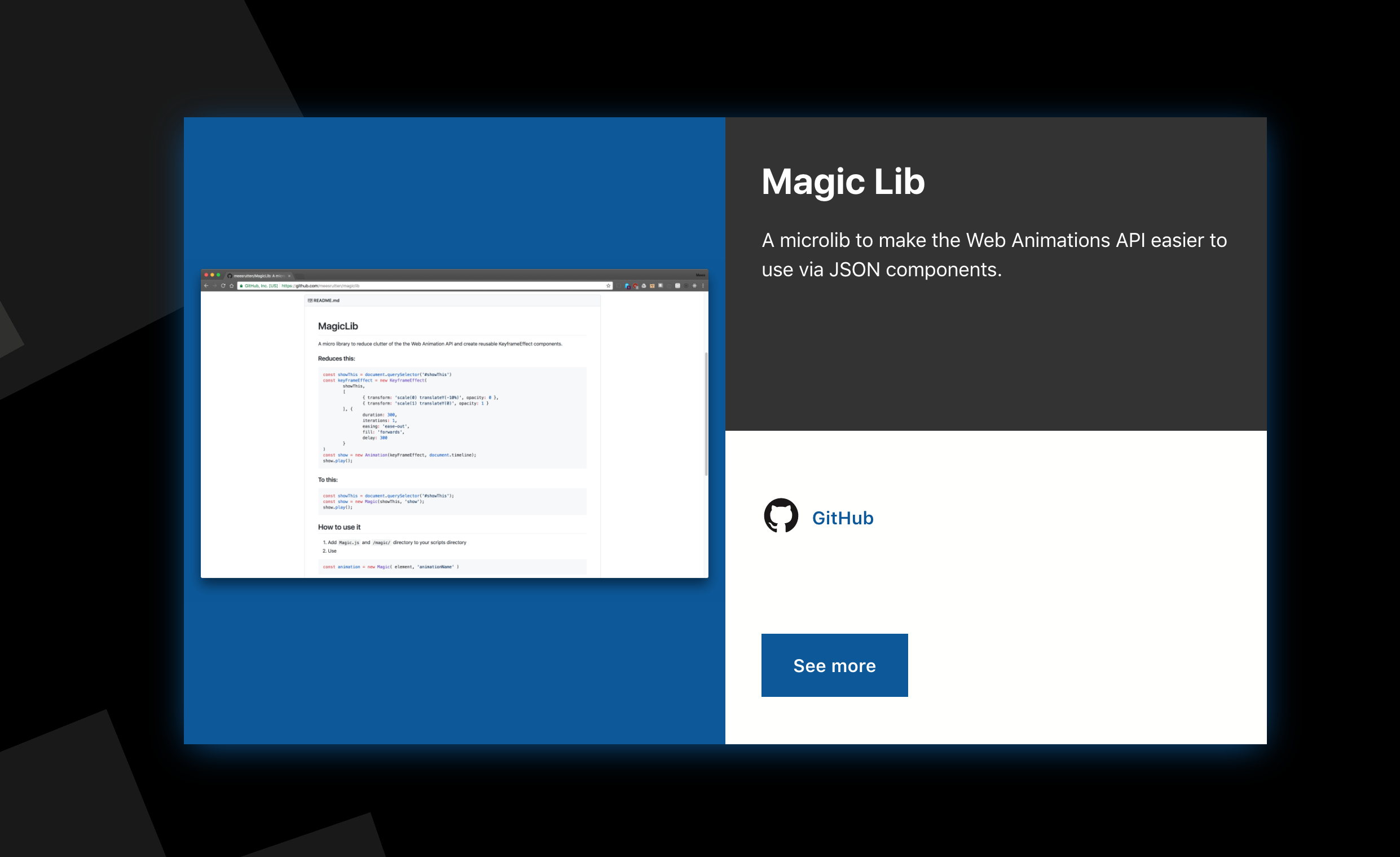
Version 1.2.0 of my portfolio, probably the final version
Version 1.2.0 of my portfolio article page, probably the final version
Animation
For animation I used TweenMax and TimelineMax by GreenSock.
Animations play when the user first enters the website and leaves the website to a new page.
For the card animation I used transform: rotate(X, Y) and the CSS property perspective.\
Accessibility and animation
To make animations accessible for (near)blind users I did a lot of research.
Aria Live Regions | MDN
aria-live helped a lot. By using polite or rude as values you are able to let a user with a screenreader know that certain elements are made visible.
Aria Busy
With aria-busy it is made possible to let a screenreader know that an element is currently loading or that it's contents are not yet visible.
- First you set
aria-busy="true"on the running animation - When the animation is finished you toggle it to
aria-busy="false" - Because of
aria-live="polite"the content is now accessible
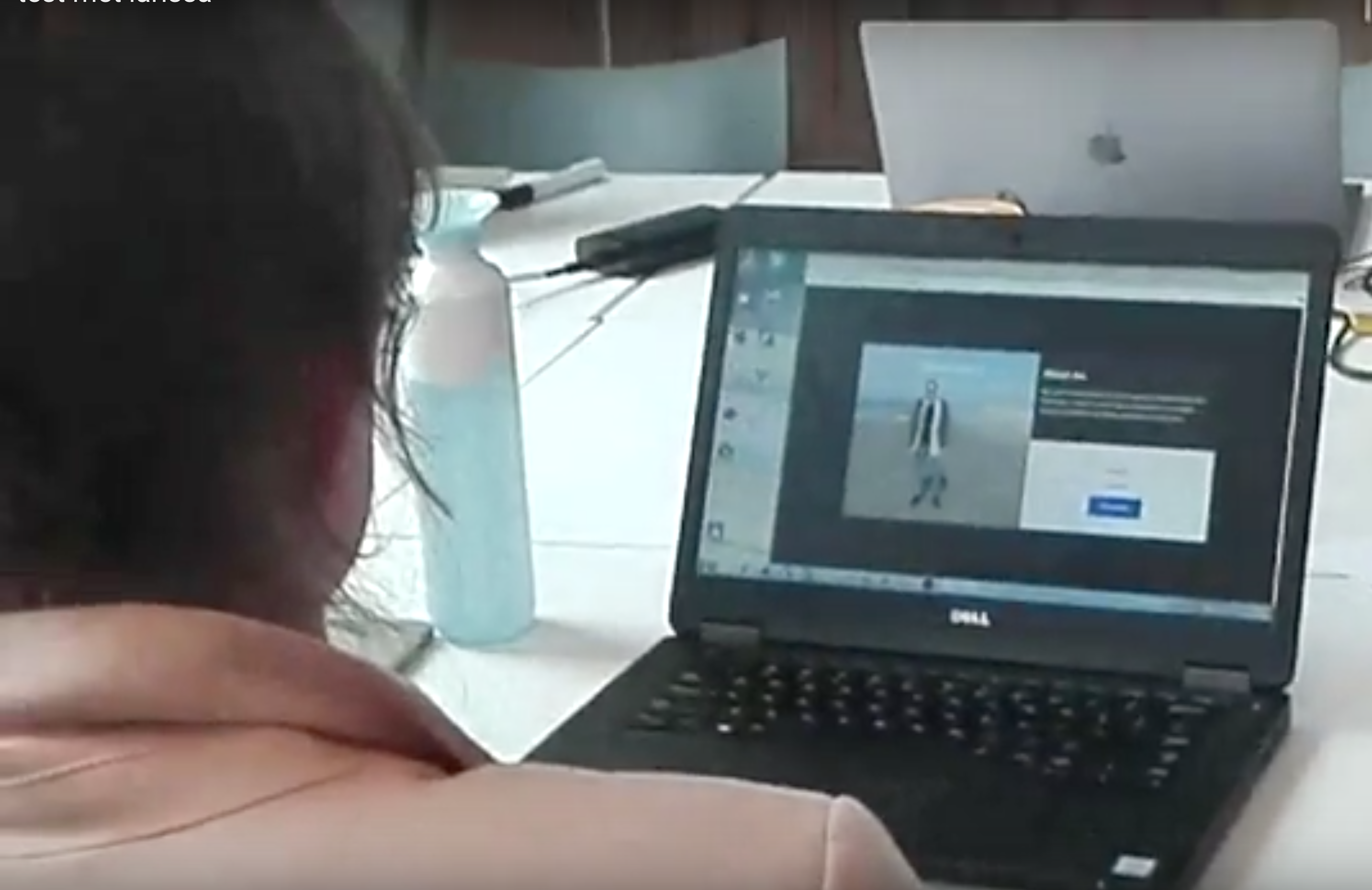
I tested the possibilities with Larissa, a woman who can currently see just 2%.
After 1.2seconds after navigating, she was informed about the animation with a descriptive text with aria-live="rude" which is dynamically added to the DOM.\
I chose for this timing because screenreaders often tell the user about a lot of meta-data of the website. She chose to ignore the text altogether; which is fine and she wasn't bothered by it.
After that she navigated to the now visible content that was made visible by animation. \
Before these tags animation were often a pain in the ass for (near)blind users as they usually make pages feel like they are broken.
What I learned from Larissa
Internet usage of a nearly blind person
- When navigating she first looks at all the headings and links.
- After that she searches for lists because navigation is often put in those.
- The use of patterns are recommended.
- She hates
<iframe>elements because when usingtabyou often get stuck - Never use links with just an icon in them, always add a description for the links list.
- Don't swap text, as the screenreader starts reading the new text immediately (looking at you, carroussels.)
- You could still do it, just add a pause functionality
- If loading takes a while give some feedback or make the loader focussable
Testing my portfolio with Larissa
Link to video
I asked her if she could:
- Make an inventorisation of the website and explain to me how she thinks the structure works
- Navigate to a page and read it's contents
Findings:
- URLs were not descriptive enough
In the links I added a
<span>with more descriptive text and added myscreen-reader-onlyclass to it. - Can't find text 'about Mees'
This seemed to have happened because I didn't change the
aria-busy="true"attribute tofalse - Aria-labels seem to break on
figureelementsSome labels were removed
- Article pages are fine
;D
My observations:
- Larissa did not seem bothered by the animation
After I toggled the
aria-busyattribute - She didn't feel like hearing the 'story-told' animation
Feedback by Koop Reynders
- Final CTA misses for John the CEO to contact you
I've added links to my email adress and twitter bio on the first card and article pages
