Live version - mdoudy.com
Next.js | Vercel | Redux Toolkit | Sass
Install Dependencies
yarnStart development server
yarn run dev

# or to clear .next cache and run dev

yarn run no-cache-devTo populate the website with your data, navigate to src/client/lib/data.json and update each section accordingly. Sample data (capitalized) and images have been added to help.
To ensure images are served properly, place them in public/images and reference them like this: /images/EXAMPLE.png
Settings
sideBarLocation available options: "left" or "right"
projectCards
- for projectCards alternating style, add projectCards section heading to showAlternatingCards array
- for less space between cards, add projectCards section heading to compactView array
"settings": {
  "sideBarLocation": "right",
  "projectCards": {
    "showAlternatingCards": ["WORK", "PROJECTS"],
    "compactView": ["PROJECTS"]
  }
}
Meta
Data used for SEO purposes
"meta": {
  "title": "META TITLE",
  "description": "META DESC",
  "mobileIcon": "/mobile-icon.png",
  "favIcon": "/favicon.ico",
  "language": "en-US",
  "canonical": "CANONICAL URL",
  "url": "URL",
  "twitterHandle": "TWITTER HANDLE"
}
Social
Used to show clickable social media icons in the sidebar. These are optional, so for the ones that are not needed, delete the corresponding lines.
"social": {
  "linkedin": "LINKEDIN URL",
  "github": "GITHUB URL",
  "instagram": "INSTAGRAM URL",
  "twitter": "TWITTER URL"
}
Document
Add a PDF version of your resume or other document to public/docs and add the corresponding path and desired file-name here.
"document": {
  "fileName": "MY-RESUME.pdf",
  "path": "/docs/temp.pdf"
}
Header
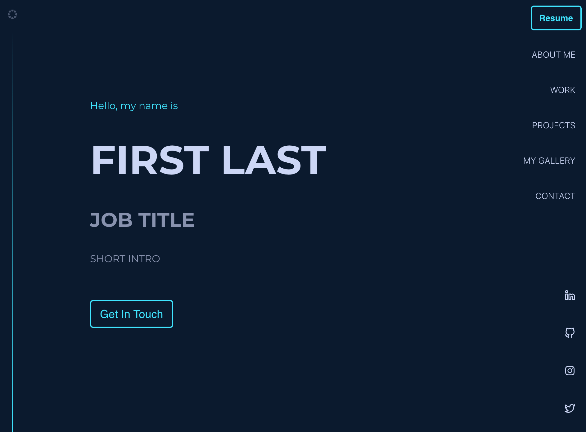
This displays the main header portion of the page. These are optional, so for the ones that are not needed, delete the corresponding lines. The ctaText is displayed in the button.
"header": {
  "preHeading": "Hello, my name is",
  "heading": "FIRST LAST",
  "subHeading": "JOB TITLE",
  "text": "SHORT INTRO",
  "ctaText": "Get In Touch"
}
Sections
Add the desired sections here using the format below.
The available types are about, projectCards, gallery, and contact. The headings of each will be used as the keys throughout the site, so these are required aand need to be unique.
Multiple instances of projectCards can be used, as long as the headings are unique.
These are all optional, so if a certain section is not needed, delete the corresponding lines.
"sections": [
  {
    "type": "about",
    "heading": "ABOUT ME"
  },
  {
    "type": "projectCards",
    "heading": "WORK"
  },
  {
    "type": "projectCards",
    "heading": "PROJECTS"
  },
  {
    "type": "gallery",
    "heading": "MY GALLERY"
  },
  {
    "type": "contact",
    "heading": "CONTACT"
  }
]
About
Fills the about section.
If html is needed rather than text for the content, replace the content key with contentHtml.
image is optional, so if not needed, delete the line.
"about": {
  "content": [
    "LOREM IPSUM DOLOR SIT AMET CONSECTETUR ADIPISICING ELIT.",
    "LOREM IPSUM DOLOR SIT AMET CONSECTETUR ADIPISICING ELIT."
  ],
  "image": "/images/about/TEMP-ME.png"
}
Project Cards
Fills each projectCards sections. Each projectCards section heading needs to be specified here with the desired corresponding data. In this example, the WORK and PROJECTS headings are used.
title, description, tools, links, image, and highlights are all optional, so if not needed, delete the corresponding lines.
highlights fills out the data used in the specified project's onClick popover.
If html is needed rather than text for the description, replace the description key with descriptionHtml.
"projectCards": {
  "WORK": [
    {
      "title": "WORK PROJECT 1",
      "description": "LOREM IPSUM DOLOR SIT AMET CONSECTETUR ADIPISICING ELIT.",
      "tools": ["TOOL 1", "TOOL 2"],
      "links": {
        "github": "GITHUB URL",
        "website": "WEBSITE URL"
      },
      "image": "/images/projectCards/TEMP-WORK-PROJECT-1-BANNER.png",
      "highlights": [
        {
          "heading": "POINT 1",
          "details": [
            "LOREM IPSUM DOLOR SIT AMET CONSECTETUR ADIPISICING ELIT.",
            "LOREM IPSUM DOLOR SIT AMET CONSECTETUR ADIPISICING ELIT."
          ],
          "media": "/images/projectCards/TEMP-WORK-PROJECT-1-POINT-1.gif"
        },
        {
          "heading": "POINT 2",
          "details": [
            "LOREM IPSUM DOLOR SIT AMET CONSECTETUR ADIPISICING ELIT."
          ]
        }
      ]
    },
    {
      "title": "WORK PROJECT 2",
      "description": "LOREM IPSUM DOLOR SIT AMET CONSECTETUR ADIPISICING ELIT."
    }
  ],
  "PROJECTS": [
    {
      "title": "PROJECT 1",
      "description": "LOREM IPSUM DOLOR SIT AMET CONSECTETUR ADIPISICING ELIT."
    }
  ]
}
Gallery
Fills out the gallery section of the site.
thumbnail is optional, but advised to reduce load time if images are too large.
"gallery": [
  {
    "image": "/images/gallery/TEMP-GALLERY-IMAGE.png",
    "thumbnail": "/images/gallery/TEMP-GALLERY-IMAGE-THUMBNAIL.png"
  },
  {
    "image": "/images/gallery/TEMP-GALLERY-IMAGE.png",
    "thumbnail": "/images/gallery/TEMP-GALLERY-IMAGE-THUMBNAIL.png"
  }
]
Contact
Fills out the contact section.
If html is needed rather than text, replace the text key with textHtml.
ctaText corresponds to the button text.
"contact": {
  "text": "LOREM IPSUM DOLOR SIT AMET CONSECTETUR ADIPISICING ELIT.",
  "ctaText": "Send Email",
  "email": "EMAIL@EMAIL.COM"
}To customize the colors, navigate to styles/utilities/_variables.scss and update the following of each theme:
$theme-1-color-1: #ccd6f6; /* primary text */
$theme-1-color-2: #8892b0; /* secondary text */
$theme-1-color-3: #48e4ff; /* contrasting color */
$theme-1-color-4: #0b1a2f; /* primary background */
$theme-1-color-5: #122341; /* secondary background */The easiest way to deploy is via Vercel, built by the same folks behind Next.js.
If using Vercel:
In Build & Development Settings, override the build command to
yarn run buildor your own command if updated.
To add Google Analytics capabilities:
Add your GA Tracking ID as an environment variable under the name,
NEXT_PUBLIC_GA_ID
For additional details and help, check out the Next.js deployment documentation.
Design aspects inspired by bchiang7 and components I've built in Helbiz.
Feel free to email me here.


