gatsby-remark-vscode


A syntax highlighting plugin for Gatsby that uses VS Code’s extensions, themes, and highlighting engine. Any language and theme VS Code supports, whether built-in or via a Marketplace extension, can be rendered on your Gatsby site.
Includes OS dark mode support 🌙
Table of contents
- Why gatsby-remark-vscode?
- Getting started
- Dark mode support via
prefers-color-scheme - Built-in languages and themes
- Using languages and themes from an extension
- Styles
- Extra stuff
Why gatsby-remark-vscode?
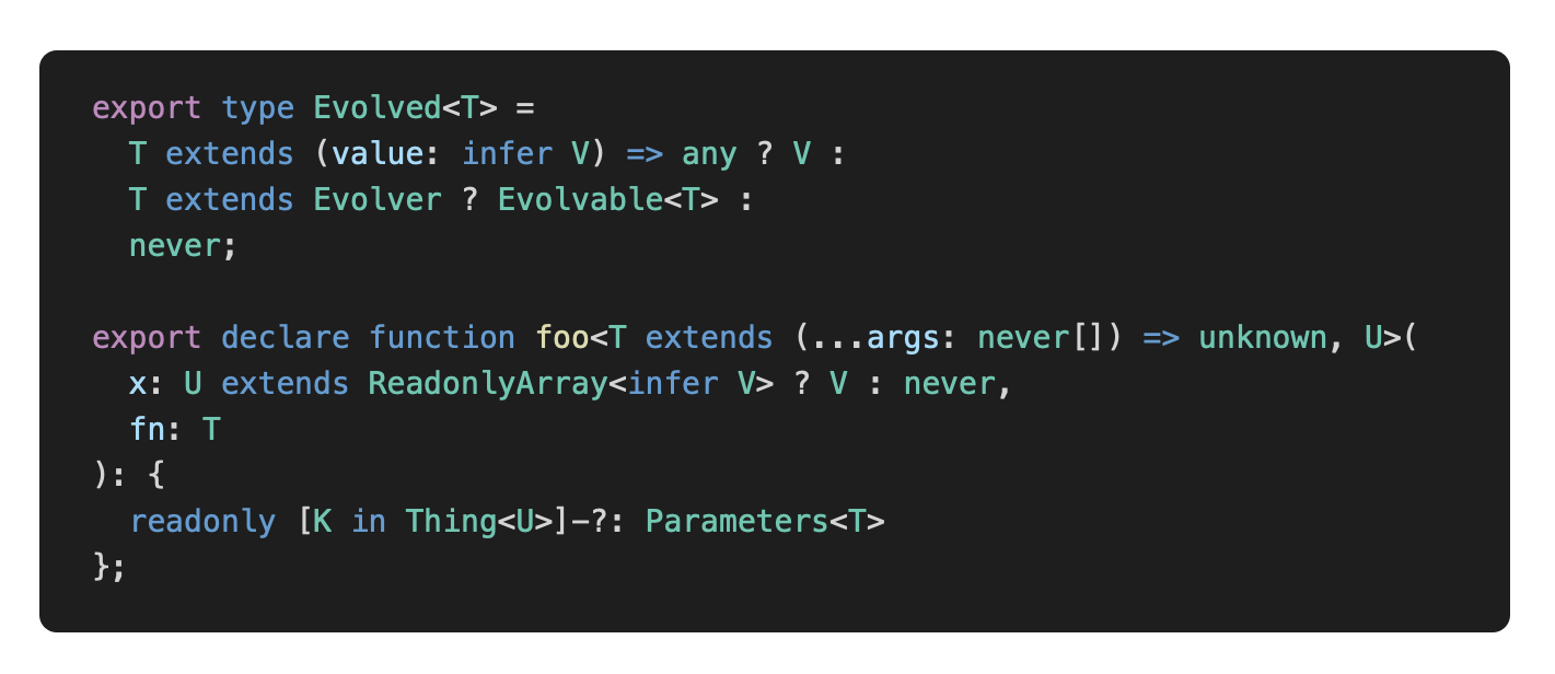
JavaScript syntax highlighting libraries that were designed to run in the browser, like Prism, have to make compromises given the constraints of their intended environment. Since they get downloaded and executed whenever a user visits a page, they have to be ultra-fast and ultra-lightweight. Your Gatsby app, on the other hand, renders to HTML at build-time in Node, so these constraints don’t apply. So why make tradeoffs that don’t buy you anything? There’s no reason why the syntax highlighting on your blog should be any less sophisticated than the syntax highlighting in your code editor. And since VS Code is built with JavaScript and CSS, is open source, and has a rich extension ecosystem, it turns out that it’s pretty easy to use its highlighting engine and extensions and get great results. A few examples of where gatsby-remark-vscode excels:
| Scenario | Others | gatsby-remark-vscode |
|---|---|---|
| Embedded languages |  |
 |
| Complex TypeScript |  |
 |
| Tricky template strings |  |
 |
| Uncommon languages | 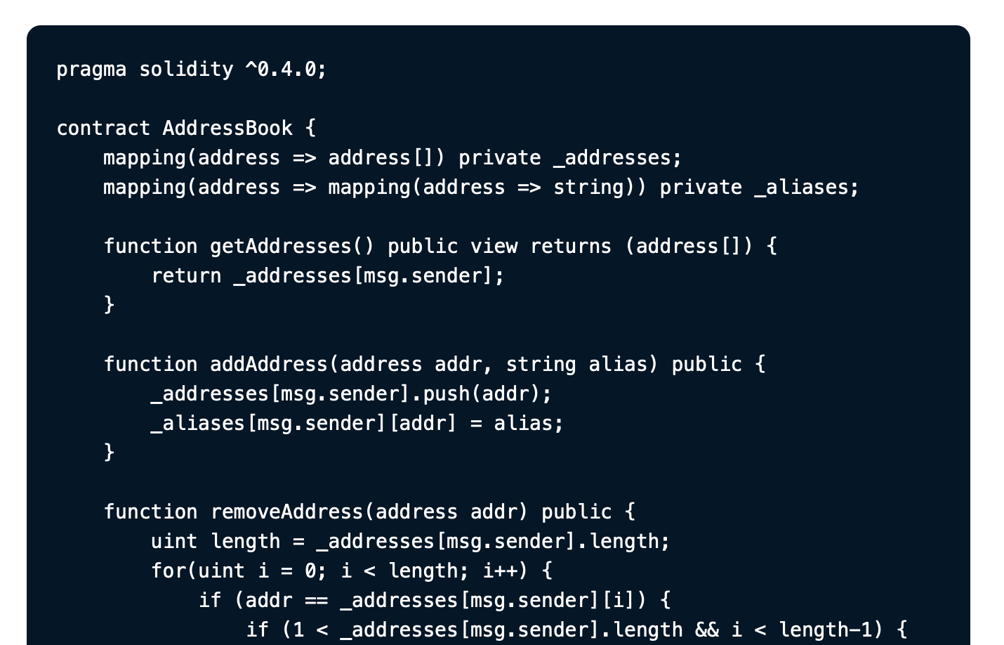 |
 |
Getting started
Install the package:
npm install --save gatsby-remark-vscodeAdd to your gatsby-config.js (all options are optional; defaults shown here):
{
  // ...
  plugins: [{
    resolve: `gatsby-transformer-remark`,
    options: {
      plugins: [{
        resolve: `gatsby-remark-vscode`,
        // All options are optional. Defaults shown here.
        options: {
          colorTheme: 'Dark+ (default dark)', // Read on for list of included themes. Also accepts object and function forms.
          wrapperClassName: '',   // Additional class put on 'pre' tag. Also accepts function to set the class dynamically.
          injectStyles: true,     // Injects (minimal) additional CSS for layout and scrolling
          extensions: [],         // Extensions to download from the marketplace to provide more languages and themes
          extensionDataDirectory: // Absolute path to the directory where extensions will be downloaded. Defaults to inside node_modules.
            path.resolve('extensions'),
          languageAliases: {},    // Map of custom/unknown language codes to standard/known language codes
          replaceColor: x => x,   // Function allowing replacement of a theme color with another. Useful for replacing hex colors with CSS variables.
          getLineClassName: ({    // Function allowing dynamic setting of additional class names on individual lines
            content,              //   - the string content of the line
            index,                //   - the zero-based index of the line within the code fence
            language,             //   - the language specified for the code fence
            codeFenceOptions      //   - any options set on the code fence alongside the language (more on this later)
          }) => '',
          logLevel: 'error'       // Set to 'warn' to debug if something looks wrong
        }
      }]
    }
  }
Write code examples in your markdown file as usual:
```js
this.willBe(highlighted);
```
Dark mode support via prefers-color-scheme
Instead of passing a string for colorTheme, you can pass an object specifying which theme to use for different values of a user’s operating system color scheme preference.
// Note: you probably don’t actually want to provide all three options,
// this example just aims to show all possible options.
{
  colorTheme: {
    defaultTheme: 'Solarized Light',    // Required
    prefersDarkTheme: 'Monokai Dimmed', // Optional: used with `prefers-color-scheme: dark`
    prefersLightTheme: 'Quiet Light'    // Optional: used with `prefers-color-scheme: light`
  }
}
This places CSS for each theme inside a corresponding prefers-color-scheme media query. See browser support.
Generally, you probably don’t need or want to set all three colorTheme options—typical usage would be to set defaultTheme to a light theme and prefersDarkTheme to a dark theme.
Built-in languages and themes
The following can be used without specifying an extension to download from the marketplace:
Languages
See all 55 languages
- Batch/CMD
- Clojure
- CoffeeScript
- C
- C++
- C Platform
- C#
- CSS
- Dockerfile
- F#
- Git Commit
- Git Rebase
- Diff
- Ignore
- Go
- Groovy
- Handlebars
- Hlsl
- HTML
- CSHTML
- PHP HTML
- INI
- Java
- JavaScript
- JSX
- JSON
- JSON with Comments
- Less
- Log
- Lua
- Makefile
- Markdown
- Objective-C
- Objective-C++
- Perl
- Perl 6
- PHP
- Powershell
- Pug
- Python
- R
- Ruby
- Rust
- Sass
- SassDoc
- ShaderLab
- Shell
- SQL
- Swift
- TypeScript
- TSX
- ASP VB .NET
- XML
- XML XSL
- YAML
Language names are resolve case-insensitively by any aliases and file extensions listed in the grammar’s metadata. For example, a code fence with C++ code in it can use any of these language codes. You could also check the built-in grammar manifest for an exact list of mappings.
Themes
Pro tip: a good way to preview themes is by flipping through them in VS Code. Here’s the list of included ones:
- Abyss
- Dark+ (default dark)
- Light+ (default light)
- Dark (Visual Studio)
- Light (Visual Studio)
- High Contrast
- Kimbie Dark
- Monokai Dimmed
- Monokai
- Quiet Light
- Red
- Solarized Dark
- Solarized Light
- Tomorrow Night Blue
Using languages and themes from an extension
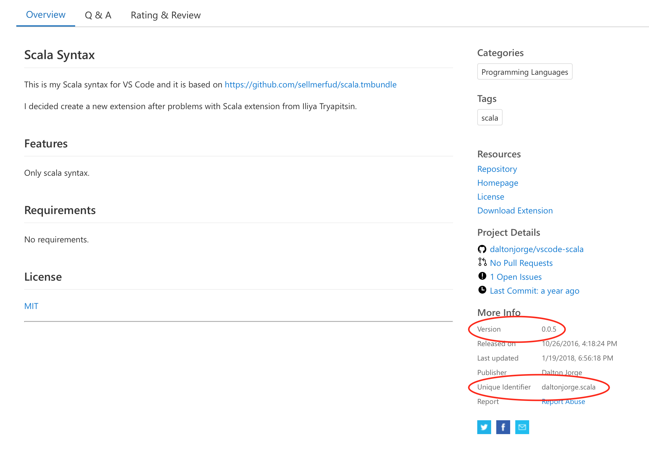
If you want to use a language or theme not included by default, you can use an extension from the Visual Studio Marketplace that provides that language or theme. gatsby-remark-vscode will download it for you; you just need to provide the unique identifier and version of the extension:
Add those strings to the extensions option in your plugin configuration in gatsby-config.js:
{
  // ...
  plugins: [{
    resolve: `gatsby-transformer-remark`,
    options: {
      plugins: [{
        resolve: `gatsby-remark-vscode`,
        options: {
          extensions: [{
            identifier: 'daltonjorge.scala',
            version: '0.0.5'
          }]
        }
      ]}
    }
  }]
Next time you gatsby develop or gatsby build, the extension will be downloaded and Scala code fences will be highlighted. Extensions are downloaded to node_modules/gatsby-remark-vscode/lib/extensions by default (but can go elsewhere by setting the extensionDataDirectory option), so they remain cached on disk as long as gastsby-remark-vscode does.
Dealing with rate limiting in CI
Anonymous requests to the Visual Studio Marketplace are rate limited, so if you’re downloading a lot of extensions or running builds in quick succession in an environment where the extensions aren’t already cached on disk (like on a build server), you might see failed requests.
As a workaround, you can set the extensionDataDirectory plugin option to an absolute path pointing to a folder that you check into source control. After running a build locally, any extensions you’ve requested will appear in that directory. Then, in CI, gatsby-remark-vscode will check that directory and determine if anything needs to be downloaded. By checking including the extensions alongside your own source code, you can avoid making requests to the Visual Studio Marketplace in CI entirely.
Styles
The CSS for token colors and background colors is generated dynamically from each theme you use and included in the resulting HTML. However, you’ll typically want at least a small amount of additional styling to handle padding and horizontal scrolling. These minimal additional styles are included alongside the dynamically generated token CSS by default, but can be disabled by setting the injectStyles option to false. If you prefer bundling the styles through your app’s normal asset pipeline, you can simply import the CSS file:
import 'gatsby-remark-vscode/styles.css';Class names
The generated HTML has ample stable class names, and you can add your own with the wrapperClassName and getLineClassName option. All (non-token-color) included styles have a single class name’s worth of specificity, so it should be easy to override the built-in styles.
Variables
The styles also include a few CSS variables you can override. The defaults are:
.vscode-highlight {
  --vscode-highlight-padding-v: 1rem;
  --vscode-highlight-padding-h: 1.5rem;
  --vscode-highlight-padding-top: var(--vscode-highlight-padding-v);
  --vscode-highlight-padding-right: var(--vscode-highlight-padding-h);
  --vscode-highlight-padding-bottom: var(--vscode-highlight-padding-v);
  --vscode-highlight-padding-left: var(--vscode-highlight-padding-h);
  --vscode-highlight-border-radius: 8px;

  /* Line highlighting: see next section */
  --vscode-highlight-line-highlighted-background-color: transparent;
  --vscode-highlight-line-highlighted-border-width: 4px;
  --vscode-highlight-line-highlighted-border-color: transparent;
}
The default values are set on :root, so you can set them on .vscode-highlight, pre, your own wrapperClassName, the class name matching the theme, or generally any selector more specific than :root.
Tweaking or replacing theme colors
Since the CSS for token colors is auto-generated, it’s fragile and inconvenient to try to override colors by writing more specific CSS. Instead, you can use the replaceColor option to replace any value specified by the theme with another valid CSS value. This is especially handy for replacing static colors with variables if you want to support a “dark mode” for your site:
{
  replaceColor: oldColor => ({
    '#ff0000': 'var(--red)',
    '#00ff00': 'var(--green)',
    '#0000ff': 'var(--blue)',
  })[oldColor.toLowerCase()] || oldColor
}
Extra stuff
Line highlighting
gatsby-remark-vscode offers the same line-range-after-language-name strategy of highlighting or emphasizing lines as gatsby-remark-prismjs:
```js{1,3-5}
this.isLine(1); // highlighted
this.isLine(2);
this.isLine(3); // highlighted
this.isLine(4); // highlighted
this.isLine(5); // highlighted
```
Comment directives are also supported:
```js
function constant(value) {
  return () => value; // highlight-line
}

// highlight-next-line
const alwaysFour = constant(4);

// highlight-start
const zero = [0, 1, 2, 3, 4, 5]
  .map(alwaysFour)
  .filter(x => x !== 4)
  .length;
// highlight-end
```
You need to pick your own background color, and optionally a left border width and color, for the highlighted lines. This can be done by setting CSS variables:
.vscode-highlight {
  --vscode-highlight-line-highlighted-background-color: rgba(255, 255, 255, 0.2); /* default: transparent */
  --vscode-highlight-line-highlighted-border-color: rgba(255, 255, 255, 0.5); /* default: transparent */
  --vscode-highlight-line-highlighted-border-width: 2px; /* default: 2px */
}
or by setting custom styles on the lines:
.vscode-highlight .vscode-highlight-line-highlighted {
  background-color: rgba(255, 255, 255, 0.2);
  box-shadow: inset 2px 0 0 0 rgba(255, 255, 255, 0.5);
}
Using different themes for different code fences
The colorTheme option can take a function instead of a constant value. The function is called once per code fence with information about that code fence, and should return either a string or an object. See the following section for an example.
Arbitrary code fence options
Line numbers and ranges aren’t the only things you can pass as options on your code fence. A JSON-like syntax is supported:
```jsx{theme: 'Monokai', someNumbers: {1,2,3}, nested: {objects: 'yep'}}
<Amazing><Stuff /></Amazing>
```
gatsby-remark-vscode doesn’t inherently understand these things, but it parses the input and allows you to access it in the colorTheme, wrapperClassName and getLineClassName functions:
{
  colorTheme: ({ parsedOptions, language, markdownNode, codeFenceNode }) => {
    // 'language' is 'jsx', in this case
    // 'markdownNode' is the gatsby-transformer-remark GraphQL node
    // 'codeFenceNode' is the Markdown AST node of the current code fence
    // 'parsedOptions' is your parsed object that looks like this:
    // {
    //   theme: 'Monokai',
    //   someNumbers: { '1': true, '2': true, '3': true },
    //   nested: { objects: 'yep' }
    // }
    return parsedOptions.theme || 'Dark+ (default dark)';
  },
  wrapperClassName: ({ parsedOptions, language, markdownNode, codeFenceNode }) => '';
}