A tiny drop-in replacement for native HTML single select elements written in vanilla ES6.
Why not just style a native select element with CSS?
Absolutely do that if it's enough for your use case. The main reason I created this project is because I needed a drop down list of icons that didn't suck.
- Zero dependencies
- Very easy to use
- Customizable
- Icon support
- Fully accessible
- Works on all modern browsers (no IE support)
- No multi-select support (not accessible)
Download the latest version, and add the script and style to your page:
<link rel="stylesheet" href="fancyselect.min.css"/>
<script src="fancyselect.min.js"></script>
Or include from a CDN (not recommended in production):
<link rel="stylesheet" href="https://cdn.jsdelivr.net/gh/mdbassit/FancySelect@latest/dist/fancyselect.min.css"/>
<script src="https://cdn.jsdelivr.net/gh/mdbassit/FancySelect@latest/dist/fancyselect.min.js"></script>
The native select elements will be replaced automatically.
Once you include FancySelect in your page, it will replace all native select elements with a custom listbox. If you would like to exclude some select elements, simply add the CSS class fsb-ignore.
<!-- This will be rendered as a native select -->
<label for="my-select">My select</label>
<select id="my-select" class="fsb-ignore">
  <option>Neptunium</option>
  <option>Plutonium</option>
  <option>Americium</option>
</select>

<!-- This will be rendered as a custom listbox -->
<label for="my-fancy-select">My fancy select</label>
<select id="my-fancy-select">
  <option>Neptunium</option>
  <option>Plutonium</option>
  <option>Americium</option>
</select>If there is a need to programmatically update a custom listbox's options, you first need to update the native select's options, then call FancySelect.update() with the native select element as an argument.
const myselect = document.getElementById('my-select');
const newItems = ['Californium', 'Vibranium', 'Uranium'];

// Add new options to the native select element
newItems.forEach(item => {
  const option = document.createElement('option');
  option.textContent = item;
  myselect.appendChild(option);
  // Please don't add select options to the DOM individually in production. Use a documentFragment.
});

// Update the custom listbox
FancySelect.update(myselect);FancySelect detects the disabled state of a native select automatically and applies it to the custom listbox. If a native select element's disabled state changes after FancySelect's initialization, calling FancySelect.update() will update it.
const myselect = document.getElementById('my-select');

// Disable the native select element
myselect.disabled = true;

// Update the custom listbox
FancySelect.update(myselect);An input and a change events are triggered on the original native select element whenever a new option is selected on the custom select box.
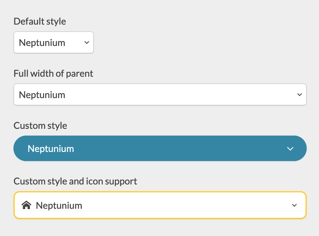
The look and feel of the listbox and the popup button can be customized with CSS variables.
<div class="custom-style">
  <label for="my-select">My fancy select</label>
  <select id="my-select">
    <option>Neptunium</option>
    <option>Plutonium</option>
    <option>Americium</option>
  </select>
</div>

<style>
.custom-style {
  --fsb-border: 0;
  --fsb-radius: 2em;
  --fsb-color: #fff;
  --fsb-background: #2F86A6;
  --fsb-font-size: 1em;
  --fsb-shadow: 0 1px 1px rgba(0, 0, 0, .1);
  --fsb-padding: .75em 1.5em;
  --fsb-arrow-padding: 1.5em;
  --fsb-arrow-size: .5em;
  --fsb-arrow-color: currentColor;
  --fsb-icon-color: currentColor;
  --fsb-list-height: 200px;
  --fsb-list-border: var(--fsb-border);
  --fsb-list-radius: .75em;
  --fsb-list-color: var(--fsb-color);
  --fsb-list-background: #34BE82;
  --fsb-hover-color: var(--fsb-color);
  --fsb-hover-background: #2FDD92;
}
</style>
Check out the included demo for more examples.
You can add icons to the select options by setting a data-icon attribute to a valid SVG sprite URI.
<label for="icon-support">Options with icons</label>
<select id="icon-support">
  <option data-icon="icons.svg#nep">Neptunium</option>
  <option data-icon="icons.svg#plu">Plutonium</option>
  <option data-icon="icons.svg#amer">Americium</option>
</select>
The icons can also be defined in the same document.
<svg style="display: none;" xmlns="http://www.w3.org/2000/svg">
  <symbol id="icon-home" viewBox="0 0 24 24">
    <path d="M24 13.839l-12-9.315-12 9.315v-3.798l12-9.315 12 9.315zM21 13.5v9h-6v-6h-6v6h-6v-9l9-6.75z"></path>
  </symbol>
  <symbol id="icon-bin" viewBox="0 0 24 24">
    <path d="M4.5 24h15l1.5-16.5h-18zM15 3v-3h-6v3h-7.5v4.5l1.5-1.5h18l1.5 1.5v-4.5h-7.5zM13.5 3h-3v-1.5h3v1.5z"></path>
  </symbol>
  <symbol id="icon-bookmarks" viewBox="0 0 24 24">
    <path d="M6 3v21l7.5-7.5 7.5 7.5v-21zM18 0h-15v21l1.5-1.5v-18h13.5z"></path>
  </symbol>
</svg>

<label for="icon-support">Options with icons</label>
<select id="icon-support">
  <option data-icon="#icon-home">Home</option>
  <option data-icon="#icon-bin">Delete</option>
  <option data-icon="#icon-bookmarks">Bookmark</option>
</select>
Note: Currently, only SVG sprites are supported, and that's unlikely to change in the future. Learn more about SVG sprites.
Install the development dependencies:
npm installRun the build script:
npm run buildThe built version will be in the dist directory in both minified and full copies.
If you find a bug or would like to implement a missing feature, please create an issue first before submitting a pull request (PR).
When submitting a PR, please do not include the changes to the dist directory in your commits.
While this implementation may be different, most of the specifications were inspired by:
- Collapsible Dropdown Listbox Example | WAI-ARIA Authoring Practices 1.1
- <select> your poison
- <select> your poison part 2: test all the things
Copyright (c) 2021 Momo Bassit.
FancySelect is licensed under the MIT license.