A benchmark utility to examine and compare various compression algorithms, based on bundle.
Clone with --recursive and build with make. Then run
./benchmark < input > log
where input is the data you want to run through the various algorithms
Thereafter, generate the plots:
./plot [prefix] [format] < log
You will find several plots in the current directory for your perusal. The
optional argument prefix sets a file prefix and format defaults to png.
To illustrate, we use a 850 MB PCAP trace (2009-M57-day11-18), plus a derived 5.3 MB of Bro ASCII logs. The trace consists of 8505 connections from standard protocols, such as DNS, HTTP, DHCP, SSL, SMTP, and FTP. We conducted our experiments on a 64-bit FreeBSD system with two 8-core CPUs and 128 GB of RAM. To reproduce the input data, download the trace and run Bro on it as follows:
bro -r trace.pcap
Thereafter, typing make generates in the screenshots directory the plots
below.
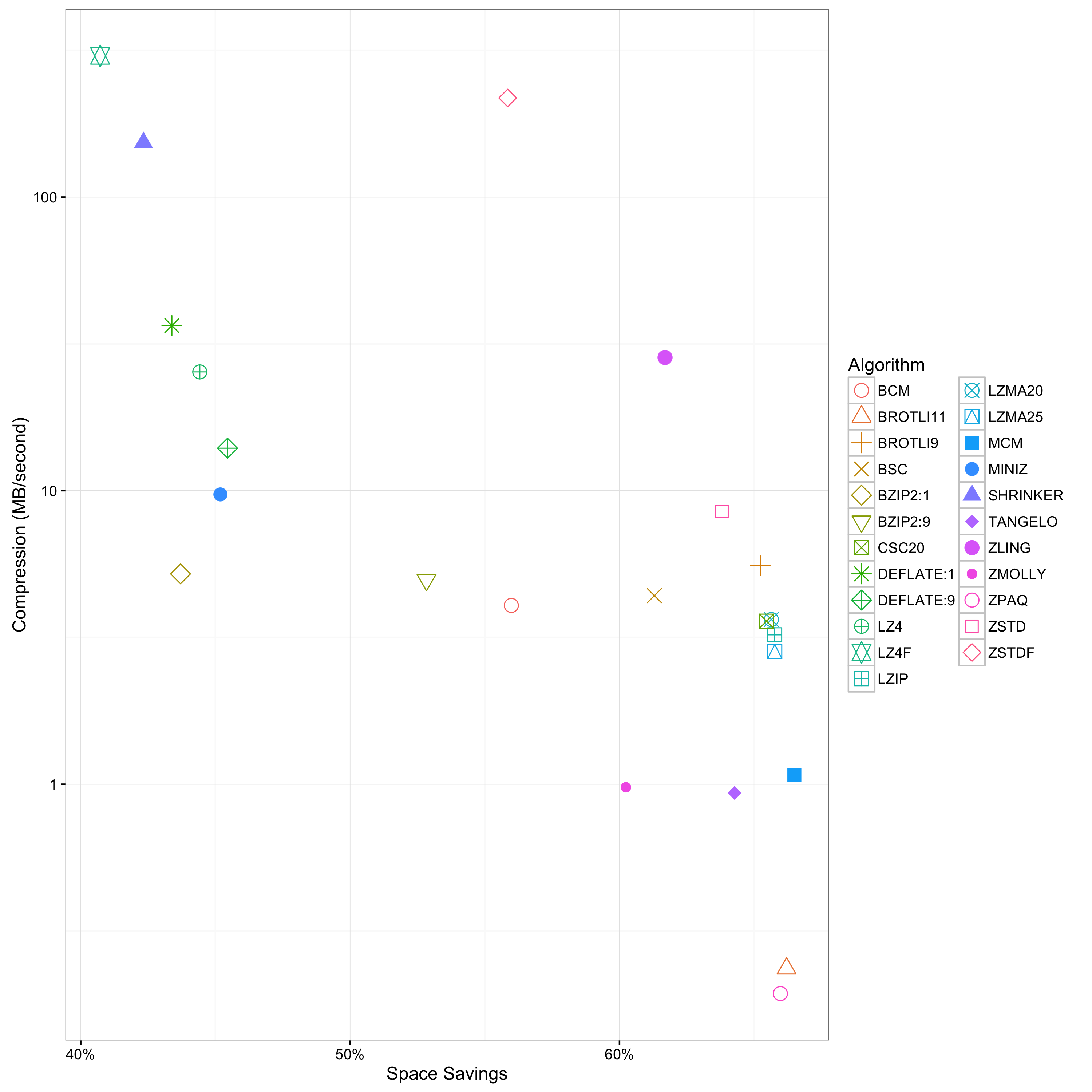
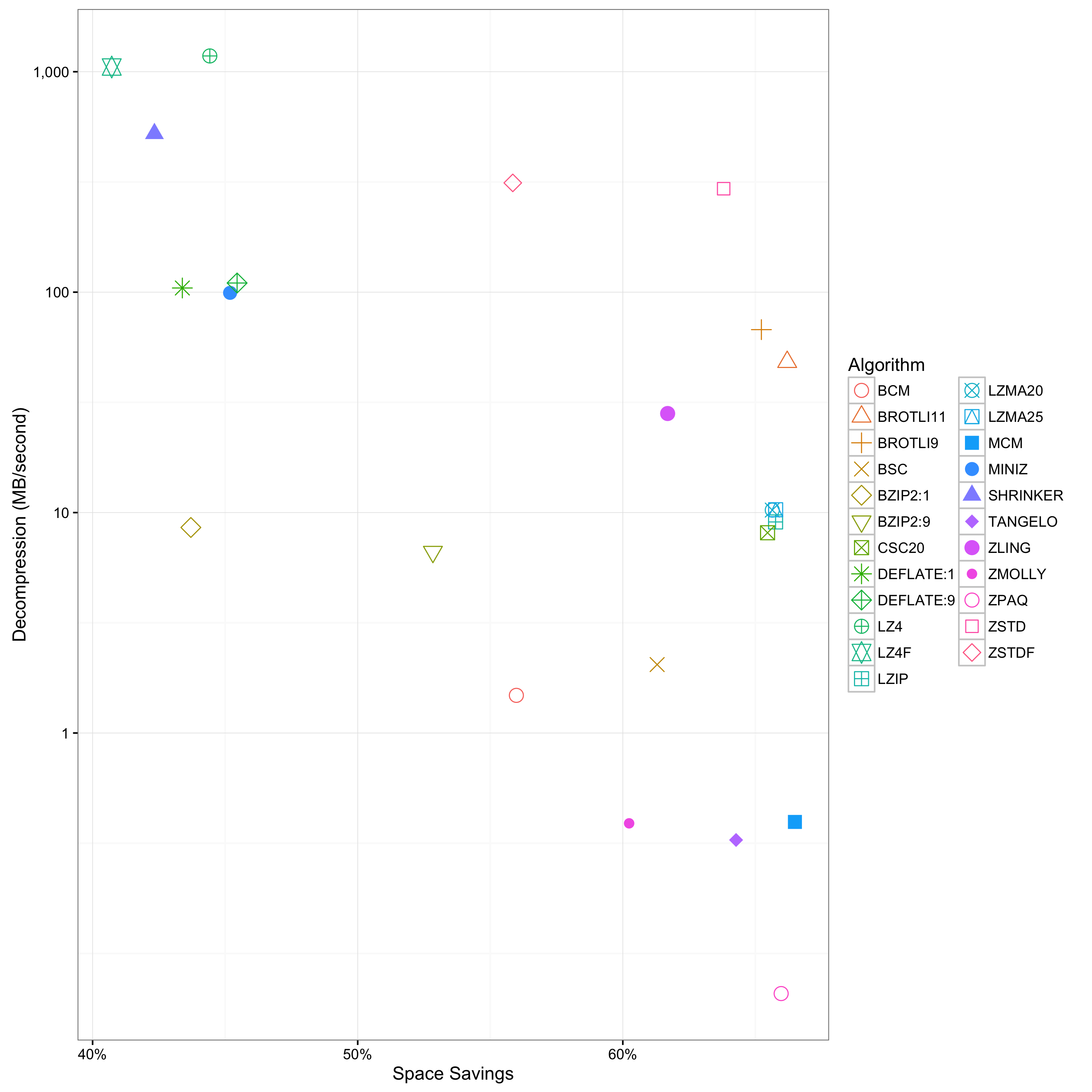
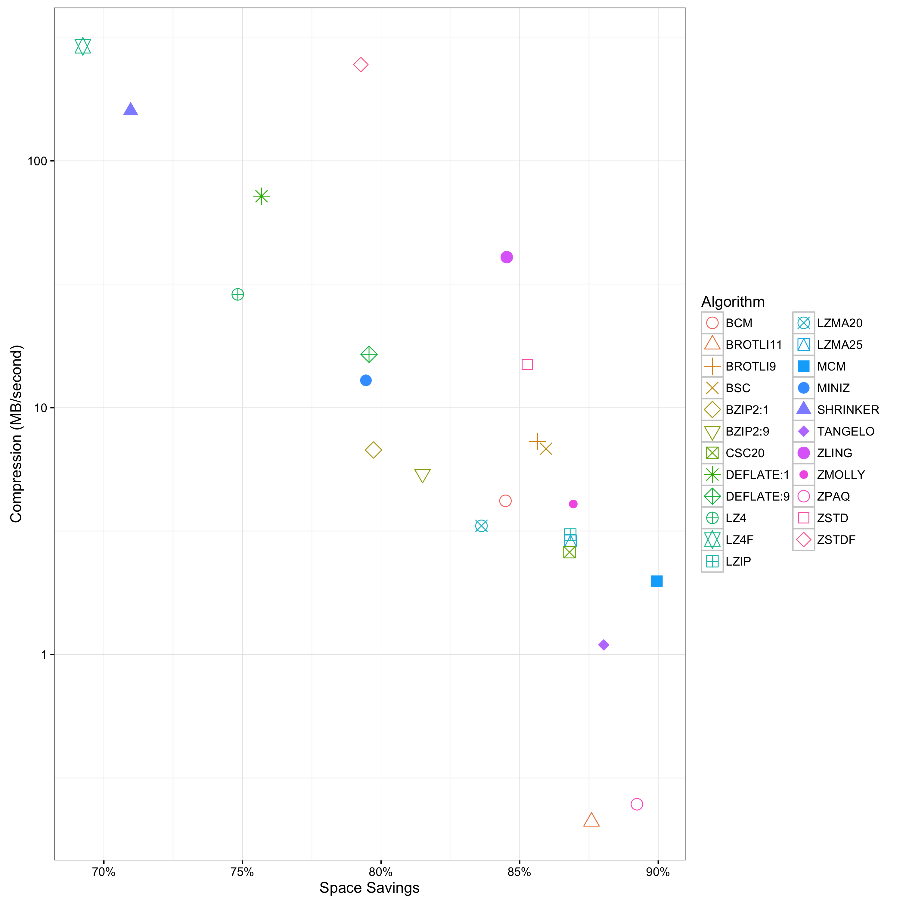
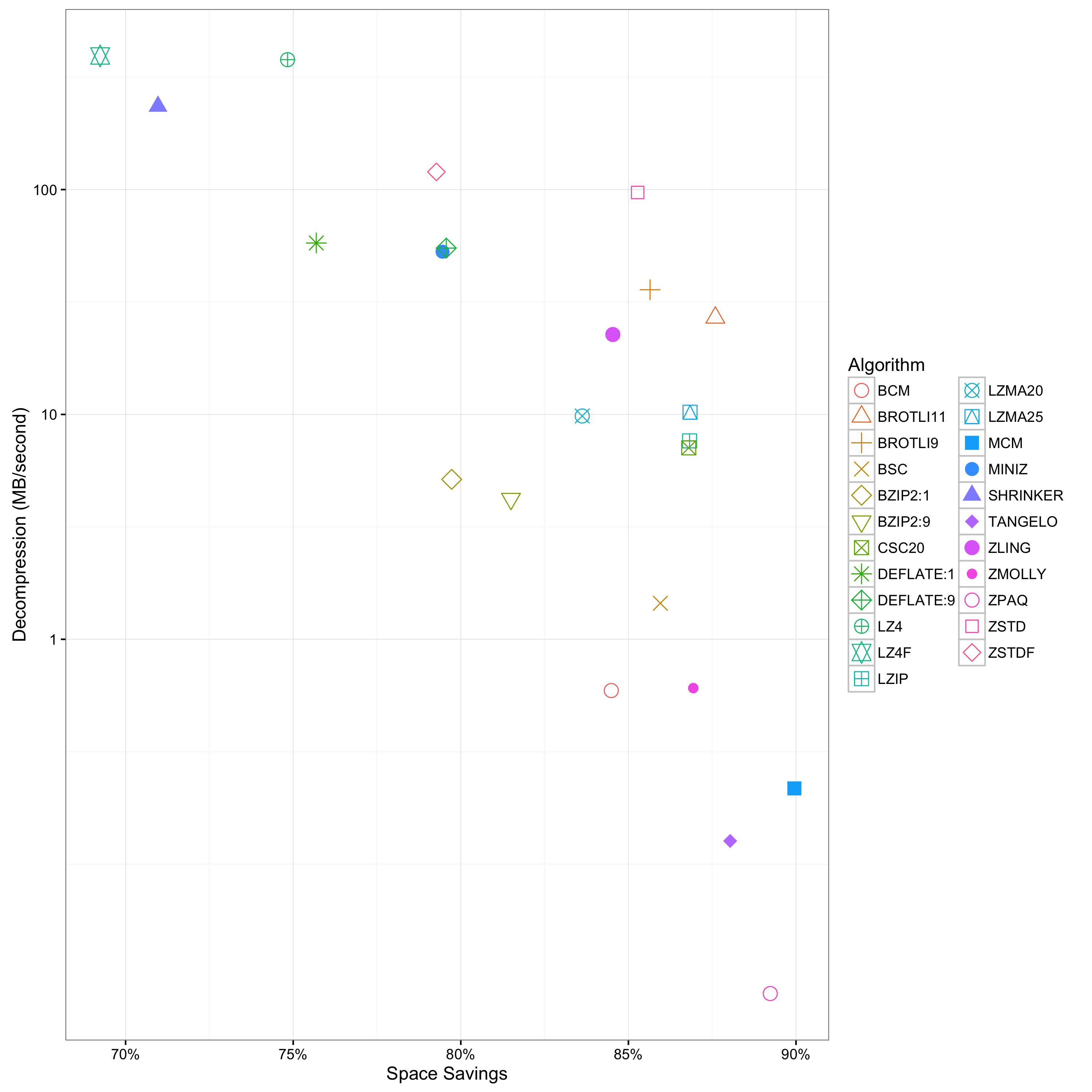
The above plots shows the trade-off space between space savings and compression, as well as space savings versus decompression. The further a point lays in the top-right corner the better it performs across both dimensions.
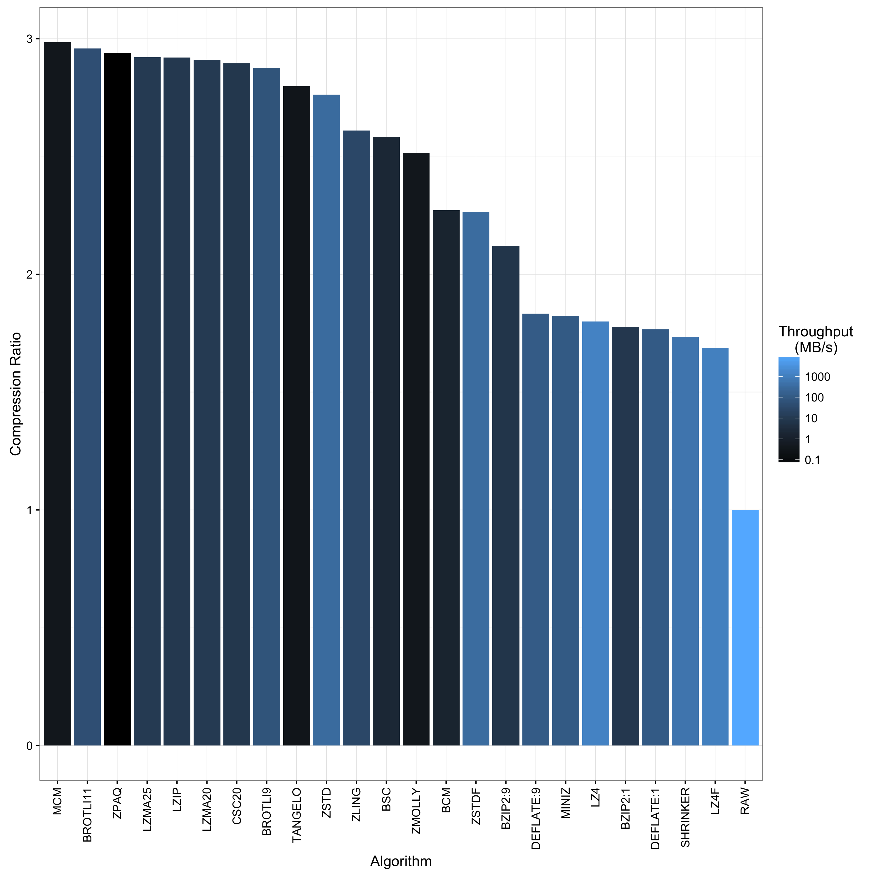
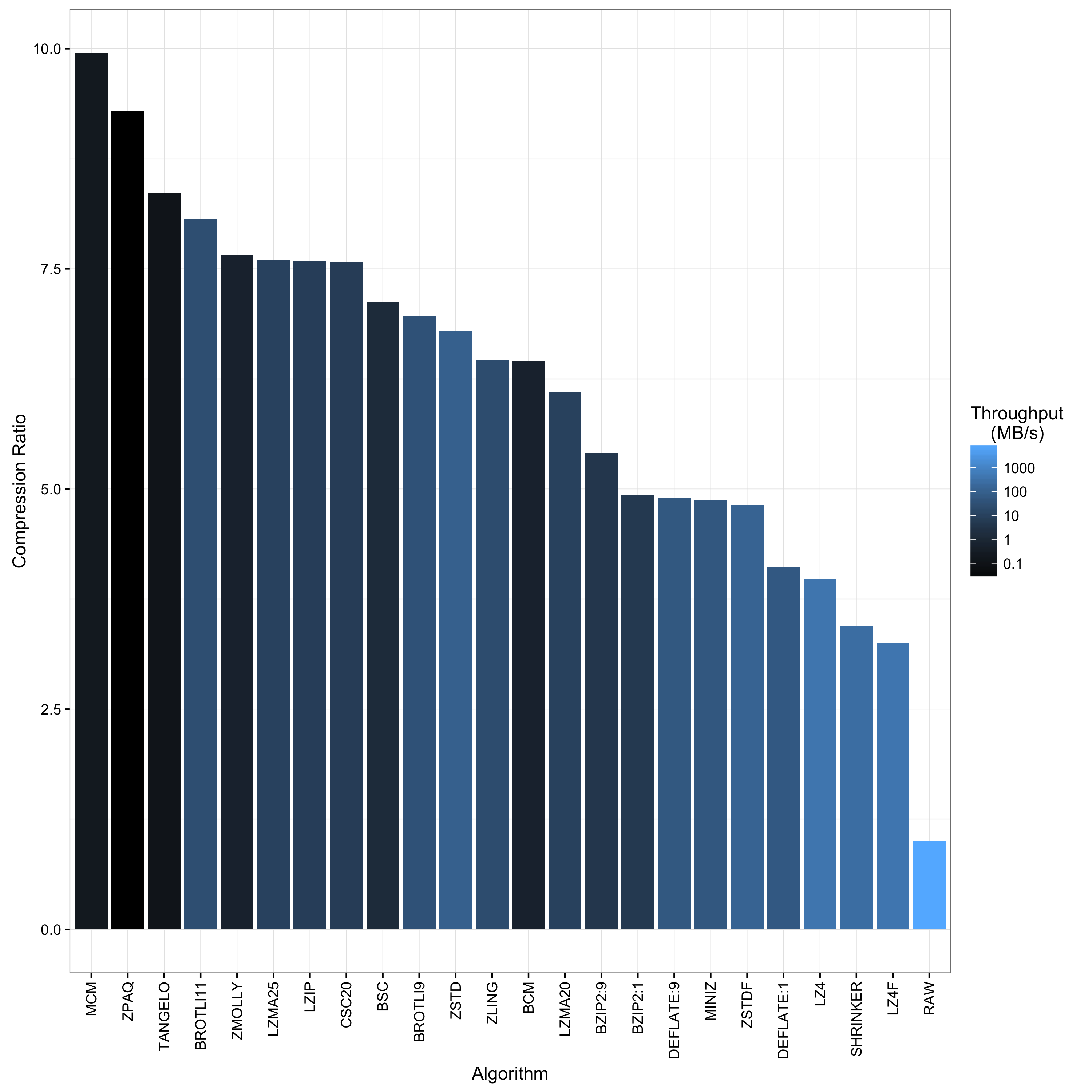
The above plot ranks the algorithms with respect to their compression ratio. The algorithm with the highest compression ratio appears on the left. The coloring corresponds to the decompression throughput in MB/sec and uses light blue to highlight those algorithms with fast decompression.
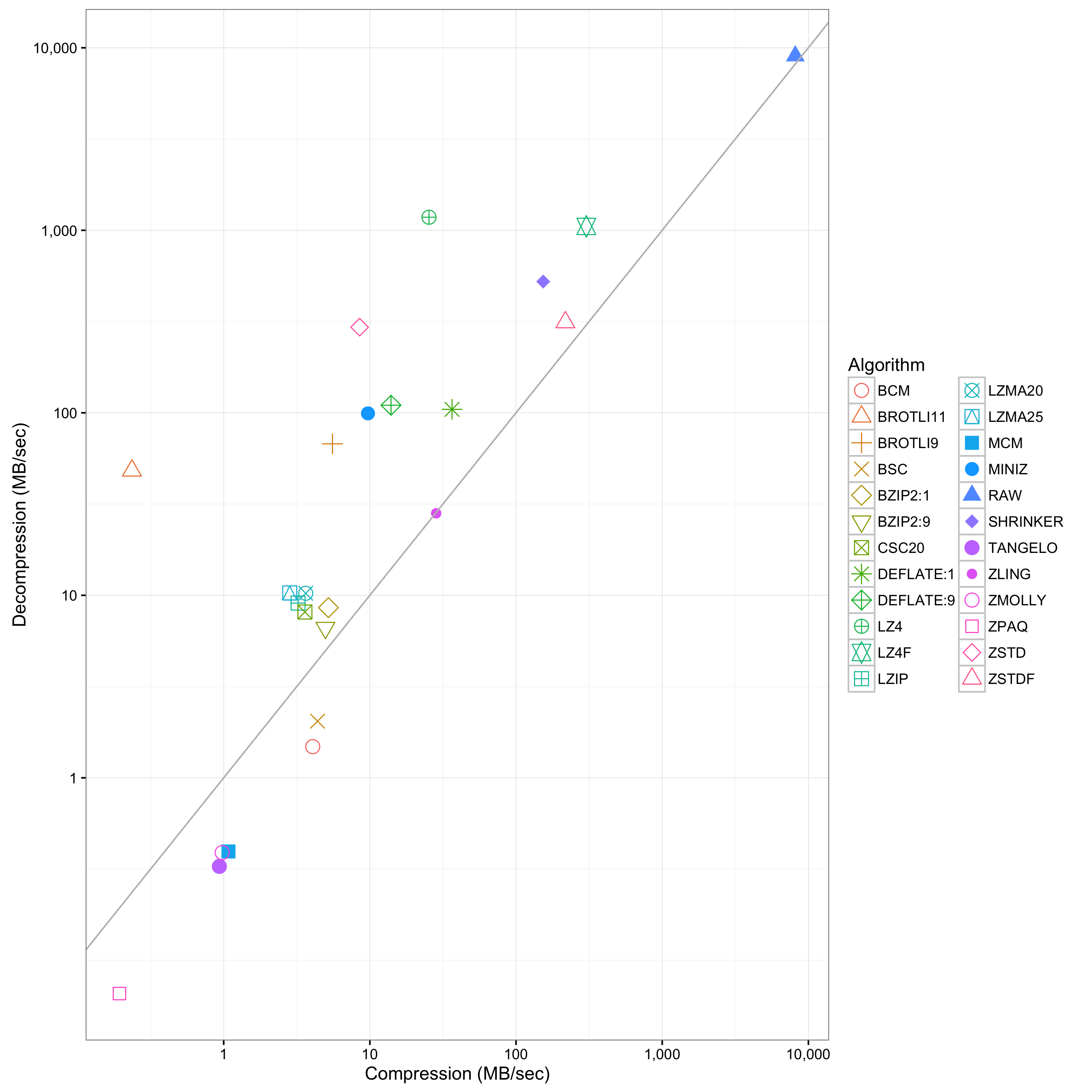
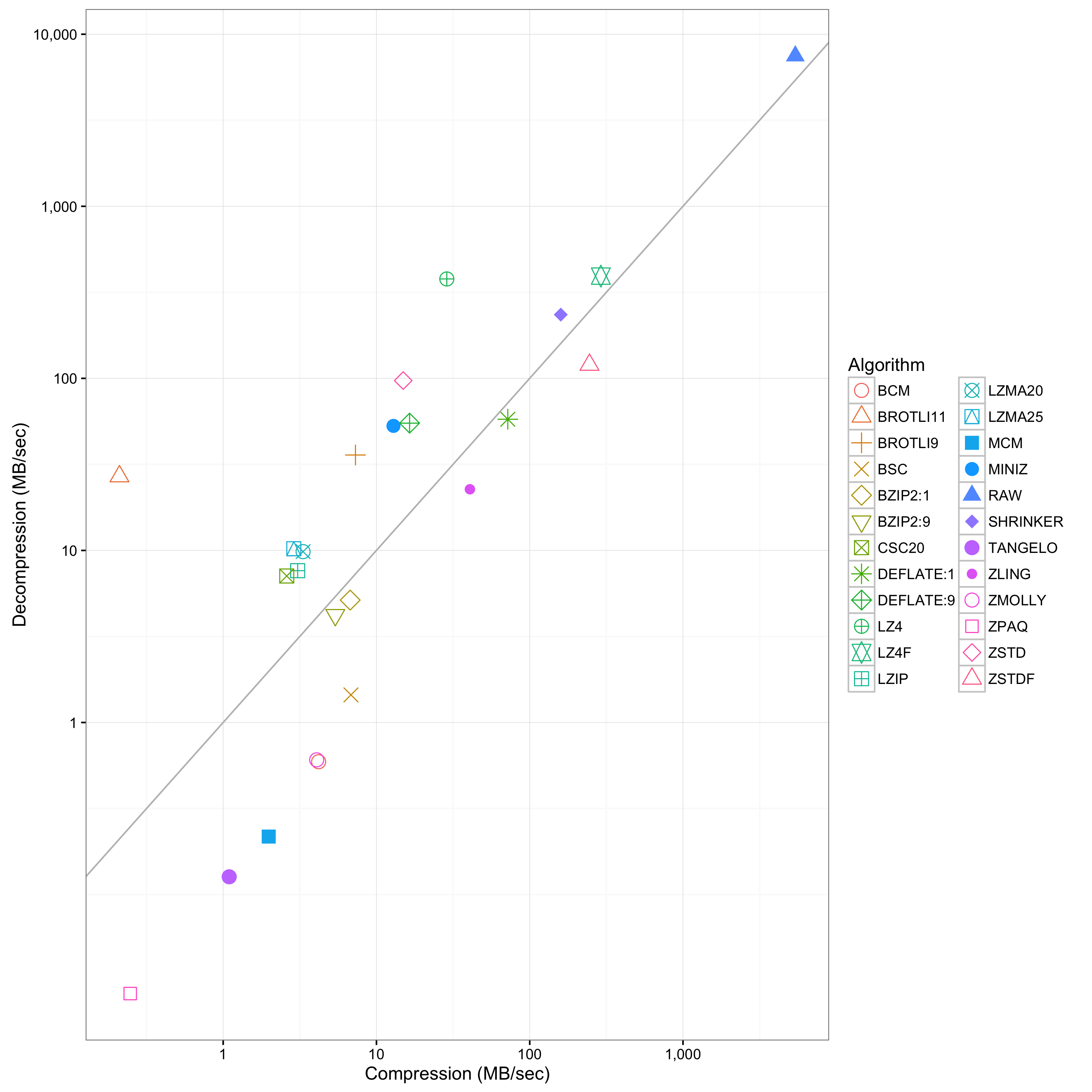
The above plot contrasts compression versus decompression throughput. The x-axis shows compression and the y-axis decompression performance in MB/sec. A point above the y=x diagonal means that it has high decompression than compression throughput. The converse holds for points below the diagonal. The further a point appears in the top-right corner, the higher its combined performance. Note that this algorithm does not profile compression ratio.
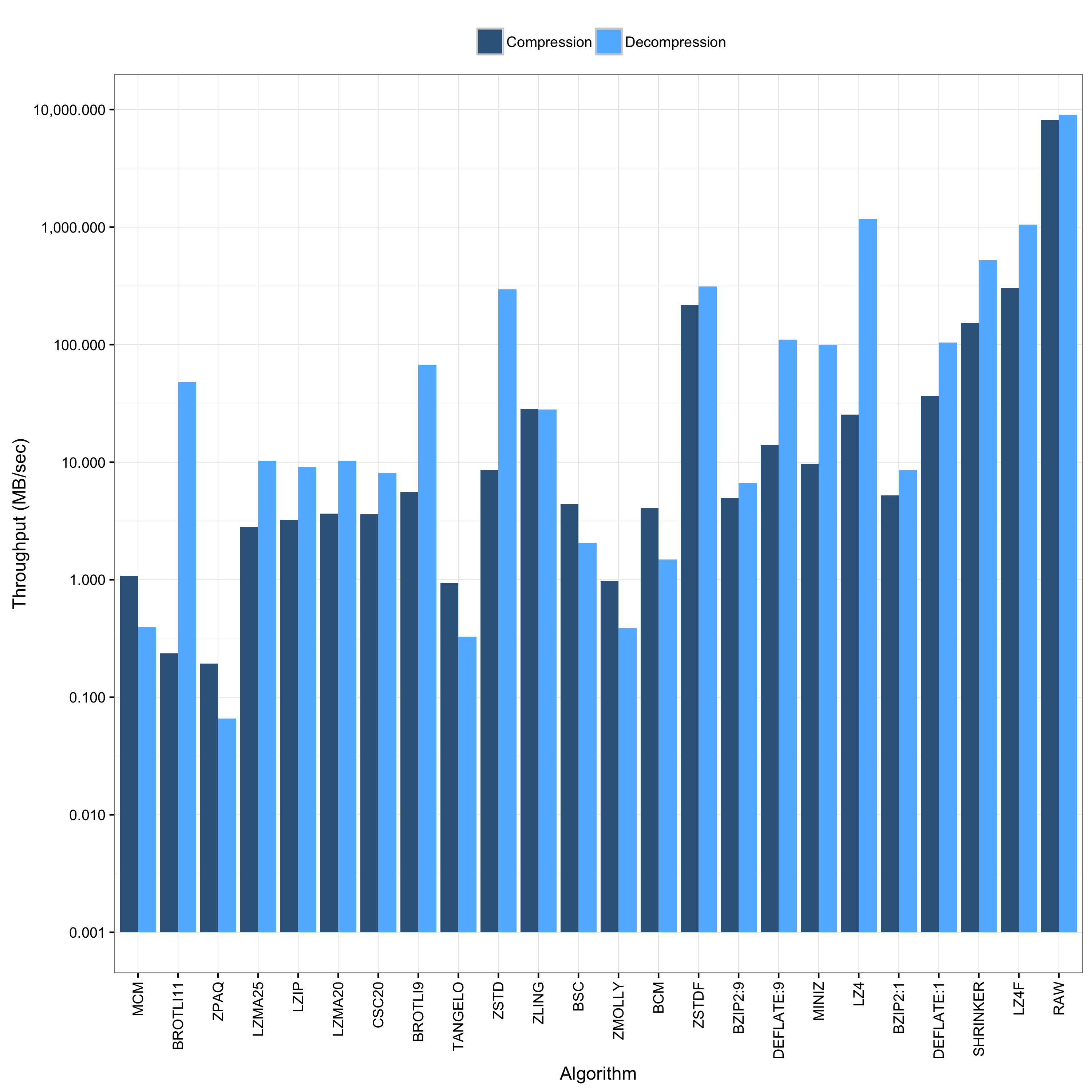
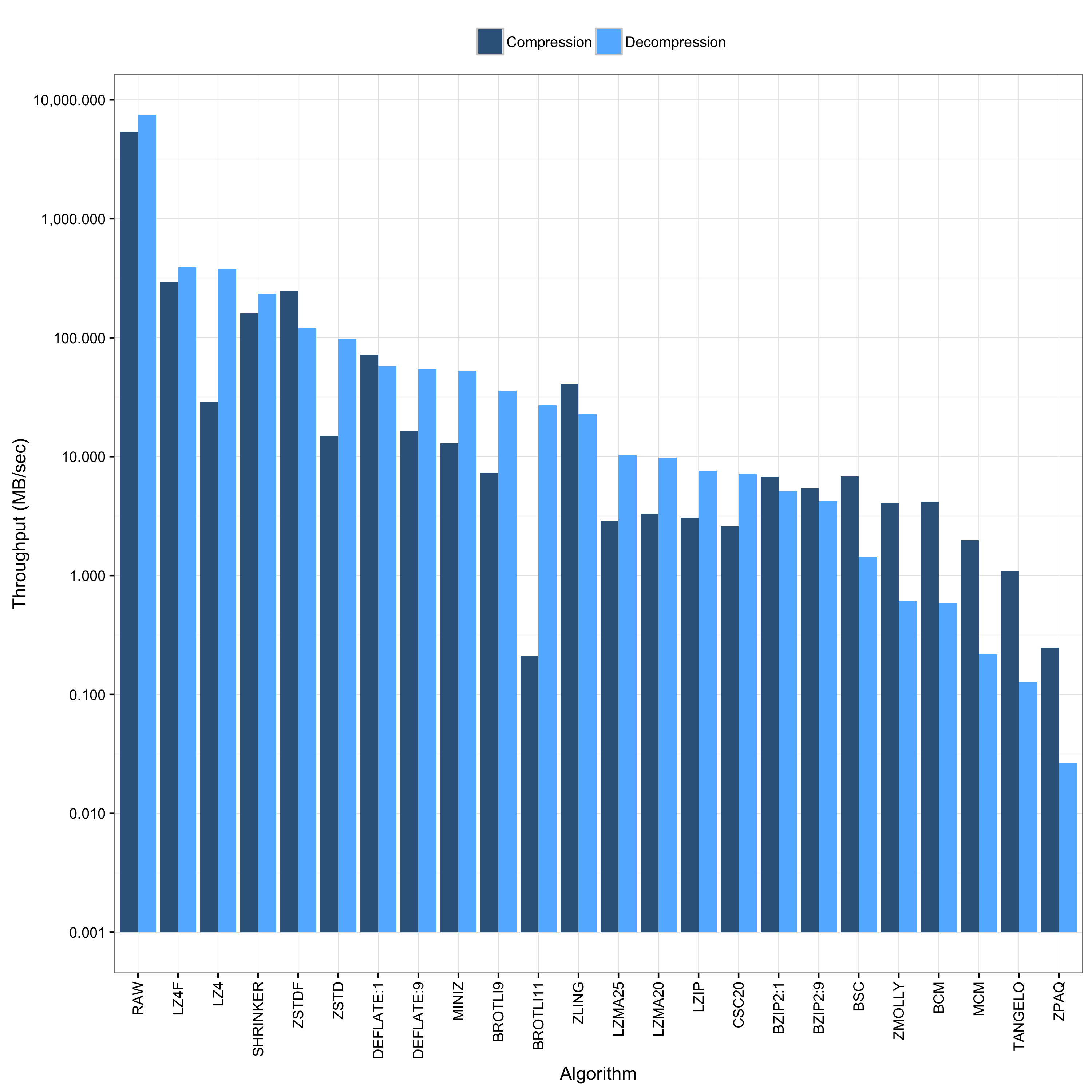
The above plot shows the same information as the previous plot, but also includes the compression ratio in that the left-most algorithm exhibits the highest compression ratio.
The next figures show the same plot types for Bro ASCII logs generated from the above trace:
The above plots come with a Creative Commons Attribution 4.0 International License, while the code ships with a 3-clause BSD license.
