Circos plots enable visualisation of large amounts of data but can be
cumbersome to produce. EpiViz is intended to streamline and enable the
efficient creation of Circos plots for a range of data typicaly used by
epidemiologists.
EpiViz was designed with metabolite association analyses in mind.
These analyses involve hundreds of metabolites which can be grouped
together in different combinations. Of particular interest in these
studies is how groups of metabolites behave rather than individual
metabolites. In this instance we use the sections of the Circos plot to
plot individual groups of metabolites and look at the overall picture
for that group of metabolites.
The application and R package build on the
Circlize and
ComplexHeatmap R
packages to make prodcuing Circos plots quicker and easier for
reserachers. For researchers with little expeirence in R the web
application is recommended. For reserachers with some experience the R
package is recommended. See the README files for specific uses of the
web application
and R
package.
Circular layouts provide a unique way to visualise large amounts of
information. An alternative approach is the
rainplot. However, if you
have less than 50 data points (i.e. less than 50 rows in a data frame)
you should try visualising your data using forest plots -
ggforestplot
and forest_plot_1_to_many() from
TwoSampleMR.
Luo, S., Lam, H.S., Chan, Y.H. et al. Assessing the safety of lipid-modifying medications among Chinese adolescents: a drug-target Mendelian randomization study. BMC Med 21, 410 (2023). https://doi.org/10.1186/s12916-023-03115-y
Bos, M.M., Goulding, N.J., Lee, M.A. et al. Investigating the relationships between unfavourable habitual sleep and metabolomic traits: evidence from multi-cohort multivariable regression and Mendelian randomization analyses. BMC Med 19, 69 (2021). https://doi.org/10.1186/s12916-021-01939-0
Please cite the web application and R package as follows:
Lee M. A, Mahmoud O, Hughes D, Wade K. H, Corbin L. J, McGuinness L. J, Timpson N. J. Epiviz: an implementation of Circos plots for epidemiologists. 2020. https://github.com/mattlee821/EpiViz
Gu Z, Gu L, Eils R, Schlesner M, Brors B. circlize Implements and enhances circular visualization in R. Bioinformatics. 2014;30(19):2811–2812. doi:10.1093/bioinformatics/btu393
Gu Z, Eils R, Schlesner M. Complex heatmaps reveal patterns and correlations in multidimensional genomic data. Bioinformatics. 2016;32(18):2847–2849. doi:10.1093/bioinformatics/btw313
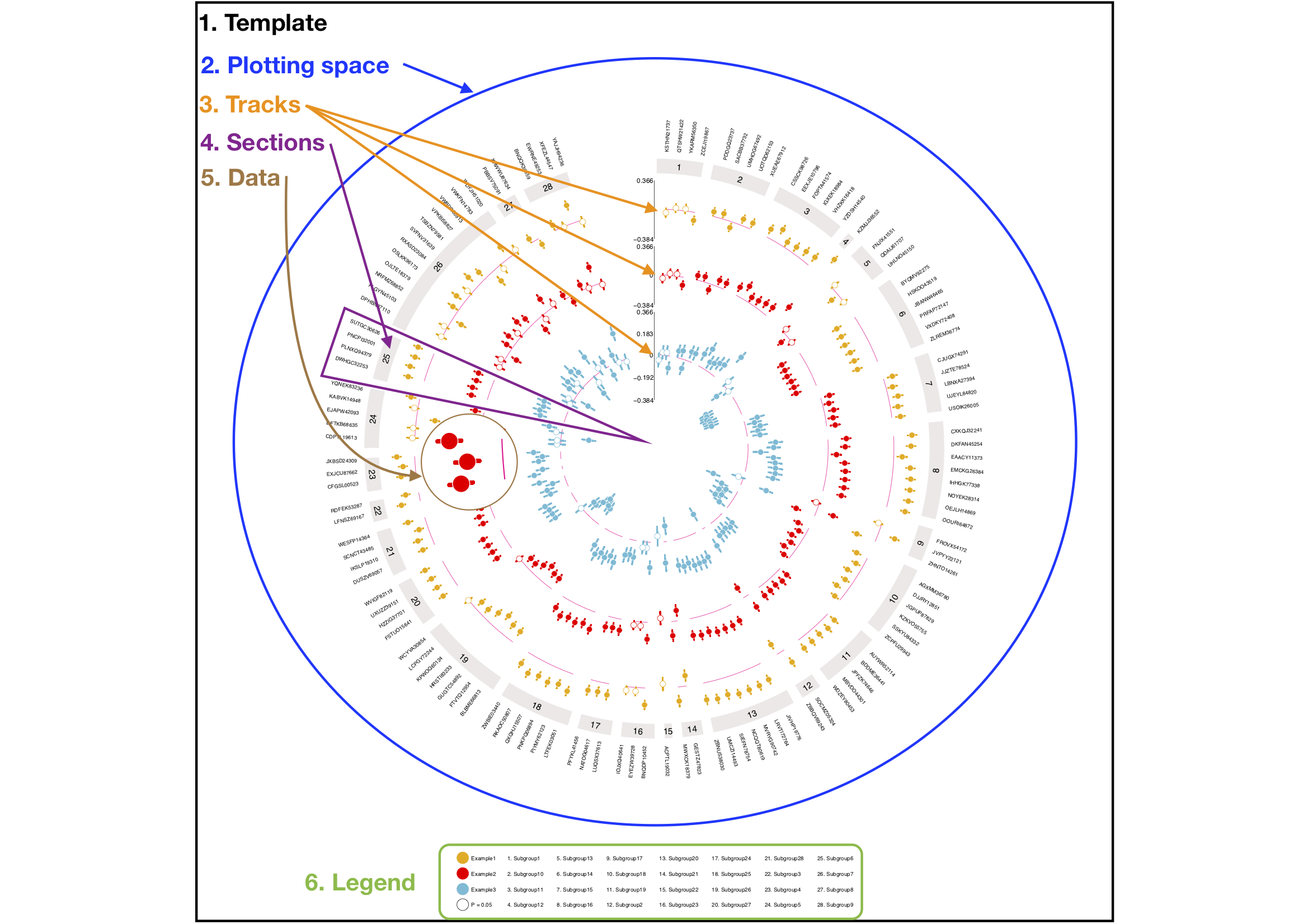
Circos plots are composed of six elements: template, plotting space,
tracks, sections, data, legend. The template element is a square of
defined proportions within which information is plotted. Each additional
element is layered onto the template one after the other. The plotting
space element is an empty circle which is layered and centered on top of
the template. Data is plotted on to the plotting space. An optional
extra of the Circos plot, the legend element takes the dimensions of the
template and creates a seperate plotting space that can be layered on to
the bottom of the template element.
The plotting space is seperated into tracks and sections. Tracks are
laid down as rings within the plotting space. Each track represents a
single element of information such as an exposure. Tracks are numbered
from the outside to the centre of the circle and coloured seperately.
Sections divide the plotting space into distinct groups, much like a pie
chart. Sections are defined by the data and usually represent groups of
outcomes such as metabolite classes. A section track is laid at the
outside of the tracks to give a header element for each section. The
section header is referenced in the legend element.
Once the template, plotting space, tracks and sections are laid down,
coordinates for each section and track location can be called to plot
the data element. Each track and section coordinate, e.g. track 2
section 3, is treated as an individual plotting space. As such, data can
be plotted based on the following coordinates: track, section, X, Y.
The X axis of each track is defined by the number of rows in the data
frame, i.e a data frame with 100 rows will have an X axis of length
100 with each row given an X axis coordinate from 1:100. The Y axis
is defined by the minimum and maximum of the data for that track. As
such, each track and section coordinate, e.g. track 2 section 3, can be
considered an individual plot with a Y axis that is shared by all of
the sections in that track. For each position on the X axis the label
element of each row is plotted outside of the section header.
