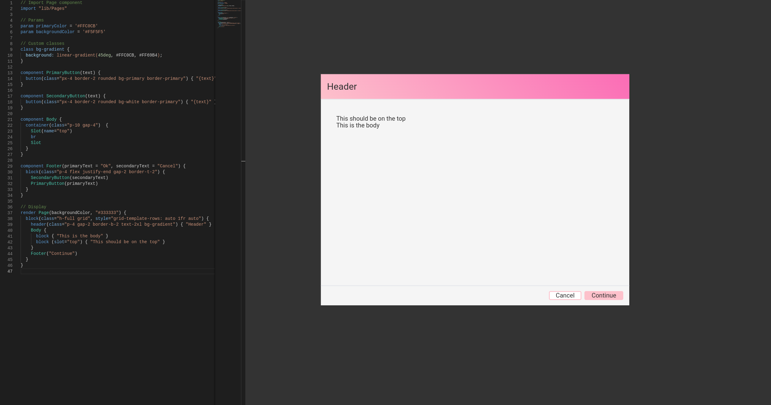
A new Design-as-code language side project.
ChatGPT help with the name, syntax and boilerplate code.
Give it a try at https://matteobortolazzo.github.io/stylo/!
You can use example.stylo to test.
This project contains:
- Renderer (Stylo to HTML)
- Code editor (syntax-highlight only)
A language server should be the next thing.
The code has few to no comments. Read at your own risk.
The solution uses yarn workspaces as the idea was to share code easily.
Run yarn && yarn start to install packages, compile and open the browser.
The application has a text editor with syntax highlight on the left, and the render on the right. We can zoom and move the rendering as we please.
Hovering on an element in the render will highlight the code definition of the left.
To see compilation errors press F12 and check the console.
The idea was to create a competitor for Figma. Instead of export code from designs, I wanted to export design from code.
The code concept was reusability of UI elements. So variables, components and imports were the priority. I should also be easy enough to learn for designers who might have little experience with code.
I also wanted some kind of standard way to apply styling. I chose Tailwind because of its recent popularity, but custom CSS classes and attributes are supported.
Definition:
rendercomponentclassparamSlotimport
Attributes:
classstyleslot
To show anything on the right panel, we use the render keyword. We can render a component or direct HTML.
// HTML
render span { "Hi" }

// Component

render Button("Hi")
Components are first-class citizens in Stylo. The body of components uses a tree structure like HTML.
component Footer {
  block { "Hello" }
}
block is NOT a keyword. We can use whatever makes sense to us as long as it's in camelCase.
Components support parameters (string). They can also have a default value.
component PrimaryButton(text = "Continue") {
  button { "{text}" }
}
We can then just pass a value when using the component.
render PrimaryButton("Ok")As mention above, Tailwind is supported by default.
component SecondaryButton(text) {
  button(class="px-4 border-2 rounded bg-white border-red") { "{text}" }
}We can define custom CSS classes with the class keyword.
class bg-gradient {
  background: linear-gradient(45deg, #FFC0CB, #FF69B4);
}Finally, we can write inline style too.
component PrimaryButton(text) {
  button(class="px-4 rounded bg-primary", style="border: 2px solid red") { "{text}" }
}We can define variables to share in the project. We use the param keyword.
param primaryColor = '#FFC0CB'
param backgroundColor = '#F5F5F5'
param welcomeText = 'Hello'
We can use them as components input values.
If we define a variable that ends with Color, multiple CSS classes are generated:
text-{color}bg-{color}outline-{color}border-{color}border-y-{color}border-x-{color}border-t-{color}border-r-{color}border-b-{color}border-l-{color}
The last feature of the components is slots. They let us create shells without specifying the content itself.
component Body {
  container(class="p-10 gap-4")  {
    Slot(name="top")
    br
    Slot
  }
}
We then pass what we want to the container.
Body {
  block { "This is the body" }
  block (slot="top") { "This should be on the top" }
}
name is used in the slot definition to distinguish them.
slot is used in the component usage to specify in which slot it should be rendered.
To conclude the reusability objectives, the import keyword is critical.
Inspired by Deno, we can import any .stylo code from and URL.
import "https://myrepo/Buttons"There's also a Pages library within the code. But there's only one component so far.
import "lib/Pages"Nice features to have would be:
- A language server
- CSS import
- Multi-file editor
- A proper SaaS
- Accounts
- Projects
- Git integration
- Export to JS frameworks
- Publish static websites
- Actual links and buttons
I am publishing the code mostly for historical purposes.
While I like the language and learned A LOT, I don't see a demand for it.
For designers, it's easier to keep doing what they do. For developers, it might work. But Figma supports design tokens and reusable components already. They also recently released a plugin for VS Code, but I wonder if it will take off.
It's true that from the Abstract Syntax Tree, we can export Angular, React, Vue or anything we like. However, this is good only for greenfield projects. Once the project grows, keeping the design in sync with the code is increasingly more challenging. Ironically, the same problem I had writing this with the help of ChatGPT!
If Figma succeeds with the dev plugin or this gets some traction, I might give it a second look. For now, I'll move on. Compilers are not a great conversation topic with my friends and family. Or strangers in general.
