Diffusion log visualiser
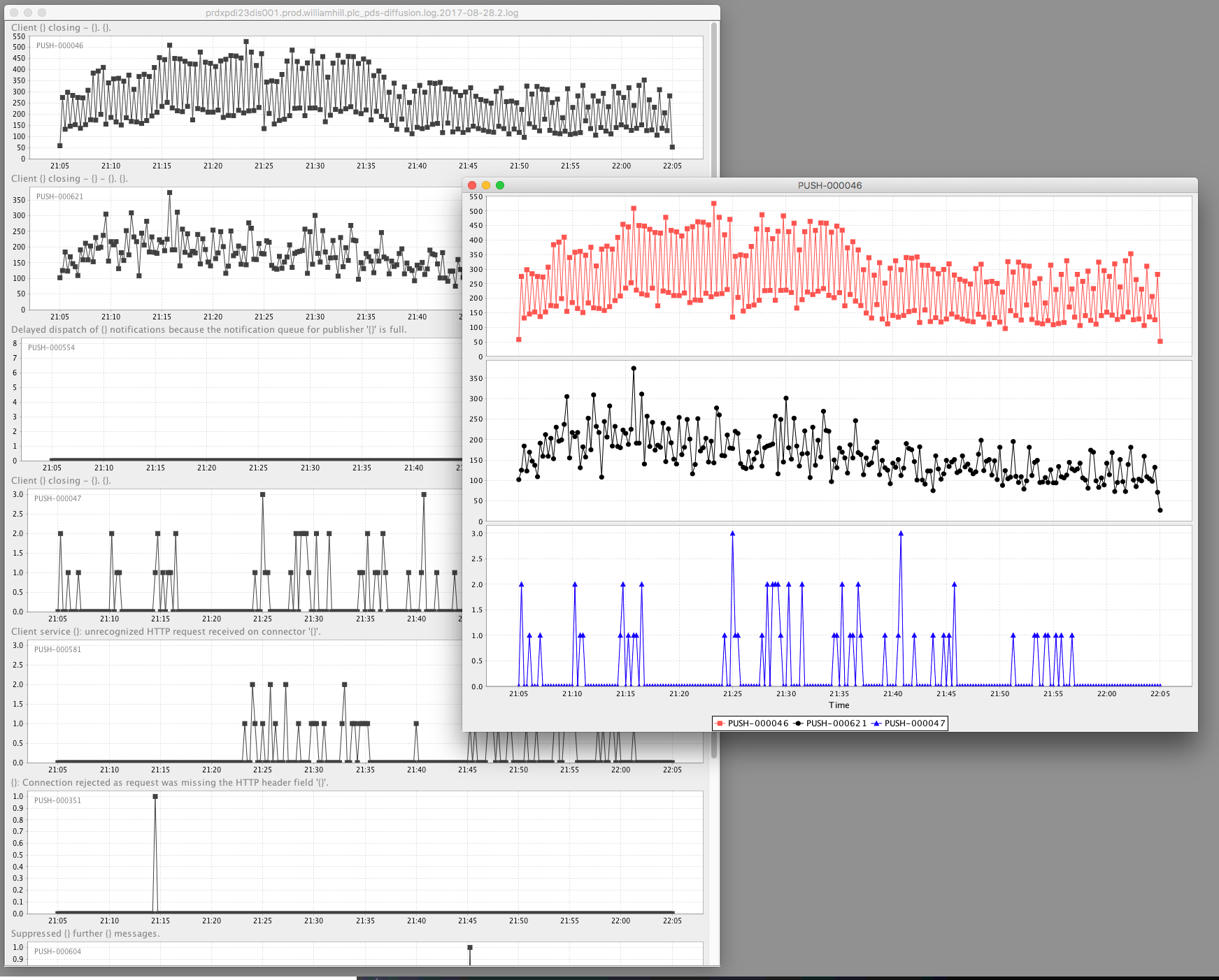
Visualise frequency of log markers from a Diffusion server log as line chart.
Requirements
- Java 8
- Maven 3.5
Quick start
git clone https://github.com/martin-cowie/server-log-analytics.git
mvn clean install
mvn exec:java
Use
- Load a Diffusion log, and you are given a palette window of each
PUSH-marker present in the log file. - Double click on a data item to create a chart
- Control-Drag other data items to the chart to add them.
- Drill down into specific times on the chart window for emphasis.
- Right click on the chart window to navigate
