This file serves as both the code used to generate the plots in the April EMAP presentation, as well as the document describing how the code works. This is an example of a R Markdown document, which is a mix of both code and prose.
To get started, I’ll load the libraries needed.
library(readr)
library(googlesheets4)
library(tibble)
library(tidyr)
library(dplyr)
library(stringr)
library(forcats)
library(ggplot2)
library(ggtext)
library(knitr)
With the exception of googlesheets4, ggtext, and knitr, these
packages are all a part of the tidyverse, and could have been called
with one line, library(tidyverse), but I thought it’d be useful to
call each one explicitly to explain its use.
- readr and googlesheets4: Used to read files and import them into data frames (R’s version of a data table).
- tibble: A play on the word “table,” provides some quality-of-life improvements for working with data frames.
- tidyr: Provides a few functions that help with cleaning data.
- dplyr: Think of a plyer, like the hand tool. Provides many tools that help with working with and transforming data frames.
- stringr: Provides some useful functions that make working with strings a bit easier.
- forcats: Provides functions that help when working with factor variables (it’s not important right now what that means, I mostly use the forcats library here to reorder bar charts).
- ggplot2: Used for rendering plots and creating visualizations.
- ggtext: Gives access to custom CSS text formatting.
- knitr: Allows the document to be rendered.
With the required packages loaded, we’ll import the responses from the
form into a data frame and name it f_response. Then, we’ll render a
table of the first five responses, just to get an idea of what we’re
looking at.
f_response <- read_sheet("https://docs.google.com/spreadsheets/d/1grrfcEcBXk9snLKBf4weHNgvi-tQegNivA5LVuUO1gk/edit?usp=sharing")

kable(f_response[1:5, ])| Timestamp | Excluding Outlook, what computer program do you use most often for work? | How often do you use Excel? | Do you use Excel for analyzing/updating/generally working with data tables? | Have you ever run into this with a data table in Excel: | Did you have to learn a programming language for your degree? | How would you rate your programming class’ difficulty? | How would you rate your programming class’ usefulness? | Have you taken the C# training? | What programming languages are you comfortable using (list multiple under “other” if applicable)? |
|---|---|---|---|---|---|---|---|---|---|
| 2021-03-29 12:07:00 | Excel | I live in a spreadsheet. | Yes (at least some of the time) | Yes | Yes, but I never used it outside of the class it was taught in. | 7 | 2 | Yes - done | VBA, R |
| 2021-03-29 12:08:06 | Microsoft Excel | Regularly - I don’t spend everyday in Excel, but at least a few days each week involve a lot of Excel work. | Yes (at least some of the time) | No | No | 1 | 3 | No, and I don’t plan to | NA |
| 2021-03-29 12:18:18 | Excel | Daily - I spend a lot of time in spreadsheets. | Yes (at least some of the time) | Yes | Yes, but I only used it occasionally after learning it. | 6 | 6 | No, but I plan to | VBA |
| 2021-03-29 12:18:24 | Teams | Regularly - I don’t spend everyday in Excel, but at least a few days each week involve a lot of Excel work. | Yes (at least some of the time) | Yes | Yes, but I only used it occasionally after learning it. | 8 | 8 | No, and I don’t plan to | VBA, MATLab, C++ |
| 2021-03-29 12:18:34 | Microsoft Excel | I live in a spreadsheet. | Yes (at least some of the time) | Yes | No | NA | NA | No, and I don’t plan to | VBA |
This is pretty messy, so let’s clean it up:
# rename the columns to something a bit more readable
colnames(f_response) <- c("timestamp", "program", "excel_use_time", "excel_use",
                          "excel_problem", "lang_degree", "lang_diff", "lang_use",
                          "csharp", "lang_known")

f_response <- f_response %>%
  select(-timestamp) %>% # keep all cols but the timestamp
  mutate(program = tolower(program), # put all programs in lowercase
         program = str_remove(program, "microsoft "), # reformat program strings
         program = str_replace(program, "teamcenter", "globus"))

kable(f_response[1:5, ])| program | excel_use_time | excel_use | excel_problem | lang_degree | lang_diff | lang_use | csharp | lang_known |
|---|---|---|---|---|---|---|---|---|
| excel | I live in a spreadsheet. | Yes (at least some of the time) | Yes | Yes, but I never used it outside of the class it was taught in. | 7 | 2 | Yes - done | VBA, R |
| excel | Regularly - I don’t spend everyday in Excel, but at least a few days each week involve a lot of Excel work. | Yes (at least some of the time) | No | No | 1 | 3 | No, and I don’t plan to | NA |
| excel | Daily - I spend a lot of time in spreadsheets. | Yes (at least some of the time) | Yes | Yes, but I only used it occasionally after learning it. | 6 | 6 | No, but I plan to | VBA |
| teams | Regularly - I don’t spend everyday in Excel, but at least a few days each week involve a lot of Excel work. | Yes (at least some of the time) | Yes | Yes, but I only used it occasionally after learning it. | 8 | 8 | No, and I don’t plan to | VBA, MATLab, C++ |
| excel | I live in a spreadsheet. | Yes (at least some of the time) | Yes | No | NA | NA | No, and I don’t plan to | VBA |
That’s still pretty messy, but I’m planning on keeping the lengthy responses as-is for legend labels. The last column, the number of languages known, will need some special work, so I’ll remove that from this main data frame and save it to its own separate frame.
# create new dataframe of just the last col:
f_lang <- f_response %>%
  select(lang_known)

# remove last col from main data frame:
f_response <- f_response %>%
select(-lang_known)With all that edited, we can now start creating the plots!
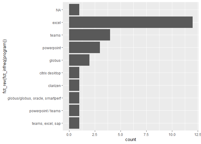
f_response %>%
  ggplot(aes(x = fct_rev(fct_infreq(program)))) + # reoder based on # of responses
  geom_bar() +
  coord_flip()
This is a good start, but it looks like I need to do some more wrangling
of this first column.There are some NA values and some fields that can
be combined into others. Additionally, I’d like to put all the responses
with less than one count in an “other” category. I’ll save the updated
plot as p_resp1 to work with later.
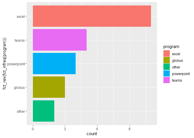
f_p_resp1 <- f_response %>%
  drop_na() %>%
  mutate(program = str_replace(program, "globus/globus, oracle, smartperf", "globus"),
         program = str_replace(program, "powerpoint / teams", "powerpoint"),
         program = str_replace(program, "clarizen", "other"),
         program = str_replace(program, "citrix desktop", "other"),
         program = str_replace(program, "teams, excel, sap", "teams"))

p_resp1 <- f_p_resp1 %>%
  ggplot(aes(x = fct_rev(fct_infreq(program)),
             fill = program)) +
  geom_bar() +
  coord_flip()

p_resp1
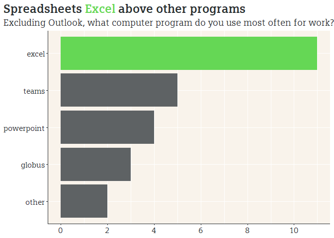
Great! This plot tells us what we want to know, but otherwise looks pretty bland. I’ll spice it up by running through some reformatting.
# load theme elements
devtools::source_url("https://raw.githubusercontent.com/markjrieke/thedatadiary/main/dd_theme_elements/dd_theme_elements.R")

# create plot
p_resp1 +
  dd_theme + # add some custom formatting that I loaded in above
  labs(title = "Spreadsheets <span style = 'color:#65D755;'>**Excel**</span> above other programs", # custom CSS styling
       subtitle = "Excluding Outlook, what computer program do you use most often for work?",
       x = NULL,
       y = NULL) +
  theme(legend.position = "none", # remove legend, since it's redundant
        plot.title.position = "plot", # shifts the plot title to the left
        plot.title = element_markdown(family = "Siemens Slab",
                                      size = 18),
        plot.subtitle = element_markdown(family = "Siemens Slab",
                                         size = 14),
        axis.text = element_markdown(family = "Siemens Slab",
                                     size = 12)) +
  scale_fill_manual(values = c(dd_green, # give each bar a custom color
                               dd_gray,
                               dd_gray,
                               dd_gray,
                               dd_gray)) +
  scale_y_continuous(labels = scales::number_format(accuracy = 1), # format label as integer
                     breaks = seq(0, 20, 2)) # set label to show multiples of 2
# save plot (automatically saves most recent plot)
ggsave("p_resp1.png",
width = 9,
height = 6,
units = "in",
dpi = 500)You may notice that I used scale_y_continuous to format the x axis -
how’d that happen? This is one of ggplot’s quirks - I used coord_flip
in one of the previous code chunks, which arranges the groups on the y
axis, rather than the x axis. This means that ggplot thinks the y axis
is now the x axis, and vice-versa.
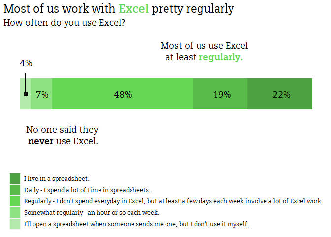
The remaining charts are built similarly, so I’ll throw together a few pretty quickly.
f_response %>%
  select(excel_use_time) %>% # keep only one column
  count(excel_use_time) %>% # get the total number of each response
  mutate(x_var = "group", # create a new variable to force the barplot to stack
         excel_use_time = fct_relevel(excel_use_time, # manually reorder the responses
                                      "I live in a spreadsheet.",
                                      "Daily - I spend a lot of time in spreadsheets.",
                                      "Regularly - I don't spend everyday in Excel, but at least a few days each week involve a lot of Excel work.",
                                      "Somewhat regularly - an hour or so each week.",
                                      "Rarely - maybe once or twice a month.",
                                      "I'll open a spreadsheet when someone sends me one, but I don't use it myself.")) %>%
  # add a plot!
  ggplot(aes(x = x_var,
             y = n,
             fill = excel_use_time)) +
  geom_col(width = 0.3) +
  coord_flip() + # coord flip! x axis will be treated as y axis
  scale_fill_manual(values = c("#4CA140", # manually adding in colors for each response
                               "#58BC4A",
                               "#65D755",
                               "#8CE180",
                               "#B2EBAA")) +
  labs(title ="Most of us work with <span style = 'color:#65d755;'>**Excel**</span> pretty regularly",
       subtitle = "How often do you use Excel?",
       x = NULL,
       y = NULL) +
  theme(legend.position = "bottom",
        legend.direction = "vertical",
        legend.title = element_blank(),
        plot.title.position = "plot",
        axis.text = element_blank(),
        plot.title = element_markdown(family = "Siemens Slab",
                                      size = 18),
        plot.subtitle = element_markdown(family = "Siemens Slab",
                                         size = 14),
        legend.text = element_markdown(family = "Siemens Slab",
                                       size = 10),
        panel.background = element_blank(),
        axis.ticks = element_blank()) +
  # lots of annotations!
  annotate(geom = "richtext",
           label = "Most of us use Excel<br> at least <span style = 'color:#65D755;'>**regularly.**</span>",
           x = 1.4,
           y = 17,
           family = "Siemens Slab",
           size = 5,
           label.color = "white") +
  annotate(geom = "richtext",
           label = "No one said they <br>**never** use Excel.",
           x = 0.6,
           y = 4,
           family = "Siemens Slab",
           size = 5,
           label.color = "white") +
  annotate(geom = "text",
           label = "4%",
           x = 1.3,
           y = 0.6,
           family = "Siemens Slab",
           size = 5) +
  annotate(geom = "segment",
           x = 1.2,
           y = 0.55,
           xend = 1,
           yend = 0.55,
           size = 1) +
  annotate(geom = "point",
           x = 1,
           y = 0.55,
           size = 3) +
  annotate(geom = "text",
           label = "7%",
           x = 1,
           y = 2.1,
           family = "Siemens Slab",
           size = 5) +
  annotate(geom = "text",
           label = "48%",
           x = 1,
           y = 9.5,
           family = "Siemens Slab",
           size = 5) +
  annotate(geom = "text",
           label = "19%",
           x = 1,
           y = 18.6,
           family = "Siemens Slab",
           size = 5) +
  annotate(geom = "text",
           label = "22%",
           x = 1,
           y = 24.1,
           family = "Siemens Slab",
size = 5)ggsave("p_resp2.png",
width = 9,
height = 6,
units = "in",
dpi = 500)
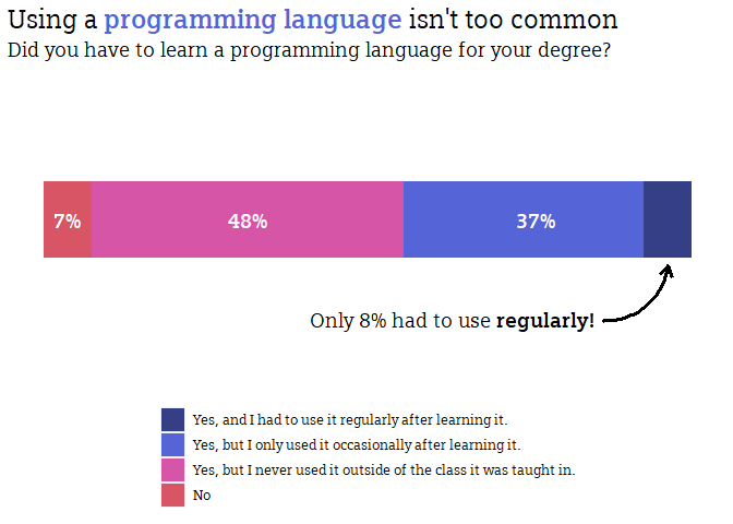
f_response %>%
select(lang_degree) %>%
count(lang_degree) %>%
mutate(x_var = "group",
lang_degree = fct_relevel(lang_degree,
"Yes, and I had to use it regularly after learning it.",
"Yes, but I only used it occasionally after learning it.",
"Yes, but I never used it outside of the class it was taught in.",
"No")) %>%
ggplot(aes(x = x_var,
y = n,
fill = lang_degree)) +
geom_col(width = 0.3) +
coord_flip() +
scale_fill_manual(values = c(dd_blue_dark,
dd_blue,
dd_purple,
dd_red)) +
labs(title = "Using a <span style = 'color:#5565D7;'>**programming language**</span> isn't too common",
subtitle = "Did you have to learn a programming language for your degree?",
x = NULL,
y = NULL) +
theme(legend.position = "bottom",
legend.direction = "vertical",
plot.title.position = "plot",
legend.title = element_blank(),
axis.text = element_blank(),
plot.title = element_markdown(family = "Siemens Slab",
size = 18),
plot.subtitle = element_markdown(family = "Siemens Slab",
size = 14),
legend.text = element_markdown(family = "Siemens Slab",
size = 10),
panel.background = element_blank(),
axis.ticks = element_blank()) +
annotate(geom = "richtext",
x = 0.6,
y = 17,
label = "Only 8% had to use **regularly!**",
family = "Siemens Slab",
size = 5,
label.color = "white") +
annotate(geom = "curve",
x = 0.6,
y = 23.25,
xend = 0.82,
yend = 26,
curvature = 0.4,
size = 1.1,
arrow = arrow(length = unit(3, "mm"))) +
annotate(geom = "text",
label = "7%",
x = 1,
y = 1,
family = "Siemens Slab",
fontface = "bold",
size = 5,
color = "white") +
annotate(geom = "text",
label = "48%",
x = 1,
y = 8.5,
family = "Siemens Slab",
fontface = "bold",
size = 5,
color = "white") +
annotate(geom = "text",
label = "37%",
x = 1,
y = 20.5,
family = "Siemens Slab",
fontface = "bold",
size = 5,
color = "white")ggsave("p_resp3.png",
width = 9,
height = 6,
units = "in",
dpi = 500)
f_response %>%
select(excel_problem) %>%
count(excel_problem) %>%
mutate(x_var = "group",
excel_problem = fct_relevel(excel_problem,
"Yes",
"No")) %>%
ggplot(aes(x = x_var,
y = n,
fill = excel_problem)) +
geom_col(width = 0.3) +
coord_flip() +
scale_fill_manual(values = c(dd_red,
dd_blue)) +
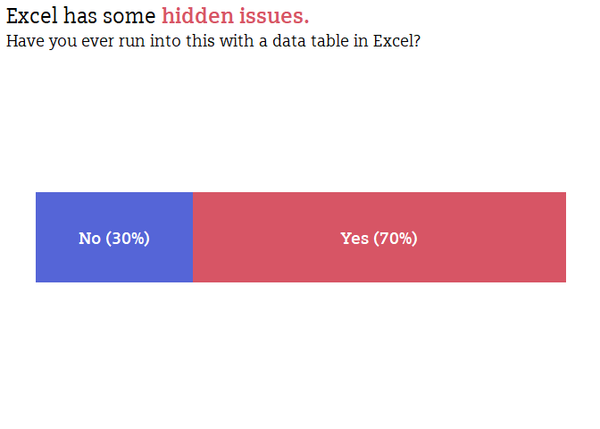
labs(title = "Excel has some <span style = 'color:#D75565;'>**hidden issues.**</span>",
subtitle = "Have you ever run into this with a data table in Excel?",
x = NULL,
y = NULL) +
theme(legend.position = "none",
legend.direction = "vertical",
plot.title.position = "plot",
legend.title = element_blank(),
axis.text = element_blank(),
plot.title = element_markdown(family = "Siemens Slab",
size = 18),
plot.subtitle = element_markdown(family = "Siemens Slab",
size = 14),
legend.text = element_markdown(family = "Siemens Slab",
size = 10),
panel.background = element_blank(),
axis.ticks = element_blank()) +
annotate(geom = "text",
label = "No (30%)",
x = 1,
y = 4,
family = "Siemens Slab",
fontface = "bold",
size = 5,
color = "white") +
annotate(geom = "text",
label = "Yes (70%)",
x = 1,
y = 17.5,
family = "Siemens Slab",
fontface = "bold",
size = 5,
color = "white")ggsave("p_resp4.png",
width = 9,
height = 6,
units = "in",
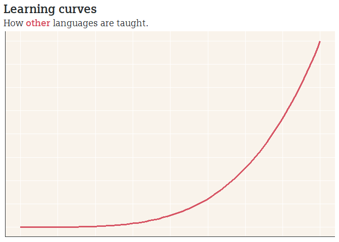
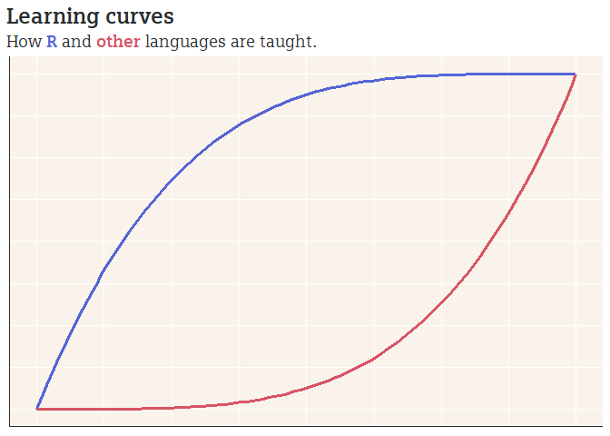
dpi = 500)The next chart is the learning curve chart - this is all made with made-up data for effect.
# create a tibble (dataframe) with the data for the "other" curve
f_std <- tibble(x_var = seq(0, 1, 0.01)) %>%
  mutate(y_var = x_var ^ 4, # arbitrary equation so that the plot looks good
         curve = "std")

# create a tibble with the data for the R curve
f_rcurve <- f_std %>%
  mutate(y_var = 1 - (1 - x_var) ^ (4), # arbitrary equation so that the plot looks good
         curve = "rcurve")

# merge together to make plotting easier
f_curves <- rbind(f_std, f_rcurve)

# first plot
f_curves %>%
  filter(curve == "std") %>% # filter out to only plot one curve
  ggplot(aes(x = x_var,
             y = y_var,
             color = curve)) +
  geom_path(size = 1.1) +
  scale_color_manual(values = dd_red) +
  dd_theme +
  labs(title = "Learning curves",
       subtitle = "How <span style = 'color:#D75565;'>**other**</span> languages are taught.",
       x = NULL,
       y = NULL) +
  theme(legend.position = "none",
        plot.title.position = "plot",
        plot.title = element_markdown(family = "Siemens Slab",
                                      size = 18),
        plot.subtitle = element_markdown(family = "Siemens Slab",
                                         size = 14),
        axis.text = element_blank(),
axis.ticks = element_blank())ggsave("p_resp5.png",
width = 9,
height = 6,
units = "in",
dpi = 500)
# second plot
f_curves %>%
ggplot(aes(x = x_var,
y = y_var,
color = curve)) +
geom_path(size = 1.1) +
scale_color_manual(values = c(dd_blue,
dd_red)) +
dd_theme +
labs(title = "Learning curves",
subtitle = "How <span style = 'color:#5565D7;'>**R**</span> and <span style = 'color:#D75565;'>**other**</span> languages are taught.",
x = NULL,
y = NULL) +
theme(legend.position = "none",
plot.title.position = "plot",
plot.title = element_markdown(family = "Siemens Slab",
size = 18),
plot.subtitle = element_markdown(family = "Siemens Slab",
size = 14),
axis.text = element_blank(),
axis.ticks = element_blank())ggsave("p_resp6.png",
width = 9,
height = 6,
units = "in",
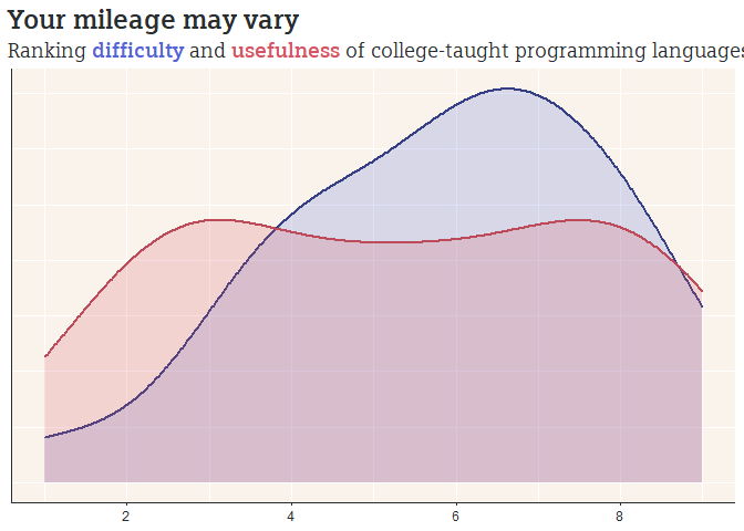
dpi = 500)Now we just need to put together the density response plots:
f_response %>%
  select(lang_diff, lang_use) %>%
  drop_na() %>% # one person didn't respond
  ggplot() +
  # I add two separate geom_density calls because I was being lazy and didn't feel like merging into one column. It just means I had to write a bit of extra code.
  geom_density(aes(x = lang_diff),
               fill = dd_blue,
               color = dd_blue_dark,
               alpha = 0.2,
               size = 1) +
  geom_density(aes(x = lang_use),
               fill = dd_red,
               color = dd_red_dark,
               alpha = 0.2,
               size = 1) +
  dd_theme +
  labs(title = "Your mileage may vary",
       subtitle = "Ranking <span style = 'color:#5565D7;'>**difficulty**</span> and <span style = 'color:#D75565;'>**usefulness**</span> of college-taught programming languages",
       x = NULL,
       y = NULL) +
  theme(plot.title.position = "plot",
        plot.title = element_markdown(family = "Siemens Slab",
                                      size = 18),
        plot.subtitle = element_markdown(family = "Siemens Slab",
                                         size = 14),
        axis.title = element_blank(),
        axis.text.y = element_blank(),
        axis.ticks.y = element_blank()) +
  scale_x_continuous(labels = scales::number_format(accuracy = 1),
breaks = seq(0, 10, 2))ggsave("p_resp7.png",
width = 9,
height = 6,
units = "in",
dpi = 500)I could have saved a bit of code by writing a new theme file, but I was being a bit lazy. There’s a general rule of thumb, "anytime you copy and paste code three times, you should just think about writing a function. I think I copied and pasted the theme for just about every chart.
If you read this, I hope it ended up being helpful. This is a fun pasttime for me, so I’m happy to answer any questions you might have, just shoot me an email.
