German ReadMe: See document README_GERMAN.adoc
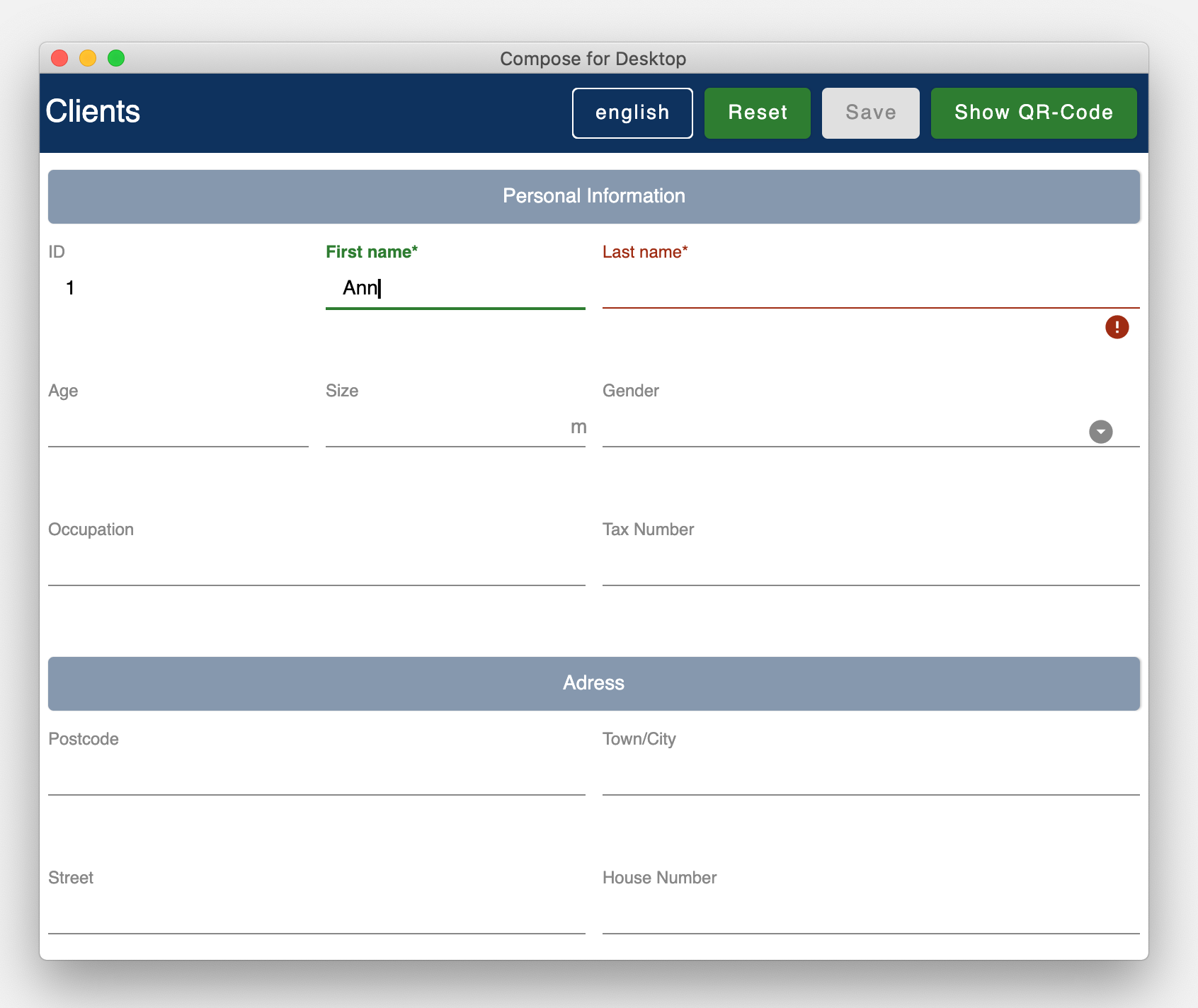
Compose Forms is a library that allows you to create beautiful & user-friendly forms quickly and easily.
The code for this example can be found here:
demo > src > main > kotlin > demo > personForm
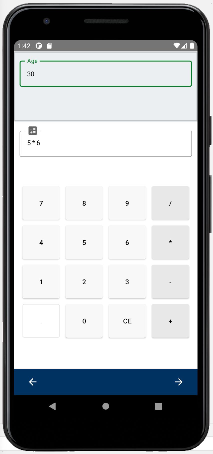
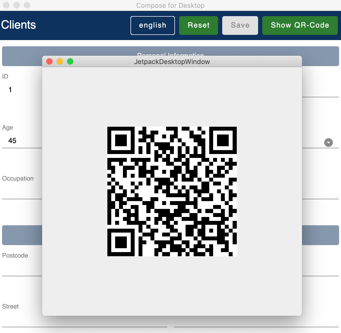
An additional user-supporting feature is the possibility to use the smartphone for the input of the individual fields. A boolean can be used to decide whether the smartphone input option should be enabled for the form. The end user is free to decide whether to use the smartphone or not. A button in the form allows the smartphone to be connected to the desktop form via QR code. Individual input masks for the desktop-focused input field are then displayed on the smartphone.
Used Technologies: Kotlin, Compose for Desktop, Jetpack Compose
Note: The library is currently under development and is being improved continuously, therefore not all functionalities are available yet.
You need:
-
IntelliJ or other development environment that supports Kotlin.
(https://www.jetbrains.com/de-de/idea/download/) -
Git to clone the ComposeForms project (https://git-scm.com/downloads)
git clone https://github.com/FHNW-IP5-IP6/ComposeForms.git
-
Android SDK
Since the Android SDK has been integrated into the developer tool Android Studio, it is best to download Android Studio.
(https://developer.android.com/studio) -
Gradle - version 6.8.2
(https://gradle.org/releases/)
When using IntelliJ, this does not need to be installed separately. -
JDK 11 or newer
(https://bell-sw.com/pages/downloads/#/java-11-lts) or (https://www.oracle.com/de/java/technologies/javase-downloads.html)
When using IntelliJ, this does not need to be installed separately.
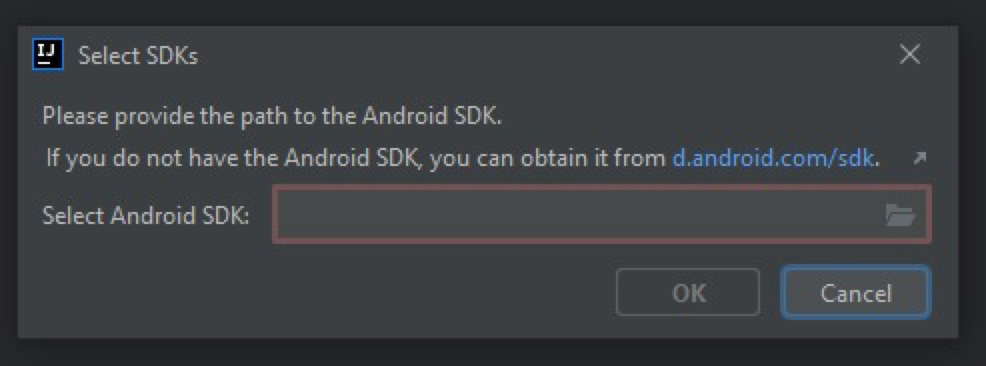
If there is no Android SDK yet, it will be asked for it:
If no Android SDK is available yet, download Android Studio (or Android SDK) and install/open it. Then specify the path to the installed Android Sdk in the IntelliJ window above.
If it is not clear where the Android SDK was saved:
Start Android Studio and create a new empty project.
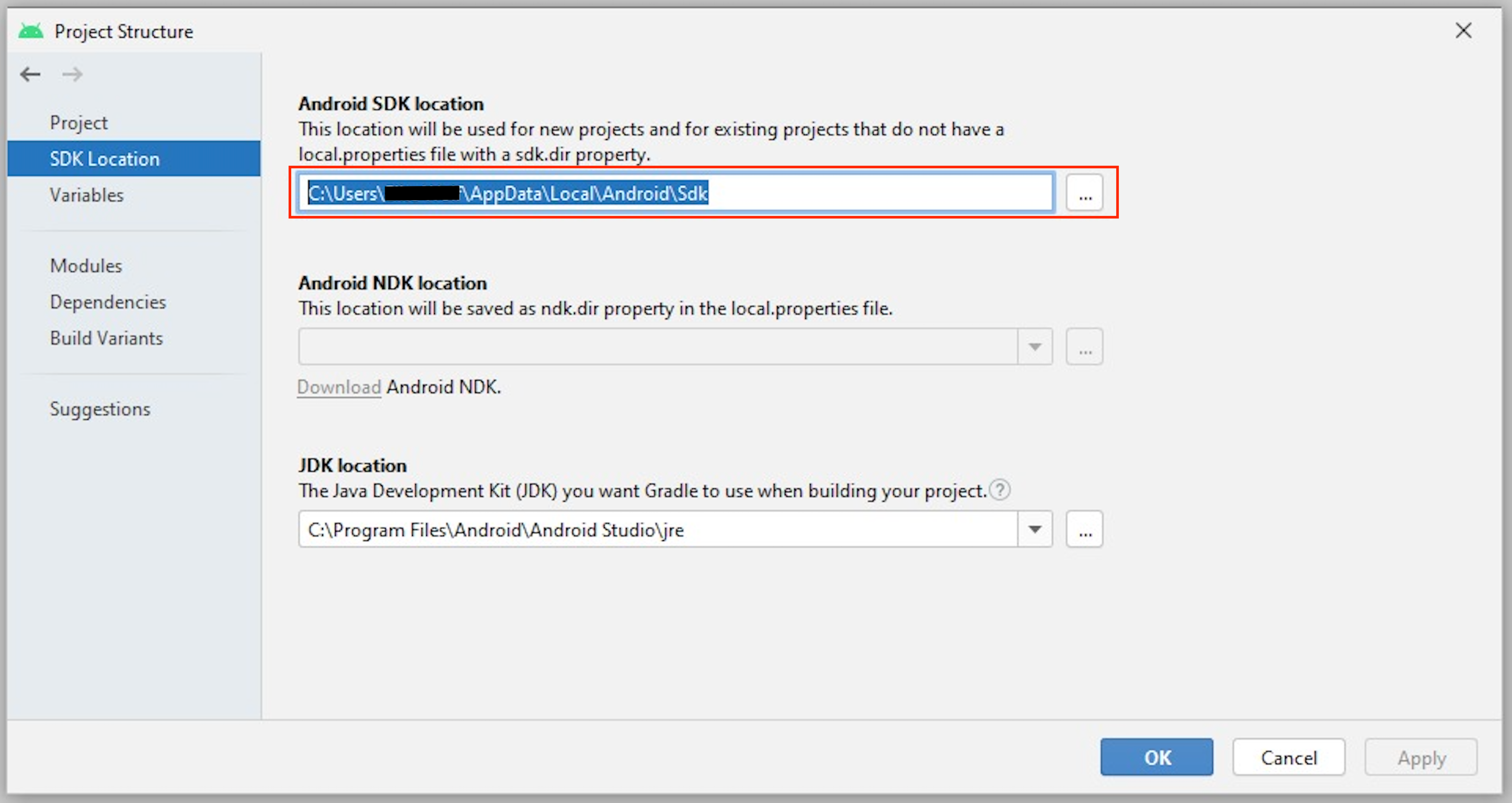
Then open Project Structure at the top right:
This is the location of the Android SDK:
This can be copied and then entered into the IntelliJ as android sdk location.
-
If the Andoid SDK is available, Gradle will start automatically. The first time this can take a little longer, because all files must be downloaded first.
-
When the Gradle is ready, the demo starter class main.kt can be started. ( demo > src > main > main.kt )
For the creation of a form the following 3 classes are basically needed:
-
Model, in which attributes and groups are defined.
-
Enum, in which the label names are defined
-
Starter class
To create a form, first a model must be created. This should implement the BaseModel.
class PersonModel : BaseModel(iLabel = PersonLabels.SIZE, smartphoneOption = true) { ... }( demo > src > main > kotlin > demo > personForm > PersonModel )
The BaseModel has 2 parameters: iLabel and smartPhoneOption.
We will come back to the iLabel parameter later when creating the attribute labels.
Below is an overview of the two parameters and their effects:
| Property | Type | Description |
|---|---|---|
iLabel * |
ILabel |
Here should be passed any entry of the label enum that has to be created. More info under the attribute parameter label. |
smartphoneOption |
Boolean |
Here can be passed true if the smartphone use should be allowed. (The user will then be shown the QR code button to connect to the cell phone). |
Parameters with * are mandatory. Parameters without * are optional.
In the model body, the application title can now be defined in an init block, which is executed 1 time at startup:
init {
        setTitle("Clients")
}
( demo > src > main > kotlin > demo > personForm > PersonModel )
Currently there is no multilingual option available for the form title. However, this will change in the future.
Now all needed attributes can be defined here in the model.
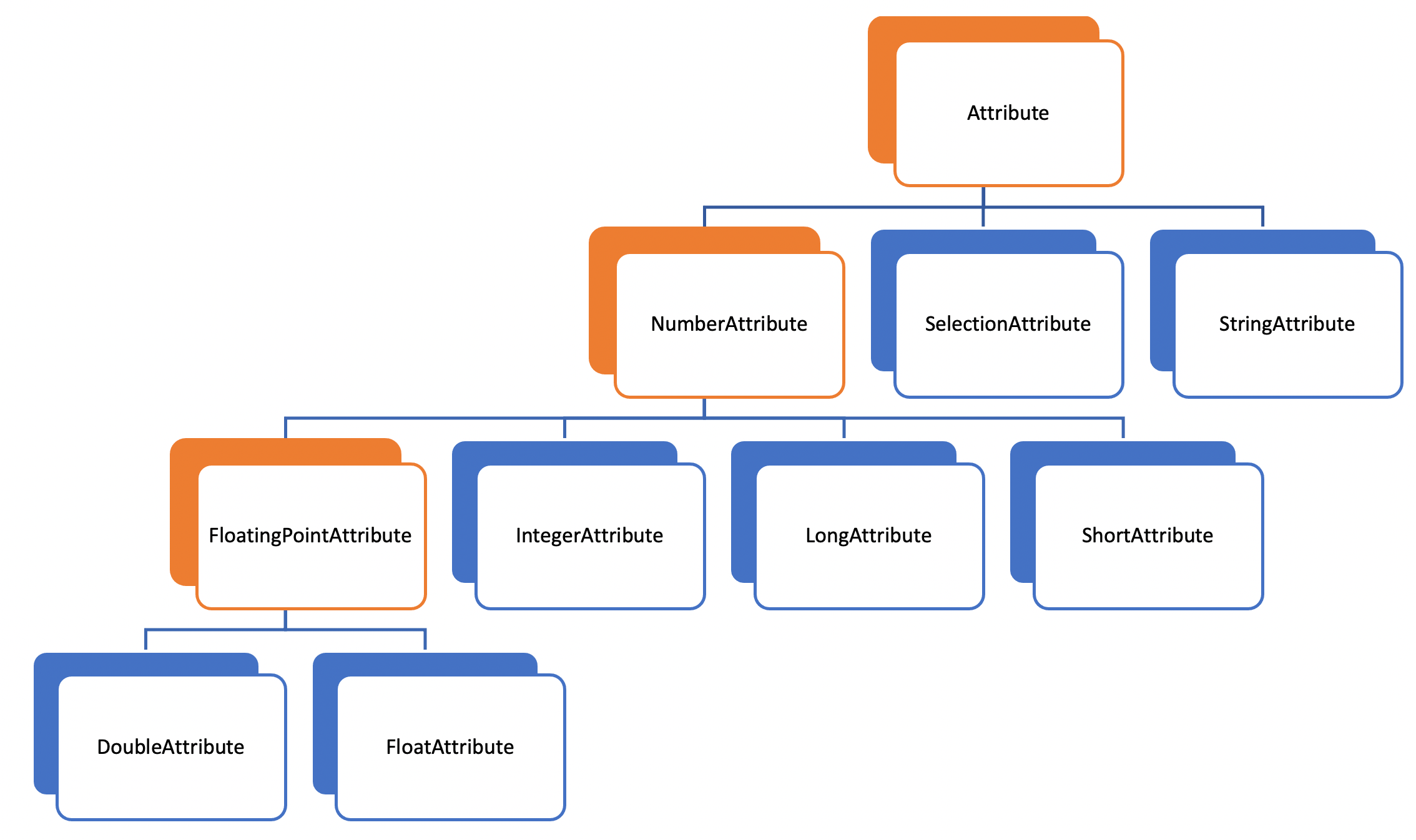
An attribute is a reflection of an object of a certain type with all values and information needed for interaction (e.g. saving etc.).
In this API there exist following attribute types:
Orange: Abstract classes
Blue: Concrete implementations. These can be used.
Example:
A StringAttribute is created in which the street name should be stored.
val street = StringAttribute(model = this, label = PersonLabels.STREET)( demo > src > main > kotlin > demo > personForm > PersonModel )
An attribute has various parameters which are used to configurate it. Certain parameters must be specified (marked with * in the following), others are optional and already have a default value set.
| Property | Type | Description |
|---|---|---|
IModel |
Model, which manages all attributes |
|
L |
Label text |
|
T? |
Last valid value |
|
Boolean |
Is the attribute a required field? |
|
Boolean |
Is the attribute a read-only field that cannot be modified? |
|
List<(T?) → Unit> |
Listeners that react to value changes |
|
List<SemanticValidator<T>>, |
Validators that determine when the user input is valid, invalid & onRightTrack |
|
List<CustomConvertible> |
Convertibles that allow the user an easier input |
|
SemanticMeaning<T> |
Give the value a semantic meaning (for example, that it is a currency). |
Certain attributes have additional parameters:
| Attribute(s) | Property | Type | Description |
|---|---|---|---|
FloatingPointAttribute |
Int |
Defines the number of allowed decimal places. |
|
SelectionAttribute |
Set<String> |
Sets the set of possible selections. |
After all attributes have been created, they can now be assigned to groups. Only attributes that are assigned to at least one group are displayed in the form.
It is important that all attributes assigned to the group have the same model as the group.
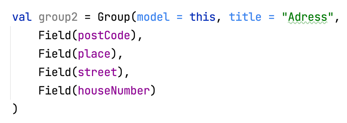
Example: Creating a group in the model:
val group2 = Group(model = this, title = "Adress",
        Field(postCode),
        Field(place),
        Field(street),
        Field(houseNumber)
    )
( demo > src > main > kotlin > demo > personForm > PersonModel )
A group has the following parameters:
| Property | Type | Description |
|---|---|---|
IModel |
Model, which manages all attributes and groups. |
|
String |
Group title |
|
vararg |
All fields that should be displayed. |
The attributes can be placed here deliberately in the desired order inside the groups. The size of the fields can also be determined (SMALL or NORMAL).
The model is now ready. Only the starter class is missing, in which the UI is connected to the model to start the application.
A new Kotlin class is created, in the following example Main.kt.
@ExperimentalFoundationApi
fun main() = Window() {
        val model = remember { PersonModel() }
        Form().of(model)
}
( demo > src > main > main.kt )
The annotation @ExperimentalFoundationApi and the remember are important when initializing the model.
For the window, the following parameters are useful to display the window optimally:
| property | type | description |
|---|---|---|
title |
String |
Define the title of the window |
size |
IntSize |
Define the size of the window at startup. |
Before the smartphone app can connect to the desktop via QR code, the app must be installed on the Android device (or emulator). To do this, simply launch the ComposeForms.app in the development environment.
If the smartphone is to connect via QR code (via the desktop application), the app must already be installed on the smartphone and the smartphone must be in the same WLAN as the desktop application.
Note: To be able to use the smartphone, the parameter smartphoneOption must be set to true in the Model.
In order to be able to properly connect the smartphone app to the desktop application via the development environment, the IP address of the desktop device must be set in the variable mqttBroker in the model ( app > src > main > kotlin > ch > model > Model ).
var mqttBroker = "192.168.0.94" //BeispielFind out IP address:
Open terminal and enter ifconfig.
In the output under en0: you can find among other things the IP address (behind the word inet).
After that the smartphone app can be started in the development environment:
Note: It is important that the desktop appliaction is started first and afterwards the smartphone, otherwise no connection can be established between the two applications.
| functionality | called model function | effect |
|---|---|---|
setCurrentLanguageForAll( lang : String) |
Sets the current language. The languages must be defined beforehand in the label enum. (see label) +. This functionality is not fully implemented yet. |
|
resetAll() |
Resets the values of all attributes to the last saved values. |
|
saveAll() |
Saves the values (user inputs) of all attributes, if they are all in a valid state. |
|
Generates a QR code so that the user can connect to the smartphone. |
For a better user experience, attributes can be in 3 different states.
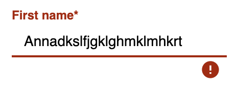
With the rightTrack state the times are over where the user gets upset about red error messages that are timed from the beginning before the user even had the chance to try to get a proper input. The rightTrack status indicates whether the user is on the right track to a valid input. Only if the input is really going in the wrong direction the input is shown as invalid.
| Appearance | Status | Description |
|---|---|---|
valid |
The input is in a valid state and can therefore be saved.
Valid means the input (String): |
|
invalid |
The input is in an invalid state and cannot be saved. If the input (String) is not valid it is in an invalid state. |
|
rightTrack (on the right way to a valid state) |
The rightTrack state is in addition to the two above. (So if the rightTrack state is set, the input is in a rightTrack state and an invalid or valid state at the same time. If it is not set, the input is invalid). The input is displayed to the user as rightTrack state if the input is in a state that is on the right track to a valid state. Once the state is valid the attribute is displayed as valid. |
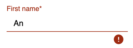
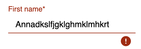
The above input fields belong to the following example:
The input must contain between 3 and 10 characters to be valid.
Number of Characters |
Appearance of focused field |
Appearance of unfocused field |
0 - 2 |
||
3 - 10 |
||
10 - … |
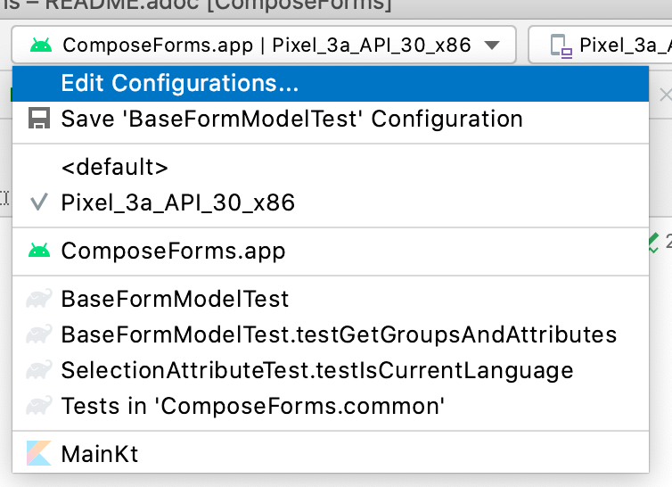
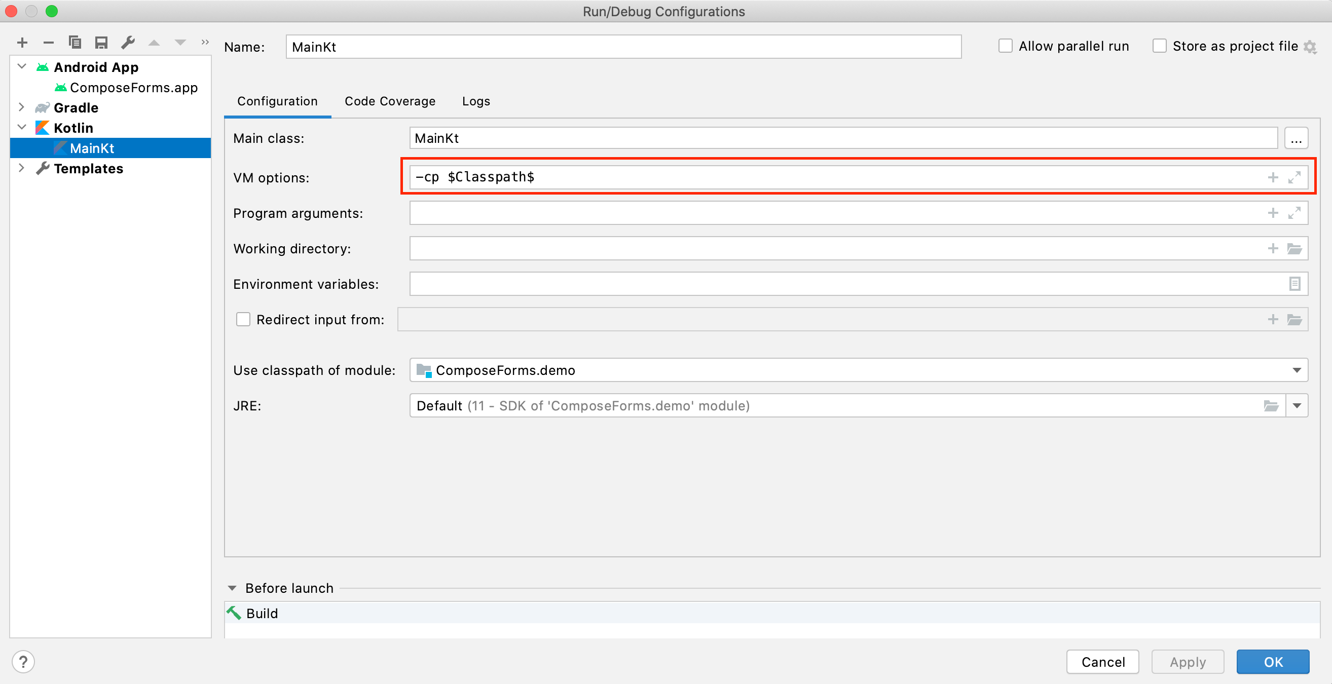
What to do if the application does not start?
Check if the variable -cp $Classpath$ is set in the configurations for the starter class under VM options. If not, this should still be set.
If this exception appears at startup the parameter iLabel (see in section Model) was not specified.
The following is a detailed explanation of the correct creation of the attribute parameters
The model of the group in which the attribute is located must be the same as the model of the attribute. (If this is not the case, an exception will be thrown).
Example 1 - All in one model
The attributes and groups are created in the same model.
For both the attribute and the group, this is passed as model.
( see: demo > src > main > kotlin > demo > personForm > PersonModel )
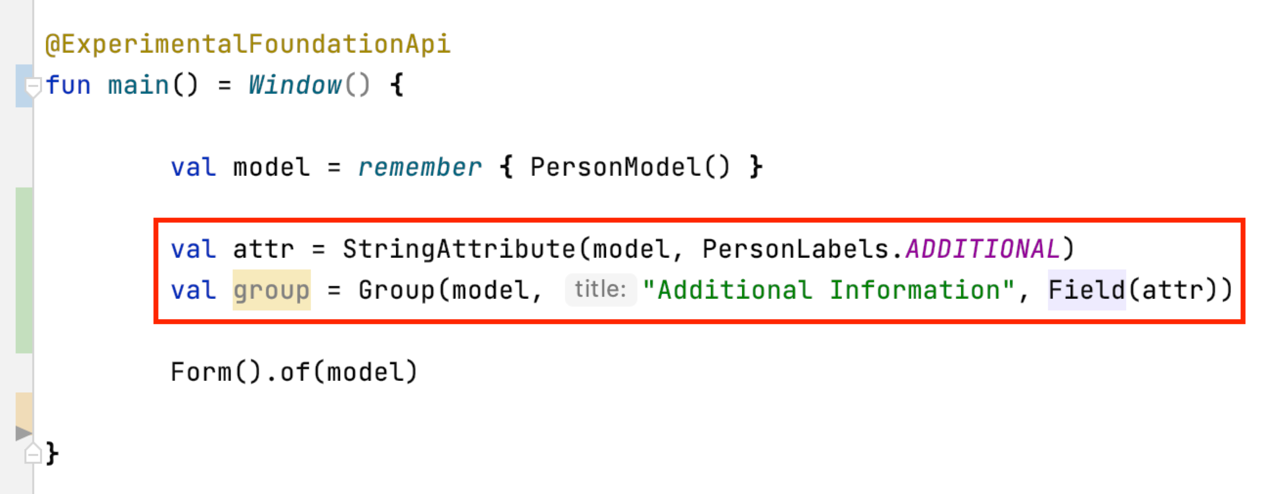
Example 2 - Attributes and groups distributed in several classes +. In addition to the attributes from example 1, another attribute should appear on the form. In this example, this attribute is defined directly in the starter class and passed to its own group. In order for it to appear on the same form, the same model must be passed as parameter.
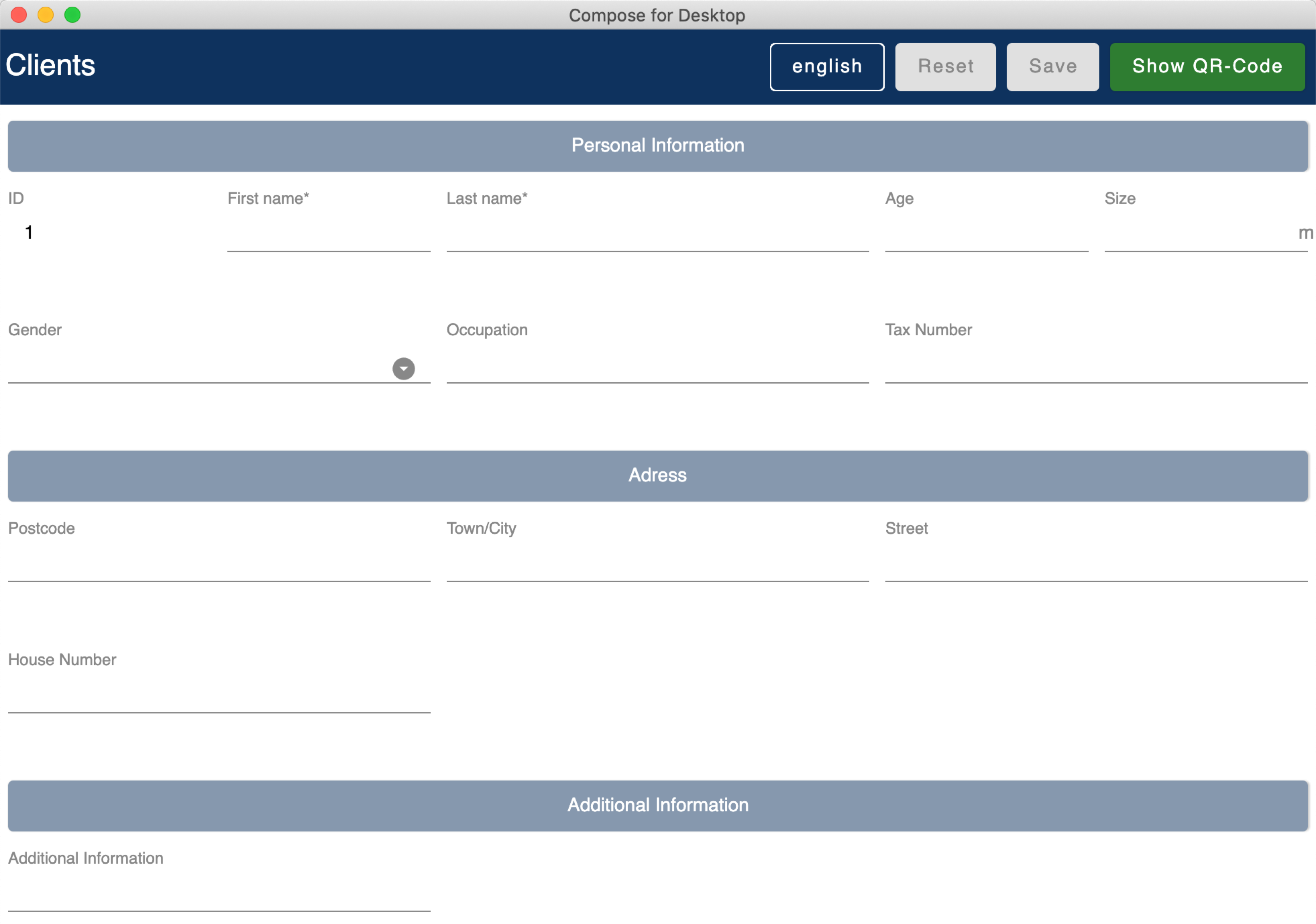
Now the additional group with the attribute appears in the form among those already defined in the PersonModel:
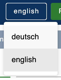
To ensure multilingualism, the label texts must be specified in an enum.
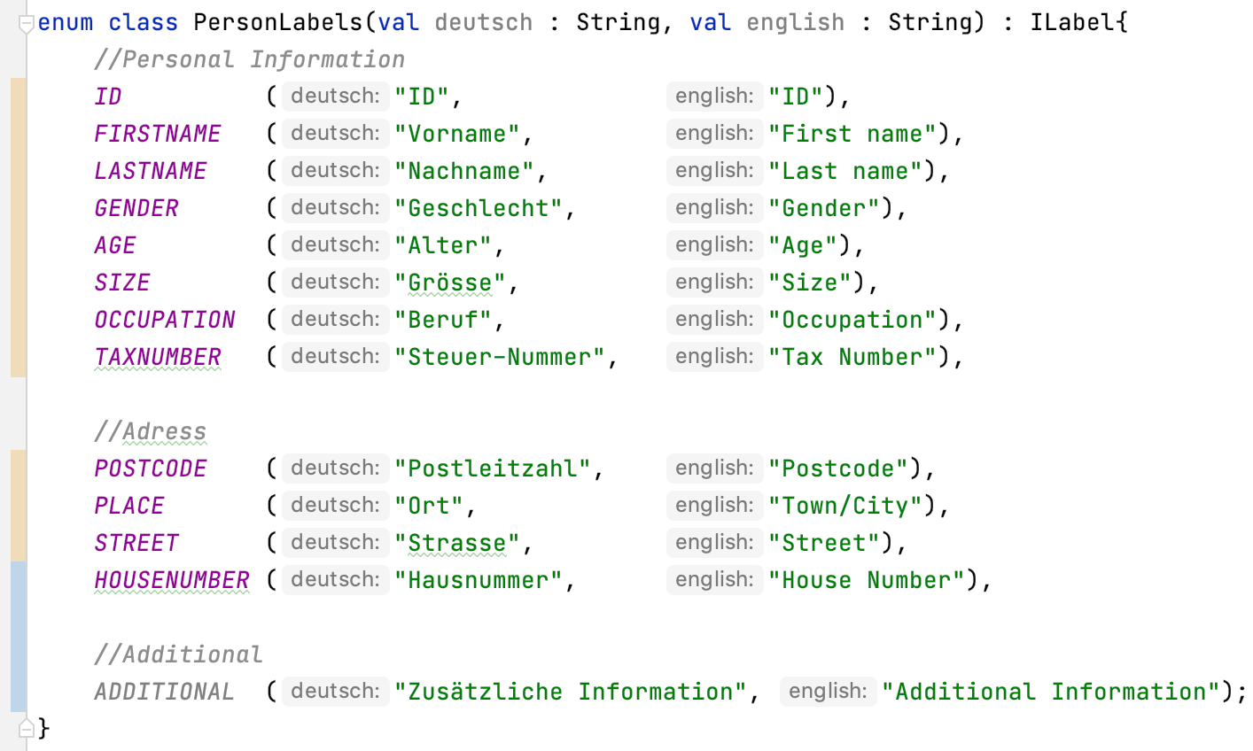
The enum must implement the interface ILabel and define all desired languages as parameters with type String.
In the enum you can now specify code variables in which the translations of the label texts can be defined.
( demo > src > main > kotlin > demo > personForm > PersonLabels )
At the attributes you only have to specify the correct code variable as label.
( demo > src > main > kotlin > demo > personForm > PersonModel )
For the languages to be recognized automatically by the form, the iLabel parameter must be given to the model. Any label from the created label enum class can be specified here.
If an attribute should not be empty the first time the form is opened, the value parameter can be used to set the value.
( demo > src > main > kotlin > demo > personForm > PersonModel )
The value must be of the same type as the attribute!
If not specified, the default value null is set.
If an attribute should be a required field (the user should be forced to make an entry and not leave the field empty), true can be passed in for the required parameter.
( demo > src > main > kotlin > demo > personForm > PersonModel )
If not specified, the default value false is set.
If an attribute should only be readable but not modifiable for the user, true can be passed in the readonly parameter.
( demo > src > main > kotlin > demo > personForm > PersonModel )
If not specified, the default value false is set.
OnChangeListeners can be used to change the attribute on which the ChangeListeners are passed as parameters when the values of other attributes are changed. A list with onChangeListeners must be passed since there can be several onChangeListeners for one attribute.
Define an onChangeListener:
attribute whose value should be observed addOnChangeListener {
lambda parameter for this attribute , lambda parameter for value to be observed → What when should happen }
Example:
As soon as something is entered for the occupation attribute (value != null), the tax number should become a mandatory field.
( demo > src > main > kotlin > demo > personForm > PersonModel )
If no value is entered, the default value emptyList() is set.
You can pass so-called semantic validators to the attribute, with which you can restrict the validity of the attribute value.
( demo > src > main > kotlin > demo > personForm > PersonModel )
Since you can specify multiple validators, they must always be passed in a list ( listOf(..) ).
If you want to change a validator at runtime, you have to define it as a variable outside the attribute and then pass it to the attribute:
( demo > src > main > kotlin > demo > personForm > PersonModel )
With override…Validator() (for … insert the type used) the validator can be changed at runtime.
Example:
If the person is >= 1m, then he must be at least 6 years old. If not, they can be younger.
(The size attribute was defined before).
( demo > src > main > kotlin > demo > personForm > PersonModel )
For certain attribute types, certain validators with different parameters are available. The following is an overview of all semantic validators and their parameters:
| Property | Type | Description |
|---|---|---|
lowerBound |
T? |
Lower limit for input |
upperBound |
T? |
Upper limit for input |
stepSize |
T? |
Step size |
stepStart |
T? |
Number from which the steps are calculated up/down |
onlyStepValuesAreValid |
Boolean |
If true all numbers between the steps are invalid. |
validationMessage |
String |
Message to be displayed to the user if the input is invalid due to this validator. |
| Property | Type | Description |
|---|---|---|
decimalPlaces |
Int |
Number of allowed decimal places |
validationMessage |
String |
Message to be displayed to the user if the input is invalid due to this validator. |
| Property | Type | Description |
|---|---|---|
minNumberOfSelections |
Int |
Minimum number of selections that must be selected by the user. |
maxNumberOfSelections |
Int |
Maximum number of selections that must be selected by the user. |
validationMessage |
String |
Message to be displayed to the user if the input is invalid due to this validator. |
| Property | Type | Description |
|---|---|---|
minLength |
Int |
Minimum length of the input word. (number of characters) |
maxLength |
Int |
Maximum length of the input word. (number of characters) |
validationMessage |
String |
Message to be displayed to the user if the input is invalid due to this validator. |
| Property | Type | Description |
|---|---|---|
regexPattern |
String |
Regex that specifies when the input word is valid, as String. |
rightTrackRegexPattern |
String |
Regex specifying when the input word is onRightTrack, as String. |
validationMessage |
String |
Message to be displayed to the user if the input is invalid due to this validator. |
Example:
( demo > src > main > kotlin > demo > personForm > PersonModel )
| Property | Type | Description |
|---|---|---|
validationFunction |
(T?) → Boolean |
Regex that specifies when the input word is valid, as String. |
rightTrackFunction |
((T?) → Boolean) ? |
Regex specifying when the input word is onRightTrack, as String. |
validationMessage |
String |
Message to be displayed to the user if the input is invalid due to this validator. |
Example:
With a convertible you can give the user an alternative notation to the value that is actually saved. The alternative notation is then converted to the correct value. (For example, you can give the user the opportunaty to use commas instead of periods, even though type double is required). Here is an example call:
Since you can have multiple convertibles in one attribute, you must always specify a list of convertibles. There is only one form of convertible, namely the CustomConvertible. This has 3 parameters:
| Parameter | Type | Description |
|---|---|---|
replaceRegex * |
List<ReplacementPair> |
A ReplacementPair contains a convertibleRegex string (the additional valid input form that the user can use) and a convertIntoRegex string (into what the former should be converted to). |
convertUserView |
Boolean |
With this parameter you can specify whether the user view should be updated to the converted value (so that the user sees the value being saved) or not. |
convertImmediately |
Boolean |
With this parameter you can define when to convert. If convertImmediately = true, then it will be converted as soon as the input is convertible. If convertImmediately = false, then the input will be converted when the user leaves the field (fielf not longer focused). |
(Parameters with * are mandatory, the others are optional)
The meaning parameter can be used to give a meaning to the attribute value. For example, that the value is given in meters:
There are several meanings that you can create:
| Meaning | Beschreibung | Beispiel-Code |
|---|---|---|
Currency( currency ) (only for number attributes) |
Takes a currency iso-code and converts it to the appropriate currency sign, which then appears on the form. |
|
Percentage( ) (only for number attributes) |
A % sign appears on the form. |
|
CustomMeaning( customText ) |
Takes a string, which then appears exactly like it is on the form. |
Only for floating point attributes.
For attributes that save decimals as values, you can also specify the maximum number of decimal places that are desired. As soon as the user enters more decimal places, the input gets invalid.
( demo > src > main > kotlin > demo > personForm > PersonModel )
If no value is specified, the default value 8 is set.
Only for selection attributes.
For the selection attribute, the selection options available to the user must be specified via the possibleSelections parameter. The selections must be passed as Strings in a set.
At the moment there is no multilingual option available here. This will change in the future.
The following is a detailed explanation of the correct creation of the Group parameters.
The model of the group must be the same as the model of the attributes that are in the group (in the fields parameter). If this is not the case an exception will be thrown.
Examples: see the model parameter for the attribute.
( demo > src > main > kotlin > demo > personForm > PersonModel )
A group title must be specified as String.
( demo > src > main > kotlin > demo > personForm > PersonModel )
At the moment there is no multilingual option available here. This will change in the future.
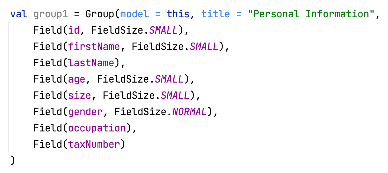
The fields parameter can be used to add attributes as fields.
Take care that the correct classes are imported for Group and Field :
The fields can be specified simply separated by commas:
A Field has the parameters attribute (mandatory), where an attribute can be passed and fieldSize (optional), which can be used to determine the size of the input field.
If no fieldSize is passed to the field, the default value FieldSize.NORMAL is set.
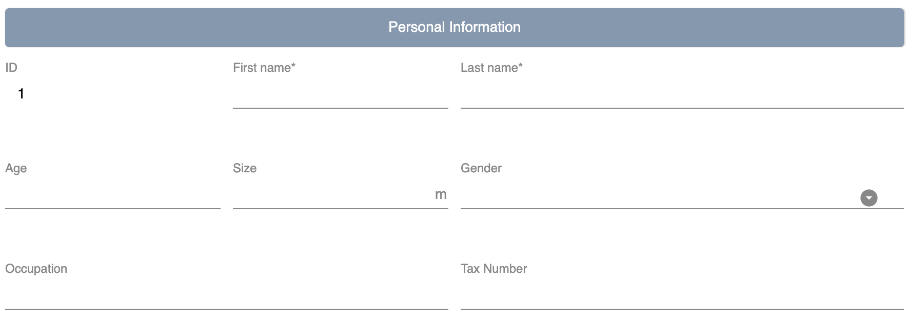
The fields appear in the same order as they are passed to the group.
FieldSize.SMALL is half the size of FieldSize.NORMAL:
If no fields are passed to the group, only the group title is displayed in the form.
These functions are useful when using onChange listeners for example.
The following functions can be called on attributes:
| Function | Description |
|---|---|
setValAsText(valueAsText : String) |
Set the user input |
setRequired(isRequired : Boolean) |
See attribute parameter required |
setReadOnly(isReadOnly : Boolean) |
See attribut parameter readOnly |
| Funktion | Rückgabe-Typ | Beschreibung |
|---|---|---|
getId() |
Int |
Returns the Id of the attribute |
getValue() |
T? |
Returns the last valid value. |
getSavedValue() |
T? |
Returns the stored value. |
getRightTrackValue() |
T? |
Returns the last right-track-valid value. |
getValueAsText() |
String |
Returns the current user input string. |
getPossibleSelections() |
Set<String> |
For the selection attribute, the set with the set choices is returned. For other attribute types, the set’s choices consist of previous user inputs (not yet implemented). |
getLabel() |
String |
Returns the current label text. |
isRequired() |
Boolean |
Returns whether an input is required or not. |
isReadOnly() |
Boolean |
Returns whether the value may be changed or not. |
isChanged() |
Boolean |
Returns whether value is the same as savedValue or not. |
isValid() |
Boolean |
Returns whether the user input (valueAsText) is valid or not. |
isRightTrackValid() |
Boolean |
Returns whether the user input is on the right track to a valid input or not. |
getErrorMessages() |
List<String> |
Returns all ErrorMessages that apply to the current input (valueAsText). |
The following functions can be called on a model:
| Funktion | Beschreibung |
|---|---|
setValAsText(valueAsText : String) |
Set the user input. |
setRequired(isRequired : Boolean) |
See attribute parameter required. |
setReadOnly(isReadOnly : Boolean) |
See attribute parameter readOnly. |
The following functions can be called on a validator:
| Function | Description |
|---|---|
override…Validator() (for … insert the correct type) |
This function can be used to overwrite the respective validator. The same parameters are available as for the initialization of the respective validator. See validators. |
