You should be reaaaaally familiar with Slack at this point, but just to make it more clear, Slack is a cloud-based set of team collaboration tools and services or in simpler terms, it is a chatting program.
We use the app almost every day to keep our communications with our classmates and the Ironhack team, so we know perfectly the chat interface but today we are going to clone their landing page. Here you can visit the website and check what are we going to do. 😜
We want to practice our new Flexbox skill, so we are going to implement the "responsiveness" of the landing page. No worries, we will show you what we need!
- Fork this repo
- Clone this repo into your
~/code/labs - Include both the client and server applications in your submission.
- Upon completion, run the following commands
git add .
git commit -m "done"
git push origin master
- Navigate to your repo and create a Pull Request
The starter_code contains the basic structure of an HTML & CSS project to start working. You will also find and images folder where all the images you will need for the project are stored.
:::info In the HTML you find all the text needed! Focus on give it some style! :::
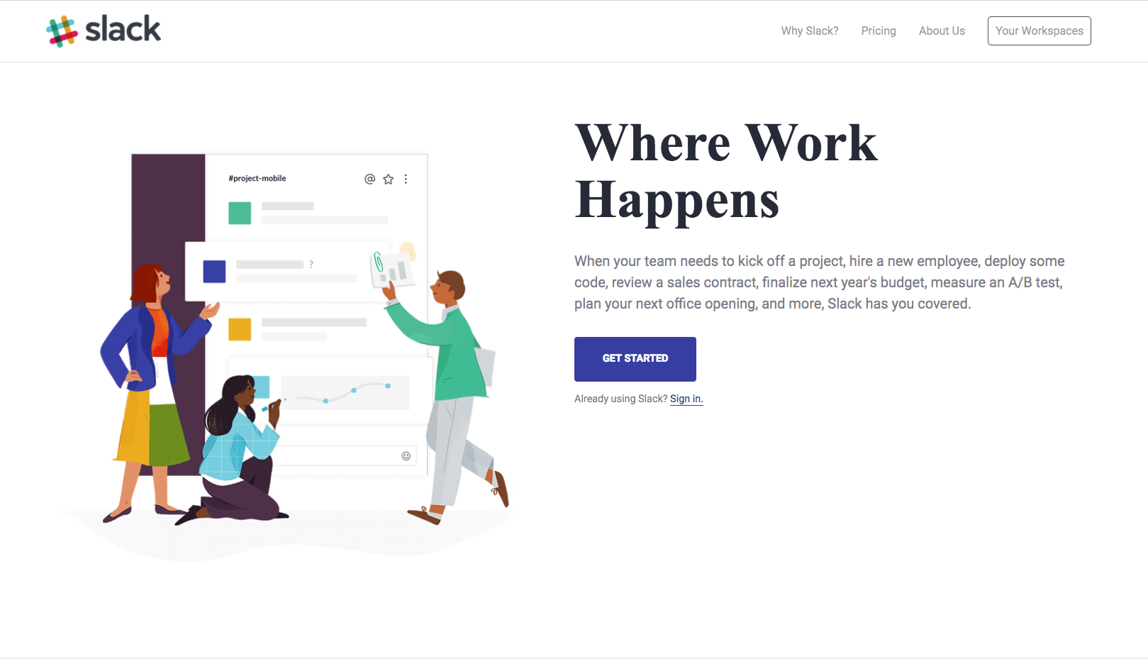
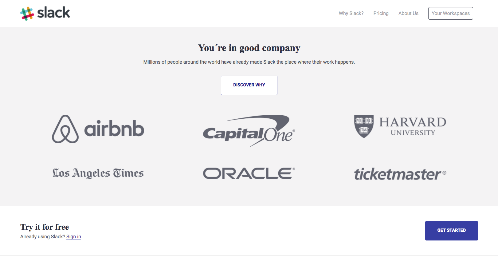
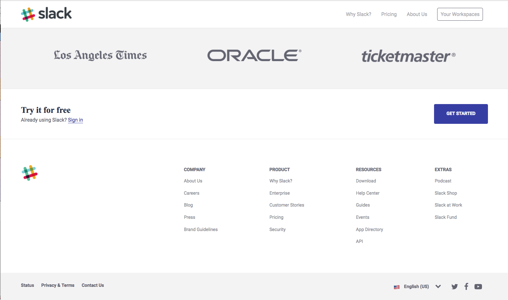
First, we need to clone the design we see on our laptops! :laptop: 💻 Oh! Remember to use flexbox, because it will be really helpful later on when we need to adapt it!
You should have something like this:
This one is really simple, we just need small changes.
-
The menu on our top nav-bar is replaced by a toggle button. We just need to make the
listdisappears and show the toggle menu button. Not necessary to make the button work, remember we are practicing our design skills here 😉 -
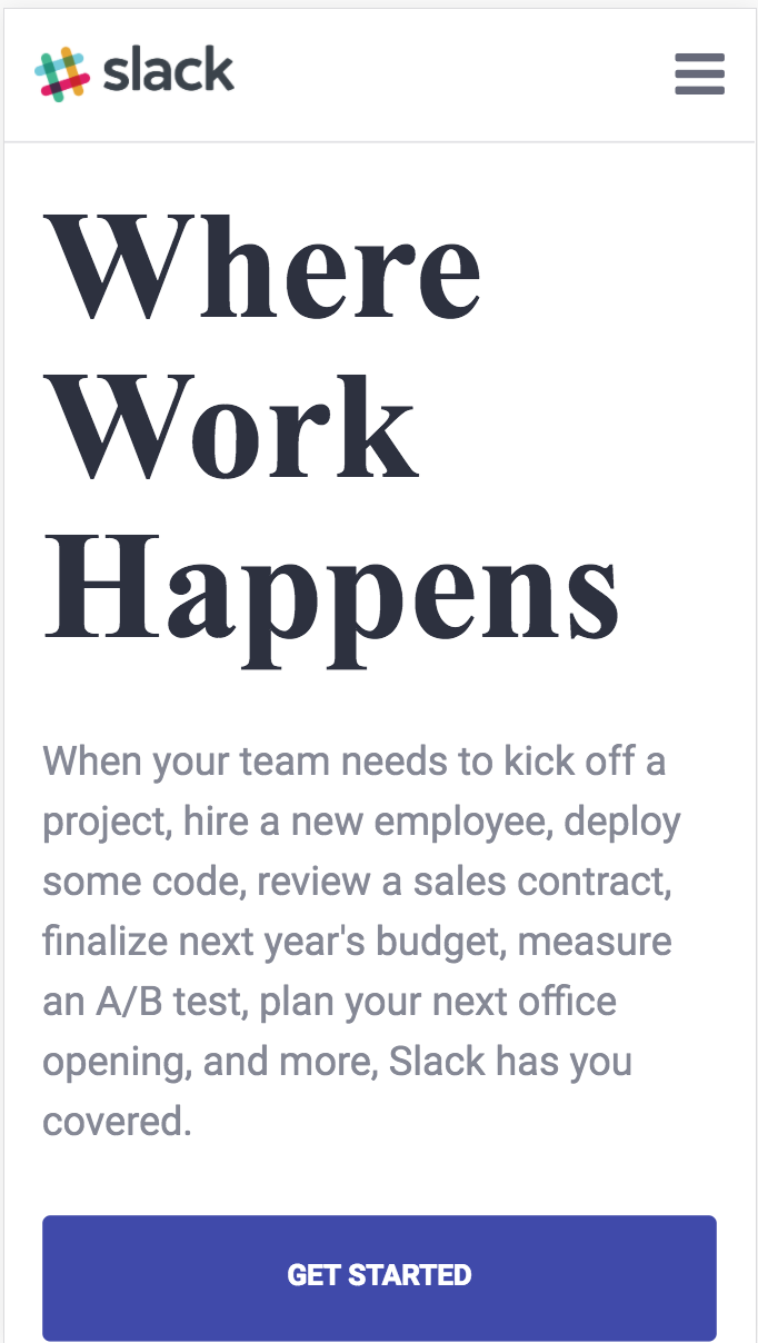
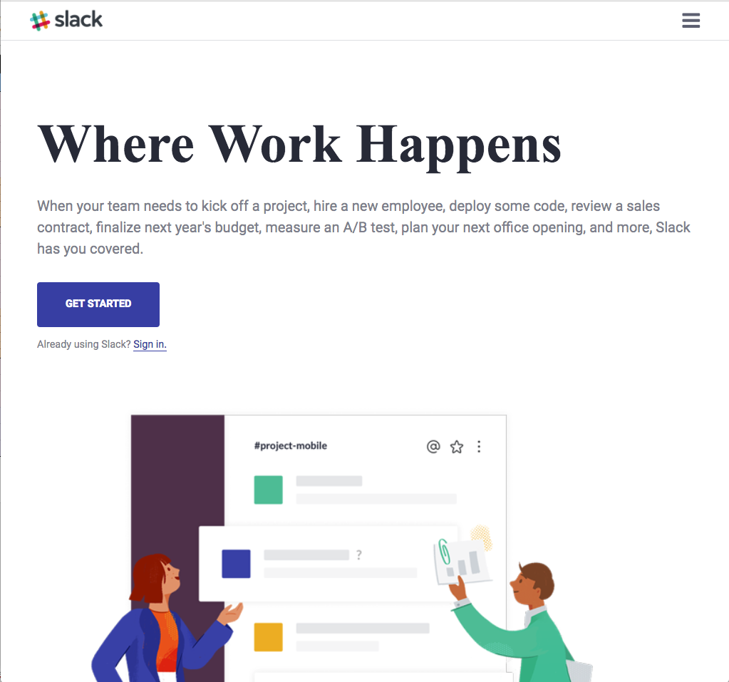
Change the main header layout. Instead of having them one beside the other, now we need the text on top and the image below it.
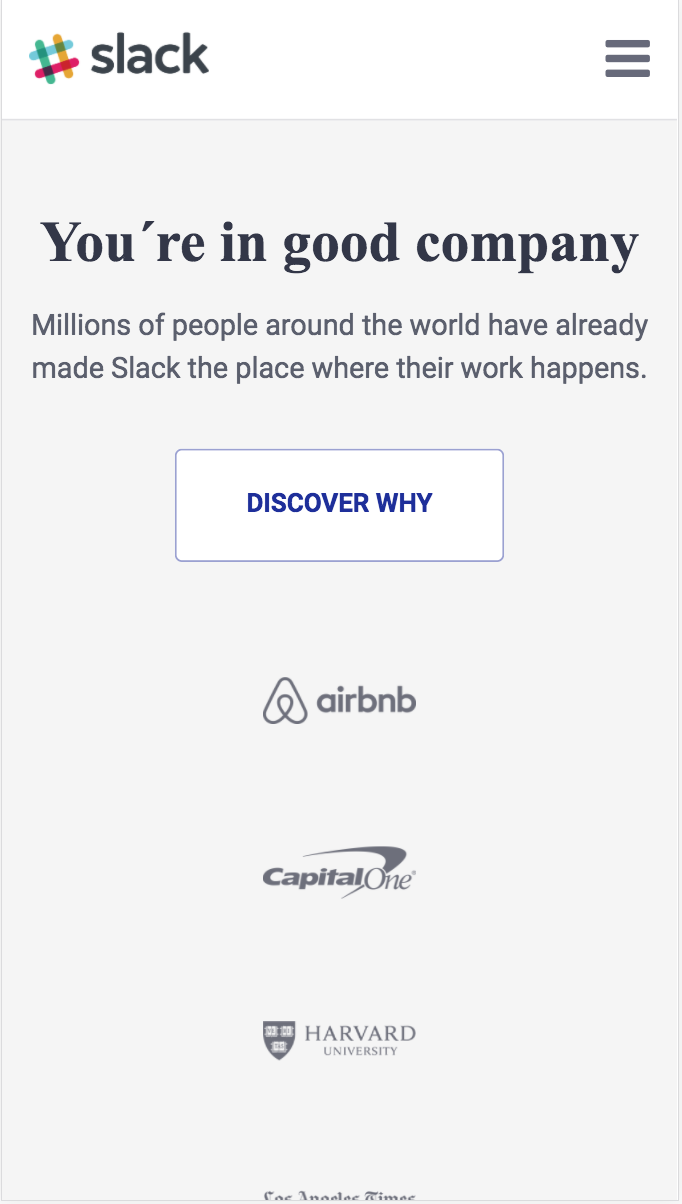
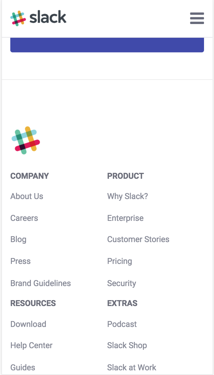
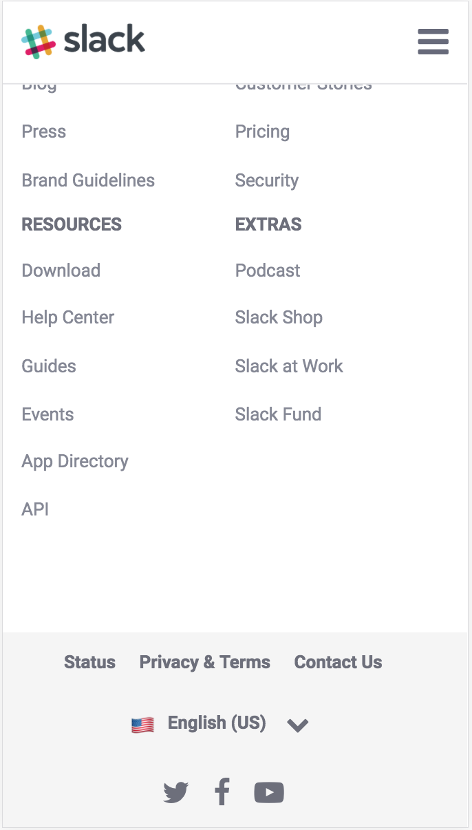
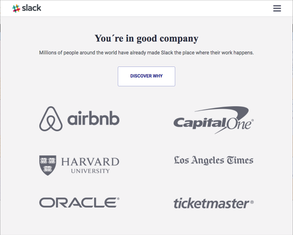
On small screens, we just need one change. The companies logo, instead of 3 per row, we should display them in pairs, that means we will have 3 rows of 2 logos each.
Last one! On extra small screens we will have a lot of changes! If you notice, this is the width apply to smartphones, so our web will have some changes! Take a look of the following screenshoots and adapt your code to clone it! 💪 📱