


Easily create forms with client side validations.
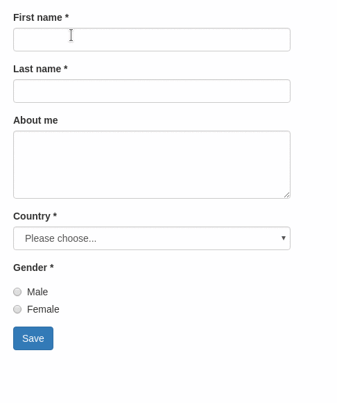
Want to try it yourself? See the live demo.
This ember-cli addon is based on the following excellent addons
and provides a handy out-of-the-box setup for user-friendly client-side validations, featuring
- Hiding of validation errors until field has been interacted with (or submit button was pressed)
- Preventing submit action until form is valid
- Live-updating validation errors
- Bootstrap integration
- Loading class on submit button while async task is executed
- Loading contextual template parameter set while async submit task is executed
*Yet another ember form addon
There are many existing ember addons with this style of API, the most prominent probably being ember-form-for. With this addon, we want to:
- focus on forms that require client-side validations
- provide good user experience out of the box
For more information, see this blog post.
First, install the addon:
ember install ember-validated-form
After, you'll need to set up
- a template containing your form elements
- a validations file (see ember-changeset-validations)
- a controller, route and/or component that provides your template with the validations and your model
You'll find a basic example in this twiddle or in the following code blocks:
// controller
import Controller from '@ember/controller';
import UserValidations from 'dummy/validations/user';

export default Controller.extend({
  UserValidations,

  actions: {
    submit(model) {
      return model.save();
    }
  }
});
// route
import Route from '@ember/routing/route';
export default Route.extend({
model() {
return { firstName: 'Max' } // or an ember object, an ember-data model, ...
}
});UserValidations is a changeset:
// validations/user.js
import {
  validatePresence,
  validateLength,
  validateInclusion
} from 'ember-changeset-validations/validators';

export default {
  firstName: [validatePresence(true), validateLength({ min: 3, max: 40 })],
  lastName: [validatePresence(true), validateLength({ min: 3, max: 40 })],
  aboutMe: [validateLength({ allowBlank: true, max: 200 })],
  country: [validatePresence(true)],
  gender: [validatePresence(true)],
  terms: [
    validateInclusion({
      list: [true],
      message: 'Please accept the terms and conditions!'
    })
  ],
  color: [validatePresence(true)]
};{{validated-form}} takes the following options:
| Name | Type | Description |
|---|---|---|
| model | Object |
ember-changeset containing the model that backs the form |
| validateBeforeSubmit | Boolean |
Specifies whether to run validations on inputs before the form has been submitted. Defaults to true. |
| on-submit | Action |
Action, that is triggered on form submit. The changeset is passed as a parameter. If the action returns a promise, then any rendered submit buttons will have a customizable CSS class added and the yielded loading template parameter will be set. |
When the submission of your form can take a little longer and your users are of the impatient kind, it is often necessary to disable the submit button to prevent the form from being submitted multiple times. This can be done by using the loading template parameter and works very well with ember-concurrency tasks.
// controller
import Controller from '@ember/controller';
import { task } from 'ember-concurrency';

export default Controller.extend({
  submit: task(function * (model) {
    yield model.save();
    // ... more code to show success messages etc.
  })
});For a minimal demo see this twiddle.
{{validated-form}} yields an object, that contains the contextual component input. All input fields share some common properties:
| Name | Type | Description |
|---|---|---|
| label | String |
The label of the form field. |
| name | String |
This is is the name of the model property this input is bound to. |
| hint | String |
Additional explanatory text displayed below the input field. |
| type | String |
Type of the form field (see supported field types below). Default: text. |
| disabled | Boolean |
Specifies if the input field is disabled. |
| required | Boolean |
If true, a "*" is appended to the field's label indicating that it is required. |
| value | String |
Initial value of the form field. Default: model property defined by name. |
| validateBeforeSubmit | Boolean |
Specifies whether to run validations on this input before the form has been submitted. Defaults to the value set on the form. |
| on-update | Action |
Per default, the input elements are two-way-bound. If you want to implement custom update behavior, pass an action as on-update. The function receives two arguments: update(value, changeset). |
The supported field types are essentially given by ember-one-way-controls. This addon does not much more than translating {{f.input type="select"}} to {{one-way-select}}.
However, some field types require extra parameters. The supported field types are listed below.
If no field type is specified, a simple <input type="text"> is rendered. Other HTML5 text-like inputs like email, number, search require specifying their type. The element also supports the following options:
placeholderautofocus
The textarea element also supports the following options:
rowsandcolsautofocusplaceholder
The select element supports more options (see {{one-way-select}}):
valueoptionsoptionLabelPathoptionValuePathoptionTargetPathincludeBlankpromptIsSelectable
The prompt property is currently not supported (see this related issue).
This component renders a {{one-way-checkbox}}.
This component renders a list of {{one-way-radio}} components.
// in your controller
shapes: [{
  key: 't',
  label: 'Triangle'
}, {
  key: 's',
  label: 'Square'
}, {
  key: 'c',
  label: 'Circle'
}],
If you want to customize the markup for each radio-button's label, you can invoke this component using block form. This is helpful if you need to localize your labels using something like ember-i18n.
// in your controller
shapes: [{
  key: 't',
  label: 'some.scope.triangle'
}, {
  key: 's',
  label: 'some.scope.square'
}, {
  key: 'c',
  label: 'some.scope.circle'
}],
// in your locale file
export default {
'some': {
'scope': {
'shapes': 'les formes',
'triangle': 'un triangle',
'square': 'un carré',
'circle': 'un cercle'
}
}
};If the input element you need is not explicitly supported, you can easily integrate it with this addon by using f.input in block form:
There are three integration points for custom components:
- initialize the state of your component with
fi.value - update the model's value with
fi.update - mark your component as dirty with
fi.setDirty
{{validated-form}} also yields a submit button component that can be accessed with {{f.submit}}. You can also use it as a block style component {{#f.submit}}Test{{/f.submit}} if you don't want to pass the label as a property. It takes the following properties:
| Name | Type | Description |
|---|---|---|
| label | String |
The label of the form button. |
| type | String |
Type of the button. Default: button. |
| disabled | Boolean |
Specifies if the button is disabled. |
| loading | Boolean |
Specifies if the button is loading. Default: Automatic integration of ember-concurrency |
Currently, the configuration supports
label.submit: default label for thesubmitbutton. If you're using ember-i18n, you can also specify a translation key.css: Custom CSS Classesformgroup(divwrapping every form element including label and validation messages)control(applied to form elements likeinput,select, ...)labelradio(divwrapping radio button groups)checkbox(divwrapping checkboxes)help(spancontaining validation messages)hint(pcontaining form input hints)buttonsubmit(Special styling for the submit button, overridesbutton)error(Name of the class added togroupwhen the element is invalid)valid(Name of the class added togroupwhen the element is valid)loading(Name of the class added tobuttonwhen the element is loading)
See an example integration of Bootstrap and Semantic UI below.
// environment.js

var ENV = {
  // ...
  'ember-validated-form': {
    label: {
      submit: 'Go for it!',
    },
    css: {
      // bootstrap classes
      group: 'form-group',
      control: 'form-control',
      label: 'form-label',
      checkbox: 'checkbox',
      radio: 'radio',
      help: 'help-block',
      hint: 'help-block',
      button: 'btn btn-default',
      submit: 'btn btn-primary'
    }
  },
  // ...
}// environment.js
var ENV = {
// ...
'ember-validated-form': {
label: {
submit: 'Go for it!',
},
css: {
// semantic ui classes
form: 'ui form',
radio: 'ui radio',
help: 'ui red',
checkbox: 'ui checkbox',
button: 'ui button',
group: 'field',
error: 'error'
}
},
// ...
}Bug reports, suggestions and pull requests are always welcome!
git clone https://github.com/adfinis-sygroup/ember-validated-formcd ember-validated-formyarn install
ember serve- Visit your app at http://localhost:4200.
yarn test(Runsember try:eachto test your addon against multiple Ember versions)ember testember test --server
ember build
For more information on using ember-cli, visit https://ember-cli.com/.