Internet.nl is an initiative of the Dutch Internet Standards Platform that helps you check whether your website and email use modern and reliable Internet Standards; and if they don’t, gives suggestions on what needs to be done to improve it.
See the internet.nl website and/or its source code on github.
- Internet.nl helper scripts
With the internet.nl website you can test individual domains, but if you need to test more domains (more than a few anyway) then it's probably easier to use the batch API of internet.nl instead. You can request access to the batch API by sending a mail to internet.nl at question@internet.nl or vraag@internet.nl
Note that newer versions of the website will allow you to upload a list as well and have it regularly tested via its new dashboard functionality, which suits most use cases. If you want to do some post-processing or other things not provided by the dashboard then these scripts may be useful.
The scripts in this repository enable you to submit domains from an Excel (.xlsx) file to the internet.nl API and process the JSON measurement results to different formats (xlsx, csv or duckdb) for further processing or inspection.
The first and foremost step is to nicely ask vraag@internet.nl or question@internet.nl to be granted access to the Batch API.
Once you have received the account details add the account information to the batch.conf file like so:
[prod]
username = <your_account_name>
password = <your_account_password>
The batch.py script will use this information to authenticate to the API.
You have to prepare an .xlsx file to contain the domains you want to batch test. The easiest approach is to simply modify the provided example domains/domains.xlsx file.
Each line can contain 4 fields: The name, the domain to be used for a web test, the domain to be used for a mail test, and a 'sector/type' field that is used to distinguish between various domains. This can be useful to group domains, for example per department responsible or the type of organisation, and is also used to produce different graphs.
With batch.py you can call the API to perform various tasks: submitting a new batch measurement request,list the batch requests, get the status of an individual request, delete an outstanding request (e.g. if it is blocking further measurements) and finally retrieve the results of a specific batch measurement. The script will use the information from the batch.conf file to authenticate against the API.
usage: batch.py [-h] [-d FILE] [-s [sheet_name]] [-n name] [-p [SECTION]] [-v] [--debug] [-V] {sub,list,stat,get,del} [parameter]

Utility for interacting with the batch requests API of internet.nl

The following commands are supported:

 sub  - submit a new batch request
 list - list all or some of the batch requests
 stat - get the status of a specific request
 get  - retrieve the results of a request
 del  - delete a request

positional arguments:
  {sub,list,stat,get,del}
                        the request to execute (default: list)

  parameter             extra parameter for the request, type and meaning depend on the request:

                        sub          (required): {web|mail} the type of measurement to submit
                        list         (optional): the number of items to list (default: 0 = all)
                        stat,get,del (required): the request_id for the stat,get or del request
To submit your domains to the API for testing use the following command:
./batch.py sub {mail|web} -d domains/domains.xlsx [-s sheet_name] [-n name]
Since the API can test mail or web domains, you have to specify which of the two you want. You can optionally provide the name you want the test to have. The default name if you do not specify one is the current date in yyyymmdd format (e.g. 20210716). Depending on the type of measurement (web or mail) the domain information in the corresponding column of the .xlsx file will be used. You can optionally specify the name of the sheet to use in the .xlsx file. The first sheet will be used by default. This allows you to have other sheets in the same .xlsx file, for example for testing purposes or simply for having multiple batches of domains in the same file.
Measurements will take some time to complete. Use the list command to get an overview of all the known batch requests.
./batch.py list
The latest requests will be listed first. You can limit the number of requests returned by specifying a limit as an argument (./batch.py list 1). Default is to list all.
To check the status of a specific request, use the stat command together with the request_id as provided in the output of the list command.
./batch.py stat 48ba299abef547049c48c826782f95f4
Once the status of a request is 'generating' or 'done', the measurements are ready.
The report can be retrieved by using the get command with the request_id, e.g.:
./batch.py get cb7be7ed776e464796cd8514c6e2a0e7
The output will be shown on screen by default unless an output file is specified with the -o argument, e.g.:
./batch.py get cb7be7ed776e464796cd8514c6e2a0e7 -o output.json
You can process the results with the process.py script, either an individual measurement batch by specifying a single json file or multiple batches by specifying a directory containing multiple json files.
To process all measurements in the measurements directory and store them in the duckdb database output.duckdb use:
./process.py measurements duckdb output
Mail and web measurements results will be stored in separate tables ('mail' and 'web' respectively).
The script will also add information on the month and quarter of the measurements (yyyyQ#, e.g. 2020Q4). Please note that a measurement done in the months 1,4,7,10 (January, April, July, October) will be marked as measurements for the preceding quarter. So a measurement in January 2021 will be marked as a 2020Q4 measurement. It helps to do measurements roughly on the same day of the month/quarter. If you want to do quarter measurements then do them at the start of January, April, July, and October.
Measurement results can also be stored in an xlsx file or csv files by replacing duckdb in the command above with xlsx or csv. For xlsx the mail and web results will be put into separate sheets ('mail' and 'web'). With csv two separate output files will be produced for the mail and web results.
If you don't want the measurements combined into a single database or file, add the -i flag to the command. This will process all json files individually to the specified output type, creating output files with the same name as the json input file but with a different extension reflecting the output type.
Additional information from the original domain xlsx file can be included by specifying the domain filename and (optionally) the column(s) to include. With no column specified the default of 'type' will be used. To process the same results as in the example above, but now including the information from the 'type' and 'name' columns use:
./process.py measurements duckdb output -d domains/domains.xlsx -m type,name
Please note that the column names cannot contain spaces and that multiple columns need to be separated by a comma without spaces as well.
Metadata fields in the output database are named md_<column> to distinguish them from the regular fields. So for the example above, the metadata fields will be called md_type and md_name.
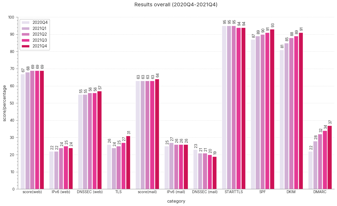
Once you have assembled a number of months (or quarters) worth of measurements you can use them to create graphs that show improvement (hopefully) over time, such as this example over a one year period (5 quarters).
Input data for the graphs is taken from a duckdb database, such as the one created by the commands shown above. The graphs are made using the bokeh graphics library.
Bokeh uses Selenium for creating the resulting graphic files (in PNG and SVG format), so you need to have this installed (it is in requirements.txt) as well as a suitable driver (geckodriver or chromedriver).
NB: Note that the drivers must be the same version as the browser you are using!
With the data present in the duckdb file, graphs.py will produce the graphs in the specified output directory:
./graphs.py output.duckdb graphs
By default, it will produce graphs for the latest 5 months present in the database (or fewer months if not enough data is present). The number of months to consider can be specified by adding a number to the command.
To produce graphs for the previous six months:
./graphs.py output.duckdb graphs 6
To produce graphs for the last N quarters instead of the last N months, add the -q flag:
./graphs.py output.duckdb graphs 6 -q
If fewer periods are present in the database than you specify, the maximum period of available data will be used. Also, if intermediate measurement series are missing these will be skipped. So for example: If the database is missing a quarter (e.g. contains 2020Q1, 2020Q2, 2020Q3, 2021Q1; so is missing 2020Q4), the graphs will be produced using data that is available and ignore the missing quarter, this is also the case for the 'top improvers' tables (see below).
All graphs are written to disk in both PNG and SVG format. The latter is useful for presentations or printed materials since SVG is a scalable format, meaning you can enlarge the graphs without losing quality. PNG is more widely supported though, and is good enough for most cases.
The graphs produced are:
- Bar graph of overall scores for web/mail combined in one graph (example above)
- Bar graph of overall scores for web/mail for every distinct type in the data (e.g. 'Uni','Research') if type data is available.
- Bar graph of only the latest scores for web/mail for every distinct type in the data (e.g. 'Uni','Research') if type data is available.
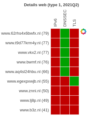
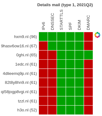
- Detailed tables overall, one for mail, one for web.
- Detailed tables (both web and mail) for every distinct type in the data (e.g. 'Uni','Research') if type data is available.
- Top 5 'improvers' overall, for both web and mail
- Bottom 5 'improvers', for both web and mail
- Top 0 (==all) 'improvers' overall, for both web and mail
Graphs taking type into account are of course only made if such data is available in the database. That is: you added it in the process step as shown above.
By default, graphs.py will check if a 'type' column/field is available and render graphs for all the distinct values present in that column. If you added other metadata columns than 'type' and want to use that for creating different graphs you can specify the name of the column to use with the -m parameter. Below an example of the bar graph of only the latest scores for web/mail for every distinct type in the data (in this example 'type 0' to 'type 5')
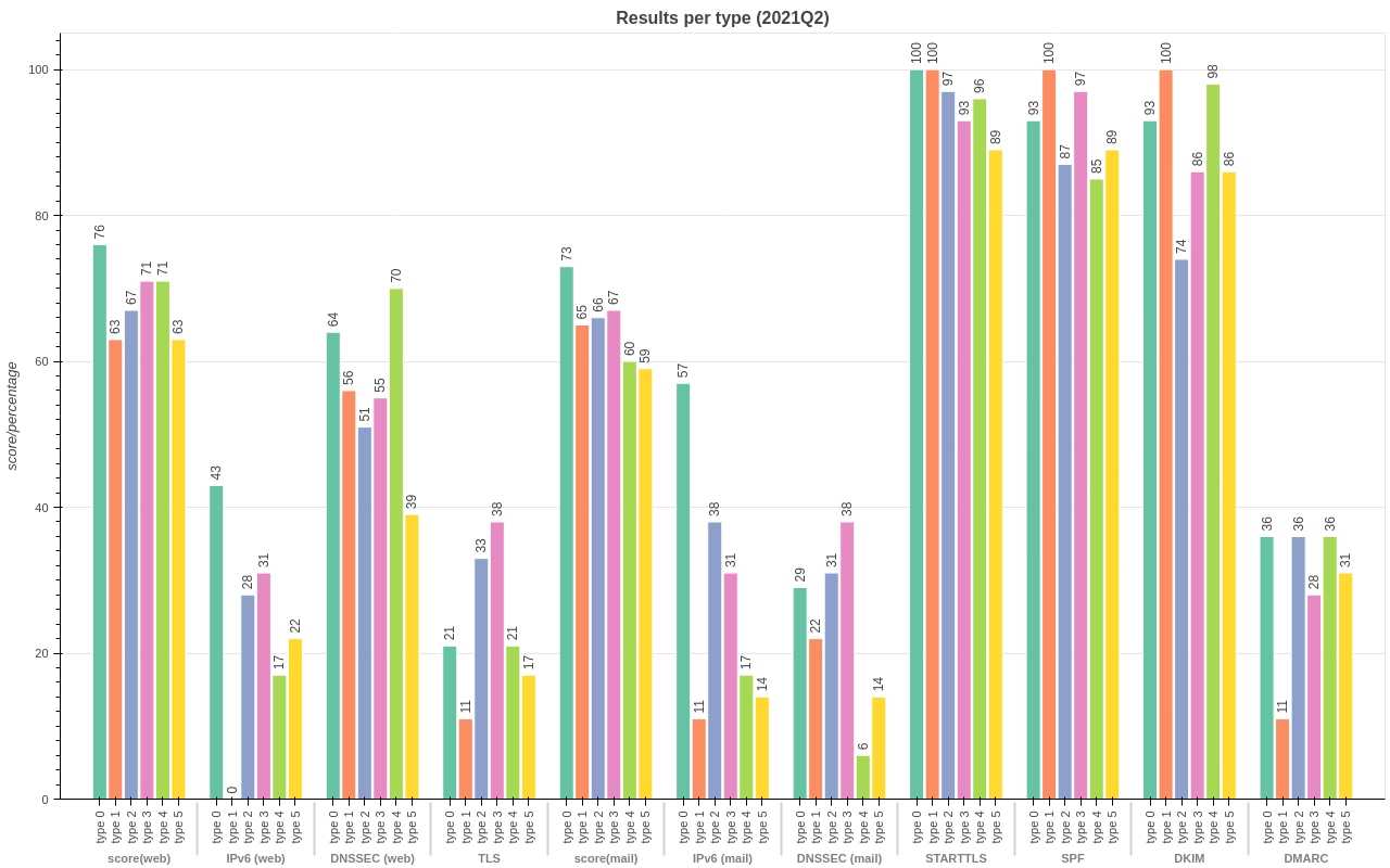
The overall score graphs for the different types use different colour schemes per type. Six different colour schemes are available, so some colour schemes will be duplicated if you have more than six different types.
The detailed tables provide a visual overview of how well the domains did on the main categories tested: IPv6, DNSSEC and TLS for web. IPv6, DNSSEC, STARTTLS, SPF, DKIM and DMARC for mail. A green colour denotes a 'pass' for a category, red denotes a 'fail'.
The 'improvement' table graphs show if the domains improved or deteriorated over time. Improvement (or deterioration) is determined by comparing the latest scores with the score of the previous period (month or quarter) for each domain present. Note that this may be more than a month (or quarter) apart if that previous measurement is missing. In other words: the comparison doesn't check whether the previous measurement is a month (or quarter) apart, it will simply use the previous (month/quarter) measurement it finds. To give an idea what an improvers table looks like: The examples below show the top and bottom 5 improvers for 2021Q2 compared to 2021Q1 for mail.
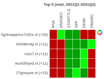
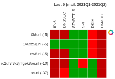
The number between brackets after the domain names is the difference in the total score for that domain (2021Q2) compared to the previous period (2021Q1).
Green squares mean a 'pass' for a topic (e.g. IPv6), red squares denote a 'fail'. A lighter colour square means it changed compared to the previous period. So a light green square denotes a 'pass' where the previous period it was a 'fail' (DNSSEC for the first domain in the left example). Similarly, a light red square means a 'fail' where the previous period it was a 'pass' (DKIM for the first domain in the right example).
In essence: light green squares are improvements, light red squares are deteriorations.
This project is licensed under the Apache License, Version 2.0 - see the LICENSE-Apache-2.0.txt file for details.