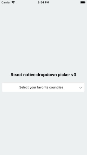
A single or multiple, searchable item picker (dropdown) component for react native which supports both Android & iOS.
x < 3.0.0 Versions are incompatible with the current version.
It's required to follow the docs in order to upgrade the package to v3.x
- Added multiple items feature.
- Added searchable items feature.
- Removed
defaultIndexproperty. - Removed
defaultNullproperty. - The
defaultValueis state-friendly. - Added
searchablePlaceholderTextColorproperty. - Added
selectedLabelStyleproperty. - Added
iconproperty for items. - The
searchableErrorreturnsjsx. - Changed
FlatListtoScrollView. - Added types file.
npm install react-native-dropdown-picker --saveyarn add react-native-dropdown-pickerThe first step is to import the package.
import DropDownPicker from 'react-native-dropdown-picker';Select a single item.
import Icon from 'react-native-vector-icons/Feather';

this.state = {
    country: 'uk'
}

<DropDownPicker
    items={[
        {label: 'UK', value: 'uk', icon: () => <Icon name="flag" size={18} color="#900" />},
        {label: 'France', value: 'france', icon: () => <Icon name="flag" size={18} color="#900" />},
    ]}
    defaultValue={this.state.country}
    containerStyle={{height: 40}}
    style={{backgroundColor: '#fafafa'}}
    itemStyle={{
        justifyContent: 'flex-start'
    }}
    dropDownStyle={{backgroundColor: '#fafafa'}}
    onChangeItem={item => this.setState({
        country: item.value
    })}
/>Select multiple items.
import Icon from 'react-native-vector-icons/Feather';
this.state = {
countries: ['uk']
}
<DropDownPicker
items={[
{label: 'UK', value: 'uk', icon: () => <Icon name="flag" size={18} color="#900" />},
{label: 'France', value: 'france', icon: () => <Icon name="flag" size={18} color="#900" />},
]}
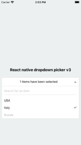
multiple={true}
multipleText="%d items have been selected."
min={0}
max={10}
defaultValue={this.state.countries}
containerStyle={{height: 40}}
itemStyle={{
justifyContent: 'flex-start'
}}
onChangeItem={item => this.setState({
countries: item // an array of the selected items
})}
/>Search for specific items.
searchable={true}
searchablePlaceholder="Search for an item"
searchablePlaceholderTextColor="gray"
seachableStyle={{}}
searchableError={() => <Text>Not Found</Text>}You may want to select one of the items as default.
Use one of these ways:
-
Add
selected: trueto the object. (This method is not state-friendly!)items={[ {label: 'Item 1', value: 'item1'}, {label: 'Item 2', value: 'item2', selected: true, disabled: true}, ]}
-
The
defaultValueproperty.defaultValue="uk" // Single defaultValue=["uk"] // Multiple
You may want to have a placeholder while the default value is null or an empty array.
Add the following properties to the component.
this.state = {
    data: null, // Single
    data: [] // Multiple
}

...
defaultValue={this.state.data}
placeholder="Select an item"
...You have 12 options to style the component.
-
The
styleproperty.Use this to adjust the inner part of the picker.
style={{paddingVertical: 10}} -
The
dropDownStyleproperty.Additional styles for the dropdown box.
dropDownStyle={{backgroundColor: '#fafafa'}} -
The
containerStyleproperty.Use this to adjust the outer part of the picker such as
margin,width,height,flex, ...containerStyle={{width: 150, height: 70}} -
The
itemStyleproperty.If you want the labels on the
leftandrightside or to centerize them:itemStyle={{justifyContent: 'flex-start|flex-end|center'}} -
The
labelStyleproperty.This property gives full control over the label.
labelStyle={{ fontSize: 14, textAlign: 'left', color: '#000' }} -
The
selectedLabelStyleproperty.Changes the style of the selected item label.
selectedtLabelStyle={{ color: '#39739d' }} -
The
placeholderStyleproperty.It is possible to style the placeholder text with this property.
placeholderStyle={{ fontWeight: 'bold', textAlign: 'center' }} -
The
activeItemStyleproperty.This property allows you to style the active item.
activeItemStyle={{justifyContent: 'center'}} -
The
activeLabelStyleproperty.This property allows you to style the active label.
activeLabelStyle={{color: 'red'}} -
The
arrowStyleproperty.Adds your additional styles to the
Viewelement of the arrow.arrowStyle={{marginRight: 10}} -
The
searchableStyleproperty.Additional styles for the
TextInputsearchableStyle={{backgroundColor: '#dfdfdf'}} -
The
searchablePlaceholderTextColorproperty.Assigns a new color to the placeholder text
searchablePlaceholderTextColor="silver"
Clicking on another picker doesn't close the other pickers? This can be fixed with the help of state.
this.state = {
    itemA: null,
    isVisibleA: false,

    itemB: null,
    isVisibleB: false
}

changeVisibility(state) {
    this.setState({
        isVisibleA: false,
        isVisibleB: false,
        ...state
    });
}

// Picker A
<DropDownPicker
    items={[
        {label: 'UK', value: 'uk'},
        {label: 'France', value: 'france'},
    ]}
    defaultValue={this.state.itemA}
    containerStyle={{height: 40}}

    isVisible={this.state.isVisibleA}
    onOpen={() => this.changeVisibility({
        isVisibleA: true
    })}
    onClose={() => this.setState({
        isVisibleA: false
    })}
    onChangeItem={item => this.setState({
        itemA: item.value
    })}
/>

// Picker B
<DropDownPicker
    items={[
        {label: 'UK', value: 'uk'},
        {label: 'France', value: 'france'},
    ]}
    defaultValue={this.state.itemB}
    containerStyle={{height: 40}}

    isVisible={this.state.isVisibleB}
    onOpen={() => this.changeVisibility({
        isVisibleB: true
    })}
    onClose={() => this.setState({
        isVisibleB: false
    })}
    onChangeItem={item => this.setState({
        itemB: item.value
    })}
/>The only thing you have to avoid is borderRadius. All the corners must be set separately.
style={{
    borderTopLeftRadius: 10, borderTopRightRadius: 10,
    borderBottomLeftRadius: 10, borderBottomRightRadius: 10
}}
dropDownStyle={{
    borderBottomLeftRadius: 20, borderBottomRightRadius: 20
}}-
Using the
containerStyleproperty to style the picker results in unexpected behaviors like untouchable items.The
styleanddropDownStyleproperties must be used instead.
Use thecontainerStyleprop to adjust the outer part of the picker such asmargin,width,height,flex, ... -
Nested Views
You have to add
zIndexto the nested views which contain the picker.
Note!zIndexlocks the picker on Android, The solution is to use thePlatform.OSimport { Platform } from 'react-native'; <View style={{ ...(Platform.OS !== 'android' && { zIndex: 10 }) }} > <DropDownPicker ... /> </View>
-
DropDownPicker wrapped by
<View style={{backgroundColor: '...'}}>Remove the
backgroundColorfrom the parent element.
hossein-zare#40 (comment) -
Multiple Pickers
<DropDownPicker zIndex={5000} />
<DropDownPicker zIndex={4000} />
<DropDownPicker zIndex={3000} />
Adding borders to the component will separate or overflow elements. to solve this issue you just need to add marginTop to the dropDownStyle and specify the value which fits your component well.
dropDownStyle={{marginTop: 2}}| Name | Description | Type | Default | Required |
|---|---|---|---|---|
items |
The items for the component. | array |
Yes | |
defaultValue |
The value of the default item. (If multiple={true}, it takes an array of pre-selected values: ['uk']) |
any |
No | |
placeholder |
Default text to be shown to the user when defaultValue={null} or defaultValue={[]} |
string |
'Select an item' | No |
dropDownMaxHeight |
Height of the dropdown box. | number |
150 |
No |
style |
Additional styles for the picker. | object |
{} |
No |
dropDownStyle |
Additional styles for the dropdown box. | object |
{} |
No |
containerStyle |
Additional styles for the container view. | object |
{} |
No |
itemStyle |
Additional styles for the items. | object |
{} |
No |
labelStyle |
Additional styles for the labels. | object |
{} |
No |
selectedLabelStyle |
Additional styles for the selected label. | object |
{} |
No |
placeholderStyle |
Additional styles for the placeholder text. | object |
{} |
No |
activeItemStyle |
Additional styles for the active item. | object |
{} |
No |
activeLabelStyle |
Additional styles for the active label. | object |
{} |
No |
arrowStyle |
Additional styles for the arrow. | object |
{} |
No |
arrowColor |
The color of arrow icons | string |
#000 |
No |
arrowSize |
The size of the arrow. | number |
15 |
No |
showArrow |
An option to show/hide the arrow. | bool |
true |
No |
customArrowUp |
Customize the arrow-up. | func |
(size, color) => ... |
No |
customArrowDown |
Customize the arrow-down. | func |
(size, color) => ... |
No |
customTickIcon |
Customize the tick icon for multiple item picker. | func |
() => ... |
No |
zIndex |
This property specifies the stack order of the component. | number |
5000 |
No |
disabled |
Disables the component. | bool |
false |
No |
isVisible |
Open or close the dropdown box. | bool |
false |
No |
multiple |
If set to true selecting multiple items is possible. | bool |
false |
No |
multipleText |
a Text to inform the user how many items have been selected. | string |
%d items have been selected |
No |
min |
Minimum number of items. | number |
0 |
No |
max |
Maximum number of items. | number |
10000000 |
No |
searchable |
Shows a TextInput to search for specific items. |
bool |
false |
No |
searchablePlaceholder |
Default text to be shown to the user. | string |
Search for an item |
No |
searchablePlaceholderTextColor |
TextInput placeholder text color. | string |
gray |
No |
searchableStyle |
Additional styles for the TextInput. |
object |
{} |
No |
searchableError |
Shows a jsx element when nothing found. | func |
() => <Text>Not Found</Text> |
No |
onOpen |
Fires when you open the picker. | func |
() => {} |
No |
onClose |
Fires when you close the picker. | func |
() => {} |
No |
onChangeItem |
Callback which returns item and index. The item is the selected object or an array of the selected values. |
func |
(item, index) => {} |
No |